Pixels of the Week – March 1, 2020
Every week I share a list of curated articles, resources and tools about UX, UI and mobile design, HTML, CSS, the web industry, process inspiration and more…
This week’s selection: 10 UX deceptive patterns illustrated, dataviz and maps, mobile UX with one hand, HTML data attributes, product prioritization matrices, drag and drop usability, qualitative user research guide, mental models, accessibility color contrast ratio explained, accessibility dont’s design tasks in the hiring process, CSS stats, free people illustrations, styling buttons in CSS, is consistency killing creativity, etc.
#Now – what I’m up to
I’ve spent my Saturday mentoring some startups to help them build a landing page for their concept. If you are interested in my mentoring skills, I’m now offering some mentorship online. You can book an hours, contact me directly if you want to book 30 minutes I will add a slot.
On #UXtalk this week we where talking about process for a new project. Here is mine, spoiler alert it contains a lot of panic.
I’m drawing silly illustrations mostly for friends and twitter mates. Feel free to use it, print it on stickers, etc.. You can get the sources here.
TL;DNR the one you should not miss
#UX
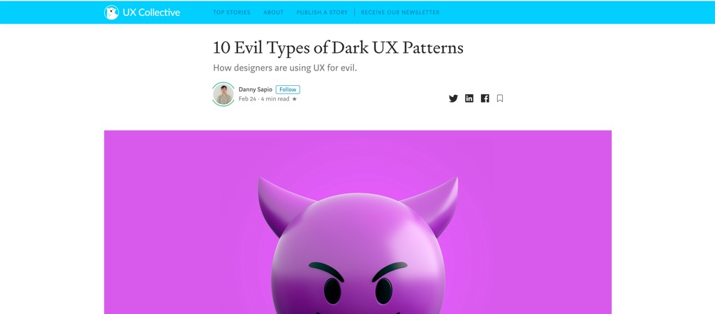
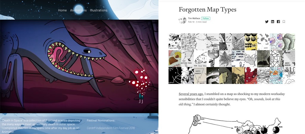
10 Evil Types of Deceptive UX Patterns: well illustrated examples of patterns that deceive and manipulative users into doing something they didn’t want / need to do. The sad part is that we see most of those in almost every website we visit those days.
Interesting article
#Design
“Consistency the Killer” an interesting articles that favors coherence over consistency within a deep understanding of users needs, coherence as a more progressive way to frame design decisions to stay creative
#UserReaserch
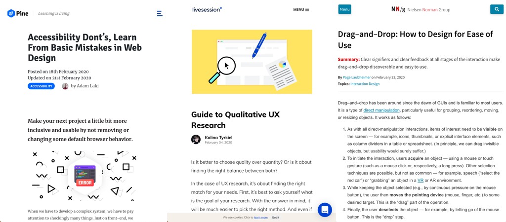
“Guide to Qualitative UX Research” a list of quantitative research methods, how and when to use them to understand user decisions and actions
#User Psychology
What’s a mental model? Mental models are based on a person past experiences and what they think they know about a system. Users will bring expectations they have built around a familiar product to another product that seems to be similar.
#Mobile UX
- “How To Design Mobile Apps For One-Hand Usage” a great article with a ton of usability advice to help you design native apps that will be easy to use
- “Gauging users’ reactions to non-native UI” super detailed and interesting guerilla testing, results so far: “HIG-relevant UI elements have a slightly positive effect on the UX of all users.”
#Dataviz
I didn’t notice before but the Material Design Guidelines has some great advice on how to design charts, from which type of visualisation to chose based on what users need to do with the data all the way to typography, colors, etc.
“Show me, don’t tell me” some dataviz best practice to help your users get the most out of the data you show them
#Product Strategy
“Getting your priorities right” a few matrices and tools to help you get product priority decisions about which feature you should build first, not build, etc.
#Usability
“Drag–and–Drop: How to Design for Ease of Use” Clear signifiers and clear feedback at all stages of the interaction make drag–and–drop discoverable and easy to use.
#Trend
“Neumorphism — the zombie trend“, I’m all for killing zombies with a chainsaw.
#Accessibility
- “Understanding Web Accessibility Color Contrast Guidelines and Ratios” a great detailed read that details all the math behind the contrast ratio score
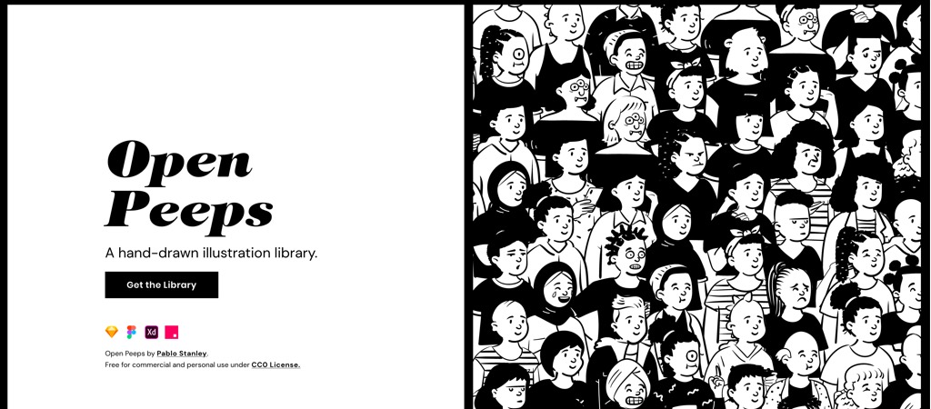
- “Accessibility Dont’s, Learn From Basic Mistakes in Web Design” the good news is that most of those are also usability mistakes, so you can make your interface both accessible and usable
#HiringProcess
“On design tasks” why they are bad for everyone. I did that once, the task was super bad and clearly showed the company’s lack of UX Design understanding. They were looking for a pixel pushers to “wow their users”. Got the job, refused it. I see them as a way to gauge the company’s maturity. When I got hired as research assistant in the HCI department the interview was role playing game and I loved it. It was a discussion to see my problem solving/communication skills that also let me discuss with future colleagues.
#Game Design
Dear Player: I love you, let’s talk, a love letter from a game designer to all players by Jennifer Scheurle
Inspiration, fun experiments and great ideas
#dataviz #WTF
- “Forgotten Map Types” a list of maps and dataviz that make little to no sense but are still amazing to see.
- A twitter thread on poor representation of the data on the Coronavirus in China
#Animation
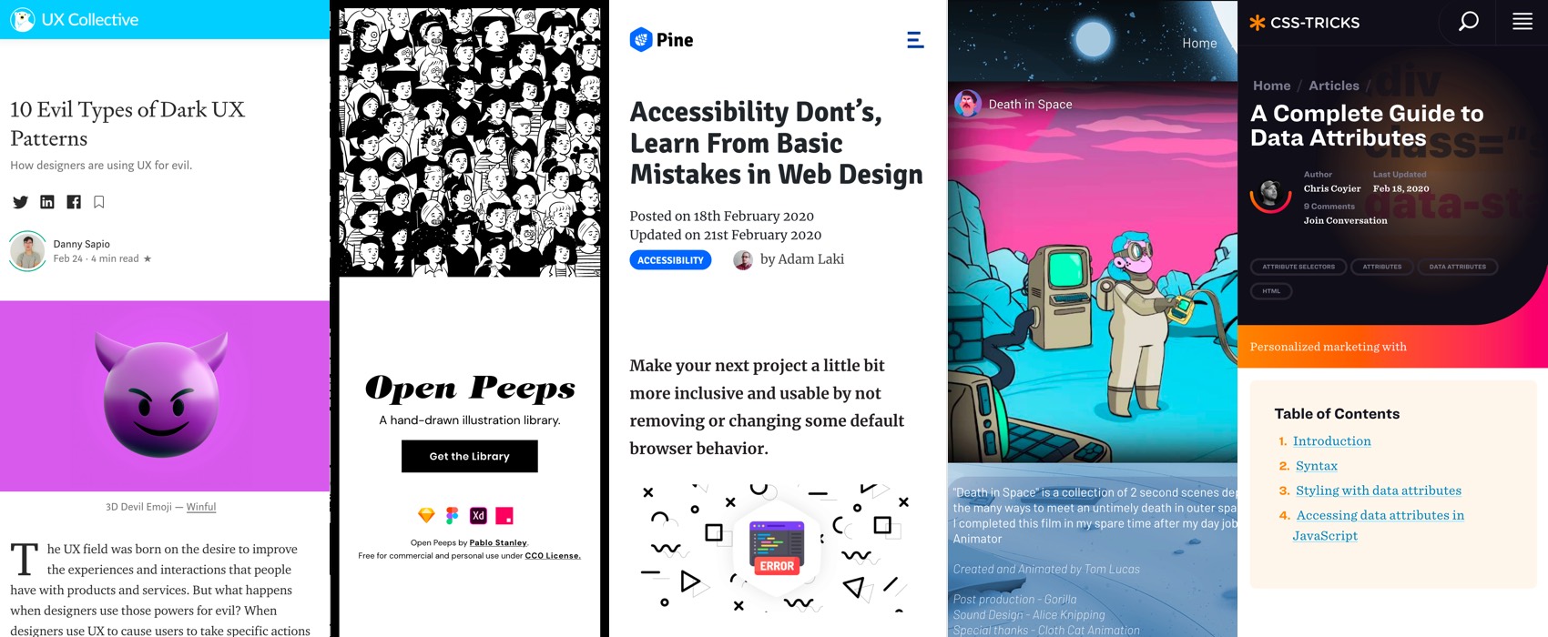
“Death in Space” is a collection of 2 second scenes depicting the many ways to meet an untimely death in outer space.
#Experiment
“Pure CSS Responsive Browser Template” a browser inside your browser ^^
Tutorials – Courses
#Technical Writing
Google releases some Technical Writing Courses
#FrontEnd
Back to basics with A Complete Guide to Data Attributes: how to use it but also how to access it in CSS and JS to build awesome things!
#CSS
“Styling The Good Ol’ Button Element” another nice article to help you style buttons in CSS. Regarding the Hover, should we keep the cursor (like native OS buttons) or change to the hand (like links) there’s still some debates in the design community
Useful tools and plugins that will make your life easy
#CSS
CSS Stats, a tool that analyses your CSS. I have some clean up to do hahaa
#Illustrations
A nice project with free icons under creative commons 0 licence: Open Peeps, Hand-Drawn Illustration Library
