Pixels of the Week – March 24, 2019
Every week I share a list of curated articles, resources and tools about UX, UI and mobile design, Front-End development, HTML, CSS and more…
This week’s selection: tips for first time speakers, an accessibility test tool, forms and gender, advice for ecommerce checkout, CSS blurred borders, frictionless design, learning UX is broken, a color palette tool, complex CSS grids and also a CSS grid plan floor, loading animations, inclusive design and how tech provides platforms for hate , a nice book on typography, the Feminist Library’s new visual identity, the need to normalize Unicode strings, how to avoid terrible UX job descriptions and more.
You can follow me on twitter to get a dose of links every days.
TL;DNR the one you should not miss
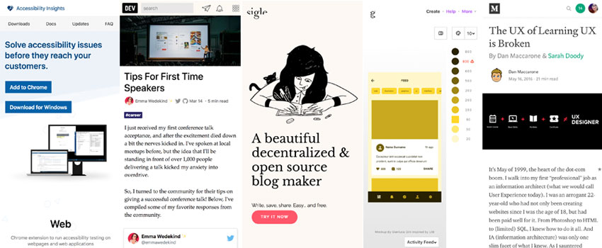
“Tips For First Time Speakers” great tips, I will add:
- get a nice remote control
- if you wear a dress it’s complicated to put the mic equipment, a jacket with pockets or a belt are options. You might think “I will stick the mic little equipment to my bra in my back”. Been there, done that, nope. You don’t want to spend a whole talk with this equipment itching your back 🙁
- a hand mic is another option if available (but it gets annoying if you have a remote control in the other hand)
- madonna mics are nice but if you have long hair again it might interfere with the sound, you might need to tie does. Yup I have super practical advice 😀
- remove the lanyard while you talk it might interfere with mic
- ask for the slides format and what type of port (hdmi, vga etc) they support in advance to avoid panicking on stage
Interesting article
#UX
- The UX of Learning UX is Broken, article from 2016 but I feel like it got worse. There’s more “5 days UX bootcamps with a lollipop certificate at the end” than ever. And frankly the quality of the lessons online scare me a little bit
- Terrible UX Design Job Descriptions (Or: How To Avoid Bad UX Design Jobs), haaa I’ve seen the “code” in so many offers and had a design test for a UX job that used the word “wow the user” twice, meh.
#Design
- The Value of Inconvenient Design – a great read on technology making the world frictionless for some people bur maybe not for everyone
- Interesting article: Contextual Menus: Delivering Relevant Tools for Tasks
#Performance
If you are interested in perceived performance, here is a nice article on loading animations: “Everything you need to know about Loading Animations“. Also I love the cat loader 😀
#Forms #Gender
Sex and/or gender — working together to get the question right
#Inclusive Design
Canary in a Coal Mine: How Tech Provides Platforms for Hate – “Listen to concerns, no matter how small, particularly if they’re coming from the most endangered groups.”
#Ecommerce
Best E-Commerce Checkout Practices for 2019 – a long 18min read with many interesting advice
#Front-End
- A JavaScript-Free Frontend, a simple web (almost) without JavaScript, an interesting expriment
- For the young folks on the back of the room, this is why it’s called a radio button
- When “Zoë” !== “Zoë”. Or why you need to normalize Unicode strings
#Accessibility
See No Evil: Hidden Content and Accessibility
#Mobile
Do you remember Firefox OS? I do. And I’m thankful because they created the base of a lot of APIs we now take for granted in mobile browsers. Also, the idea of a web based OS might work today, with Google promoting PWAs, huge steps were made towards this.
Inspiration, fun demos and Great ideas
#Robot
MIT invented a new type of robot hand that’s both adorable and terrifying
#Website #Illustrations
Sigle is a beautiful decentralized & open source blog maker. I love the site, the logo, the illustrations, everything here <3
#Book
On the Road to Variable -The Flexible Future of Typography, a nice gift idea for your friend who love typography
#Typography
The Feminist Library’s new visual identity is inspired by its archive of protest banners. And I LOVE the font <3
#CSS Grid
CSS Grid: Floor Plan, because, hell, whyyy not
News in the industry
#Chrome
Chromium Blog: Chrome Lite Pages – For a faster, leaner loading experience.
This is starting to look a little bit like Opera Mini used to work, proxy browser part to serve the page faster for slow connexion
2016, Stephanie Rieger talks and writes about ” a merchant in Kuwait selling sheep through Instagram, 2019, Introducing Checkout on Instagram
Tutorials
#CSS
- Blurred Borders in CSS, an interesting trick
- Sophisticated Partitioning with CSS Grid, the result is awwwwesome
Useful tools and plugins that will make your life easy
#Color
Geenes, another color palette tool
#Accessibility
accessibilityinsights is a tool (chrome extension + windows app) to test accessibility on your site. The assessment part of the tool gives you a checklist with some helpers to test the page and you can export the results, really cool <3