Pixels of the Week – March 24, 2024
UX research methods, design principles and a football goal variable font
My curated weekly-ish online newsletter, where I share interesting articles, tools, and resources I found during the week. You can expect content about UX, design, user research, accessibility & tech, but also some processes, some inspiration, sometimes books, and a couple of videos and podcasts. Also, don’t forget to, subscribe to the newsletter to get notified, you will get the weekly links directly in your mailbox, and be notified when I publish other articles.
Now: what I’m currently up to

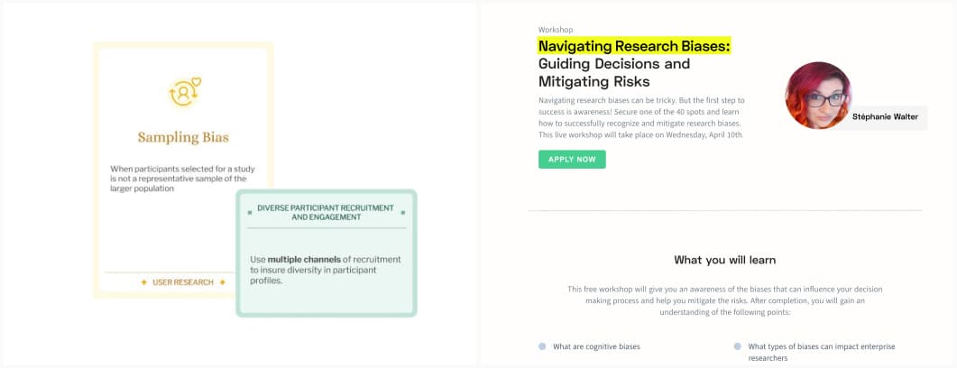
I’m currently working on a new workshop: Navigating Research Biases :
Guiding Decisions and Mitigating Risks. For this, I’m expanding my UX cognitive bias cards and creating a set of new mitigation cards. So here’s a little sneak peek of some new cards I’m creating and the concept. The workshop is hosted by Condens and is free.
Most popular content this week
60 ways to understand user needs that aren’t focus groups or surveys (8min) from cultural probes, to heuristic evaluations, card sorting, tree testing, to usability testing and more, David Travis offers other 60 alternative methods you might want to try.
Interesting articles that caught my attention
UX research and product design
- The Magic of Details: How UX Microinteractions Transform Products (12min) some nice examples of micro interactions in real lids (dragging, interactive dashboards, hover effects, popovers, autocomplete, etc.) and how they can make user’s life easier. They are powerful tools, but, before delving into microinteractions, you need to thoroughly and reliably develop the core functionality and architecture of your application, because functionality serves as the foundation of the product.
- Card Sorting vs. Tree Testing (7min) Design students, are you confused about card sorting vs. tree testing? Card sorting helps figure out how users naturally group information, while tree testing evaluates if an existing navigation structure makes sense for finding things. You need both to build a strong information architecture for your site.
- 5 proven sets of design principles and how I use them: learn and understand the rules so that you can break them if required, because design principles are not immutable laws of nature; they’re rules of thumb that tend to result in better work. Except for the WCAG guidelines in here, since they are rules that you need to follow to be legally compliant.
Accessibility and diversity
- Asking users for their pronouns: A guide for UX designers (18min) by Chelsea Roden. Designing a pronoun selector isn’t just about ticking a box for inclusivity — it’s about respecting your users. Do you really need a pronoun selector (aka, ask the why behind this information), avoid “other” option, allow for multiple pronouns, let people add tier custom, try to prevent misuse.
- How screen readers read special characters: an update (10min) a study on which special characters are safe for screen readers.
- Deaf Telehealth Accessibility: A Person’s Experience (15min) Meryl Evans explains how Telehealth is not very accessible to the deaf and hard of hearing. This is the case for all patients regardless of whether they prefer sign language, speaking, or captions. Medical providers need to be proactive by offering multiple modes of communication.
- WCAG 2.2 Detective Skills – Accessibility in government (8min) I really like how auditing is presented here as a fun detective adventure. Because, accessibility is a serious topic, but it doesn’t need to be daunting. How do you audit for WCAG2.2 new features? You start by searching for clues that there might be sleuths, and if so, you examine further using the WCAG criteria.
Curiosity cabinet: non-design/tech rabbit holes I enjoyed
This video is a palindrome: a song played twice, one time regular, and one time in reverse, but by the same person. Also, doesn’t reverse English sound like German or Danish?
Inspiration: fun experiments, beautiful art, and great ideas
- Where’s Madeleine? a fun game where you need to find the fluffy cat in a series of pictures
- F.C. Variable – Rob en Robin This is next level: Rob & Robin released a variable font, that lets you play with variations to create different football goals. You won’t write text with it, but you will for sure have a lot of fun
Useful tools & resources
Figma plugins
- Ruri Lines: this is a very fun Figma plugin that lets you turn any image into a line pattern. I love some of the effects you can do with this
- Color Shades I often use scales to build color palettes, so I’m super happy to discover there’s a Figma plugin for that.
Design Inspiration
- Unsection Looking for a footer, a testimonial or pricing inspiration? Unsection lets you find inspiration, based on the type of section of a site you want to design (mostly useful for B2C sites)
- Scroll-driven Animations a collection of demos of different scroll driven animations (might be motion triggering for some people)
- Design System Hunt a place to find design systems with an option to sort by the ones who also have a figma library
The other nice ones
- Card Buddy: The best index cards app for Mac and iOS We often talk about storytelling in UX. Card Buddy is a tool to help you write stories with card index cards. It’s supposed to be for novels, but I wonder if this can’t be used for UX writing to a certain extent? I’m curious if anyone tries this.
- Creatica Sometimes, all you need is a nice abstract SVG background.
Tutorials
- Go ahead and block AI web crawlers a small tutorial with what to copy and paste in your robot.txt if you want to stop AI web crawlers from scraping your content. I wonder how much of this is efficient and if it will mess up your SEO though.
- The perils of using double quotes inside an alt attribute text value: if you want your quotes to be read, either use HTML character entity ". Or use actual typographic quotes (e.g., alt=”Huge Ass“umption””).