Pixels of the Week – March 5, 2023
Prioritize usability problems, product strategy and a 3D printed frog palace!
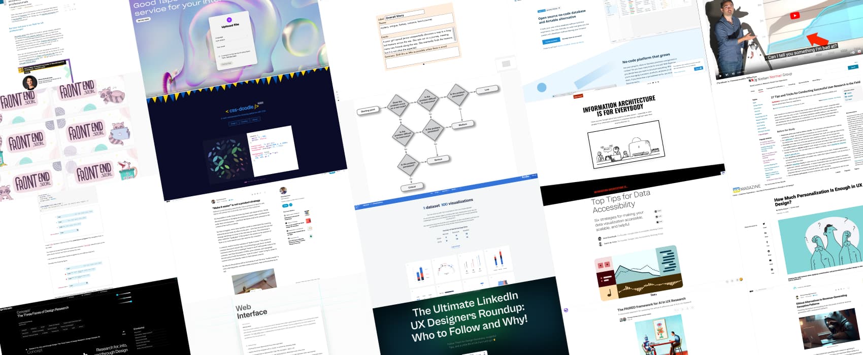
On Twitter, LinkedIn and Mastodon, I share curated articles I read, resources and tools about UX Design, User Research, UI and mobile design, HTML, CSS, the web industry, some process, some inspiration, etc. This is an archive of everything I shared this week. And some extra links that I decided to only share for the blog readers. Also, subscribe to the newsletter to get notified when those are published!
#Now – what I’m up to

I will be talking about Enterprise UX, aka, the fun and challenges of designing tools and products, for people at work on 9 – 11 October at Smashing Conf Antwerp, 3 days dedicated to UX, UI and product design!
I finally finished my raccoons and opossum illustrations for your mastodon instance. On the plant topic, have you every see triangle root bound UNDER the man pot? Yup, I managed to do that.
I might also put less images in those articles, to avoid hosting too much decorative images and make the page lighter. So, quick question: do you find the images (aka screenshots of the resources) useful in those articles? Answer on social media, or drop me an email!
TL;DNR the one you should not miss
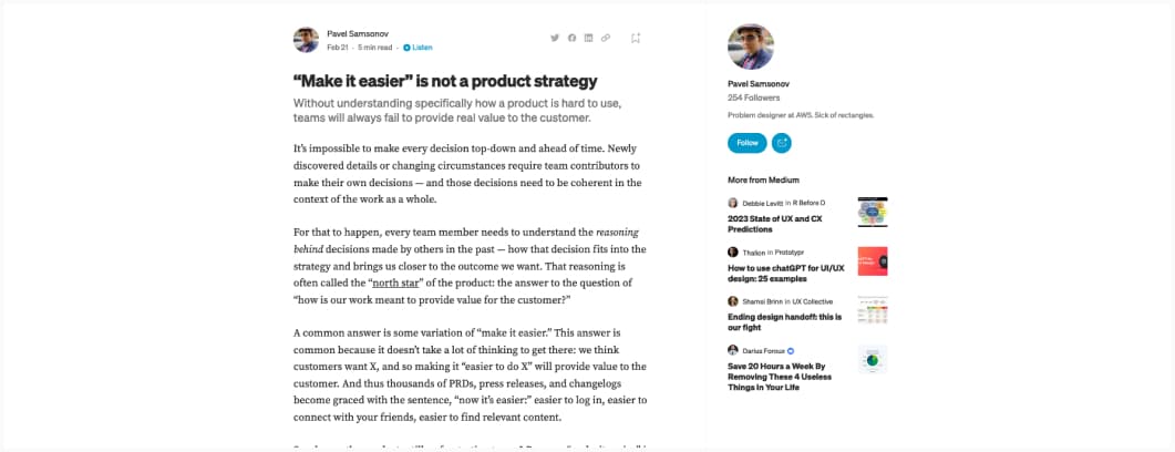
Louder for the people in the back: “make it easy is NOT a product strategy“, and what you need to go beyond that
Interesting frameworks and concepts
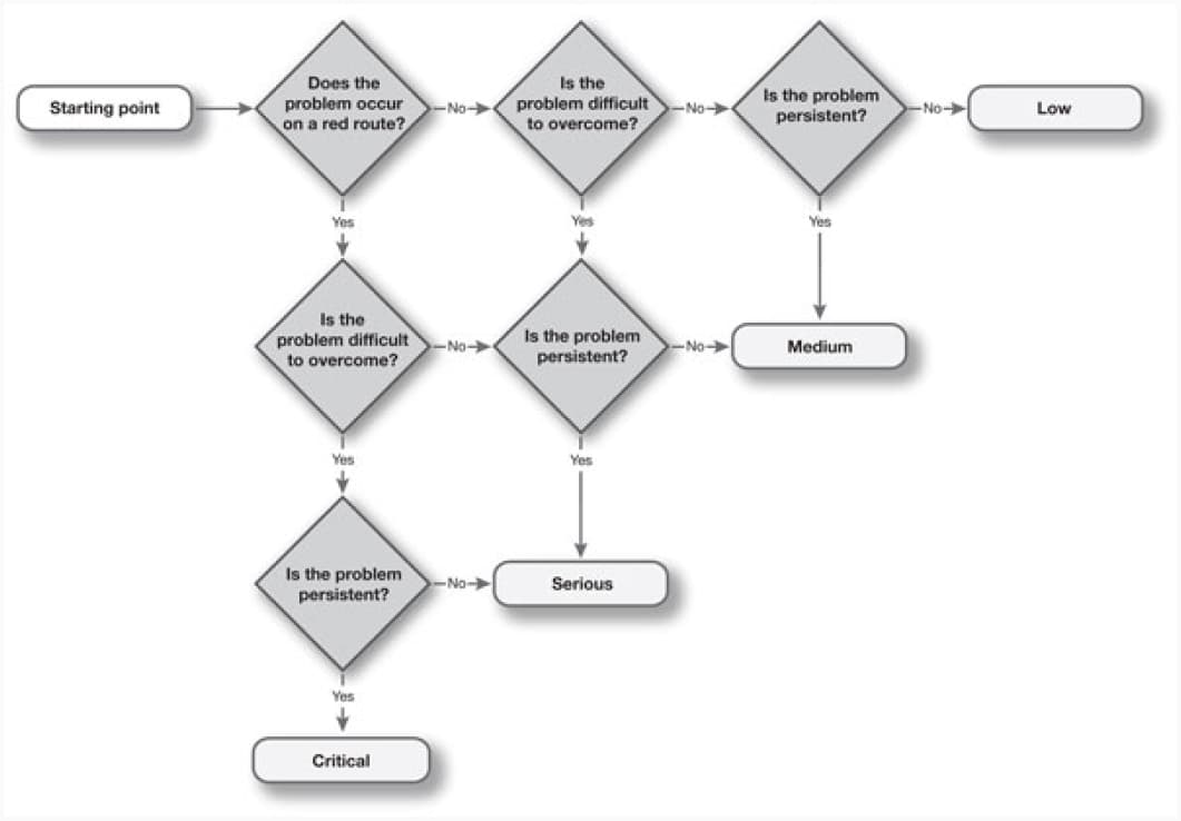
Back to basics, because “frequency” should not be the only criteria when it comes to qual research: “How to prioritise usability problems“, with an interesting decisions tree to help you prioritise
Interesting articles
- Great tips for user research in the field, like observation, interviews, contextual inquiries, etc.
- Personalization vs customization, how too much of each can be a problem too and what to do about it. Google Analytics 4 is a great example of how annoying too much customization can be: the tool is overly complex and you need to set up everything
- Why all of Hollywood UI looks the same: an interesting analysis of sci fi movie UIs, an attempt at explaining why they are all blue, some ideas of how this technology could exist in the real world, and kudos for including some concerns about accessibility for those interfaces if they ever were to exist
- Interesting list of 10 biases can impact survey answers, and what to do to avoid them (+ some introduction on the limitation of surveys as a research method)
- We need a a structured approach for assessing the ethical & effective use of AI in UX Research, here is an interesting proposal for that: the PAIRED framework (Principled, Accountable, Initiated, Reviewed, Enabled, and Documented).
- Interesting read on The Three Faces of Design Research: research for design, research into design and research through design
- Interesting examples of deceptive patterns, how they can (or did) damage business, and what to do instead to build trust and more ethical businesses and interfaces
- Interesting tips to help you build more accessible dataviz. Be careful with number 6 about multi sensory experiences though, especially if you include audio or visual presentation, those need to be accessible too!
- A list of interesting Web interface guidelines, including accessibility, motion, typography, etc.
- Do we need CSS flex-wrap detection? I’m selfish, I have a site in 2 languages and would 100% need that because French words are longer, I have specific FR breakpoints for nav. So, yes, totally makes sense, we need this.
- For my fellow linguistics and cognitive psychology geeks: A Brief Guide to Embodied Cognition: Why You Are Not Your Brain, aka, how experiences with our physical body, especially in the early years of life, shapes our language. Interesting topic on metaphors too.
- The age of Agile must end. 30 years ago the technology industry… thoughts on why the agile method doesn’t work to build more user centric products and what to do instead
- From foe to friend: the many ways AI is transforming products, some areas where AI can help designers do their job with repetitive tasks and how to use machine learning powered features to enhance user experience with personalization
Inspiration, fun experiments and great ideas
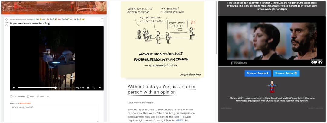
- In case you missed it this week, some important frog and possum news: Guy makes nice house for a frog mean, I got a pavilion for birds who come to my terrasse, so, well, yup, 100% makes sense.
- “Without data you’re just another person with an opinion“, a nice sketplanation
- General Zod Chaos Generator, a fun mix of gifs montages on the general zod movie scene form superman
Useful tools and resources that will make your life easy
- Goodtape: usually automated transcript tools struggle with French, so, it’s kind of my benchmark. I fed this one 15min of one of my teaching classes and it did quite good, so you might want to give it a try.
- A list of UX designer you can follow on Linkedin to help grow in our industry (also you can submit someone if they are not already on the list)
- Fontjoy, a tool to pair fonts together. Hit generate to get random pairing, keep one that you want by locking them. It’s a little bit random, I’ve see meh pairings, but, if you tweak with it, you can get nice results.
- Interesting concept: 1 dataset, 100 visualizations. Not all 100 work and are easy to understand for that dataset though, but, it gives you a lot of examples of different ways of presenting the same data
Tool - This was fun: take the flash history quiz. I got 40%, but, I’m bad with dates. what about you?
- Ha, my kind of weather app (or more like PWA here): tell me what I need to wear if I go outside
- Aw this is cute: a web component for drawing patterns with CSS
- Oh, that is nice, if you work in a place where you can’t use airtable because it’s in the cloud, Baserow is an open source alternative, and you can self host it on your own servers. I will have to check how easy it is to self host though
- Quick Reads, A tool that can summarized a whole article in a few words (using GPT-3). It’s far from perfect, but, I’m very bad at writing introductions for my article, so I might use this to help me with those. What would you use it for?
- I you want to have fun writing, with an AI-powered graph-based help, you can play around with Jotte
Videos
Interesting video on different types of click-baits, from the “it’s interesting and legit” to “totally misleading and rubbish content
Online Course
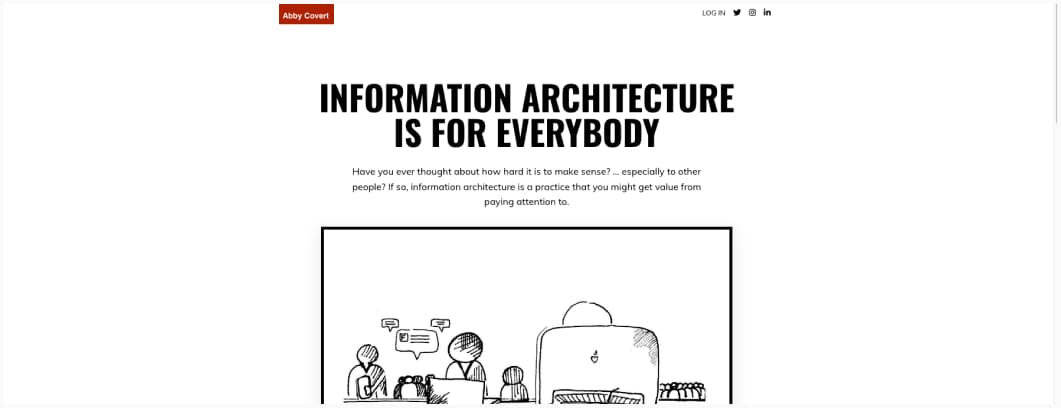
Yeah, Abby Covert built a free online course to teach what Information Architecture is, methods, tools, and more and I really think any designer should check this (no video transcripts though but she also has a lot of written information on her blog)
Conferences
- Are you there, G-d? It’s me, UX Research, an interesting talk on how to be more inclusive of different religions in our designs
- “If I’m arguing with you, it’s because I believe you have still on you the capacity to change, if I walk away, it’s because I’ve decided you don’t. I’m not going to waste my time arguing with somebody who doesn’t have the capacity to change” – Mike Monteiro in the Brave UX podcast
- A great talk by Jane Davis on how to create and nurture a culture of research in a company, including a 12 components of research maturity (this is not a scale, but a spectrum)
- How to Make UX Research Accessible for Neurodivergent UX Professionals, this is an awesome talk by Penninah Jones
Tutorials
How To Build A Magazine Layout With CSS Grid Areas grid layout is awesome and lets you do a lot of cool things, including some magazine style layouts
News in the industry
- Last baseline alignment, CSS alignment is always a mess, this one is going to be super helpful to a lot of things like tables and taglines
- Ho, no, usability.gov is now archived and no longer updated. I really hope they will keep the archive, there is still a lot of very descent usability and UX related content on that one.
