Pixels of the Week – May 14 , 2023
Accessibility issues with AI tools, Google I/O webplatform news and retro games
On Twitter, LinkedIn, and Mastodon, I share curated articles I read, resources and tools about UX Design, User Research, UI and mobile design, HTML, CSS, the web industry, some processes, some inspiration, etc. This is an archive of everything I shared this week. And some extra links that I decided to only share for the blog readers. Also, subscribe to the newsletter to get notified when those are published!
Now: what I’m currently up to
I was invited to a Twitter Space Google I/O as GDE web platform and discussed, among other things, new features coming to the web. I’m happy to see we go towards more user-centric, inclusive & accessible experiences with a lot of new CSS features and APIs. We need to embrace that flexible nature of the web. The way our site is displayed changes based on different media features (media queries, container queries, prefers-reduced motion, prefers-contrast, inverted-colors, etc.), viewport size, zoom level, etc. All of those are triggered by the user situation and preference. Every user will see, use, experience, navigation through a small variation of that site. It’s really time to let go the pixel perfect mockup. I also would love it, if more designers could start getting interested into all those new features and in how to use them for a greater experience. You don’t need to learn to code. But, understanding what a browser can do will for sure help build better, more user-centric experiences in the next couple of years. So, yeah, I’m super happy to see where the web platform is going those days.
Interesting frameworks and concepts
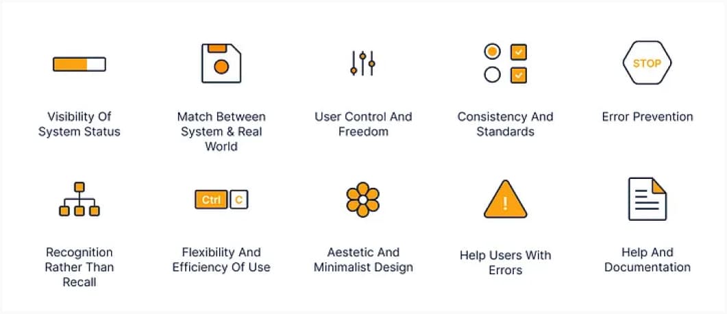
8 mental model design heuristics: interesting heuristics to help with learnability of a design. Text version of the table is available on google doc
TL; DNR: the one you should not miss
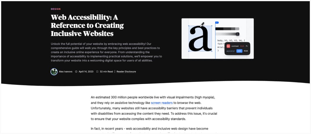
A Reference to Creating Inclusive Websites: a list of what you can do, test and need to be careful about when building accessible sites. In the end, it’s not that hard, if you start including this from the start.
Interesting articles that caught my attention
UX design, research, and fonts
- There’s a technical name for the absence of user research: Guessing: Some people think user research takes time, but guessing doesn’t. They don’t realize that guesses slow down projects. Without research, the team argues over whose guess is more likely correct. It takes time. User research takes more time upfront than guessing but saves time in the long run. It gives the team the confidence to deliver a solution that customers love the very first time. It leads to industry-leading innovations that no competitor can match. Because you can’t guess your way to delivering successful products.
- 6 reasons tooltips are a bad idea and what to do instead: in the context of forms, I tend to agree here, show the hint directly instead of hiding it. That being said, sometimes the help is too long (help enterprise forms). If still you need some, I recommend checking Tooltips in the time of WCAG 2.1 for accessible ones.
- Product Discovery Methods for a Product Delivery World: interesting 14 steps method to test concepts super early in the project. But, at the same time, people are bad at predicting their own future. So, I would be interesting to see concept testing vs actual client behavior once the concept is launched.
- Visualize data from UX standardized questionnaires: very fascinating article on different ways to present quantitative results, in this case, from questionnaires like UMUX, SUS, etc.
- Customizing icons to complement fonts: I really like the experiment here of matching arrow icons to a specific font. I’m impressed how well the ink traps one work.
- Navigating the FTC’s new rules on deceptive patterns in subscription cancelations: some countries are starting to regulate against deceptive patterns, and, I think, it’s a good thing. Think twice before using those, it’s not a sustainable strategy.
Accessibility and inclusive design
- Accessibility context cards: some cards to help designers understand what different people with different disabilities need in terms of accessibility and how to bake that into the mockups.
- Don’t use custom CSS scrollbars: when you customize browser scroll bars, it’s not up to you to have them make them accessible (color contrast, resize, etc). It’s a lot of work! You are also breaking consistency, making it potentially difficult for people with cognitive disabilities to navigate your site.
Psychology
David Hume — Why we change our mind : interesting article on the concept of deduction vs induction, cause, and effect and how we try to predict things
More on AI and chatGPT
- Will A.I. Become the New McKinsey? Long interesting articles on the dangerous combination of AI and capitalism and how AI is used to make predatory capitalism even worse. It also introduces the concept of acceleration: the only way to get out of capitalism is first to get it to a point where society collapses, the idea of it’s going to get worse before it gets better.
- ShatGPT: chatGPT’s UI is not accessible, and, it’s a problem.Even with minimal UI, people still find ways to make it inaccessible.
Cool news from Google I/O
This week we had the Google I/O. I selected a couple of talks and news I’m really happy and excited about for you:
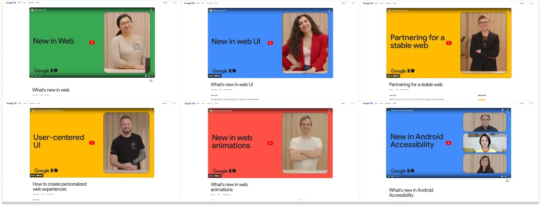
- What’s new in the web: a short 9min video where Mariko Kosaka walks you through a couple of the cool new things coming to the webplatform you don’t want to miss: HTML modals, individual CSS transform properties, new better dynamic viewport units, focus visible, etc.
- How to create personalized web experiences: Adam Argyle explains how different features can help you accommodate to user preferences (new relative units for fonts, prefers-reduced-motion, accent color, prefers-color-scheme, color spaces, logical properties, container queries, etc.)
- What’s new in web UI Una Kraverts presents the really cool new things you can do with CSS for UI: container queries, has selector (aka parent selector), advanced nth-child, text-wrap: balance, color features, CSS nesting, better control over the cascade, scoping, popover, anchor positioning, a couple of more animation features, etc. I love this, more intrinsic web, more smart styling in the browser.
- What’s new in web animations: Bramus Van Damme goes through a couple of cool new things, including view transition API for SPAs, scroll driven animations, . It’s all fun, but, please, support prefers-reduced-motion.
- Partnering for a stable web Rachel Andrew announced more collaboration between different actors on the web and the creation of Baseline, a place to find out whether a feature or API is safe to use in your site or web applications
- What’s new in Android Accessibility: a couple of new features regarding screen readers and sound accessibility and more tools to help you test and check accessibility of your native apps
Curiosity cabinet: non-design/tech rabbit holes I enjoyed
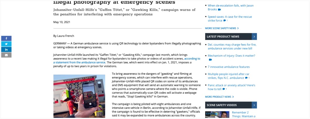
German EMS uses QR technology to discourage illegal photography at emergency scenes: that’s actually super smart, “Johanniter-Unfall-Hilfe placed QR codes on some of its ambulances and EMS equipment that will send an automatic warning to someone who points a smartphone camera where the code is visible.”
Inspiration: fun experiments, beautiful art, and great ideas
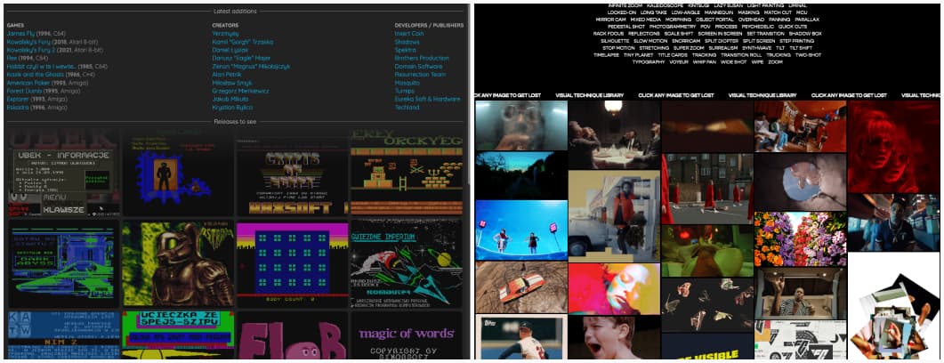
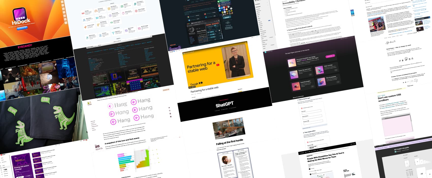
- Polishpixels.com: the video games retro archive we all need
- Trigger Warning: a giant page full of animates GIF! That’s basically what Eyecandy is. It’s fun to dig in different visual rabbit holes (be careful with motion sickness)
Useful tools & resources
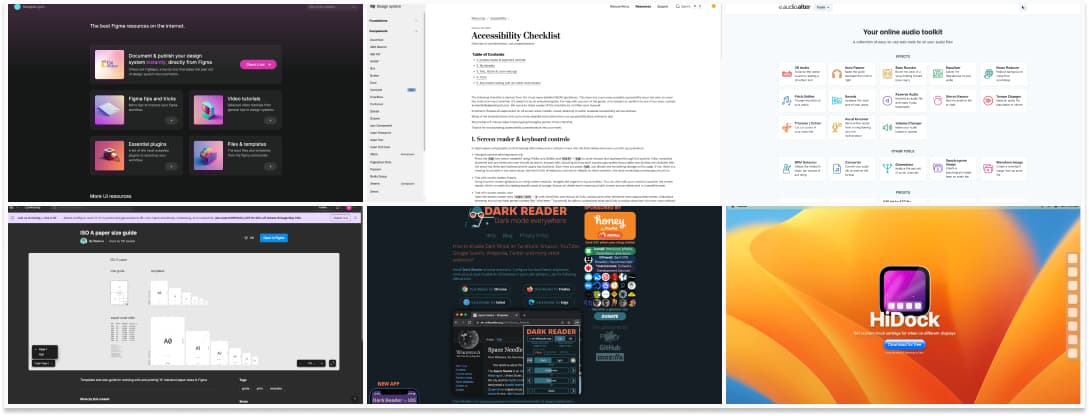
- Designer Lynx: a place to find Figma tools (plugins, templates) but also interest resources for UI design
- ISO A paper size guide for Figma: This is very nice if like me you sometimes use Figma to build print templates (I used it to create my user interview cards printable PDF for example)
- Accessibility Checklist: the Washington Post has a small checklist to help you cover the most prominent types of usability issues you can catch with manual testing on a site. Very useful. And more accessibility resources here.
- Dark Reader: a browser extension to enable and customize dark mode for any site or a whole domain. Also, the name is fun.
- Audioalter: a collection of online tools to edit audio files, from noise reduction, reverse audio, bass booster, etc.
- HiDock: for the macOS users here, a tool to set custom dock settings for each display.
Cool and Interesting Videos
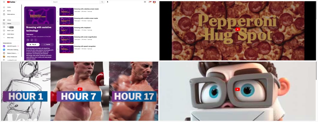
- Browsing with assistive technology: 5 videos that explain to you how disabled users browse the web using a desktop screen reader, a mobile screen reader, their keyboard, a screen magnification tool and a speech recognition tool
- An AI artist explains his workflow: interestingly, it took 17h to arrive to the final result. Not what you expected, right?
- Pepperoni Hug Spot: a whole TV commercial entirely made using AIs (GPT4 for script, Midjourney for images, Runway Gen2 for videos, etc)
- DeliveRAPility – A Deliverability Rap Song (generated via different AI tools)
Latest news in the industry
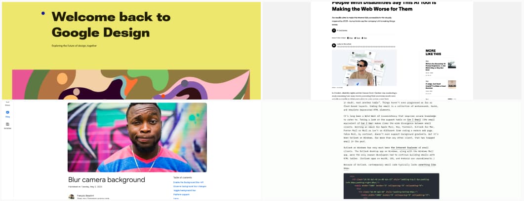
- People With Disabilities Say This AI Tool Is Making the Web Worse for Them: AccessiBe aims to make the internet fully accessible to the visually impaired by 2025—but activists say the company’s AI is making things worse.
- Modern HTML email (tables no longer required): this is a very good news, welcome to 2023 emails!
- Welcome back to Google Design Google launched a new version of Google design, it’s quite nice
- Blur camera background: chrome brings background blur as an API you can use if you build a video conference tool in the browser. That’s a very cool idea
