Pixels of the Week – May 26, 2024
The value of low fidelity, find a junior job & a Figma wireframe plugin
My curated weekly-ish online newsletter, where I share interesting articles, tools, and resources I found during the week. You can expect content about UX, design, user research, accessibility & tech, but also some processes, some inspiration, sometimes books, and a couple of videos and podcasts. Also, don’t forget to, subscribe to the newsletter to get notified, you will get the weekly links directly in your mailbox, and be notified when I publish other articles.
Now: what I’m currently up to
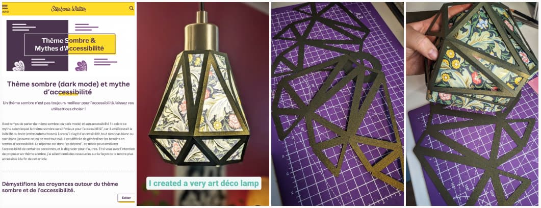
This week, I took some time to translate my article Dark mode & accessibility myth into French: Thème sombre (dark mode) et mythe d’accessibilité.
I’ve also designed and created some very cute paper lamp shades. You can check the video on Instagram and the pictures on Mastodon, TwitterX or LinkedIn I bought this amazing floral green paper in London, and it turn out sooo nice, art deco stylish. I’m very pleased with the result, and I’m also happy I found something to do with the paper. I have this strange relationship with beautiful paper, where I buy them, because they look amazing. But, then I’m afraid to use them, because they will get cut. Yeah, there is no logic here.
Interesting frameworks and concepts
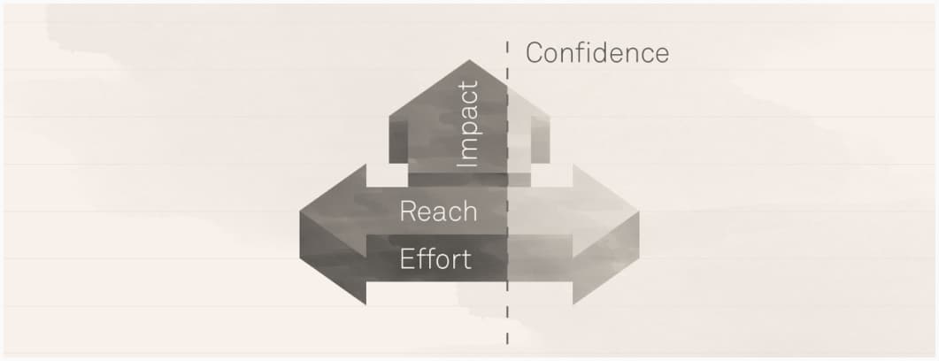
RICE: Simple prioritization for product managers: reach, impact, confidence, effort, an interesting model to help you prioritize your roadmap. The final formula is (Reach x Impact x Confience) / Effort. You can then compare the rice score for different features, projects to help you prioritize
Most popular content this week
Low fidelity design is higher up the value chain (8min) yes, yes and yes, I was nodding while reading this one. Low-fidelity design (sketches and storyboards) is important for defining problems and aligning teams early in the process. Because high-fidelity visuals don’t actually create clarity. Rather, they hide the fact that the work wasn’t done, with detail that is every bit as fake as the sketch — but enough to satisfy stakeholders who are looking for an output.
Interesting articles that caught my attention
UX research and design
- Why creative labour isn’t always seen as “real work” – and what that means for artists and designers (12min) historical views of art as less legitimate work still affect artists today, leading to unpaid internships and exploitation. We need collective action and structural changes, like those seen in recent entertainment industry strikes, to improve conditions and properly value creative work.
- The psychology of deceptive discounting in UX (7min) a sad lesson in deceptive patterns principles like priming, confusion, urgency and dopamine rush, used by ultrafast fashion brands to overwhelm and trick users into impulse purchase. Anna Rátkai argues that this not environment friendly and against user’s well-being, and companies should be less aggressive with discounts, especially since most of those are totally fake.
- Is the Customer always right? It depends … (5min) the sentence dates back from 1900’s and was in the very specific context of retail and hospitality. Also, the whole sentence was actually “The customer is always right — in matters of taste.” . While customer feedback is important, businesses should balance it with strategic decision-making. Otherwise, you become a feature factory.
Accessibility, dyslexia and legibility
- All I Want for GAAD (12min) a couple of things companies and individual contributors can do, to help push accessiblity, especially the ones who provide content creation tools could do to reduce friction when implementing accessibility. I would love for Apple and Google to have accessibility checkers as part of the automated / manual approval process for apps. A lady can dream, right?
- I’m a Creative Director with Dyslexia, AI Takes My Creativity to Places (8min) AI tools like ChatGPT help simplify tasks like email writing for dyslexic people. By transforming mental images into designs, tweaking, refine and iterate, AI tools can also accelerate their process.
- The Basics of Legibility (10min) an interesting lesson in typography, by Niko Kitsakis on why some fonts are easier to read than others. A big part of it is familiarity for the user.
AI, again, and more of it
- The rise of Generative AI-driven design patterns (12min) an interesting least of areas and features where LLMs can be used to enhance content creation, perform decisions and more.
- Back to the Hype: An Update on How Cybercriminals Are Using GenAI (15min) Generative AI continues to be misused and abused by malicious individuals. A dive into new criminal LLMs, criminal services with ChatGPT-like capabilities, and deepfakes being offered on criminal sites.
Other interesting thoughts
- We can have a different web (16min) a beautiful yet sad essay by Molly White on how the web, that once was an open garden where people shared seeds and visited each other’s garden became a wall garden, where algorithms dictate whose flowers you will and will not see. But, it’s not too late to change that. I loved her metaphor!
- Rollout Strategies with Feature Flags (12min) feature flags offer a solution when you roll out and want to avoid too many risks. They let you control which feature you want to active, for which users. There’s a couple of strategies like dark launches, global rollouts, kill switches, percentage rollouts, canary launches, and ring deployments you can chose from.
Curiosity cabinet: non-design/tech rabbit holes I enjoyed
Where “Roger That” Really Comes From – What Does It Mean? My kind of small random knowlege
Inspiration: fun experiments, beautiful art, and great ideas
Lemonade, a cute refreshing animation
Useful tools & resources
- Blocks a plugin to speed up your wireframe process in Figma: it lets you drag and drop pre-defined wireframes components in your file directly.
- PatternPad a tool to generate nice repeatable geometric patterns for your next project
- Handheld Design curates and handpicked inspiration for mobile UIs
- Open Doors a Job board for junior UX, Service and UI designers
- Hand-Drawn Free Icons some cute icons in a hand drawn style that you can use in Figma (by Streamline)
- Cally a small feature rich calendar component that you can reuse for your projects.
- !Boring Sound Kit a library of sounds you can use for prototyping and non-commercial projects.
Cool and Interesting Videos & Podcast
InEx a podcast on inclusive design
Latest news in the industry
- Apple’s New AI-Based Accessibility Features Are Pretty Wild (5min) from eyetracking to control your device to features to compensate for motion sickness in the car (I need this on Android hhaha), I’m super curious about those.
- W3C unveils 174 new outcomes for WCAG 3.0 (7min) so, yeah, we might have to wait until 2028 for WCAG 3.0, meanwhile, you can participate and give feedback!