Pixels of the Week – November 27, 2022
Every day, I share on Twitter and LinkedIn a list of curated articles I read, resources and tools about UX Design, User Research, UI and mobile design, HTML, CSS, the web industry, some process, some inspiration, etc. This is an archive of everything I shared this week.
#Now – what I’m up to
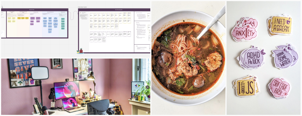
I’m all settled for now in the new office, the toilet paper pink wall is, yurk, but will be painted eventually. I’m putting the final touches to my Miro board for Monday’s workshop, we will tackled user research plan and user interviews. And, yes, by final touches I mean aligning stuff AND adding plants to the board. Obviously. I’m also trying new Chinese cooking recipes, this time, some meatball soup. (inspired by China Sichuan Food’s soup). Finally, I bought a thermal laminator to give my stickers a more polished finish. For now glossy, but I will try some matt sheets as well.
I talked with Vitaly from Smashing Magazine’s Podcast about enterprise UX, user journey maps and many other things to build better digital products
TL;DNR the one you should not miss
#Dashboard
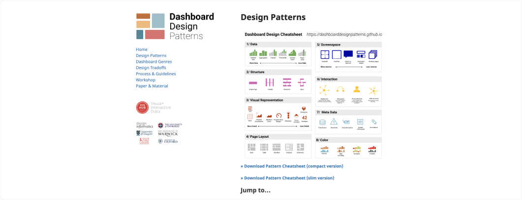
I love a good dataviz that is a simple representation of complex concepts. Vishub
create those dashboard design patterns. A must bookmark for anyone working in enterprise UX or complex dashboards
Interesting article
#UX Research
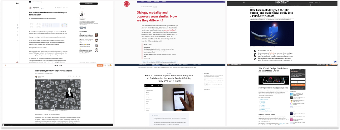
“Run activity based interviews to maximize your time with users” I really like this idea of running activity based interview, here you have 3 interesting examples. I also tried some light shadowing (show me how you do this). Drawing the interface can be interested to check user mental model & expected labels
#UX Layoffs
How the layoffs have impacted UX roles “UX and research in particular, may have been disproportionately impacted as compared to engineering functions”. Sadly, design / research is considered as a “non essential function” in periods of crisis when company go into survival mode
#Accessibility
Dialogs, modality and popovers seem similar. How are they different? What do they imply for usability? For accessibility (screenreader, keyboard navigation)? A very detailed summary of what you need to know.
#Mobile Navigation #Mobile UX
Interesting finding to help you optimize your mobile navigation: Have a “View All” Option in the Main Navigation at Each Level of the Mobile Product Catalog (Only 24% Get It Right)
#ErrorUX
Hostile Patterns in Error Messages. There is nothing more annoying that an email field that triggers and error while you didn’t even have the chance to finish typing it. Interesting example of hostile patterns in error messages, and what to do to avoid them
#Product Design Story
How a feature came to the market and how little the creators anticipated its impact on the world (how could they): The inside story of how Facebook designed the like button—and made social media into a popularity contest
#iOS
Some nice iOS 16 design guidelines, from navigation to button patterns and more (plus a little cheatsheet to help you at the end)
#HCI #Apple
The Canon Cat and the Mac that Steve Jobs killed: Jef Raskin’s ideas on how a computer should work and help the person accomplish their task. Some interesting points, you can see his influence on modern software and computers, even if the Canon Cat bombed
#History #Coffee
How Coffee Fueled Revolutions—and Revolutionary Ideas – From the Ottoman Empire to the American and French Revolutions, coffeehouses have offered a place for (sober) people to discuss new waves of thought.
#Trans History
The Forgotten Trans History of the Wild West. It was a frontier in more ways than one.
#Pronatalism
Trigger Warning: eugenics, white supremacism and racism. “Billionaires like Elon Musk want to save civilization by having tons of genetically superior kids. Inside the movement to take ‘control of human evolution.” Where do I unsubscribe from the world?
Inspiration, fun experiments and great ideas
#Art #AI
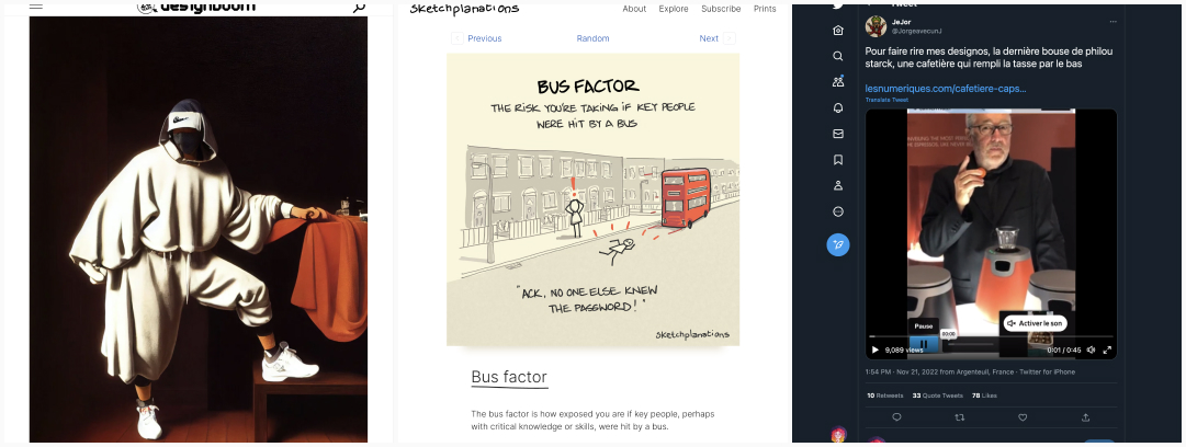
This is an amazingly fun project: AI artist vibes with nike streetwear in the renaissance era
#Sketchplanation
The bus factor is how exposed you are if key people, perhaps with critical knowledge or skills, were hit by a bus
#WTF
Philippe Starck (the lemon juicer guy) created yet another useless object: the coffee machine that fills the mugs from the bottom. And I thought design was about solving problems…?
Useful tools and resources that will make your life easy
#Cognitive Biases #Psychology
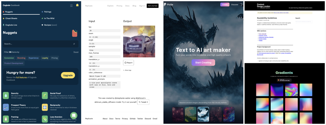
Coglode Cookbook, an interesting tool to help understand behavior and psychology principles when you design, with illustrations and examples. Some are behind paywall but you can check the free ones already.
#AI #StableDiffusion
- I was playing with deforum stable diffusion, a tool that can animate prompts, and it’s quite fun (but also motion sickness triggering). Here is a nice post apocalyptic scene with cars on fire, bins and crows
- PicSo is another AI image generator to have fun with. Not bad haha.
#Readability
Readability Guidelines, a guide to help you get started with clear language and improve the readability of you content for everyone
#Gradients #AI
Rayst Gradients: I don’t think using AI to generate gradients is the most impressive thing, but I find those quite relaxing, so, here you go. Also, you can re-use them if you want.
Videos and Podcasts
#Accessibility
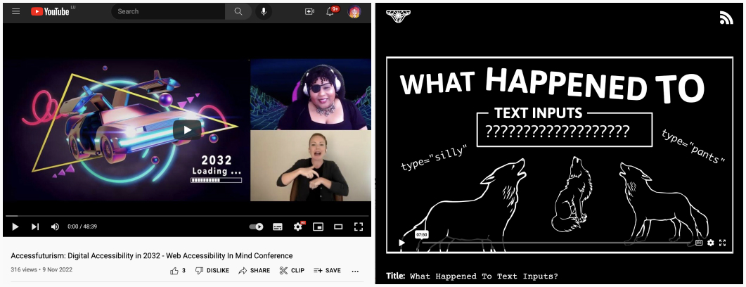
Crystal Preston-Watson presented the opening keynote for the 2022 Web Accessibility in Mind, with an amazing talk about accessfuturism, what the future of accessibility could look like, potential and issues
#Inputs #Usability
My favorite black and white author, Heydon is back with another awesome video: What Happened To Text Inputs? Also known as “could be please stop screwing up simple parts of web interface”??
Tutorials and Courses
#Accessibility
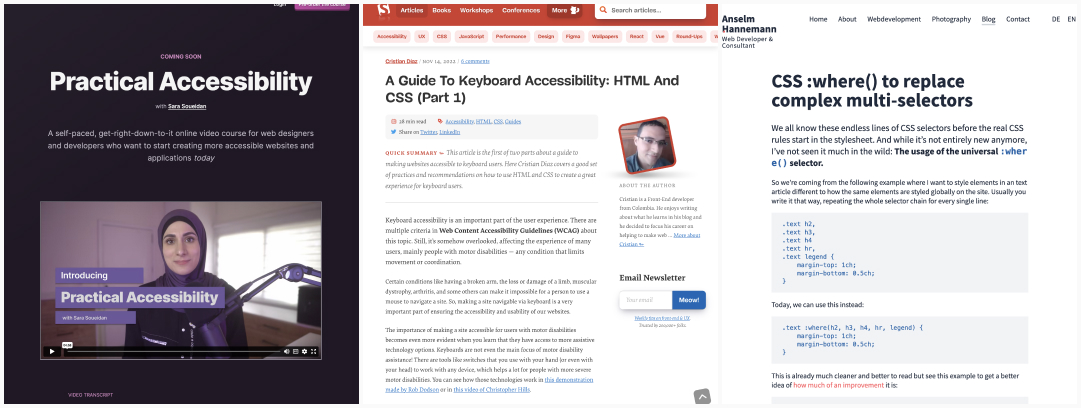
- Yeaahy, Sara Soueidan launched her Practical Accessibility online course. You can pre-order it now and get 25% off original price. This should be a must for your front-end teams!
- Very detailed articles with a lot of links to dig even further: A Guide To Keyboard Accessibility: HTML And CSS (Part 1) and A Guide To Keyboard Accessibility: JavaScript (Part 2)
#CSS
I really like that :where() could replace complex multi-selectors. Such a powerful new CSS selector
