Pixels of the Week – November 28, 2021
Every day, I share on Twitter and LinkedIn a list of curated articles I read, resources and tools about UX Design, User Research, UI and mobile design, HTML, CSS, the web industry, some process, some inspiration, etc. This is an archive of everything I shared this week.
#Now – what I’m up to
I finished Arcane (Netflix anime based on League of Legends’ characters) and I’m obsessed with how beautiful the anime was. It was animated by the Paris-based Fortiche Production and it’s just gorgeous. Also, please Riot, make Vi x Cait canon, thanks! By the way, if you play Wild Rift, I’m always looking for nice people to play with, so send me an email.
TL;DNR the one you should not miss
#Accessibility
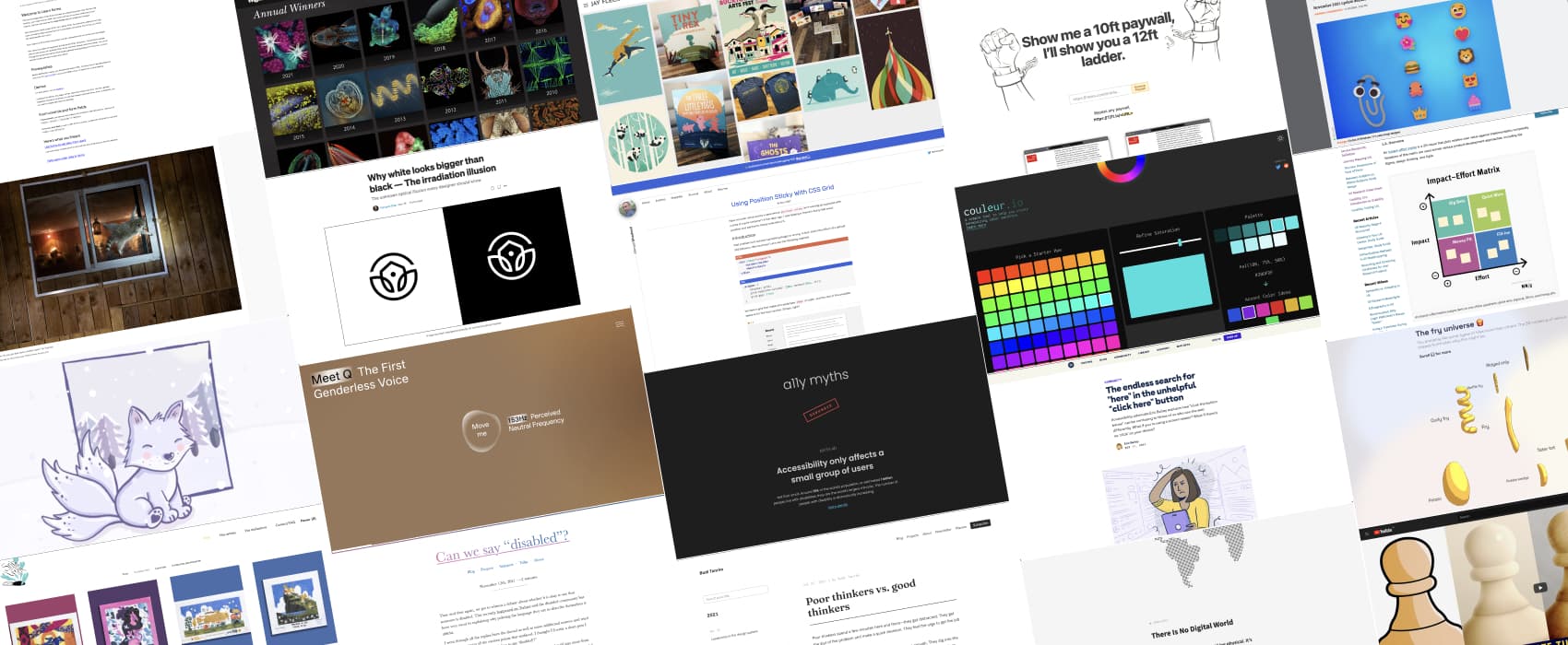
22 Accessibility Myths debunked to help you make people understand that accessibility is important
Interesting article
#Metrics
“Campbell’s Law: The Dark Side of Metric Fixation” I hate that I nodded while reading this article because I see this happen again and again all the time. Time to pay closer attention to the metrics we use? Don’t lose the forest for the trees.
#Digital
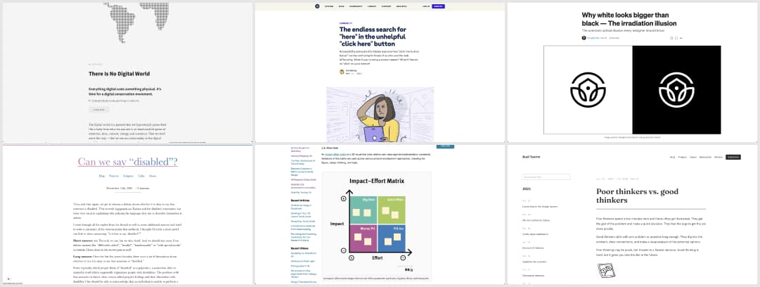
“Is something so wrong with this real world that we’ll do anything but invest in it? I wonder why we’ve given up on living here — on making this place our home, rather than a projection, a rocket, or a server farm.” from “there is no digital world“, a depressing, yet essential read
#Accessibility
- Can we say “disabled”? Short answer: yes. Not only we can, but we also should. And we should stay away from ableist variants like “differently abled”, “invalid”, “handicapable” or “with special needs” by @KittyGiraudel
- The endless search for “here” in the unhelpful “click here” button: how “click the button below” can be confusing to those of us who use the web differently by @ericwbailey
#Prioritization Tools
Should we ship this or that to the users first? Well, there’s no “one size fits all” way to help you prioritize your roadmap, but there’s a few tools that could help you. Here’s 5 prioritization methods in UX road mapping.
#Design Principles
Back to one of the basics of design, did you ever wonder why your logo (or text) “looks” bigger when displayed in white on black then the opposite? Here’s why: the irradiation illusion. Important when dealing with dark modes!
#Problem Solving
#Design System
This is really cool: Creating design systems with Figma Tokens
Inspiration, fun experiments and great ideas
#Photography
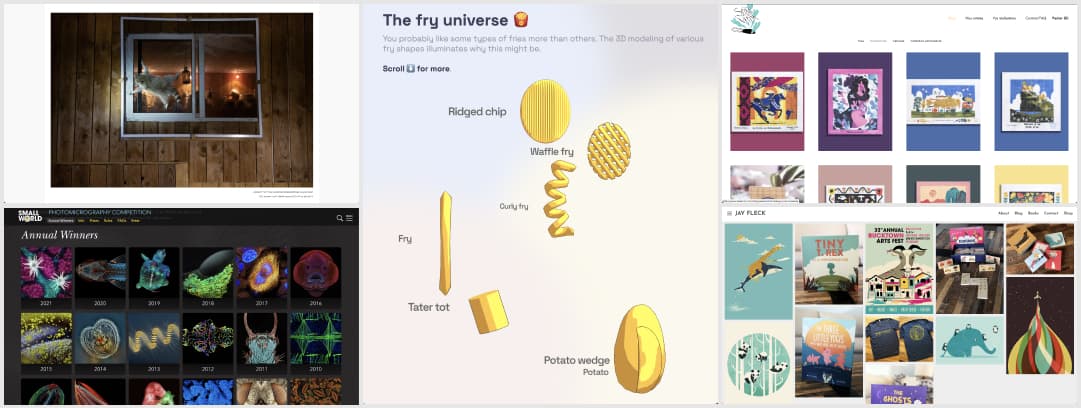
- The winners of the Comedy Wildlife Photography Awards will brighten your day. We need to talk about the second raccoon picture in it, they are all amazing, but that raccoon!
- A collection of the winners of the Nikon Small World Competition dedicated to photography through the light microscope. Those are beautiful and terrifying for some at the same time
#Canvas
Canevasfatal is a French shop that works with different artists to bring you colorful cross stitching canvas models. I used to do that as a child, but my patterns were quite boring compared to those ^^
#Dataviz
I love it when people use technologies to build fun dataviz. Why you might prefer certain types on fries, illustrated with a 3D model of their fried vs unfried volume.
#Illustrations
Morning cuteness, meet Jay Fleck, a Shorewood, IL based illustrator and picture book author
Useful tools and resources that will make your life easy
#AIVoice
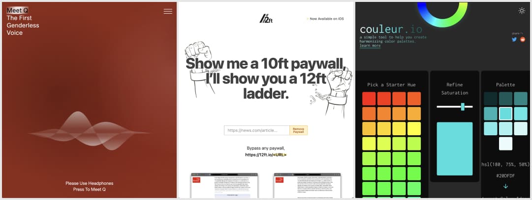
Meet Q, the first genderless voice for artificial intelligence by @genderlessvoice. There is unfortunately no caption on what the voice is saying on the homepage, but the YouTube video has some captions
#Paywall
“Show me a 10ft paywall, I’ll show you a 12ft ladder”: a tool to remove paywall from different articles
#Color
A simple tool to help you create harmonizing color palettes.
Tutorials
#Procreate
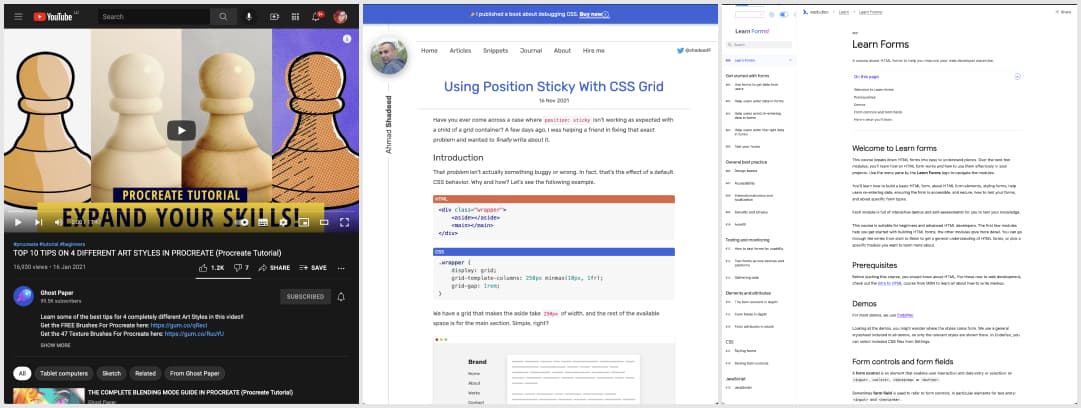
There’s a lot of Procreate tutorials around, while checking for brush tips I stumbled upon Ghost Paper’s channel. He honestly has some of the best practical tips I watched so far. Really loved this one showing 4 styles for the same illustration
#CSS
Using Position Sticky With CSS Grid: the “problem” that isn’t actually one but more a default CSS behavior ^^ by @shadeed9
#Forms
This is cool: a whole free course on HTML forms, from best practice, security, to testing, monitoring, CSS styling, etc.
News in the industry
#Emojis
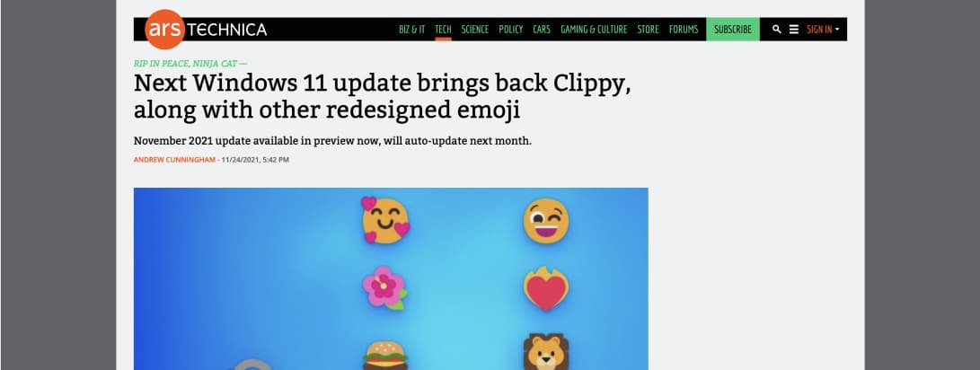
This made me smile: “Next Windows 11 update brings back Clippy, along with other redesigned emoji” I hope the fox is cute, because it is ugly in many OS/ emoji kits.

