Pixels of the Week – October 11, 2026
AI and design’s craft crisis, accessible color tools & comedy wildlife awards.
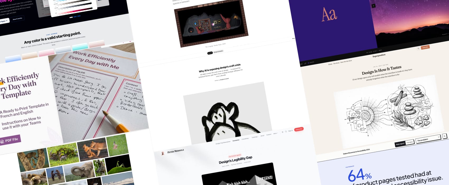
Pixels of the Week is my weekly-ish curated newsletter for designers, UX folks, devs, and anyone building accessible, inclusive, usable (and let’s be honest, awesome) digital products. This week brings some resources on neurodiversity and cognitive accessibility, explains why design struggles to justify its value to business, and how AI exposes design’s craft crisis. Also don’t miss some nice accessible color combinations and funny wildlife photos. Subscribe to my newsletter to get this directly in your mailbox!
Now: what I’m currently up to
October is ADHD awareness month! I’ve selected resources to help you make your website more accessible for people with different cognitive disabilities, including ADHD, autism, etc. Here you go: Neurodiversity and UX: Essential Resources for Cognitive Accessibility. I’ll be exploring more content around ADHD and neurodiversity in the future. And, if you are interested in helping neurodivergent teams work together, Myriam and I created a little tool: the Work Efficiently Every Day with Me Template. It’s a template that you can help your teams work together, without having to disclose any medical conditions. I’ve put it with a 25% discount until end of October to help more teams use our tool. And if you are interested in hosting more in debt workshops for your company, we (Myriam and I) offer neurodiversity trainings!
Articles
Design’s Legibility Gap (7min) legibility is the reason why UX struggles in a lot of companies (according to Peter Merholz). Business people value predictable, measurable and only see the “pixels in the screens”. Meanwhile research and exploration often stay invisible. The job of the design lead: make the work of the UX team legible to the corporate people, while making the corporate context understandable to the design team. Yup, helping the business understand the value of open-ended, exploratory work is not an easy task!
Design Is How It Tastes (12min) When designing we are often stuck into creating systems then think about the visual way. We describe things like rounded corners, tokens, and palette. And lost some of what made the “taste” of great design. Since image models can now turn sensory descriptions into working designs, Jem Gold explains that we could instead start with describing sensations, then visuals and then only then build the systems around those. I am quite curious about the approach, this sounds like putting the “vibe” into vibe design: describe the vibe, not the UI!
Why AI is exposing design’s craft crisis (20min) Sometimes you read something that feels like a punch in the guts, yet, you keep nodding. Here we are. This: “We told ourselves AI would level the playing field. Instead, it raised the floor. If you can’t tell the difference between functional code and broken code, between accessible design and inaccessible design, between scalable architecture and technical debt, these tools just let you fail faster.” Yup yup yup. Since the 2010s, the industry has told designers they don’t need technical skills. As a result: designers can’t join technical conversations and lose agency. The fix isn’t learning to code, it’s technical literacy: understanding APIs, data models, performance and accessibility, and evaluating AI output. That’s how designers keep strategic influence.
The Quiet Power of Reflective Games (15min) “In an industry that prizes fast-paced, time-pressured decision-making, reflective games invite players to meditate on life’s beauty, banality, and the spaces in between.” I wasn’t aware this type of game had a name, but I definitely want to play more of those!
Inspiration
It’s that time of the year again: the comedy wildlife awards finalists arrived, and, trust me, you need this today. We have fun, we have drama, we have epic fails. Which one is your favorite?
My top 3: Drama queen mantis, Yoga kitty cat, When I open my emails on a Monday morning. Bonus: how most of us feel once we read those emails.
Interesting websites
Color Shift a cool little project that matches a picture, to a WCAG AA color combination. You can also tweak the colors if needed.
Useful tools & resources
State of Ecommerce Accessibility 2026 64% of product pages tested had at least one critical accessibility issue. This comes from an analysis of 59,400 product pages across many different websites. Chat makes me sad: the top 10 is again, easy fixes: contrasts, link names, heading, small targets. Folks, we can do better!
Every Color, by Family a nice little online tool that grouped colors in different families and lets you browse them. It then automatically calculates the contrast with either white or black text for each color in the family, and lets you also know if this color prints as is. You might also be interested in the Figma color palette builder plugin
Interesting videos
How to navigate headings with NVDA screen reader (video) (3min32) a great short video to help people understand why proper headings are important for accessibility, and how screen reader users navigate headings with a screen reader, share this with your colleagues!
