Pixels of the Week – September 10, 2023
Personas non grata, WCAG 2.2 finally coming and some cool dataviz
On Twitter, LinkedIn, and Mastodon, I share curated articles I read, resources and tools about UX Design, User Research, UI and mobile design, HTML, CSS, the web industry, some processes, some inspiration, etc. This is an archive of everything I shared this week. And some extra links that I decided to only share for the blog readers. Also, subscribe to the newsletter to get notified when those are published!
Now: what I’m currently up to
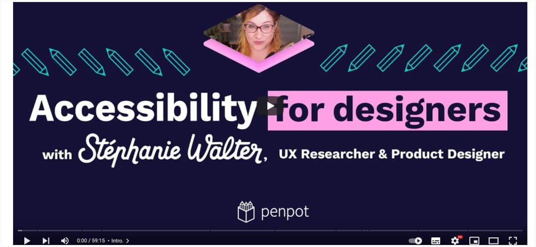
In case you missed it, I collaborated with Penpot to bring you a 1h introduction on how and where designers can have the biggest impact on Accessibility within a product.
I also created a template that you can find in the library, to help you document accessibility, with ready to use documentation components.
I will also be remotely talking about “Designing beyond the happy path” at Smashing Meet next Thursday. It’s a free and online meetup with 3 talks (me, Marco-Christian Krenn and Chiara Aliotta) and a panel discussion at the end.
TL; DNR: the one you should not miss
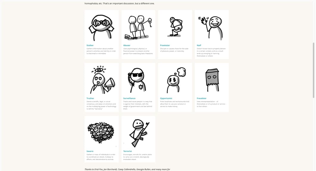
Personas non grata: 10 type of people you probably don’t want in your product or service, but who are likely to find their way in any way. Those will help you design beyond the “ideal condition”
Interesting articles that caught my attention
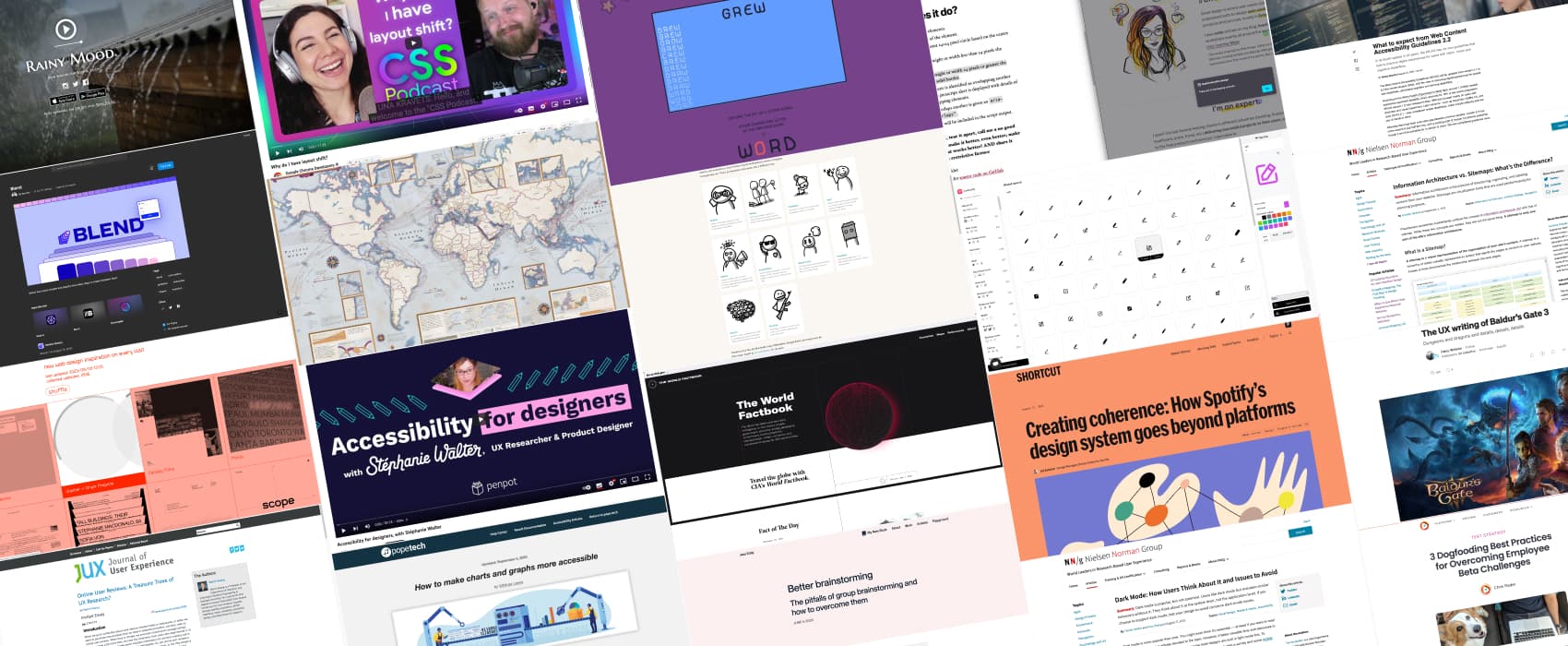
- Dark Mode: How Users Think About It and Issues to Avoid (17min) “Dark mode is a nice-to-have, not necessarily a need-to-have in most cases. There will always be users who are grateful when dark mode is supported — particularly when they use a design frequently, for long periods, and in dark conditions. However, dark mode should not take priority over ensuring basic usability just because it is popular and preferred by many users and designers.”
- Online User Reviews: A Treasure Trove of UX Research? (15min) online user reviews can be a cost-effective way to collect large amounts of data from real users. But, since those are not collected in a controlled setting, so there is a risk of bias (selection, reporting and recall bias).
Also, if you are curious about more biases, beyond those, check my deck of 60 cognitive bias cards to help raise awareness of biases when designing products & services
- Things that Jakob’s Law is not: (4min) wait, so, someone used the “Users spend most of their time on other sites” as an excuse to not implement accessibility feedback, hu? That’s a new, bold one…
- The UX writing of Baldur’s Gate 3 (8min): fun decisions in a fun open world where you can romance every NPC
- How Spotify’s Design System Goes Beyond Platforms (11min) interesting cross-platform approach: they first design the component for all platforms at the same time, rather than designing for each platform individually. Also, design tokens, of course!
- Better brainstorming: (10min) group brainstorming often produce fewer ideas than individual ones, due to production blocking, social loafing, fear of being judged. To avoid those issues: have people come up with the ideas on their own first, use digital brainstorming tools (miro, figjam), structure the session, try the stepladder technique and get a great facilitator
- Information Architecture vs. Sitemaps: What’s the Difference? (7min) Information architecture is the practice of structuring, organizing, and labeling content from your website. Sitemaps are visualization tools that are used predominantly for planning purposes.
- 3 Dogfooding Best Practices for Overcoming Employee Beta Challenges (6min) those tips also apply if you work in enterprise UX, on tools used internally and you need to recruit participants
Curiosity cabinet: non-design/tech rabbit holes I enjoyed
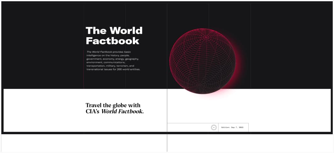
The World Factbook: basic intelligence on the history, people, government, economy, energy, geography, environment, communications, transportation, military, terrorism, and transnational issues for 266 world entities. For example, Luxembourg!
Inspiration: fun experiments, beautiful art, and great ideas
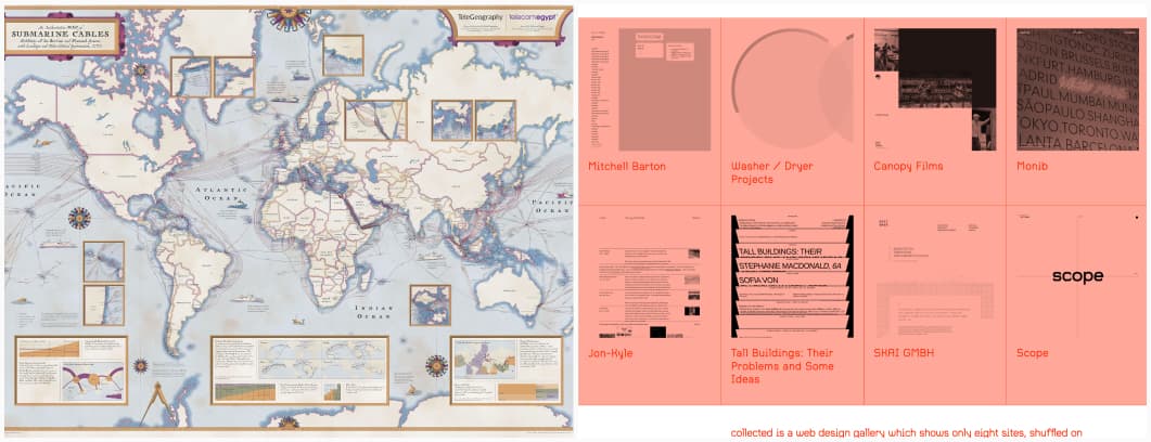
- collected a gallery of random website for your inspiration, refresh and get new ones
- Submarine Cable Map 2023: (trigger warning: the site might trigger motion sickness) for my dataviz lover friends, this is a very beautiful map of more than 529 submarine cable systems
Useful tools & resources
- Iconbuddy: a tool to download, edit and personalize 180K+ icons coming from different sources for your projects. You can choose the color, the background and to put it on a gradient.
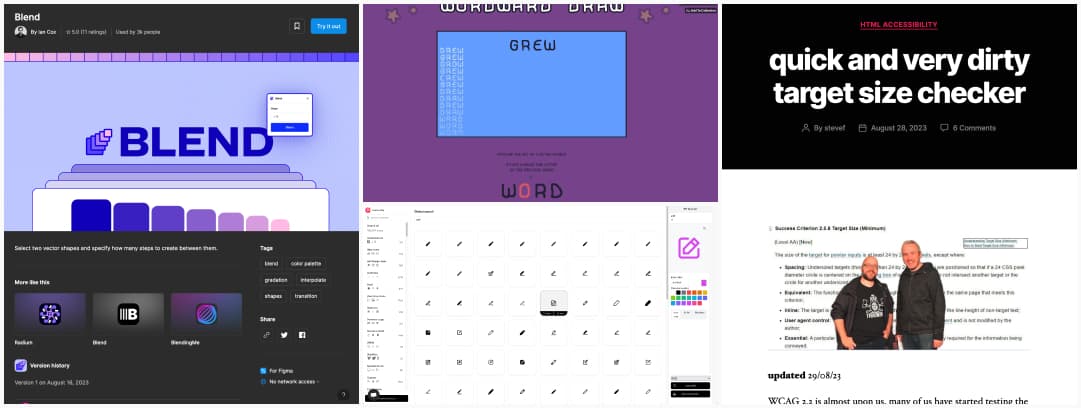
- Blend: a Figma plugin that lets you select 2 vector shapes and will build the steps in between them, it works with colors but also size and shapes
- A quick and very dirty target size checker: a bookmarklet to test the new WCAG2.2 2.5.8 target size minimum criteria: 24px minimum, if not, you need spacing (draw a 24px circle that is centered on the targets and make sure the circles don’t overlap)
- Rainy Mood: enjoy the sound of rain while working, relaxing, sleeping. Yeah, I know it’s very specific, but, it does relax me.
- Wordward draw: a fun game (in the browser and Windows) where you explore 4 letters words to find 105 pictures. And, I’m bad at this, haha.
Tutorials & technical articles
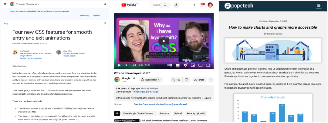
- Four new CSS features for smooth entry and exit animations: a couple of cool new CSS specs and abilities and what you can do with them for transitions. I really like the transition-behavior one to let us transition the display property.
- Why do I have layout shift? a 11 minutes video on different causes of layout shift and what you can do to prevent it (with Una Kravets and Adam Argyle)
- How to make charts and graphs more accessible: great summary on how to make static visualizations but also dynamic ones accessible, from keyboard interaction to color usage and screen reader announcements
Latest news in the industry
What to expect from Web Content Accessibility Guidelines 2.2: a very brief summary of what’s coming to WCAG 2.2, and I’m super happy there are more criteria for people with cognitive disabilities, we really needed those as well. If you need a longer, more detailed version: WCAG 2.2 — It’s finally here
