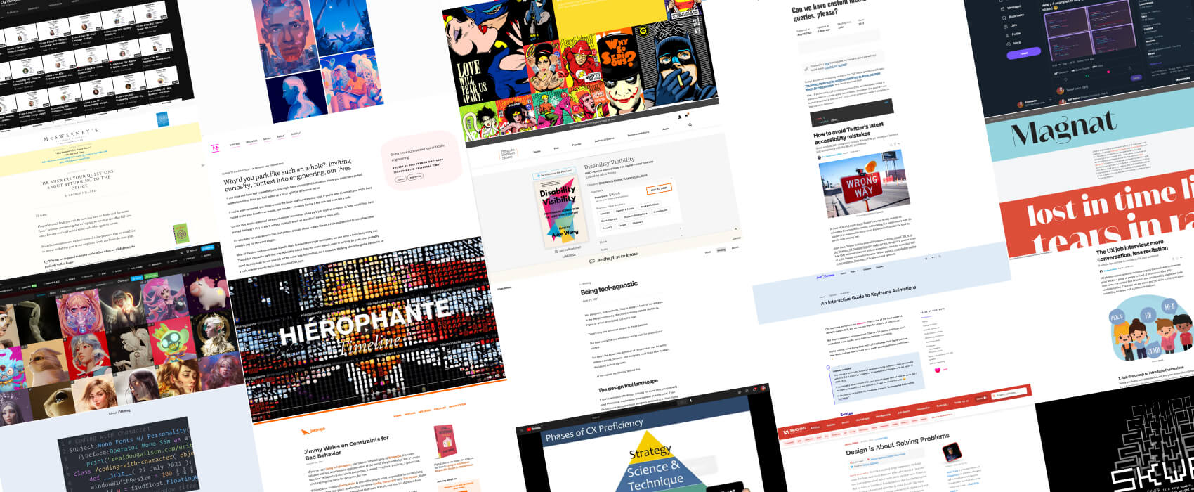
Pixels of the Week – September 12, 2021
Every day, I share on Twitter and LinkedIn a list of curated articles I read, resources and tools about UX Design, User Research, UI and mobile design, HTML, CSS, the web industry, some process, some inspiration, etc. This is an archive of everything I shared this week.
#Now – what I’m up to
By the time you read this, I’ll be on holidays, enjoying the sea (maybe the sun but I’m not sure based on weather forecast). That’s the amazing thing about scheduling posts. Which also means: no weekly links next Sunday.
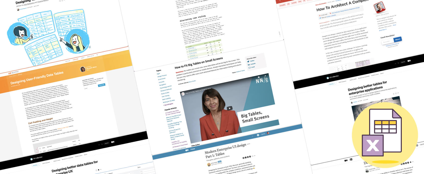
So, this week, I put together a list of some essential resources to help you design tables, especially if like me, you work on enterprise web apps with a lot of data. There’s advice on research, best practices, UI patterns, etc.
Something to think about
#CriticalThinking #UXtips #UItips
I will repost something I put on twitter here: Advice for UX & UI designer beginners when checking resources online: be careful when you see UI tips saying “never” or “always“. Most of the time, with real users, you end up in a deep “it depends” area (this is why we test things).
Also, be extra careful with “UX tips” that give inaccessible advice. Like “use a red border for errors” and that color is the only visual mean to indicate errors. Good UX is building accessible products from the start! How to keep a critical eye on those? Running your own feedback sessions with colleagues to check your biases, then if you can, conducting some user research to validate your design hypotheses should help.
Last but not least: spend a few months in Enterprise UX designing B2B tables and or forms for complex productivity webapps and I guarantee you can throw most of those “UI tips” about font sizes, moar whitespace, remove content and such over simplification through the window.
Darren Hood has also an interesting post on the topic of “it depends”
TL;DNR the one you should not miss
#Tools
Being tool-agnostic: a nice reminder that tools are just tools, sometimes you can chose, sometimes you need to adapt to the tools already chosen by your team. Being tool-agnostic is important (by @amrancz)
Interesting article
#Design
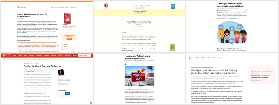
- “If you design for the worst people, then you’re failing to design for good people.” an interesting reflection on how we might need to design to empower people to keep the environment safe for other
- This 2011 resurfaces in my feed and I think it’s still interesting: Design is About Solving Problems, and we might not be able to solve them if we jump right into inspiration galleries and look at competition, we might even close doors to solutions
#Accessibility
- How to avoid Twitter’s latest accessibility mistakes. Good accessibility programs include things that go above and beyond just compliance with the WCAG guidelines by Sheri Byrne-Haber, CPACC-
- A long and super interesting read on “UX=Accessibility & Accessibility=UX” with the idea of shifting towards an Obstacles and Preferences-based model of accessibility and what it could look like. By Gareth Ford Williams
#Job Interview
A few interesting tips to help you connected with your audience when you have to present something for a UX designer (but could apply to most jobs) job interview by @scweeker
#Logo
Hahah, this made me laugh, especially since I think I tried 30 different ways to design a “S” for my own logo I think like anyone with an S in their logo: 7 overused logo letterforms to let go of
#Engineering
Why’d you park like such an a-hole?: Inviting curiosity, context into engineering, our lives by Tatiana Mac. It’s easy to judge without context, why we need to approach things with curiosity over critique when working (and in our life too)
#BackToTheOffice
I’m going to need a “I hate that I like that” button for this “HR Answers Your Questions About Returning to the Office” satire
Inspiration, fun experiments and great ideas
#Inspiration
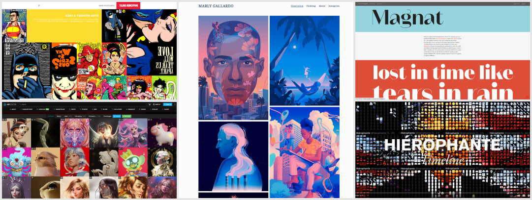
- I love the pop culture work of Butcher Billy, a designer and illustrator from Brazil. Check the Behance and website
- Luiza McAllister is a Brazilian 2D/3D artist and you should really check her work on artstation and behance
- Starting the week with the work of Marly Gallardo, a artist from New York. I love that blue and pink color palette
#Typography
Time to geek out about typography: “Fonts in the Twilight Zone“, an interesting article on those fonts that don’t always fit into existing categories. I’m officially in love with the g of the Magnat font. (via @ilovetypography)
#Emojis
This person made a music video only by tweeting emojis. 6 800 tweets, 900k emojis, hundreds of hours of work. This is the twitter account used to create that.
News in the industry
#CSS
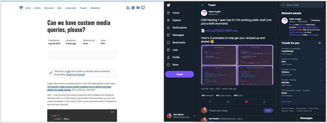
- Can we have custom media queries, please? via @stefanjudis. Oh, this looks nice, I hope too that this spec gets more attraction in the feature because it could be really handy!
- Also CSS nesting is coming!
Podcasts
#UXBootcamp
In case you missed it, Debbie Levitt has a few interesting episodes on Bootcamps on the Delta CX youtube channel:
- How Proficient Can a UX Bootcamp Make You? (Phases of CX Proficiency Model)
- The Disproportionate Pros and Cons of UX Bootcamps
- Inside Stories of UX Bootcamps
- A few shorter ones in the “Perspective” playlist (search for “bootcamp”)
#Podcast
A Lens A Day is a series of short (20 minutes) podcasts created by @brownorama
on the topic of Information Architecture. Also, don’t forget to check his deck of information architecture lenses cards. If will help you gain perspective around different aspects of your design regarding IA.
#Design #Panel
Design Around the World: with other Maltem designers, we talked about what it means to design in Canada, Europe, North Africa and Asia. This was an awesome discussion, especially since many of us come from different backgrounds.
Tutorials
#CSS
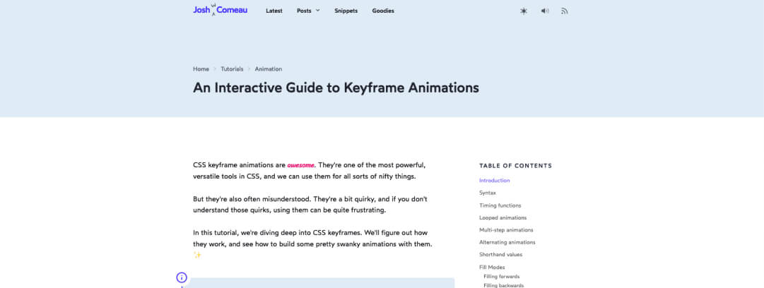
Back to CSS 101s, today with “An Interactive Guide to Keyframe Animations” by @joshwcomeau
Books
#Book #Disabilities
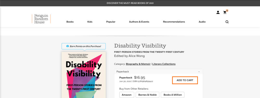
Disability Visibility, some First-Person Stories from the Twenty-First Century edited by @DisVisibility
Useful tools and resources that will make your life easy
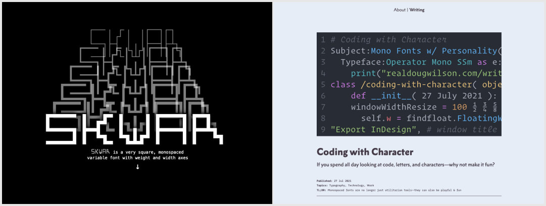
#Typography
- Skwar: yeah check this out, Heydon created a fun square mono-spaced variable font!!
- You can be a developer and a beautiful fonts lover, so here’s a list of mono-space fonts for your IDE which great personality. Anything catching your eye? I might give that Cascadia Code a try!