Pixels of the Week – September 14, 2025
Invisible stigma in UX research, accessibility common mistakes & a nice color tool
Pixels of the Week is my weekly-ish curated newsletter for designers, UX folks, devs, and anyone building accessible, inclusive, usable (and let’s be honest, awesome) digital products. I share interesting articles, tools, inspiration, and resources I found during the week. This is the archive version. If you’d rather get it straight in your inbox (plus be notified when I publish other articles), subscribe to my newsletter.
Now: what I’m currently up to
I’m currently in full conference preparation mode. Like a busy little bee. I want to bring new cards also to my UX templates shop at some point, but, my friends, time isn’t with me at the moment. Cool things are happening in the background and I hope to get a couple of new articles and tools on the blog by the end of the year, but, no promises. I’m also enjoying the September sun, the balcony garden is full of tomatoes, strawberries and raspberries, and, my kumquat has flowers. Which makes no sense, but, okay, let’s embrace it and see what it does during the winter!
Most popular content this week
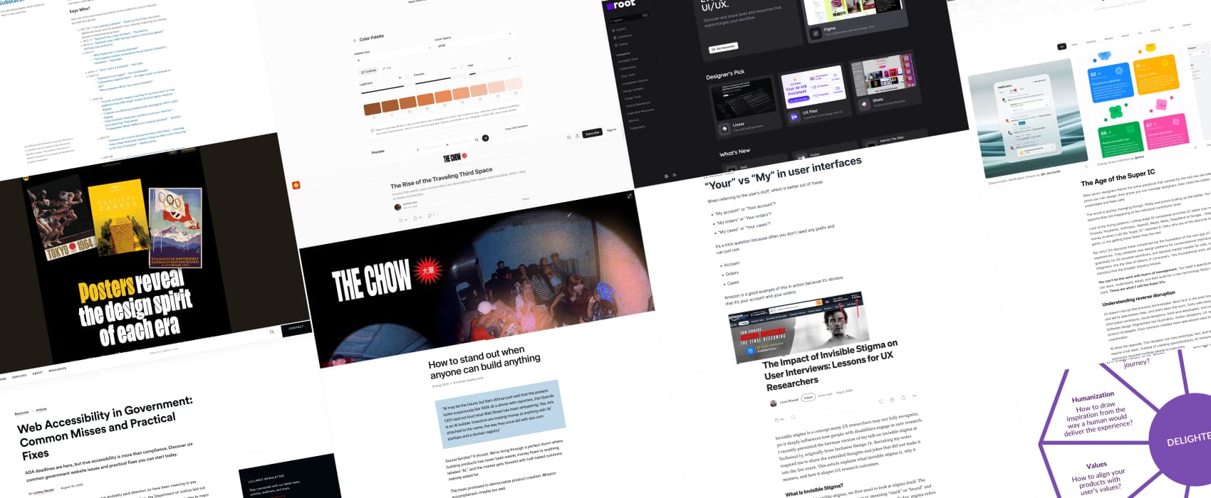
The Impact of Invisible Stigma on User Interviews: Lessons for UX Researchers (10min) Invisible stigma shapes how people with disabilities show up in user research. The main issue: they are invisible, so, easy to miss. Laura Wissiak explains how masking, disclosure, and social bias affect interviews. How can you address those? Listen to participants, do your homework related to disability, prioritize individual experience, encourage people to disclose if they feel comfortable with it, and be aware that statistically you will have a significant portion of participants with disabilities. (also, if you want to enjoy the article not on medium)
Interesting articles that caught my attention
Web Accessibility in Government: Common Misses and Practical Fixes (9min) Lindsey Markel explains how to fix as quick wins, and long term changes PDF overload, vague alt text, poor color contrast, broken keyboard navigation, frustrating forms, and generic “read more” links. Those are annoying for government websites, but, honestly, most websites could benefit from those fixes!
“Your” vs “My” in user interfaces (5min) Should you go for “my” or “your” when labeling items in interfaces? In summary: Use “your” when communicating to the user. Use “my” when the user is communicating to you. By Adam Silver
How to stand out when anyone can build anything (7min) Most people go for “how do we build this”, instead of asking “what should be built that people actually want?”. And, since it’s easier than ever to build something those days, most new apps, products, solve, fake problems. In a flood of mediocre products, those who focus on people (real user needs, understanding the business, translating needs into solutions) will stand out. For Anton Sten, the market flooded with AI-generated products is an opportunity, to stand out. Interesting mindset.
The Age of the Super IC (10min) I’m all in on the “Super IC” (individual contributor) idea, we do need to start recognizing designers who want to stay hands-on and solve hard problems without being shoved into management. That’s been my path for years, and I plan to keep it that way. But I don’t buy that you need to be some AI wizard to qualify. Depth in craft and influence through shipped work should count just as much. By Hardik Pandya
I Am An AI Hater (6min) Anthony Moser explains why, he is a AI hater. Only humans can be haters. This is how he celebrates his humanity. For him, AI is “incoherent empty men (who) want to sell me the chance to stop reading and writing and thinking, to stop caring for my kids or talking to my parents, to stop choosing what I do or knowing why I do it.” Please, just read the full article.
Curiosity cabinet: non-design/tech rabbit holes I enjoyed
The Rise of the Traveling Third Space (13min) bar, malls, gyms, public parts are all third places where people are supposed to be able to hang, to find a sense of community and belonging. Unfortunately, that doesn’t happen that much anymore, most of those places don’t guarantee real connection. East Asian cities prove that even with tons of public spaces, loneliness stays high. Patrick Kho introduces the concept of “travelling third places”, that are not that much about where, which place, but about, the community, the people around it. I love the concept, I need those in Luxembourg!
Inspiration: fun experiments, beautiful art, and great ideas
Obsession 14: Posters reveal the design spirit of each era: Thomas Moes went into a rabbit hole of sport posters over the years. He noticed era has patterns, that transcends the events themselves. He selected 3 posters for each decade between 1900 and 2010, and tried to summarize the design trend for each. Love it.
Useful tools & resources
UIRoot: a repository of tools and resources to help you with animation, collaboration, colors, components, icons, typography and more
Viewport UI a new place for you to find some curated UI inspiration, organised by categories like web, desktop, mobile, watch, etc.
oklch.fyi an online tool to convert, generate and explore OKLCH colors. I like being able to tweak a whole color ramp, adapting chroma to make it more or less vibrant.
How to Leave Substack You should probably leave Substack. Here’s why and how. Short version: they allow bad actors to monetize, hate speech and misinformation. I admit it’s always an ethical challenge, when I find an article interesting there: do I share it, or not. I wish more people had their own place, but, there are also alternatives.
Interesting frameworks and concepts
Applying Delight into your Product: the The Nine Delighters (10min) Humanization, surprise, personalization, seasonality, celebration, partnership, fun, community, and values: 9 delighters presented by Nesrine Changuel. It’s an interesting framework, to avoid just adding delight for the sake of delight, but really bring actual value to the users.