Pixels of the Week – September 25, 2022
Every day, I share on Twitter and LinkedIn a list of curated articles I read, resources and tools about UX Design, User Research, UI and mobile design, HTML, CSS, the web industry, some process, some inspiration, etc. This is an archive of everything I shared this week.
#Now – what I’m up to
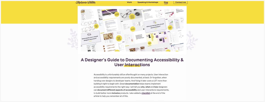
This week I talked about documenting accessibility for designers. at id24 conference. The video will be online soon, meanwhile, check my transcript of the talk.
Also, the Stephania is really growing. I’m super happy. She now has small leaves. I just hope the stem won’t break when those leaves will grow.
What’s your favorite way or follow-up sentence to encourage people to go a little bit further in interviews (or tests)? For me it’s a gentle “anything else?” + silence. The silence it important. Let people the time to reflect. It’s ackward, true, but worth it.
TL;DNR the one you should not miss
#Semantic HTML
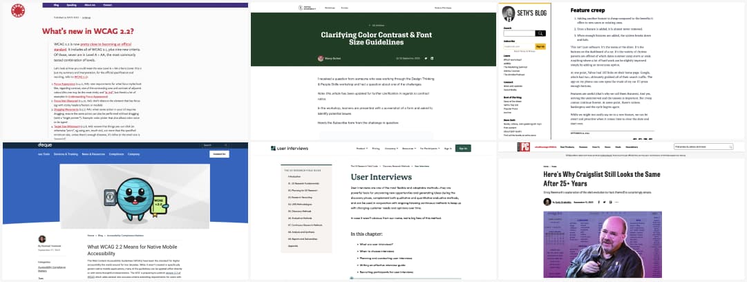
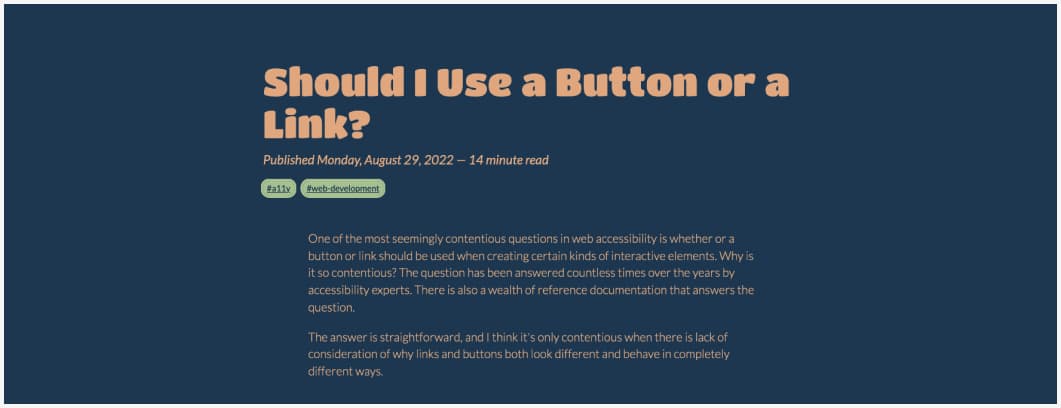
Link or Button? Use an anchor element (link) when you need to connect two sources, use a button element when you need to let user perform a programmable action (like submitting a form, opening a dialog). As simple as that! by Ashlee M Boyer
Interesting article
#Accessibility
- Here’s the Too Long Didn’t Read of all the new things coming to WCAG 2.2
- Interesting article on what the new WCAG 2.2 criteria will mean also for the accessibility of the native mobile apps (on @dequesystems’s blog)
- Very interesting conversation by Marcy Sutton on the minimum 4:5:1 or 3:1 for button elements in interfaces, related also to their font-size.
#User Interviews
A nice little guide to User Interviews, from what those are, when you need them to planning, writing the guide, recruiting, moderation and analysis by @userinterviews
(inception much hehe?)
#Product Design
Small interesting toughs on Feature Creep. It’ easy to add features to a product, but at some point, you must be smart and also know when to clean the slate. This is why measuring after a feature was launched is really important!
#Simplicity
In case you wonder why the design of Craiglist hasn’t changed much in the last 25 years, here’s an interview from his founder
Inspiration, fun experiments and great ideas
#Typography
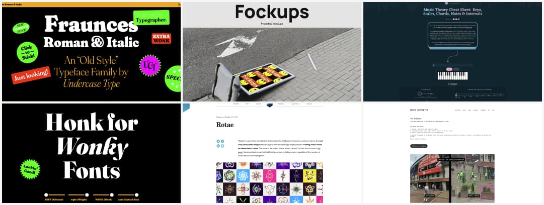
Need a nice font, with extra wonk? Why don’t you try Fraunces. It comes with roman and italic styles, and it’s a very nice variable font with a wonk axis!
#Fun
Let’s face it: we all design for the best case scenario, especially when it’s print design and advertisement. And them, things get messy. Meet fockups: a place to find mockups to display your designs in bad but realistic conditions.
#GenerativeArt
Remember Spirographs? Meet Rotae, a generative art collection based on the vast array of beautiful shapes that can appear from the seemingly simple process of letting circles rotate on (many more) circles
#Music
I love a good creative use of the web, so here we go: Music Theory Cheat Sheet: Keys, Scales, Chords, Notes & Intervals
#Privacy #SocialMedia
Interesting and quite scary project: @driesdepoorter used open cameras and AI to find how some Instagram photos were taken
Useful tools and resources that will make your life easy
#Patterns
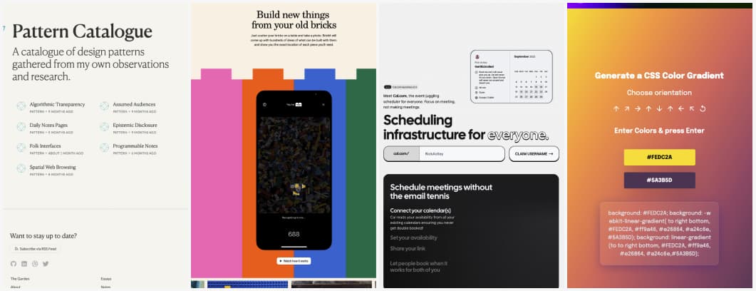
An interesting catalogue of design patterns gathered from the observations and research of Maggie Appleton. I see a lot of the folk interfaces, people re appropriating existing software to solve their problems in enterprise UX.
#Lego
Brickit: this is a really cool idea: scatter your bricks on a table, take a photo and this (only iOS, meh) app will give you ideas of what you can build with those.
#Scheduling
If you are looking for an open source tool to schedule meeting, cal.com looks promising.
#CSS
Another nice CSS gradient generator
Nice videos
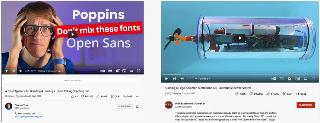
“Font Pairing: A good typeface for headings”, a great video if you want to understand how to better pair fonts, with a really cool real site example
#Lego
Not sure what to do this weekend? How about building a lego powered submarine?
News in the industry
#Emojis
So, YES finally proper pink heart emoji, because this one was not playing nicely with the other hearts 💗.
#Figma
“Adobe acquires Figma, cue the memes“, yup, I’m here for the memes too. I really like the fake Setch release note haha
