Pixels of the Week – April 28, 2017
Every week I post a lot of my daily readings about Web, UI and UX Design, mobile design, webdesign tools and useful resources, inspiration on twitter and other social networks.
This week’s selection features accessibility and colors, design for gender diversity, UX trends and glossary, web app vs native apps, offline in progressive web apps, some emotions in animations, plenty of grid layout ressources, some Sketch plugins, a free webdesign vector editor and little bit of yummy burger menu alternatives.
You can follow me on twitter to get a dose of links every days.
TL;DNR the one you should not miss (make it two this week)
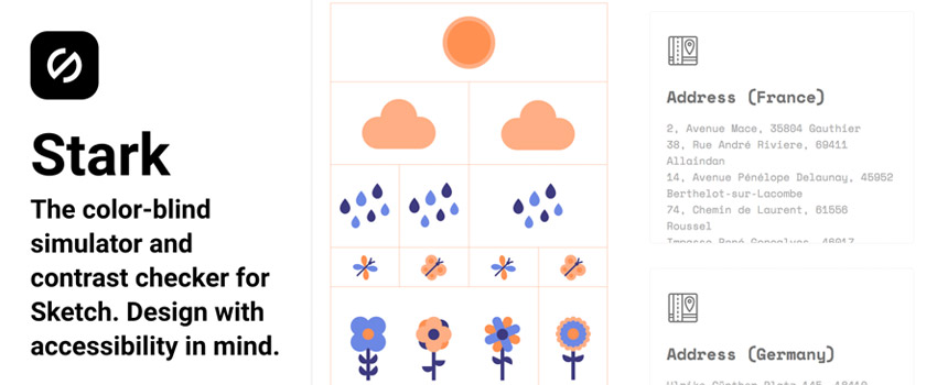
#Accessibility #Sketch
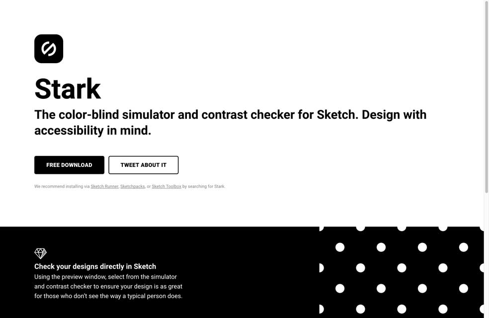
Stark, finally a color-blind simulator and contrast checker tool for Sketch
#Design #Diversity
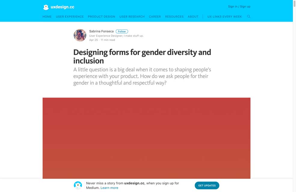
“Designing forms for gender diversity and inclusion” ❤
Interesting article
#UX
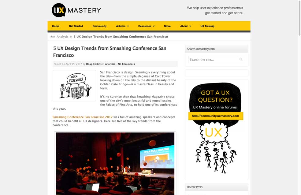
“5 UX Design Trends from Smashing Conference San Francisco” I hate reading accessibility as a trend because trends don’t last. But still great read.
#Mobile Strategy
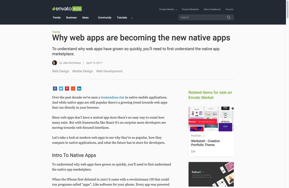
“Why web apps are becoming the new native apps”, happy to see that 🙂
#UX Research
Overcoming the social desirability bias in UX research. Tldnr: ask indirect questions
#Chatbot
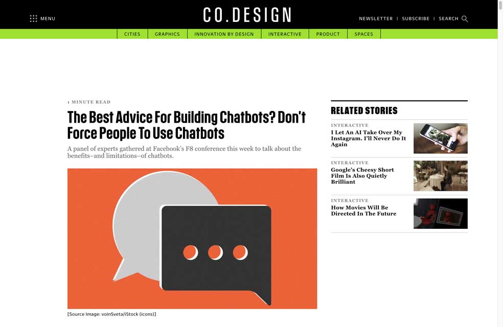
The Best Advice For Building Chatbots? Don’t Force People To Use Chatbots >> yes pleaaaase
#Dataviz #Longread
“Data Visualization “Versus” UI and Data Science” really long read but totally worth the effort with many resources
#Animation #Emotion
“What Gives UI Animations Emotion?” the 1944 small movie is a really nice example
#Diversity
“Recruiters shouldn’t be gatekeepers and let’s stop screening on resumes” on advancing diversity in recrutement
#Pricing
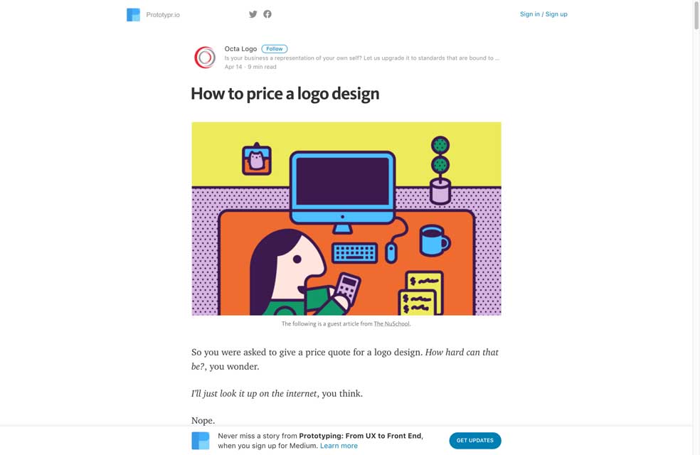
“How to price a logo design” worth bookmarking for later if you again need to explain why a logo costs more than $50
#Browser
Think you know the top web browser? Interesting read, also don’t forget Facebook and other webapps’ webviews
#UX #Facebook
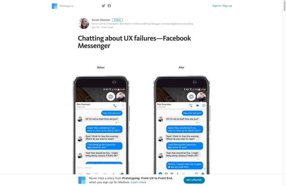
“Chatting about UX failures — Facebook Messenger” glad to see I’m not the only one not understanding those decisions
#CSS #Fonts
Moving to a System Font Stack in 2017
Talks
#Details
A great talk on small little details -> Lena Groeger – Think Small: the Power of Wee Things
#Forms
Great talk: Joe Leech – Forms are boring
Tutorials
#PWA #JavaScript #Offline
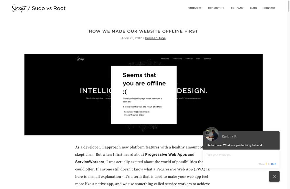
How we made our website offline first – quick nice introduction
#CSS #Grid Layout
Spring Into CSS Grid ?, a cute way to learn CSS grid layout
Useful resources, tools and plugins that will make your life easy
#UX Glossary
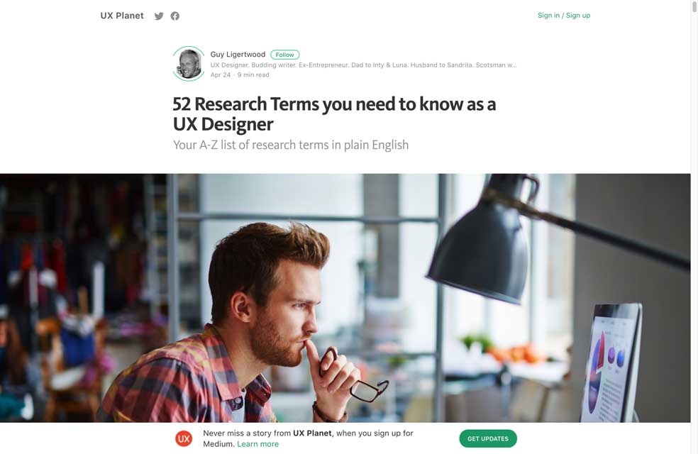
You can see this as a huge UX glossary: 52 Research Terms you need to know as a UX Designer, Your A-Z list of research terms in plain English
#Data
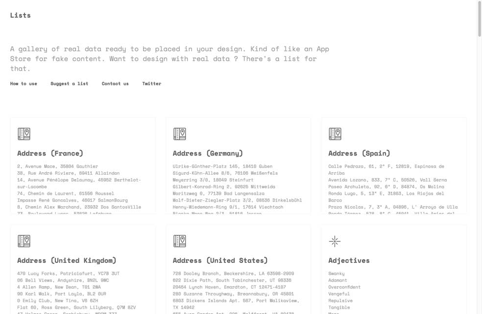
It’s always better to work with real data, but in cas you can’t, this tool can provide formated fake ones: lists.design
#Grid Layout #CSS
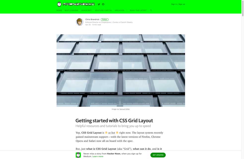
Getting started with CSS Grid Layout, plenty of ressources in on article 🙂
#SVG #JS #Animation
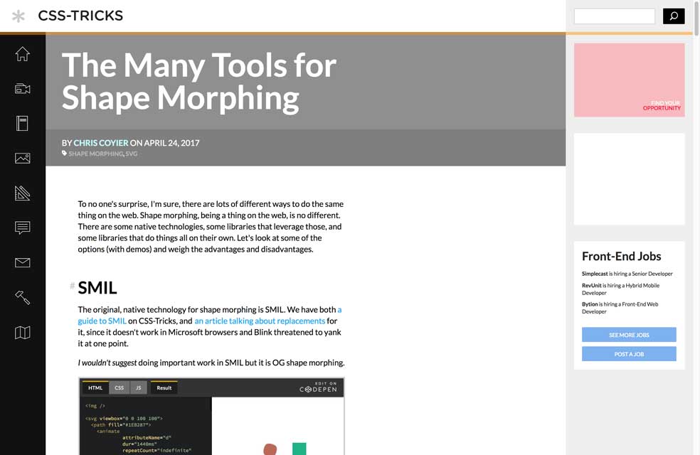
The Many Tools for Shape Morphing
#Icons #Brand
Simple Icons for popular brands in one place
#Sketch #Plugin
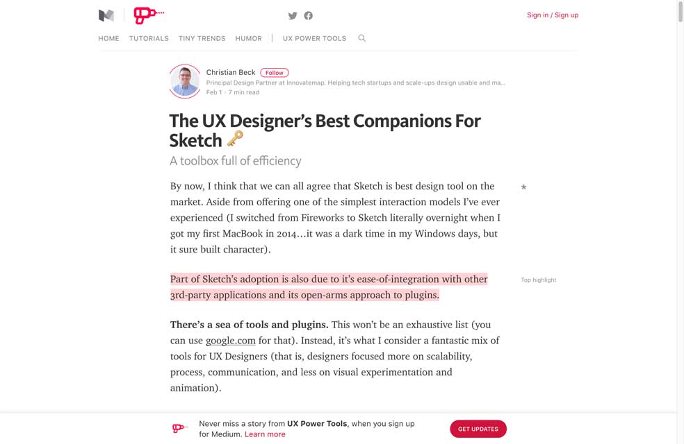
The UX Designer’s Best Companions For Sketch ? – A toolbox full of efficiency
#Design
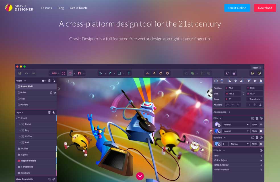
designer.io, a full featured free vector design tool with an online version, interesting
Fun, games, experiments and demos
#burger
6 Tasty Alternatives to the Hamburger Menu. They missed the meatball menu, the 3 little dots on top of each other). And for moar food see this tweet.
#Hacking
thehappyhoodedhacker.tumblr.com I’ll leave that here
#NSFW #Emojis
Non. Nope. Nein. Meeeeh why would anybody want an emoji as sextoy?
