Pixels of the Week – August 5, 2016
Every week I post a lot of my daily readings about Web, UI and UX Design, mobile design, webdesign tools and useful ressources, inspiration on twitter and other social networks.
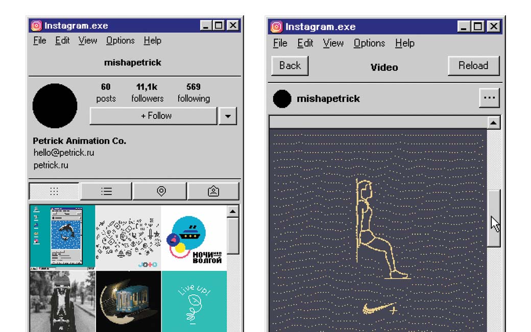
This week’s selection: UI design, using hover on sites today, the UX of Pokemon Go, performance, responsive tables, mobile dropdown and forms, a little bit of typography, a tutorial on progressive web apps (using beer) and a CSS only scroll indicator, a few advice on creating graphs in Sketch and a little something that will delight Instagram fans and Stranger Things fans.
You can follow me on twitter to get a dose of links every days.
TL;DNR the one you should not miss
#Performance
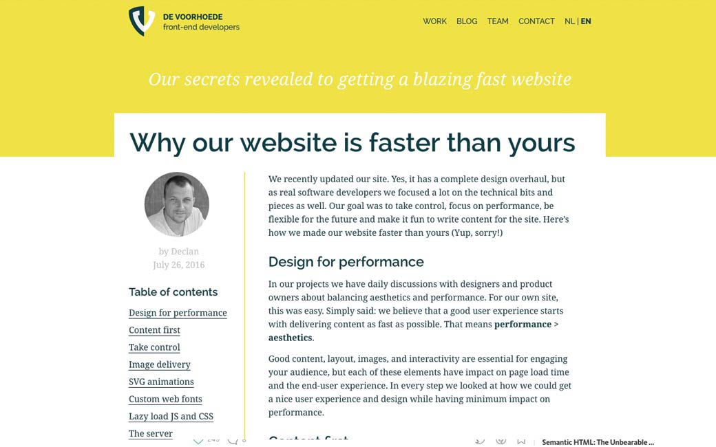
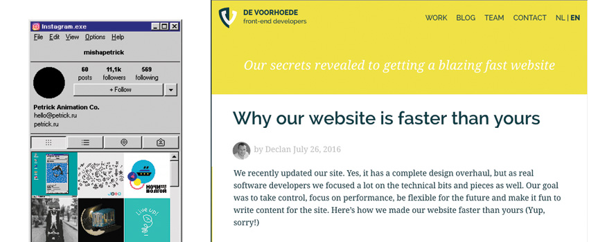
Why our website is faster than yours, a list of tips to make your website faster as well
Interesting article
#Design
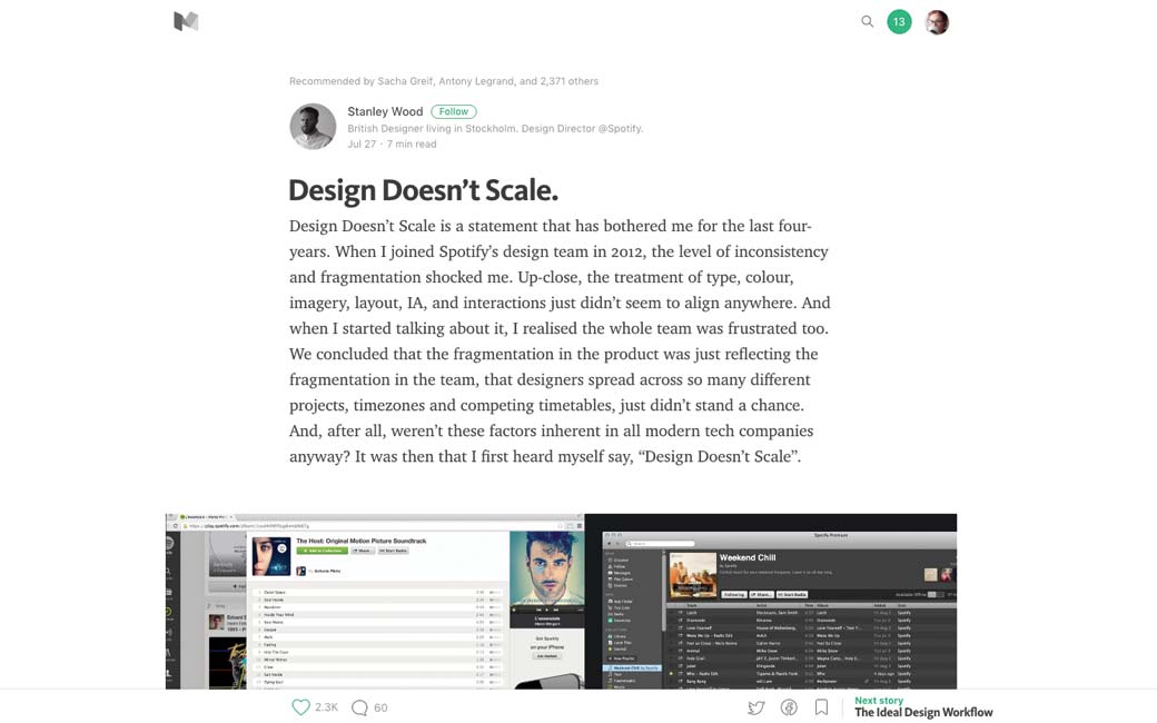
Design Doesn’t Scale (and how they changed that at Spotify)
#Hover
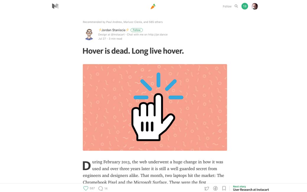
Hover is dead. Long live hover. TLDNR: Don’t use hover as the primary action to trigger anything essential. Ever. For ?? the ?? rest ?? of ?? your ?? life.
#UX
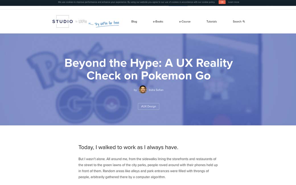
Beyond the Hype: A UX Reality Check on Pokemon Go
#CSS #Performance
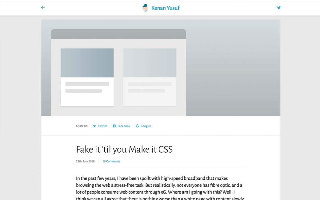
Fake it ’til you Make it CSS, a few (CSS) tricks to make your user what while your interface loads
#Table #Mobile #Accessibility
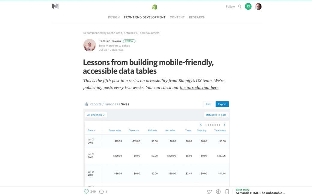
Lessons from building mobile-friendly, accessible data tables
#Design
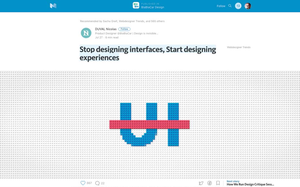
Stop designing interfaces, Start designing experiences, Blablacar designer explaining how creating a design system using Lego metaphor helps them
#Mobile
10 Rules For Efficient Form Design
#Mobile
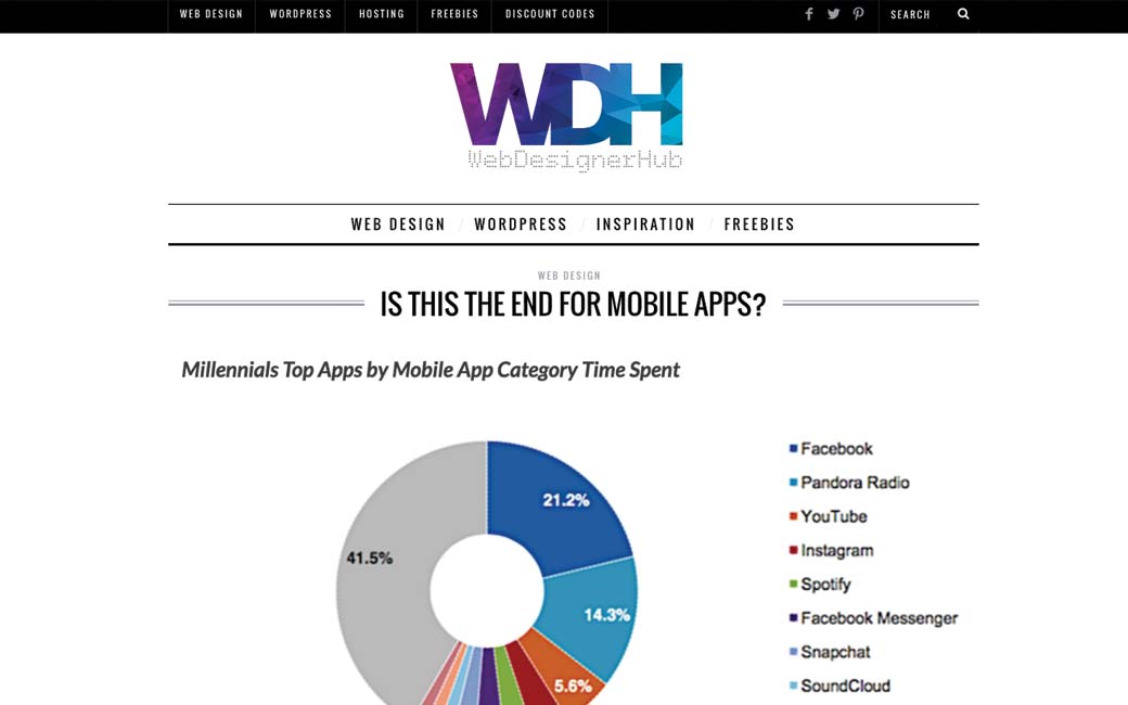
Is this the end of mobile apps?, an analysis on the blurry frontier between apps and sites and the rise of deep linking and progressive web apps
#Mobile #Form
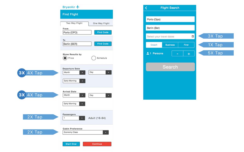
Mobile DropDowns Revisited: “Avoiding dropdowns improves execution times by 40%”
#Web
Hidden Expectations, the hardest parts of the Web are the invisible parts.
#Typography
Making a case for letter case. A little thing like capitalization can be a big deal
#Design
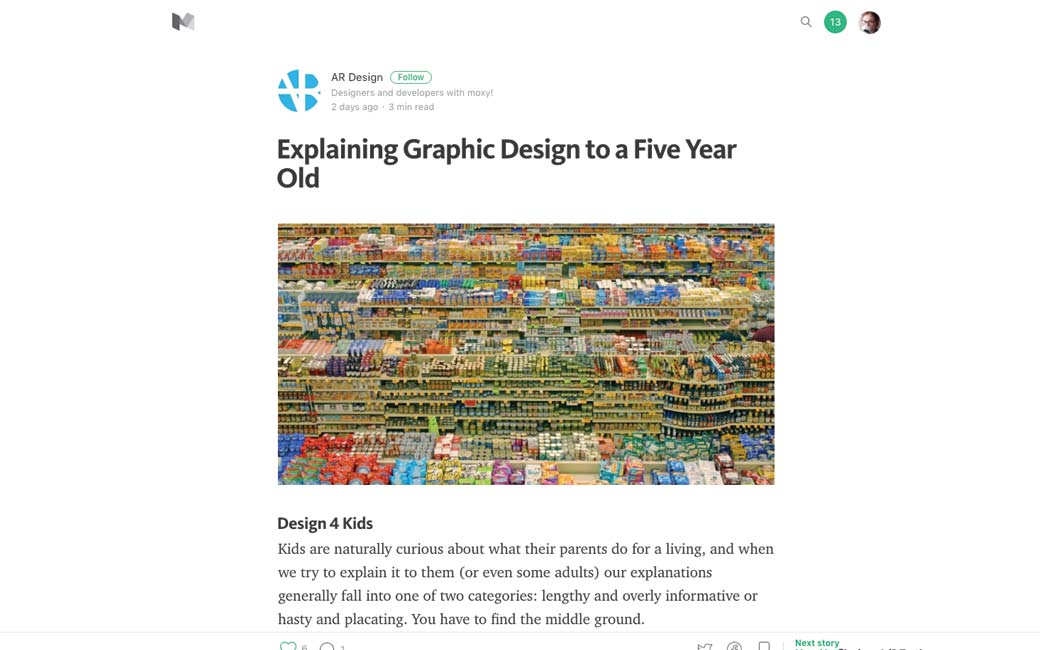
Explaining Graphic Design to a Five Year Old
#CSS
Neat uses for CSS’s awesome viewport units
Inspiration and Great ideas
#Video
Ikea is trolling us with a parody of instagram
Webdesign news
#Dropbox
Dropbox got a new collaborative tool, any body tested this to work with clients on ideas and concepts
Tutorials
#Design #Sketch
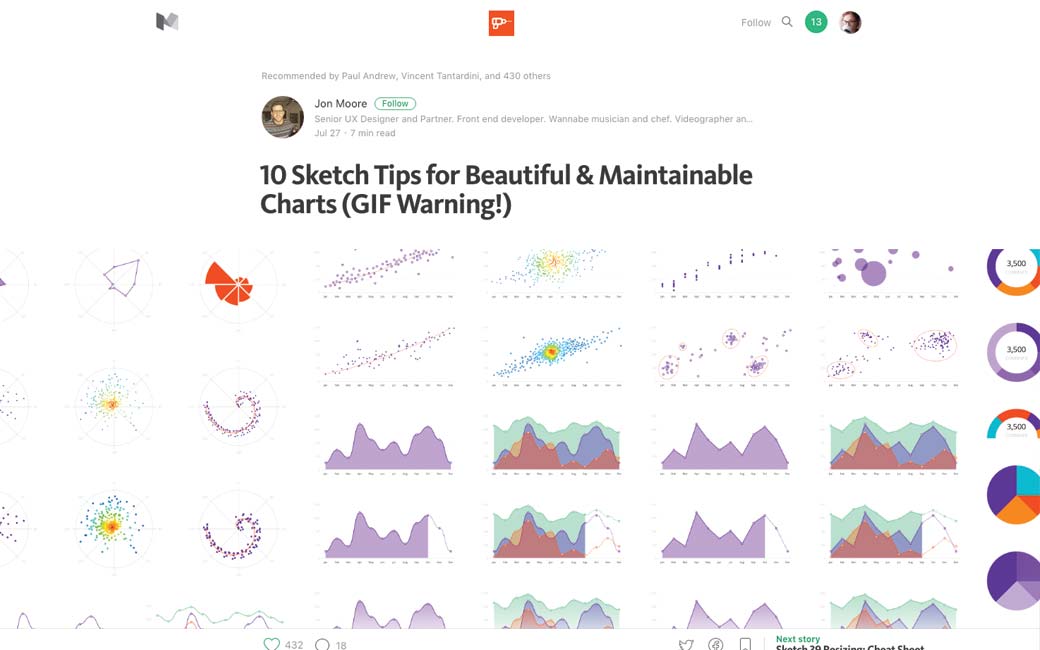
10 Sketch Tips for Beautiful & Maintainable Charts (GIF Warning!)
#PWA
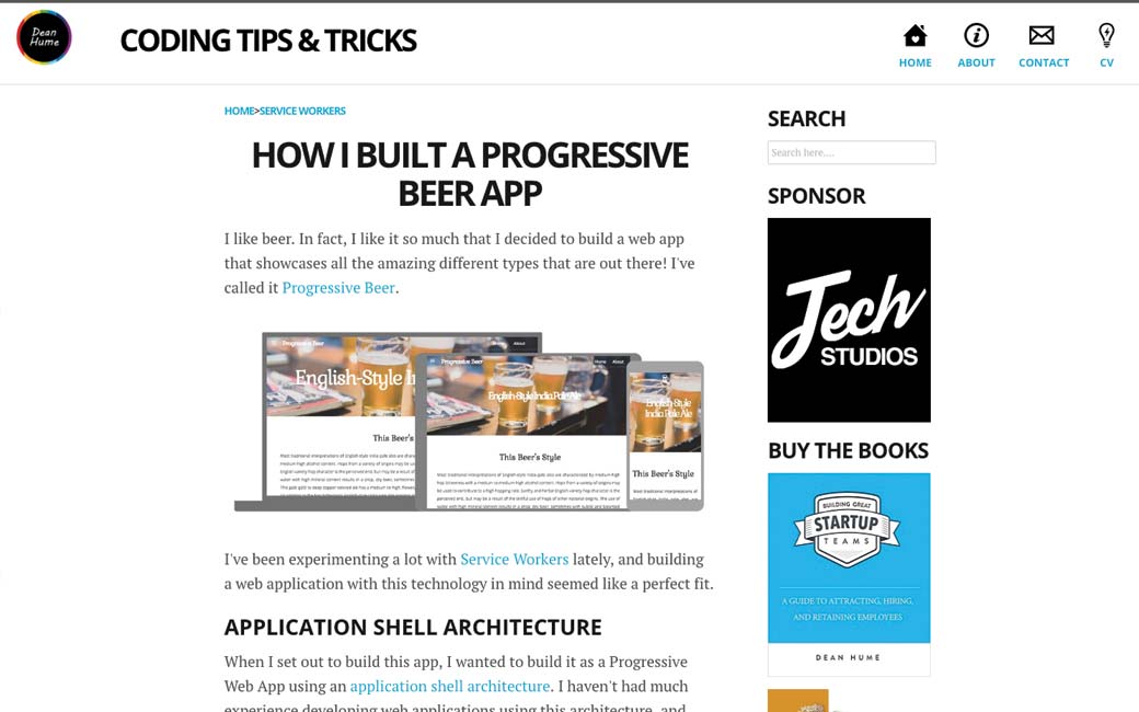
How to build a progressive beer web app, a well detailed tutorial
#CSS
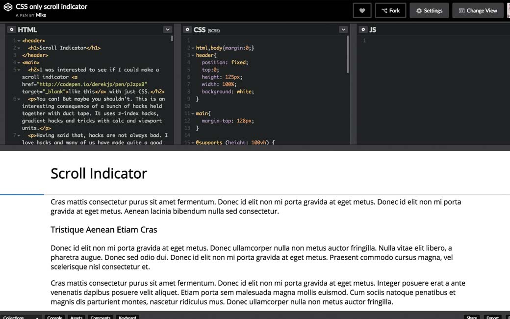
This is REALLY smart: CSS only scroll indicator
Useful ressources, tools and plugins that will make your life easy
#CSS #Animations
Book in Brief: Designing Interface Animation
Fun, games, experiments and demos
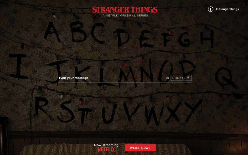
#Stranger Things
Bye bye productivité : strangergif.com
