Pixels of the Week – October 7 , 2016
Every week I post a lot of my daily readings about Web, UI and UX Design, mobile design, webdesign tools and useful resources, inspiration on twitter and other social networks.
This week’s selection: User Experience (onboarding, forms, patterns, personas, recrutement, user research, sketching, cognitive dimensions and user models) analytics and information architecture, designing systems, an atomic design case study, and how to reduce UI complexity. You’ll find motion and pixels vs vexels in the inspiration section, some CSS tutorials (floating labels, typography) and a flexbox hack, plus an introduction to Adobe XD and a collection of SVG patterns, a PSD styleguide and some CSS button loaders.
You can follow me on twitter to get a dose of links every days.
TL;DNR the one you should not miss
#Mobile
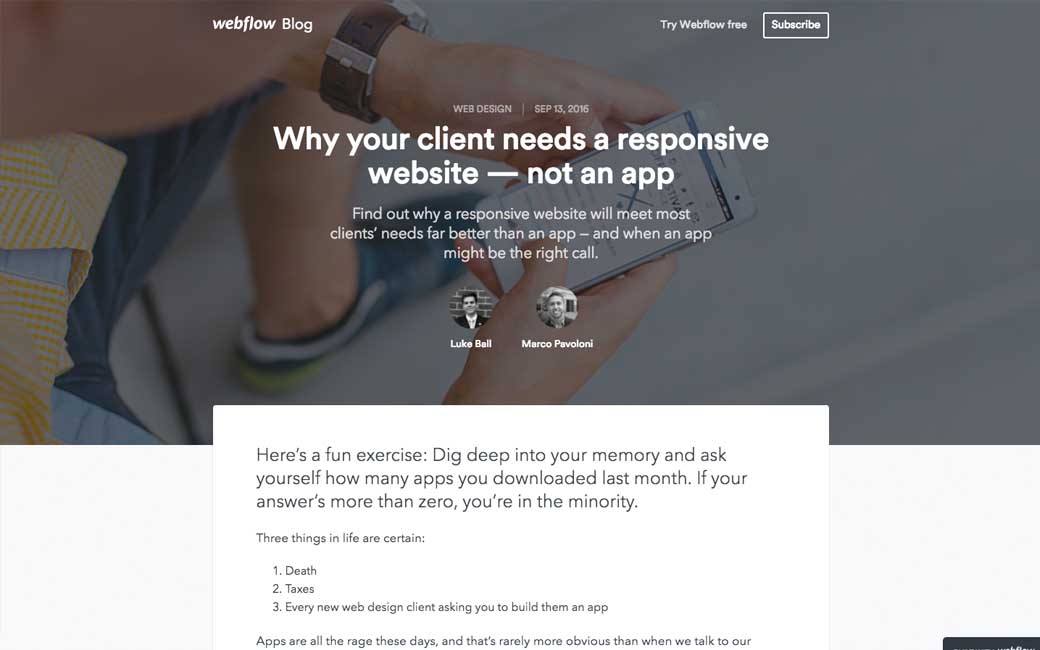
Why your client needs a responsive website — not an app. Find out why a responsive website will meet most clients’ needs far better than an app — and when an app might be the right call.
 Interesting article
#UX
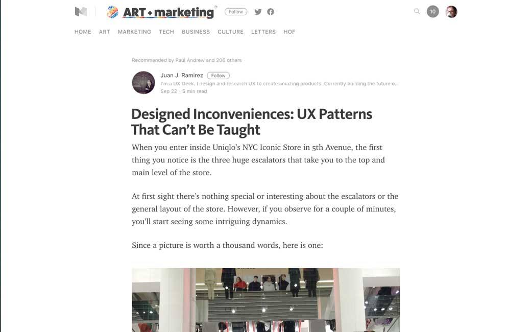
Designed Inconveniences: UX Patterns That Can’t Be Taught. Wondering where this starts becoming deceptive patterns
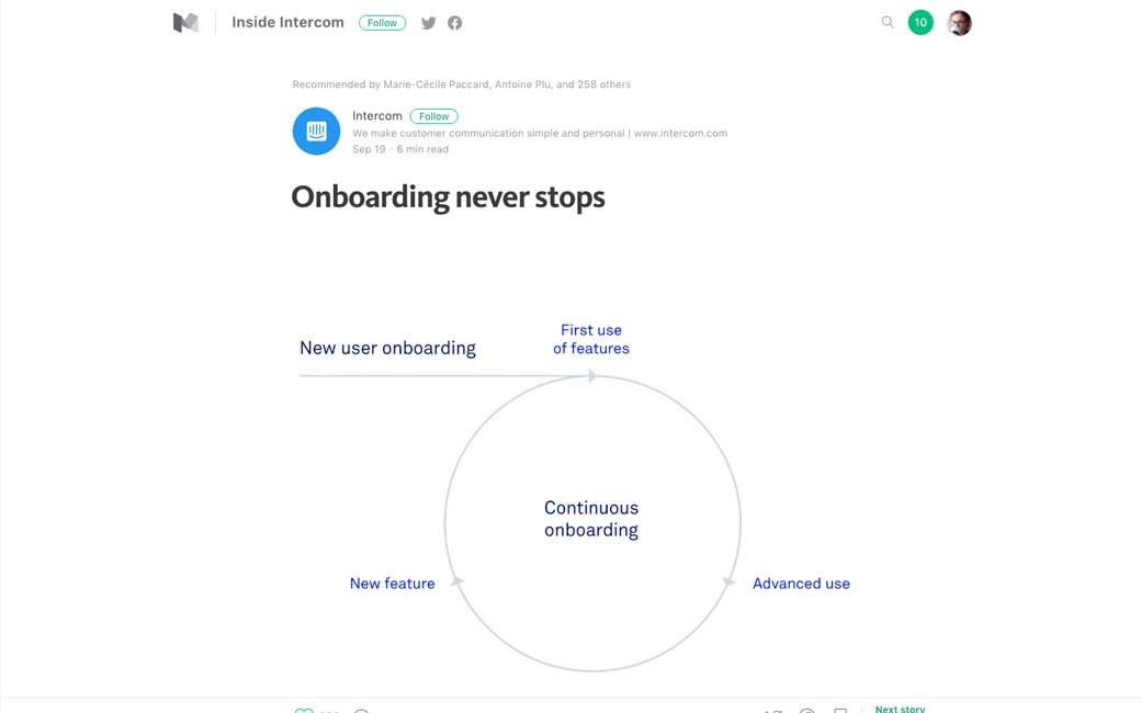
#Onboarding
#Form #UX
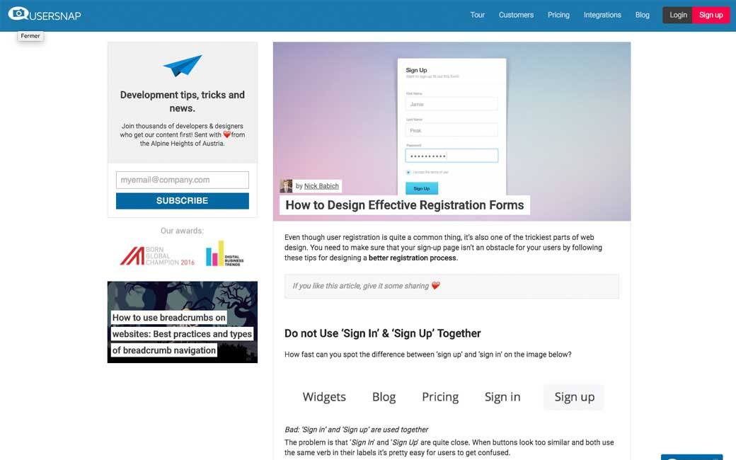
How to Design Effective Registration Forms, a few interesting advice
#Space
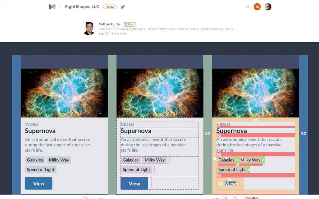
Space in Design Systems – From Basics to Expanded Concepts to Apply Space with Intent
#Atomic Design
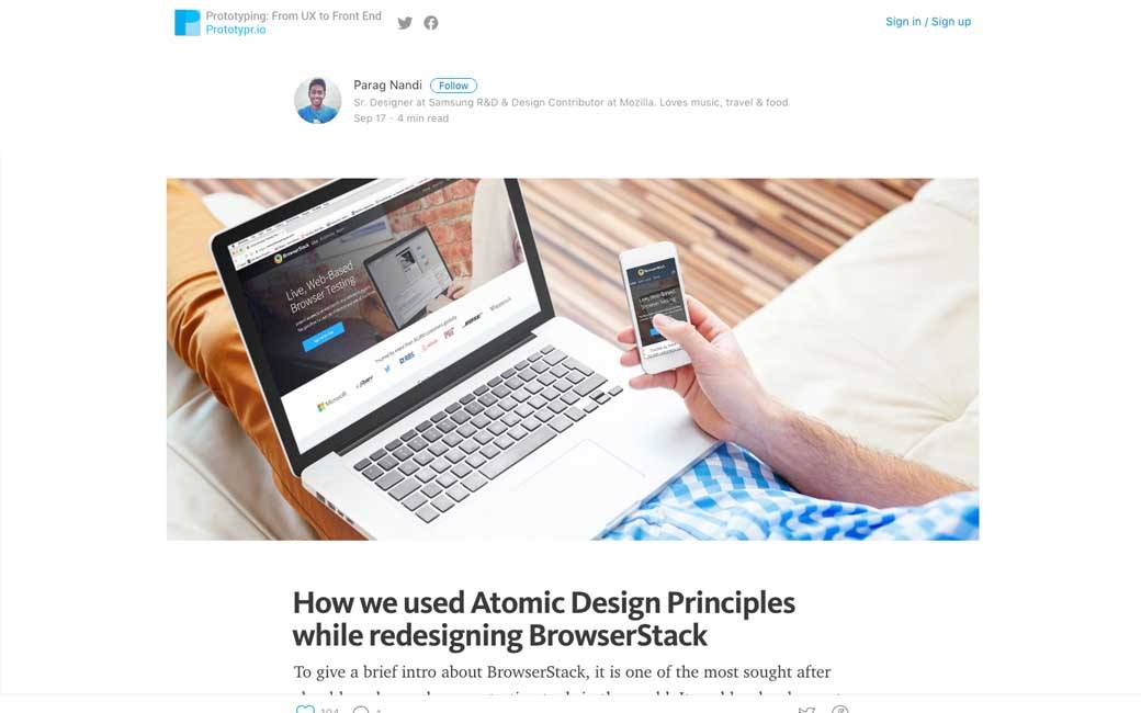
How we used Atomic Design Principles while redesigning BrowserStack
#Bot #Messenger
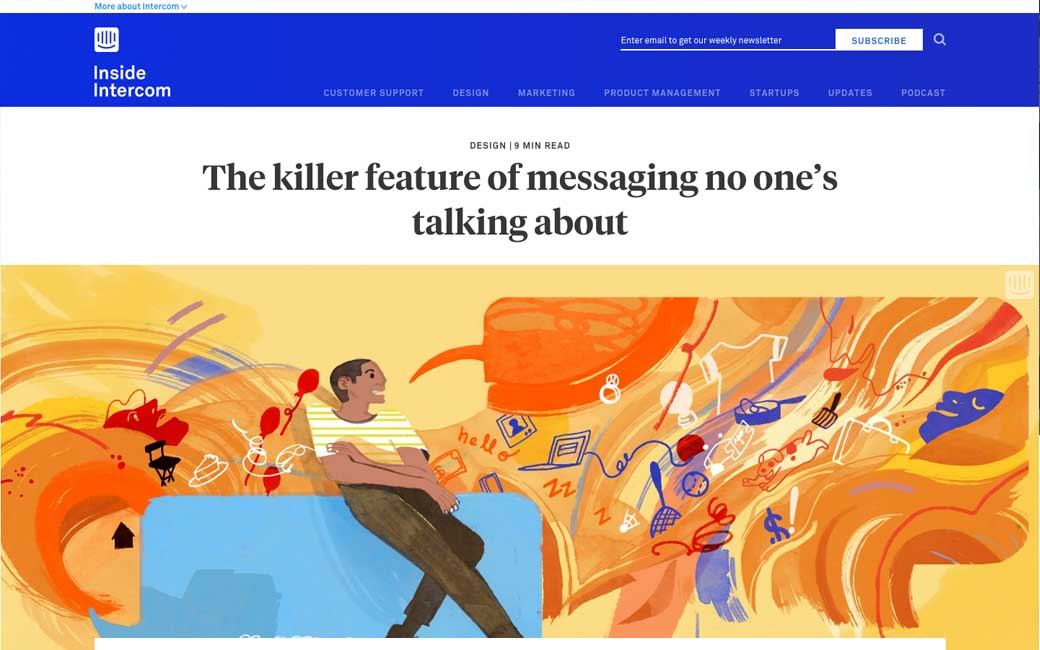
The killer feature of messaging no one’s talking about, on organizing everything for the user in one single place
#UX
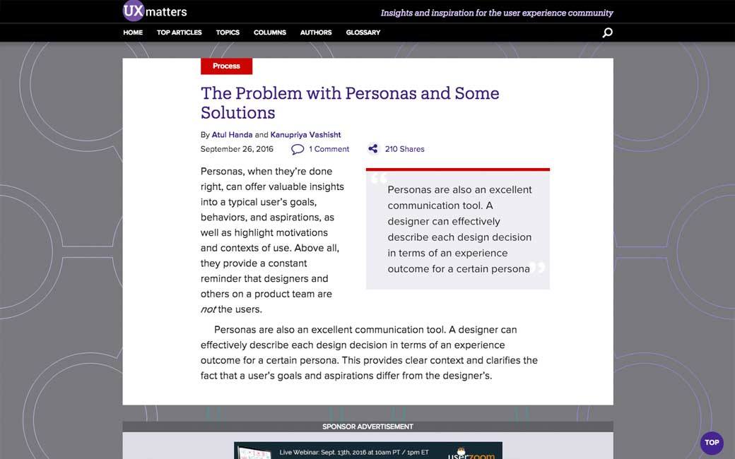
The Problem with Personas and Some Solutions
#UX #Job
Interesting advice: What Recruiters Wish That UX Design Applicants Knew Before Applying
#UX #Survey
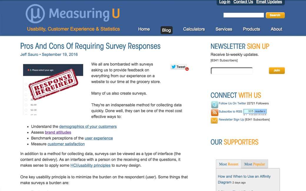
Pros And Cons Of Requiring Survey Responses, TLDNR: the advice that you should never have mandatory responses is overstated.
#UX
7 Steps To Conducting Better Qualitative Research
#UX #IA
5 Information Architecture Warning Signs in Your Analytics Reports, with analysis and solutions
#Design
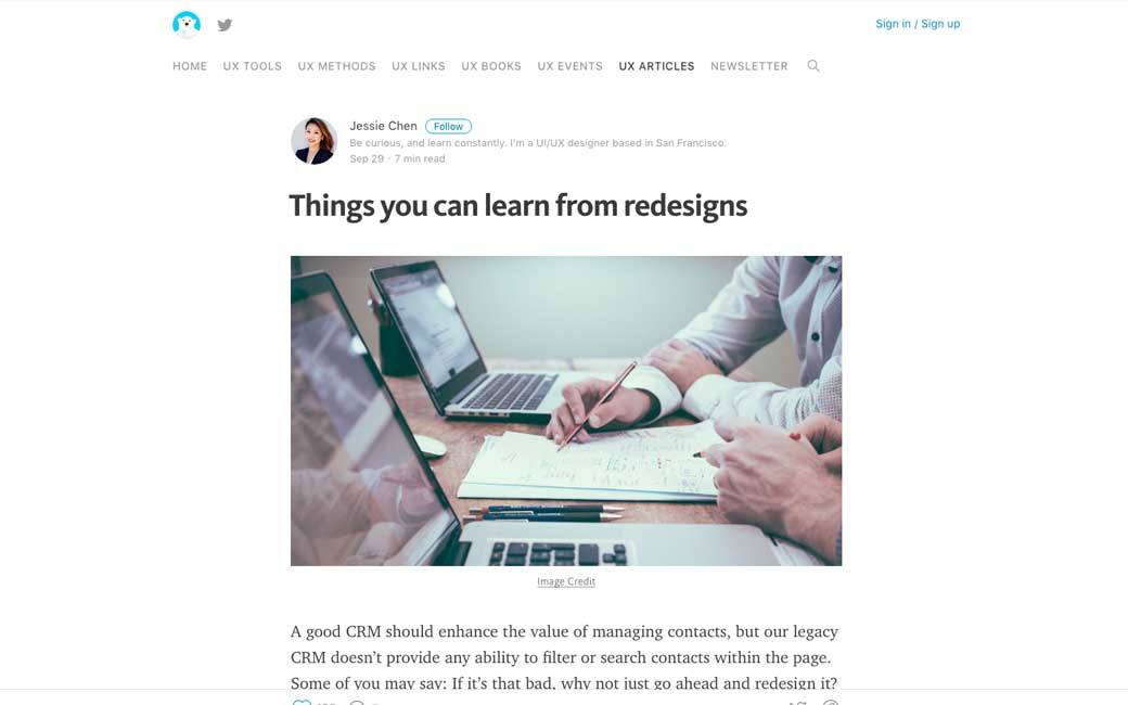
Things you can learn from redesigns, really interesting insight on a complex filter design
#UX #Sketching
Everything You Need to Know about UX Sketching
#UX
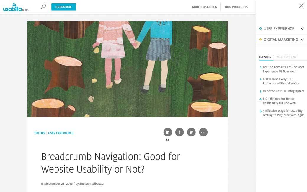
Breadcrumb Navigation: Good for Website Usability or Not? (tldnr yes but be careful with path based ones)
#Usability #Cognition
A Usable Guide to Cognitive Dimensions, 14 dimensions you need to be careful about when users need to interact with a system
#Design
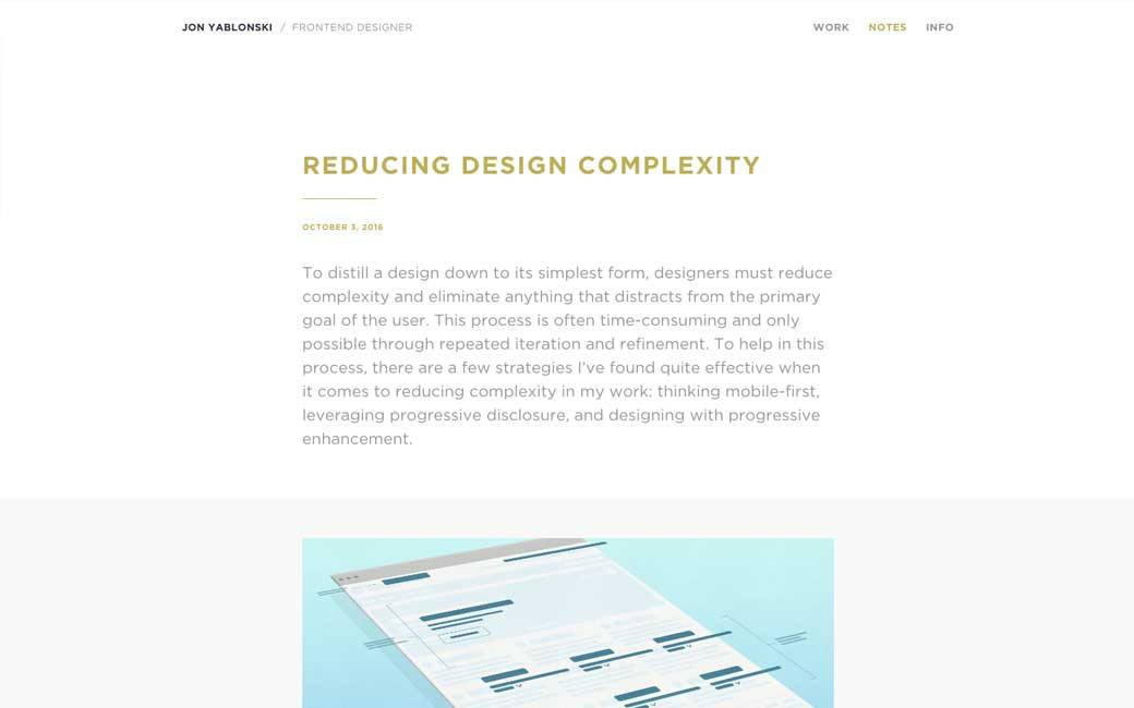
Reducing complexity with mobile first, progressive disclosure and progressive enhancement
#UX
The 8 Questions Every Website Visitor Wants Answered in 10 Seconds
#Sexism
Computer scientist shuts down mansplainer who told her to learn Java
#CSS
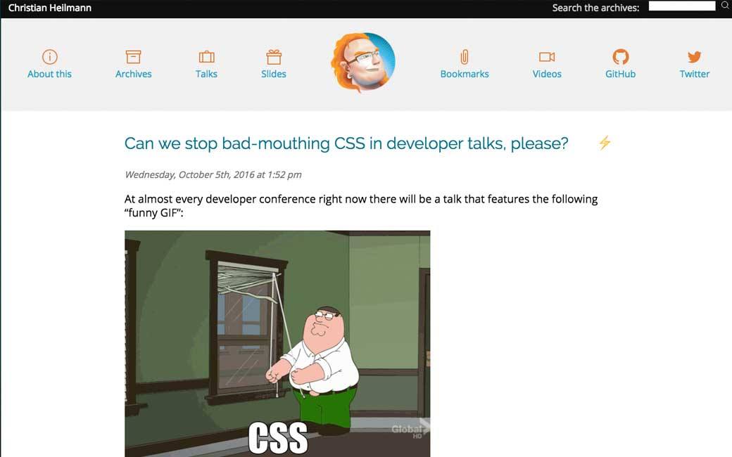
Can we stop bad-mouthing CSS in developer talks, please?
#User #Sketching
Understanding your users’ mental model, a simple sketch can transport you inside someone else’s head better than any other product research technique.
#Mobile #Case study
Taking an invoicing app to the next level
Inspiration and Great ideas
#pixels
Inspiring and interesting explanations: Pixels and voxels, the long answer
#Maps
A Technical Follow-Up: How We Built the World’s Prettiest Auto-Generated Transit Maps
Tutorials
#CSS
Interesting technique: Column Charts in CSS
#CSS #Typography
Hum, not quite sure playing with kerning of fonts that were designed this way is a good idea, but if you need to: Methods for Controlling Spacing in Web Typography
#CSS #jQuery
Accessible floating labels, des floating labels accessibles.
#Adobe XD
Getting started with Adobe Experience Design — Part I and Part II
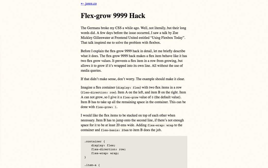
#CSS #Flexbox
#HTML
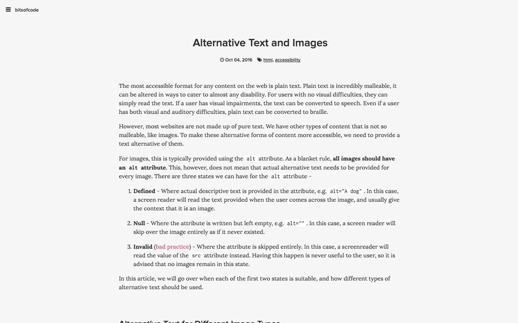
Alternative Text and Images, different image type require different alternatives (text, informative, etc.)
Useful resources, tools and plugins that will make your life easy
#SVG
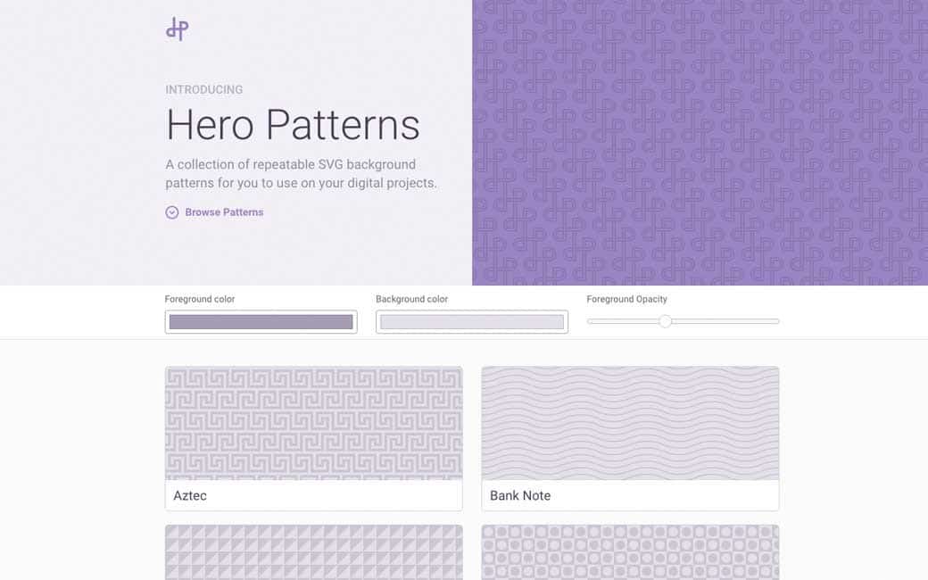
heropatterns.com, a collection of SVG background patterns
Fun, games, experiments and demos
#Buttons #Loaders
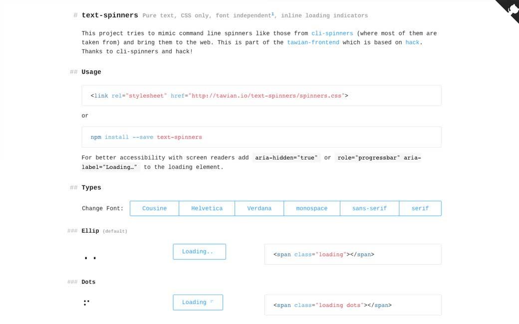
Fun idea: text spinners in CSS (voiceover reads some of those, especially the unicode so be careful)
#Styleguide
Photoshop Style Guide .PSD (and workflow)
Fun, games, experiments and demos
#Buttons #Loaders
Fun idea: text spinners in CSS (voiceover reads some of those, especially the unicode so be careful)
 Interesting article








![[Freebies] Photoshop Style Guide](https://stephaniewalter.design/wp-content/uploads/2016/10/styleguide-titre.jpg)
