Pretty, but not Usable – CSSDay 2019 UI Special
Last week, I gave a talk at CSSDay Amsterdam for the UI special. This talk is based on my years of experience working with dev teams that used Bootstrap, Material UI, Ant, PrimeNG, iOnic, etc to build the projects. I share my experience and process, some design/dev relations tips to help people build a user centric product while working with a UI framework.
The talk summary
“Don’t worry about the UI, we have a framework for that” they say. Then the designer’s job is merely to paint over whatever product comes out of it. Does that sound frustratingly familiar? How can we change this situation to bring user needs back in the process, while still working with an imposed framework? Let me share with you some stories from my projects, what worked but also failed. I want to help and inspire you find a collaboration process that will also work for your own teams.
The slides
Slides are available on Speakerdeck and here:
Pretty but not usable - slides
The video
The talk was recorded, here is the video:
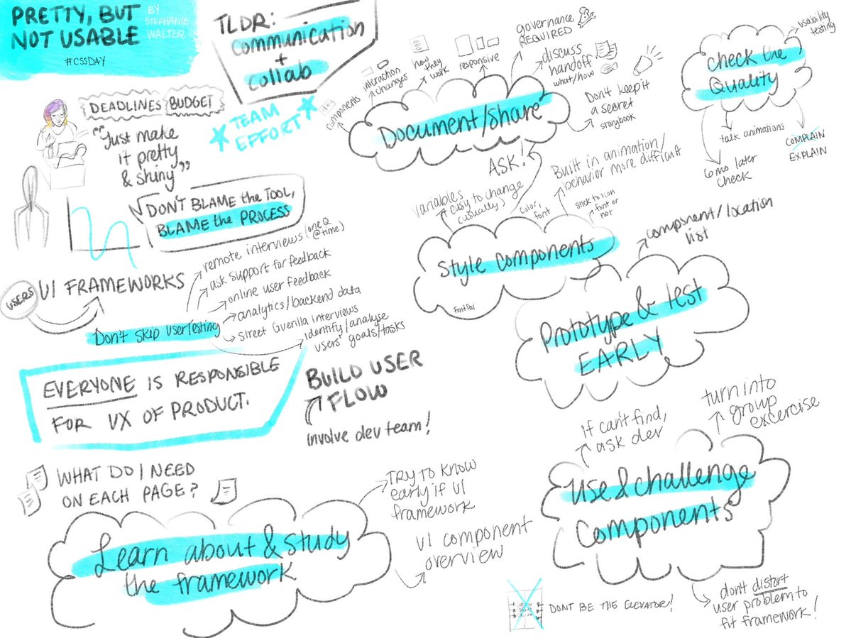
A nice Sketchnote
If you are a visual person, Emily Painter drew a lovely Sketchnote of my talk:
Some key points
I will write a detailed article on the topic (soon?). Meanwhile, here’s a few key points
1. Don’t Skip User Research.
Even with small budget, it’s important to understand your users’ needs and problems in order to solve them. I give a few guerilla user research technics in the talk to help you with that. All the data you will collect will help you build user flows and define what users will need in the different pages
2. Learn about & Study the framework.
As a designer I need to know there’s a framework used on the project and check what it is capable of, what components I will have to work with. Even better: choosing a framework should not be a developer decision. This needs to be a discussion with designers (and product managers) as well. And it’s better to discuss about this AFTER the user research.
3. Use and challenge the components
With the components, I can build quick paper prototypes and wireframes. When a component doesn’t work, we challenge it and discuss this directly with the dev team. Choosing the right component should be a team exercise and a discussion.
Also, having a framework lets your dev team build prototypes quite early in the process to do some usability testing. This lets you know if your design solution and components work and suit users’ needs.
4. Style the components
There’s a lot to say about styling components but the main idea is again, communication. Asking the dev team about what can be easily customised and what can’t is a good idea. Also be careful about accessibility, icons that users can’t understand without a label, unreadable fonts, etc.
5. Document and share
At this stage of the process, the generic UI Framework some team chose to start with is slowly becoming our product’s custom UI library. This could be used to kick-start a design system project as well. We need to document this UI library, the designer version but also the dev one. And people need to know those exist before they can use it. So you will need some tools and process to share this, and some governance.
6. Check the quality of the product
The design team won’t have time to create detailed mockups for all pages. So the dev team usually ends up building pages based on some specifications, wireframes and the UI framework we customised. It’s part of my designer’s job to check the quality of the product that we launch so we do some quality reviews of everything that was built. We also do some final usability testing before we launch.
Conclusion
This whole process is only possible with a lot of communication between the dev and design team.
Developers should not be the only ones taking the framework and components decisions. Designers should not come at the end of the project and be asked to put some paint on the components. Everyone gets frustrated with this kind of process, but the most frustrated person will be the users stuck in pretty but not usable products and interfaces.
A UI framework or UI kit project is not a dev project, involve designers early! And.. Don’t Skip User Research.
