Pixels of the Week – June 9, 2024
Visual design rules, the power of kawaii design & accessibility in design systems
My curated weekly-ish online newsletter, where I share interesting articles, tools, and resources I found during the week. You can expect content about UX, design, user research, accessibility & tech, but also some processes, some inspiration, sometimes books, and a couple of videos and podcasts. Also, don’t forget to, subscribe to the newsletter to get notified, you will get the weekly links directly in your mailbox, and be notified when I publish other articles.
Now: what I’m currently up to
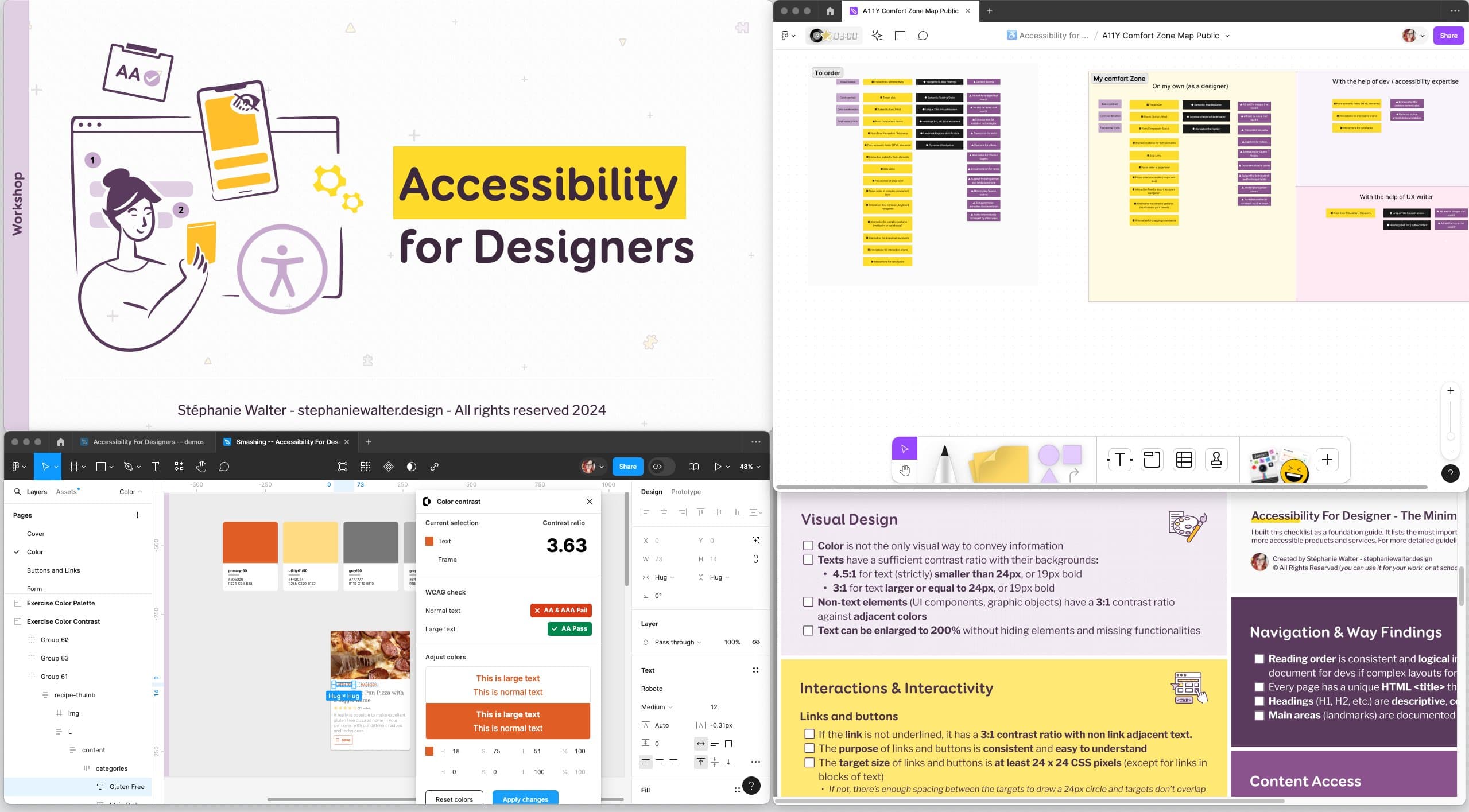
I’ve started session 1 and 2 of my “Accessibility for Designers” workshop. I had such amazing, interesting questions from participants. I really love that part. It’s not just about teaching, it’s also discovering edge cases I didn’t think about, and finding answers and interesting solutions for those. I love geeking about colors. So, I’m wondering if I should turn the color part into something standalone. It’s almost 2 hours, there are a LOT of small details, especially with 1.4.11 criteria. Maybe a 45min talk? A recorded webinar “on demand” ? Maybe a newsletter course (I’ve never done those, but, why not?). Let me know what you think on social media / by contacting me!
Also, as a reminder, UX London is coming soon! 3 days of awesome talks and workshop about UX research, product design and design systems, 18 – 20 June. Still unsure about attending? You can use my “JOINSTEPHANIE” coupon, for a 20% discount! I’ll be running my “Designing adaptive reusable components and pages“. I will teach participants my step-by-step process to organise the content, and extract your full page information architecture and reusable components (at different sizes) from it.
Most popular content this week
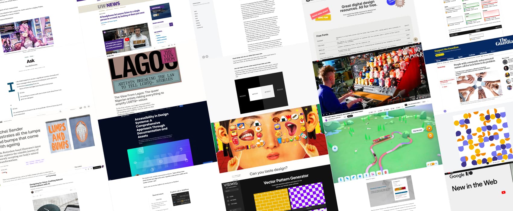
Visual design rules you can safely follow every time (10min). What I love about them: I tend to do all of this naturally, because, years of experience, and a trained designer eye and often my explanation to people is something around “it feels better like that”. So, it’s nice to have explanations from Anthony Hobday for a couple of those.
Interesting articles that caught my attention
Design, taste and kawaii
- The Worst Website In The Entire World (10min) an exploration of a very poorly designed, frustrated website. At this point, it’s hard to know if it’s on purpose or because due to incompetence / silos, but it’s almost magical how they took every bad design decisions they could.
- Evolving from implicit intent to explicit design rules (15min) geeking out about how components might adapt and stretch to adapt to different content and how to set up those implicit rules in different design tools.
- Designing for Voice: Crafting Natural Conversations with AI (10min) voice user interfaces rely heavily on sound and conversation flow. There’s a lack of visual cues, so designers need to focus on clear interactions, conversation flow and handling errors to make the experience successful. Designer also need to be careful about privacy.
- Can you taste design? (12min) Eating is a multi-sensory experience, and the design surrounding food – from restaurant interiors to menu typefaces – can have a tangible impact on that.
- Kawaii Computing: what VTubers can teach us about design (8min) VTubers’ kawaii designs are influencing mainstream branding. Cuteness has power, and its impact is more significant than ever. Apparently, cute, anime-inspired styles enhance help reduce anxiety and improves focus with users. A whole trend of VTubers’ kawaii design is becoming more and more mainstreams, and brands like Duolingo adopt it. I really like such style, so, that’s good to hear!
Accessibility & Inclusive Design
- Accessibility in Design Systems: A Comprehensive Approach Through Documentation and Assets. Pinterest did a lot to build an accessible design system: accessible components, but also guidance and training, a component accessibility scorecard, inclusive language, some design checklists and accessibility annotations from designers. Yeah, it takes a village, but it’s worth it!
- People with commonly autocorrected names call for tech firms to fix problem (5min) another episode of “maybe tech companies should be more careful with names”, because having your name auto-corrected to Satan is not funny when it’s your name. zoo
Last but not least: “Ask,” (6min) I agree with Dan Mall here, if you want something from me, if you make me guess what it is, there’s a higher chance I will say no, just, because we all have tones of things to think about. Make it easier for people to say you to you, by asking direct questions, and being very specific.
Curiosity cabinet: non-design/tech rabbit holes I enjoyed
The Firby Organ, a musical instrument made from, furbies. Well, just because you can, doesn’t mean… oh nope, you actually should, because, this is next level nightmarish stuff.
Inspiration: fun experiments, beautiful art, and great ideas
- The View From Lagos: The queer Nigerian artists risking everything to amplify LGBTQ+ voices (11min) a reminder that there are still a lot of countries in the world where being queer is not puting your life at risk
- Choo-choo world: want to start the week with something cute and fun? In Choo-choo world you create a cute vibrant train track, and then you got to play the train! I think we need more fun, cute, playful tings on internet, and this is one of those.
- Rachel Sender illustrates all the lumps and bumps that come with ageing / The Rotterdam-based illustrator’s latest zine explores the relatable journey of warmly accepting our body’s natural transformations.
Useful tools & resources
Free Design Stuff: free curated design resources for personal and commercial use, including places to find fonts, icons, photos, illustrations, tools, free courses and more.
SVG patterns generators
- Vector Pattern Generator: a tool that lets you customize patterns that you can then copy paste as SVG or CSS code
- Pattern generator by Super designer: a fun tool to create geometric patterns based on 4 different tiles selection
- SVG Shape Generator another cool and fun SVG blob and shape generator
Latest news in the industry
- What’s new in the Web (Google I/O ‘24) a lot of cool new things coming to the browser. I’m especially happy about :user-valid and :user-invalid. We have :valid and :invalid but those were triggered while user was typing. Rather useless if you as me. The new ones will only get triggered after a user has significantly interacted with the input. This is going to be nice for form validation. Check Baseline 2024 for all the new things coming.
- Masonry and reading order (5min) Rachel Andrew addresses some of the accessibility concerns about the new masonry grid layout
- AI headphones let wearer listen to a single person in a crowd, by looking at them just once (8min) This is amazing, the impact for people with earring challenges who want to amplify the voice of the person they want to hear, for example, would be huge. I can also imagine this getting used by also neurodivergent folks who have issues concentrating when there’s background noise, and want to be able to focus on the conversation with one person.