Accessibility: 9 Myths and Pushbacks, And How to Answer Them
Reframes, evidence, and practical strategies to help designers convince teams to invest in accessibility.
Many designers care about accessibility. Developers do too. Tech people in general care. Caring about accessibility is easy. Convincing others is the hard part. You raise accessibility in a meeting. Then people push back. “We have no disabled users” “We’ll fix it later” “Branding won’t allow it”. It feels like you fight the same battles again and again. Friends, you’re not failing, you’re just having the wrong conversations.
This article is a text version of the talk How to Convince People to Invest in Accessibility as a Designer, that I presented at axecon 2026 (you can register for free to access the video). It’s targeted towards designers, but, hopefully, can help other roles. I go through 9 usual pushbacks designers often face, when advocating for accessibility. And I will equip you with the tools to answer: how to re-frame, what evidence to use (business outcomes, hard data, real examples) and strategies to set up. And I’ll end with real actual actions you can take tomorrow.
Table of content
To help you navigate and share this content, here’s a access to each pushback:
- Misconceptions About Disability
- Short-Term Thinking: Responsibility, Cost & Timing
- Design and Complexity Myths
- Designers, YOU can start an accessibility grassroots movement
Misconceptions About Disability
The first pushbacks I usually have to deal with, are linked to misconceptions people in tech and around, have about disability and disabled users.
“Disabled people don’t use our website.”
A lot of people are convinced that disabled users don’t use their website. They’ll claim things like “We don’t have disabled users, so we don’t need to make our website accessible” This is a myth. And it’s one of the most frustrating ones to hear.
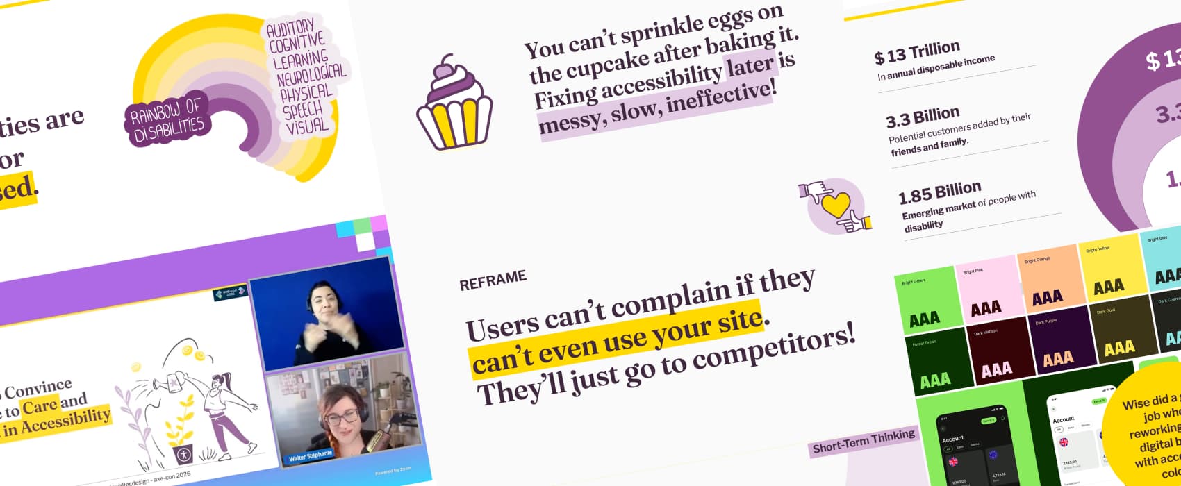
The data: 16% people experience significant disability worldwide.
Around 1.3 billion people experience significant disability worldwide. That’s 16% of the world population. One person in six. The odds are high that some of them visit your site (You can use the world health organisation as a source for those numbers.)
Let’s also not forget that not all disabilities are visible. Not all are disclosed.
The re-frame: your data is highly biased.
With 16% of disabled people around the world, there is a statistical chance you have disabled users. Or you had disabled prospects, who left, because, your site is not accessible.
There is no way to know if a user is disabled if you rely on analytics data. If you want to know, you need to ask people. But, here again, your data will be biased:
- This is a very private information, a lot of people won’t agree to disclose their disability in a survey. For good reasons: sharing this kind of personal information with a website is a big privacy risk for a lot of people. Often you have no idea how the information will be stored, you might not trust the product or service with it, and lie in the survey.
- Some people don’t identify as disabled, for different reasons, including social stigma. Or like, me, they might consider their disability as “not too bothering for using this product” and not disclose it. For example, I have vestibular disorder, most of the time I’m fine. I mostly have issues with parallax and moving things. I would disclose this to a video game, because, it does impact my experience. Not sure I would disclose this to my newsletter provider tool for instance, since the impact would be minimum.
- Survivorship biais: you will survey people who stayed. What about all the people who left your product/service because it was not accessible? Those often become invisible in your data.
So, yeah, in the end, it’s hard to measure if you have disabled users, or potential users. Trust me (or trust the numbers): you do!
Sidenote: you can get the rainbow of disabilities as a sticker on my shop!
The strategy: understand how disabled people actually use digital products
The strategy I use here is education. Stakeholders and people with decision power need to understand how disabled people actually use digital products. W3C has a great resource for that: Stories of Web Users. It’s a collection of user stories and testimonials. For example: Ade is a reporter with limited use of his arms. Ian is a data entry clerk with autism. Lakshmi is a senior accountant who is blind. Each story comes with a short video that you can show your team to help them better understand the diversity of disabilities. Help people understand a reality that they are usually not confronted with. Even better, if you can: show videos of disabled people using your own products.
“No one complained about accessibility!”
Once people accept they probably do have disabled users, the next pushback shows up. “If it was broken, users / clients would have told us by now. So it must be fine!”
The re-frame: you can’t complain if you can’t reach out!
Users can’t complain if they can’t even use your site. They don’t send feedback. And most people won’t complain anyway, they’ll just go to a competitor. Especially if the competitor built something more accessible.
The data
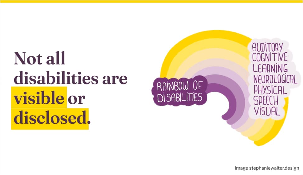
The numbers back this up. A Nucleus Research study from 2019 showed that 23% of transactions on e-commerce websites were abandoned by blind users because of accessibility issues. That’s $6.9 billion lost to competitors every year. And that’s only blind users. So, yeah, users won’t complain, they’ll just go elsewhere! Inaccessibility is a revenue loss risk!
Inclusion builds loyalty. Inaccessibility builds the opposite.
Let’s also not forget that people talk. The disability community is quite loyal. When we find something accessible, we recommend it. Freespoons is a good example. It’s a collaborative site where disabled people recommend accessible products and services to their community.
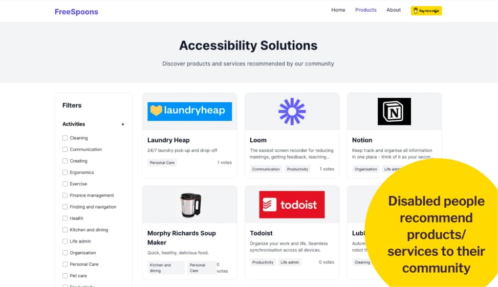
Disabled people recommend products and services to their community.
The opposite is also true: when a product is inaccessible or a brand does something harmful, we tell others to avoid it. For example: Sonos’s 2024 app redesign broke screen reader accessibility for blind users. After backlash, they began fixing issues. They committed to including blind testers. But trust was damaged.
The strategy: tie accessibility to KPIs
The strategy here is to tie accessibility to the KPIs your company already tracks. Customer satisfaction, retention, conversion. Find the metric your stakeholders care about. Then connect accessibility to it. And remember: silence is not satisfaction.
Short-Term Thinking: Responsibility, Cost & Timing
The second category of pushbacks I face quite often comes from short-term thinking. People argue about who is responsible, how much it costs, and when to do it. These pushbacks feel very different on the surface. But they all share the same root: people don’t see the long-term cost of ignoring accessibility early.
“Fixing accessibility is the developers’ job.”
People will claim things like “We can fix accessibility in the development phase. Designers don’t need to worry about it.” This is a very common one. And it’s wrong.
Reframing with data: it’s cheaper to fix accessibility early
Yes, you could wait for developers to fix accessibility issues. But at what cost?
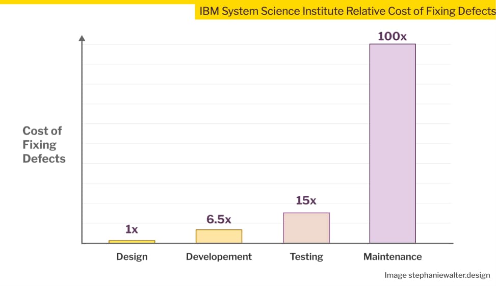
An IBM study on the relative cost of fixing defects shows exactly what happens when you wait:
- Fixing a problem during development costs 6.5 times more than catching it in the design phase.
- Wait until testing, and it’s 15 times more.
- Fix it after launch, during maintenance, and it’s 100 times more expensive.
Accessibility is not a defect in itself, yes. But, when designers don’t pay attention to accessibility, they can introduce a lot of problems in their mockups with bad design decisions: dad contrast, missing labels, poor hierarchy. When designers don’t catch them early, those become defects and bugs that developers inherit and have to fix later. And late fixes are expensive.
If you need more data: Deque has a study on how 67% of accessibility issues originate in design
The strategy: accessibility is a shared responsibility
Make accessibility a shared responsibility. Add clear checkpoints at each phase of the workflow. Here is how each role can contribute:
- Product and project managers can define accessibility requirements at project level. They can make accessibility part of the definition of done in an agile environment.
- UX researchers and UI designers can involve disabled people in research and usability testing. They can check for accessibility issues in mockups and fix them early.
- Developers ensure the technical accessibility of pages and components.
- UX writers and SEO specialists can help with accessible content, heading levels, and alternative text.
- QA testers can check that pages and components work with assistive technologies.
Accessibility is a team effort. It doesn’t belong to one role.
“Accessibility will slow designers down.”
People will claim things like “Accessible design means more documentation work for designers, we don’t have time” I think it’s actually the opposite.
The re-frame: documenting design & accessibility decisions brings clarity
Clear documentation actually prevents misunderstandings. It avoids reworks and saves time in the long run.
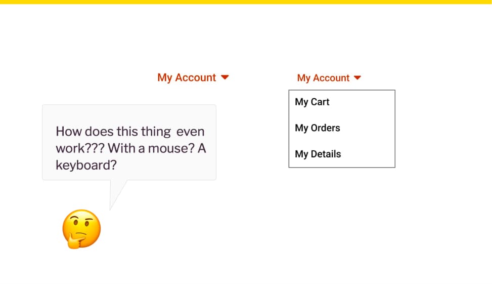
Think about what happens without it. Let’s take an example of a complex dropdown component. Developers often get minimal documentation: here’s the component, in 2 states, closed, open, done. They wonder: How does this thing even work??? With a mouse? A keyboard? What happens when you hover an element? How do you open a sub element with a keyboard? Not documenting doesn’t save time. It just moves the work to the next person. And might create confusion and misunderstanding along the way.
On a personal note, forcing myself into documenting design decisions, interactions and complex components also helps me build better ones. Often, I imagine something high level. But, when I actually dig into building interaction flow, I sometimes discover my first ideas won’t work. It pushes me into iterating more, to ensure my components actually work. It might take a little bit of my time while I design, but it avoid sending back broken components to the design phase.
The strategy: have conversations to align people
Designers don’t need to document everything. That’s not realistic. What we do need is to sit down with developers and talk through the requirements. The documentation is the result of that conversation. Not a one-way handoff.
What to do? Put designers and developers around the same table. That table can be a Figma file, a Zoom call, a Jira ticket. Whatever your team uses to communicate. The goal is a shared understanding of how complex components work. Accessibility included.
For more on the topic, check an interesting reflection on why an annotation kit won’t solve all your accessibility problems by Eric Bailey.
“Accessibility is too expensive, not worth the cost.”
People will claim things like “We don’t have the budget right now.” Sometimes they drop the “right now” entirely, going “We don’t have the budget”. Period.
The data: the potential revenue lost of by excluding some users. 
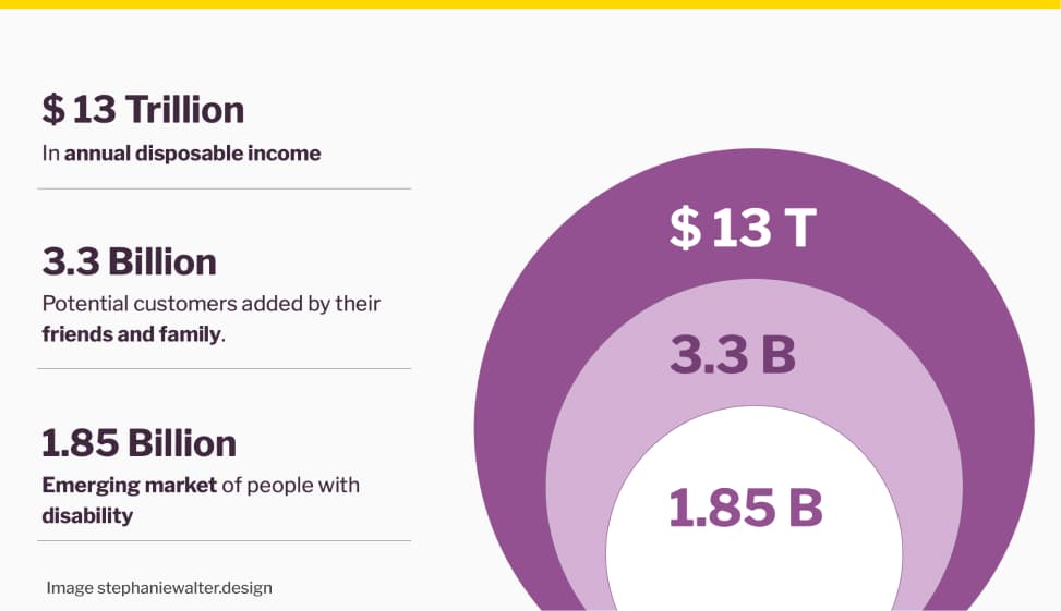
Let’s again talk numbers, from The 2020 Return On Disability Report, because stakeholders love numbers.
- Around 1.85 billion people worldwide live with a disability. This is an emerging market larger than China.
- Add their friends and family, people who make purchasing decisions based on emotional connection to a disabled person, and you reach 3.3 billion potential customers.
- That’s $13 trillion in annual disposable income, according to the 2020 Return on Disability report.
You are losing potential revenue by excluding these users. Accessibility opens new markets.
The re frame: inaccessible websites cost you revenues
So, there’s also a giant market you are missing on because your product or website is inaccessible. And also, fixing accessibility later in the project is what actually costs a lot of money.
To re-frame this, you might want to ask people: “is accessibility too expensive, or is building an inaccessible product that we need to fix later, while losing potential customers what really costs you money?”.
The strategy
Find out what business KPIs your stakeholders care about. Conversion? Revenue? ROI? Customer acquisition? Connect accessibility to that metric. Speak their language.
For example: if your stakeholders care about ROI of initiatives specifically, bring this Forrester Research study from 2022. It showed that every $1 invested in web accessibility and UX brings back $100. That’s a 99% return on investment.
“It’s not our priority now. We’ll fix it later.”
“We need to launch. We’ll fix accessibility next quarter. Next release. If someone complains.” I’ve heard this so many times. And every time, “later” never comes.
The re-frame: you can’t sprinkle eggs on the cupcake after baking it!
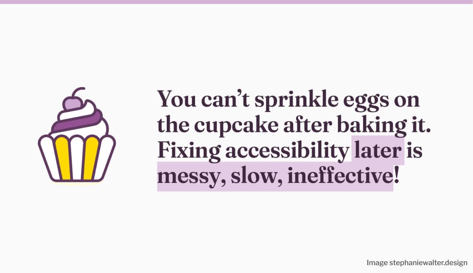
Let me get one thing straight: you can’t sprinkle the eggs on the cupcake after baking it. The cupcake will crumble. This is exactly what we’re trying to do when we push accessibility to the end of a project. Fixing accessibility later is messy, slow, and ineffective.
Maybe you can’t convince stakeholders with a cupcake analogy. Here’s another one that tends to bring some impact: You wouldn’t fix security later. So why skip accessibility? Treat accessibility like security: non-negotiable from day one.
The legal risk of not fixing accessibility
Also, this “Later” can become very expensive. And very public. Let me bring you a few real examples, to convince people.
In 2019, a blind user sued Beyoncé under the Americans with Disabilities Act. Her website had no alternative text on images. The lawsuit claimed the site prevented visually impaired people from learning about tours, buying tickets, and accessing merchandise. Yup, even being Queen B doesn’t give you a free pass when it comes to accessibility!
An overlay solution won’t save you from a lawsuit either. An e-commerce company selling glasses thought it would. They installed an overlay on top of their inaccessible site, but a blind user still couldn’t access it. They sued. During the case, an accessibility expert documented all the barriers that remained, even with the overlay running. The company settled. They had three years to rebuild their accessibility strategy from scratch. Check The ADA lawsuit settlement involving an accessibility overlay by Sheri Byrne-Haber for full details.
And if you are in Europe: the European Accessibility Act came into force in June 2025. This is no longer just for the public sector. E-commerce websites, online banking, telecom services, transport ticketing, streaming platforms, and video-on-demand services are all required to be accessible. Products like smartphones, ATMs, and e-readers too. If your service is based outside Europe but sells to European customers, it still applies to you.
And if you need resources on the EAA, here you go:
- The European Accessibility Act: what businesses and app developers need to know
- Understanding the European Accessibility Act (EAA)
- The European Accessibility Act for websites and apps
- European Accessibility Act (EAA): Top 20 Key Questions Answered
The strategy: re-frame accessibility as a risk management strategy
Re-frame accessibility as risk management. You wouldn’t skip security testing before launch. You wouldn’t ship something with known vulnerabilities and hope no one notices. So why treat accessibility differently?
Including accessibility from the start is a proactive risk management strategy. Fixing issues before a lawsuit or a public backlash is always cheaper and safer than reacting after. Don’t wait for a lost customer or a legal notice to make it a priority, start embedding it early in the project.
And remember: legal compliance is the floor, not the ceiling. The goal is to bring a great UX for everyone. Accessibility isn’t just about compliance, it’s about dignity.
Design and Complexity Myths
The last category of pushbacks I want to talk about is linked to design and complexity myths. These ones are close to my heart, because they hit designers specifically.
“Accessibility ruins creativity.”
People claim things like “We can’t innovate anymore. It will make everything look the same. Accessibility kills creativity.” I could retire if I had a euro for every time I heard that one.
The re-frame: constraints are part of the design process
We already accept usability constraints as part of our job. We also accept technical constraints. Accessibility constraints are no different. Constraints are part of design. And accessibility constraints can actually inspire better solutions for everyone.
When accessibility drives innovation
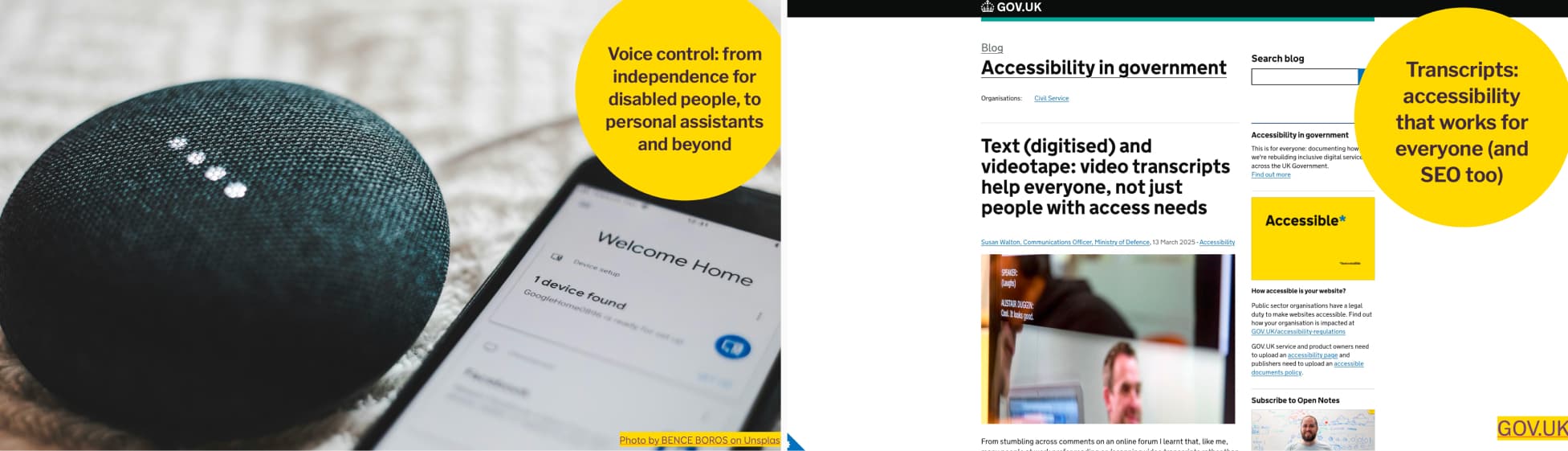
Two examples: voice control, from independence for disabled people, to personal assistants and beyond. And transcripts: accessibility that works for everyone (and SEO too).
Let me give you two examples of innovations that were designed and developed for disabled people, that reached the general population: voice control and video transcripts.
We take voice control for granted now. But did you know it was originally developed for users with mobility impairments, so they could control their devices without a keyboard or mouse? The technology improved. Big tech saw broader potential. That same innovation became the foundation for Siri, Alexa, and Google Assistant. We went from a tool for independence to a technology everyone uses daily. More on this topic: the Dictation Software section of Disability Pride Month: The Origins of Assistive Technology.
Another example: video transcripts. The UK Ministry of Defence added them to help colleagues with disabilities. They quickly became a favorite for everyone. Staff used them to skim content, save time, copy information, or avoid wearing headsets.
What started as an accessibility feature became a usability boost, and even helped with SEO.
The strategy: accessibility as an opportunity to challenge people
Don’t present accessibility as a constraint. Present it as a way to challenge people to think of innovative solutions. A creative brief. Ask your team: how can we solve this in a way that works for everyone? The answer might end up benefiting a lot more people than expected.
“We need to prioritize brand identity over accessibility.”
I’ve been in situations where people would claim “the yellow is not accessible. Branding will never allow changing colors”. We spend soooo much time discussing and validating colors in certain places, that the idea of just adapting them, brings fear to people.
The re-frame: you are not changing, you are improving the brand identity
First we need to understand and acknowledge the fear. In some organizations, people spent so much time discussing and validating colors, that the idea of changing them, again, brings fear to their heart. This is where psychology and a language shift can help: re-frame this, from “we need to change some colors, to ensure sufficient contrast” to “we are improving the brand to adapt it for an accessible digital usage”. There is a big difference. Usually, small changes perceived as improvements are easier to accept.
Bring good examples of accessible branding
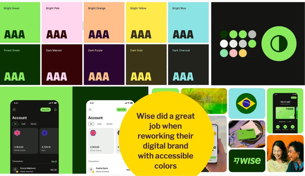
Wise did a great job when reworking their digital brand with accessible colors
Hard data is tricky here. But real-world examples work just as well.
Wise reworked their digital brand with accessibility in mind. They built a color palette with bright green, pastel pink, pastel peach, yellow, and light blue. The combinations work nicely. And they made it work across their app, logo, and all brand touchpoints. The result kills the myth that yellow and pastels can’t be accessible. It’s not about specific colors. It’s about how you combine them to ensure the right contrast.
If you want more yellow examples, The Grenoble Metropole‘s website has a very high accessibility grade, and they do use yellow as the primary color.
And on the very specific topic of “yellow is not accessible”, I wrote an article about exactly that: Yellow, Purple, and the Myth of “Accessibility Limits Color Palettes”
The strategy: we don’t change, we improve
When you hit this wall, re-frame the conversation. You’re not changing the brand. You’re improving it for a better digital usage. You didn’t change the colors, you “expanded the palette and design tokens for an accessible digital use”. That’s not a threat to brand identity.. That’s brand maturity. You helped the brand evolve into a multi-And yes, I’m not a big fan of marketing jargon either. But sometimes, you need to speak the same language, for people to understand you.
You can start with the proposal of a parallel accessible palette with design tokens that will only be used for the web. You can also show examples like Wise. Make it feel like progress, not a threat.
“Accessibility is overwhelming.”
“It’s just too complex. There are too many rules. Too much to do. We don’t have the expertise and don’t know where to start.” This one is hard, because honestly, I get it. It can feel overwhelming, especially if you’re starting from scratch.
The re-frame: accept you can’t fix everything at one
It’s hard to accept, but you can’t fix everything at once. And that’s okay. Focus on progress, not perfection. Start small. Build on top of that.
The strategy
Here is the thing: you don’t need a top-down mandate to start. As a designer, you are already in a position to bring change from the bottom up. You can start a grassroots movement. And let it grow. And that’s exactly what the last part is about.
Designers, YOU can start an accessibility grassroots movement
We often think that change needs to come from the top. Leadership buys in. A mandate comes down. Everyone follows. But that’s not the only way it works.
As a designer, you are already in a position to bring change from the bottom up. You don’t need a title. You don’t need a budget. You just need to start.
1. Start Small. Pick one thing you can do tomorrow
Not a hypothetical future tomorrow, but the actual tomorrow. It’s like going to the gym. The hardest part is starting. Once you do one thing, you build on top of it. Here are a few ideas.
Show your team how people use the web with assistive technologies.
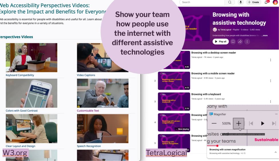
Show your team how people use the internet with different assistive technologies
Go to your team and show them how people navigate your site using only a keyboard, or with a screen reader.
Not there yet? No problem, W3C has Web Accessibility Perspectives videos, short clips that show why different people need keyboard navigation, captions, good contrast, and more. Tetralogical’s YouTube channel has demos of people browsing with assistive technologies like screen magnification. The goal is simple: help your team see real human needs behind the accessibility requirements.
Include people with disabilities in user research.
Include people with disabilities in user research, before you start building anything. When you schedule exploratory interviews or usability testing sessions, actively look for participants with disabilities. Understand the challenges they face in your product before a single pixel is designed.
Resources on the topic:
- Conducting Accessibility User Testing: Expert Insights – The A11Y Collective
- Unlocking Accessibility: User researchers share their approach to digital accessibility and recruiting people with disabilities
- User Research with People with Disabilities
Fix contrast issues in your mockups
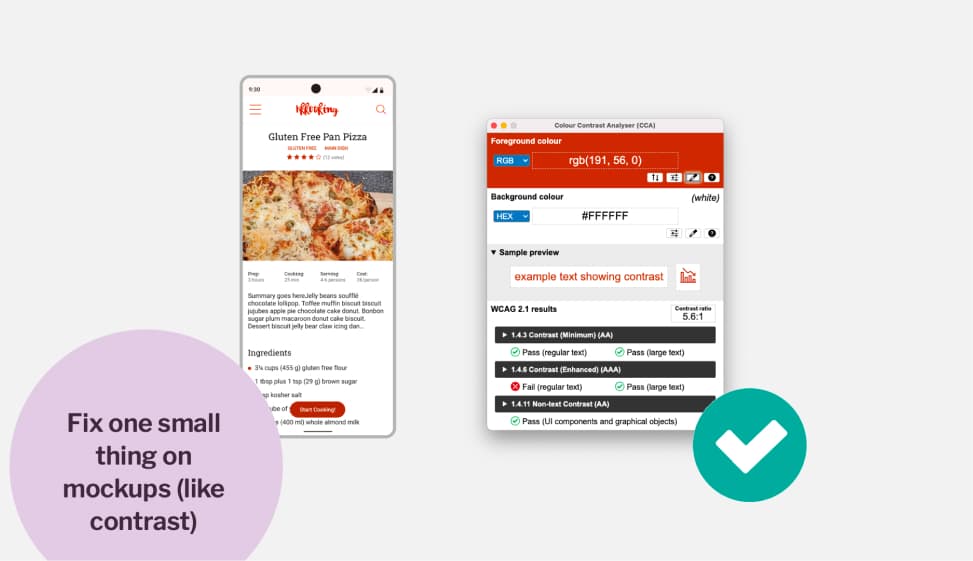
Fix one small thing on mockups (like contrast)
Audit your mockups and pick one thing to fix. Often contrast issues are the first, and easiest to fix. Use a contrast analyser tool to check if your text has enough contrast against its background. If they don’t, change background or text color. Good, one step in the right direction.
If you need help, check my article How to check and document design accessibility in your mockups
Document alternative text for icon-only buttons
While you audit your mockups, check for places where you have buttons with icons but no visible label. Because a screen reader user has no idea what those buttons are supposed to do. Pick one. Document what it should be read by the screen reader (often, it’s the action function of the button, like “Edit”, “Delete”, “Search”, etc.) Tell your developer. Then document the next one. And the next one. Step by step.
Integrate accessibility barriers in user journey maps
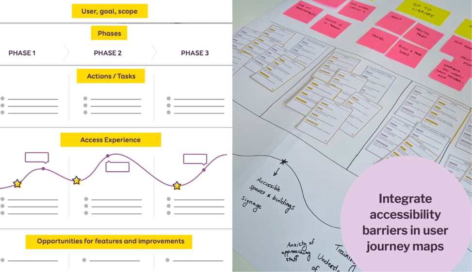
Integrate accessibility barriers in user journey maps
We usually map goals, phases, tasks in journey maps. What if we also mapped the accessibility experience? Where do users with disabilities hit walls?
For example, I ran a workshop with a library, where we mapped all the accessibility barriers students face when borrowing a book, across every touchpoint. Take your existing journey maps. Add the barriers. Make the invisible visible.
If you are interested in such an exercise, I’m available to run a remote or in person version of my new Accessibility User Journey Mapping Workshop. Accessibility is often added after the journey is already mapped. In this hands-on workshop, I will teach designers and project teams how to embed accessibility barriers directly into a user journey maps, across digital, physical, and human touchpoints. You know me, I love cards, so of course I created a dedicated deck of “accessibility barrier cards”. It’s available as a 2-hour intro or a 6-hour applied session, in English and French.
Check out my Accessibility Journey Mapping Workshop
Run a usability testing session with a disabled user.
Include disabled users, when you run usability testing sessions. You could run a session on a specific journey. For example: can someone complete your checkout process using only a keyboard? No mouse. Start to finish. We often test accessibility technically. But do we check if people can actually accomplish a full journey?
2. Build Momentum. Celebrate wins and share progress.
Once you start, don’t keep it to yourself. Share what you did. Make progress visible. Celebrate small milestones, a contrast fix, a first accessible component, a usability test with a disabled participant
Public appreciation builds accessibility champions. It spreads momentum. Other people see it and want to be part of it. Momentum is contagious.
3. Grow the Movement. Slowly increase the pace, add new initiatives.
Once you have some wins, bring in more people. Train them. Add new initiatives. Increase the pace gradually.
But be careful not to burn yourself out. This is the mistake I see most often: people want to start and immediately fix everything, bring in consultants, and launch a full accessibility program. The energy is great. But if you try to grow too fast without those small seeds planted first, you will burn out. Your team will burn out. And the movement dies. This is a marathon, not a sprint. Forty-two kilometers, not a hundred-meter dash. Pace yourself.
Beyond the business case: accessibility is a universal right
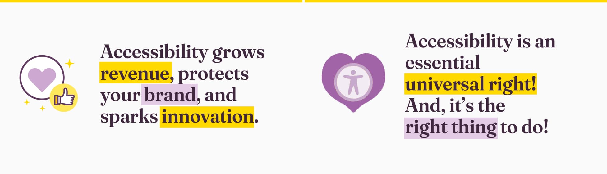
Most of the pushbacks you’ll face can be answered. You now have the tools to do it. When the argument is about money, show the numbers. Accessibility grows revenue. It opens markets. It protects your brand from legal and reputational risk. It sparks innovation that ends up benefiting everyone.
But I also want you to remember this. All the business cases, the ROI figures, the lawsuit examples, those are tools to convince people who need that kind of argument. They are not the reason accessibility matters. Accessibility is a universal right. It’s not a nice-to-have. It’s not a feature for later. It’s about dignity, and it is the right thing to do. It’s about making sure that human can use your products and services, contribute to the web, every day, without barriers.
So go. Pick one thing. Start tomorrow. Build on it. And don’t fight these battles alone.
Also, if you want to present this talk at your company, a meetup, or an event, online or in-person, reach out. I’d love to do it!