Dark mode & accessibility myth
Dark mode isn't always better for accessibility, let users chose!
Let’s talk about dark mode and accessibility! There’s a myth that dark mode is good for accessibility, because it improves text readability (among other things). As always, when it comes to accessibility, it’s not black or white (haha, color pun intended). We can’t really generalize, so, the answer is often, “it depends”, dark mode can make it better for some users, but not all of them. And, if you are going to offer a dark theme, I’ve selected resources on how to make it more accessible at the end of this article.
* article disponible en français également *
Dark mode accessibility myth debunked
Dark mode doesn’t improve readability for everyone
Let’s debunk this myth in a very short “too long, didn’t read”: while dark mode can improve readability for some users, it’s not true for everyone. Dark mode can also make things hard to read for a couple of people, including people with astigmatism, but also, people navigating without a mouse (keyboard users) when the focus indicator is poorly handled, people with dyslexia, etc. (for longer details, check the resources section)
Dark mode or not, give users the choice!
So, do we need to stop dark mode? Not at all. The solution is to give users the choice, if possible, offer the 2 modes and let them choose. Also, don’t force users to follow their operating system settings. Some people are okay with a dark OS, while being not able to read light to dark text (spoiler alert: me). I like what Firefox does in that area: they give you the option to either follow your OS, or, always choose one or the other. This parameter is what the prefers-color-schememedia query uses then, when 2 modes are possible. Same for Gmail too. 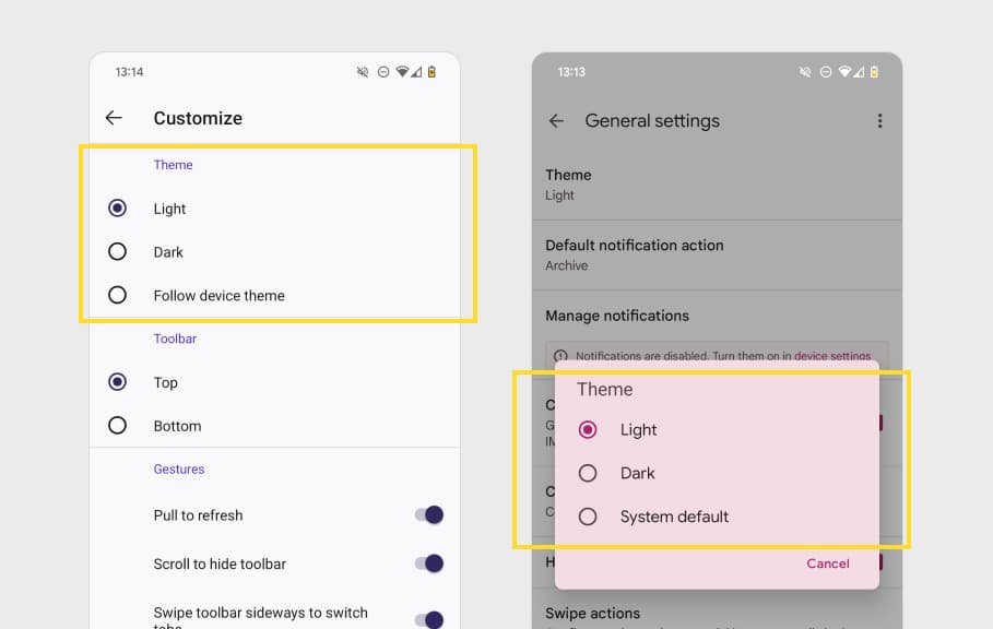
Make your dark theme accessible too!
Last but not least, don’t forget that your dark mode must be accessible too. Here’s a couple of points to not forget:
- Check your color contrast ratios. (You can read my article on the topic on color contrast ratios and tools to help you check those)
- Be careful about the fonts especially bold ones that might bring the halo effect to some people
- Don’t forget to adapt the focus indicator. This is true for dark theme, but also, for any “dark areas” on your site (check my focus indicator that turns white in the dark newsletter area for example)
- Don’t forget to double check the visited links of your dark mode: they are purple by default with poor contrast when used on a dark background (thanks Sheri Byrne-Haber for the reminder!)
Browser workarounds if light / dark mode isn’t an option.
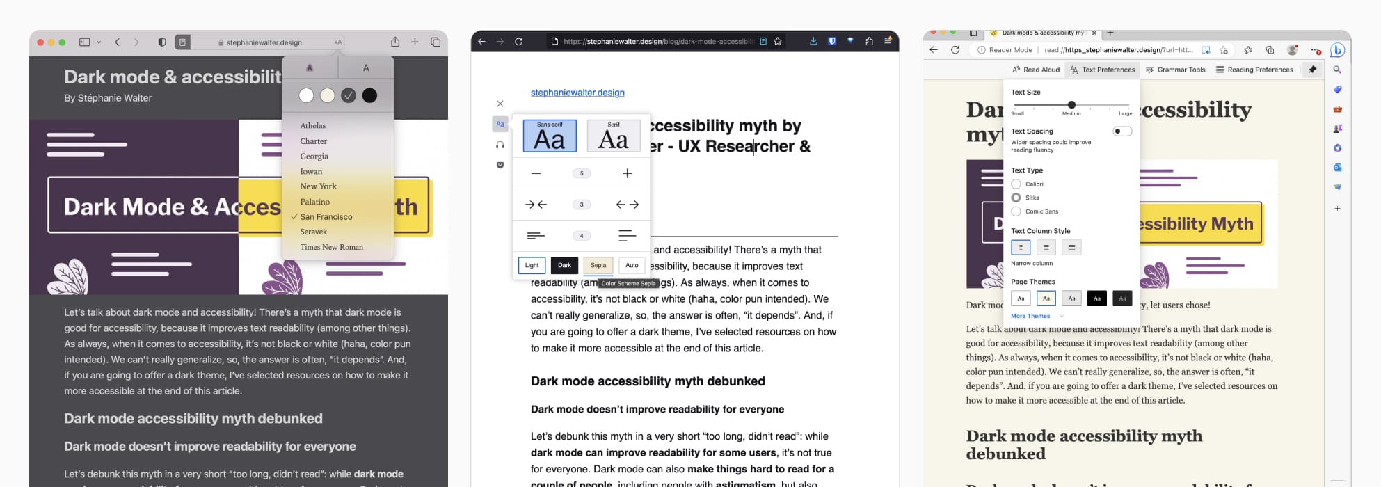
After publishing the first version of this article, I had interesting discussions with people and some asked me how do you deal with it (if you are astigmatic for example) and the site does only offer dark mode. And the same question the other way around: how do you do, if you need a dark theme, because you are photosensitive, and the site only offers a light one. My personal current prefer for reading long text, is Firefox reader mode: it removes all distraction and lets you chose a mode. Also, in my case, most of the times I don’t even read the article, I let Firefox’s screen reader read it aloud to me. Safari and Edge (at least on mac) offer the same thing. Another solution, if you need dark theme, is dark reader, an extension for multiple browsers that lets you force a dark mode on any site. Last but not least, Bramus played with the idea that Dark Mode Toggles Should be a Browser Feature. I’m curious to see where this will lead as well. So, yeah, one size fits all doesn’t exist, and I’m happy there are options for everyone!
Small note translated from a comment from Julie Moynat (accessibility expert) on Mastodon :
“Note that it’s much easier for users to switch a light website that doesn’t offer dark mode, into dark mode, than the opposite. Because extensions to switch from dark to light mode don’t exist. So if only dark mode exists on your website and Firefox’s read mode can’t be activated (it can only be activated on text and sometimes, for certain articles, it doesn’t even work), I’ll close your site straight away.”
Resources to dig further
If you know me, this blog, you know I love to give people resources
Dark mode and accessibility
Here’s a couple of more detailed articles to help you understand better some issues with dark mode and accessibility
- Dark UI themes are new and cool — but are they accessible? Sheri Byrne-Haber, CPACC broke down some claims about dark mode into “definitely true”, “your mileage may vary” and “not really true”, debunking a couple of myths in the process, including electricity saving and text readability improvement.
- Accessibility for People with Astigmatism (on level access, not a fan of them because of their buying an overlay tool, but, the article explains nicely) an explanation on how astigmatism works, and the “halation” that makes light text on a dark background look blurry. It’s especially hard when using pure white on pure black.
- Peering into the accessibility of Dark Mode: how did we get into the dark mode trend, does it really help with readability, when does it help and not help with accessibility, and a little debunk on productivity and sustainability myths around dark mode too.
- Why ‘dark mode’ causes more accessibility issues than it solves: TLDR — dark mode makes astigmatism worse because of halation (see other articles), so, again, put the user in control. There are also a lot of links to different scientific papers at the end that you might want to check out.
Bonus, if you are curious about the history of dark mode, I recommend: A Brief History of “Dark Mode”—From the Matrix-like Displays of the Early ’80s to Today: dark screens used to be a necessity, now they’re a sleek display option. What happened in between?
How to build an accessible dark theme
As I said, if you are going to offer a dark mode, you also need it to build it the right way, and make it accessible. Here are a couple of resources to help:
- Dark Isn’t Just a Mode Steven Hoober wrote a nice article to help you improve your dark modes. TLDNR: it’s about tints, not just “white on dark”.
- Dark mode UI design – 7 best practices skip the intro that has some myths that need to be debunked, go right to the best practice part, that has some nice tips on using colors, elevation, contrasted focus indicator and more, by Ondřej Pešička
- Dark Mode: Best Practices for Accessibility: if you are going to provide a dark mode, this is good advice to make it accessible too (not as easy as you think with contrast ratios)
- Material UI principles for dark theme is another interesting place to help you.
- Dark mode and variable fonts Robin Rendle explores the “white text looks extra bold on dark background” effect, and how to use variable fonts to adjust the weight for dark themes