Designing for Accessibility: Creating Inclusive and User-Centric Products
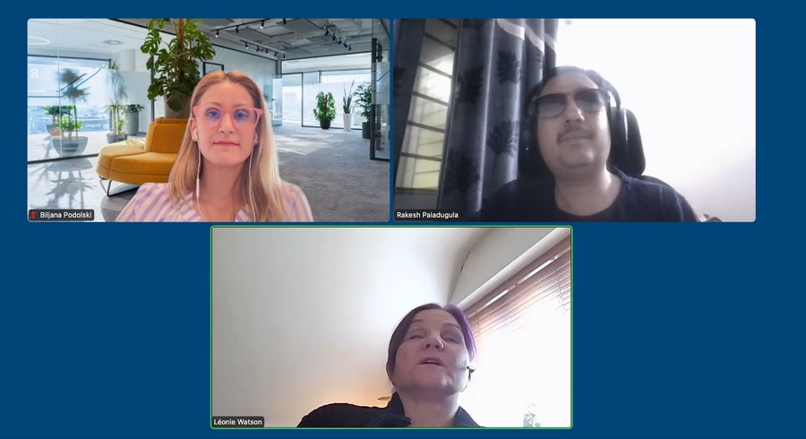
Panel Notes with Léonie Watson and Rakesh Paladugula
In a recent panel discussion organized by HTEC Group, renowned accessibility experts Léonie Watson and Rakesh Paladugula discuss the importance of designing for accessibility and the need for inclusive, user-centric products. They offer pragmatic advice on how to help accessibility become an integral part of design, and not just an afterthought anymore. From keyboard navigation, to the use of colors, ARIA, design documentation and more, they covered what designers need to be aware about to build more inclusive products. I’m sharing with you the notes I took during the session.
What is accessibility to you?
Léonie’s answer: “For me (a blind user who listens to the web instead of seeing it like most people) the accessibility is the freedom to do what I want with the technology, and not what someone else has decided I can do with it, because they didn’t do their job properly. It’s the freedom to choose the tool I want to use, and not being forced into one product because it’s the only accessible one”
Rakesh’s answer: “It is an equal opportunity: if something is available for someone who sees, who hears, I should be able to use and do the same. I might be doing it another way, but I want to be able to use it too”
What do designers need to think about when it comes to accessibility?
Rakesh’s answer:
Accessibility should not be an afterthought: not after production, after development, after design. We need a shift to the left approach. It starts in the design phase. When you start on the design, most accessibility problems can be avoided.
Here are top 5 things to take into account:
- Styleguide colors: figure out (and document) what combinations are working together with sufficient contrast.
- Keyboard navigation: how do you want the applications or sites to be navigated for a keyboard only users? What is the sequence you want? What is the order in which someone will complete a workflow, how will they tab from here to here? Decide the sequence and communicate it to developers, to avoid keyboard challenges that might happen if this wasn’t defined
- Controls: what is kind of control are you creating? Is it a button or a link? Is it interactive or not? How do you want it to be read aloud, or navigated with a keyboard?
- Images: what images convey information in that design? What is their description?
- Roles: what is the hierarchical structure of the page. What is a header? What regions do we have?
Léonie’s answer:
- Make friends with developers: find out what the people building the design do, how they it. Find out about their needs and constraints. “Find a developer, bring them cake, it’s a good way to start a friendship”
- Annotate your designs: “this is how I expect this to work”. Leave as many notes about your expectations, why you designed something the way you did, etc.
- Have handover meetings: don’t just send the prototype over the wall, into the developer and wish them luck. Talk them through the annotations
- Quality insurance: don’t feel that your job is finished once you hand it over to developers. Come back with developers, check if the implemented how you expected it. Aka: collaborate!
What are the technologies disabled people use, that designers should be aware of
Rakesh’s answer:
- Screen readers: those are very sophisticated and important. They should know how it behaves and communicates the information to the users. What does the screen reader take when you create something? What is the information you want to convey to the screen reader.
- Keyboard: thinking about keyboard only users will go a long way to understand the experience of certain users. Screen reader users are keyboard only users too. Keyboard is an assistive technology, but often people don’t think about it like that
- Think about audio capabilities: how do users who can’t hear experience those?
- Check with your computer, what accessibility features there are. Get familiar with them.
Léonie’s answer:
- Take a look at the Tetralogical Youtube Playlist: Browsing with assistive technology
- Also, don’t think about those as tool for disabled people. A lot of non disabled people use them. Siri for example, has an experience close to a screen reader experience, you listen to what she says, you give commands, etc.
- Regarding speech synthesis: a lot of platforms have options, but you don’t have options in the web. We have CSS speech that would bring more nuance. (More on that on Léonie”s article Why we need CSS Speech )
Some people say colors are bad for accessibility. Is it a true statement?
Rakesh’s answer:
- Every color is a good color if you use it properly with the proper contrast
- Be careful about people with colorblindness though, don’t convey information just with colors
Léonie’s answer:
- It’s not A color that is the problem, but that color in combination with other ones.
What standards can someone refer to for A11y
Léonie’s answer:
- WCAG is a good start and some references guidelines
- Look for the standards of the technology you are using: HTML, SVG, ARIA, etc.
- Check ARIA, but be careful, if you do it wrong you can mess up accessibility
- Also, check the Inclusive Design Principles: a set of principles to help you make your sites and products more inclusive
Rakesh’s answer:
- ARIA patterns and design patterns are a good place to better understand what is expected for complex components
- Also, yes, WCAG for sure.
How do you make tooltips accessible to blind and low vision users?
Léonie’s answer: You need to make the button that triggers it accessible. But, I would caution against using them, especially the ones that appear when you hover the element. They can cause issues for screen magnifier users. They might hide part of the page to them. All you could see is the tooltip, but then if you move away you are not looking at that content anymore.
Where would you start, as a designer, when documenting your mockups?
Rakesh’s answer: Keyboard, if you can get that one right, it’s a nice first place.
Léonie’s answer: Focus (keyboard) first, not focus only on that, but, start with keyboard.
Sidenote: If you are interested in documenting accessibility and how to annotate mockups, check my articles and talk A Designer’s Guide to Documenting Accessibility & User Interactions. I also created a checklist of what you need to be careful about, and document. It comes with a Figma, Sketch and Penpot annotation kit: annotation components you can simply drag and drop into you mockups to help with documentation.
Get the Checklist and Annotation kit
Final thoughts
Léonie’s answer: Don’t be afraid of all of this. When I started I remember thinking “in 10 years we will all be doing this because it will be part of education because the world will get it and everybody is aging”. But, this didn’t happen. So, don’t worry, there are a lot of good blog posts. It’s a nice time to learn. Don’t be scared. Start somewhere, and in a couple of months, this will be part of your process. It will be part of what you do.
Rakesh: You can’t boil the ocean in one day, start learning, start doing. Start reading. The target should be “accessibility becomes part of your DNA as a designer”.
Questions from the audience
Any advice on testing tools?
Léonie’s answer:
- Accessibility insights is a good tool
- Tools are not the whole answer though, you can’t automate all testing, they test one third.
- You can do testing for yourself, for example: keyboard testing. (if you want to learn more about quick test, Léonie also recommends the Tetralogical “Quick Accessibility Test” Youtube Playlist)
- Also, you need a human tester
Rakesh’s answer:
- Webaim is good
- He also has interesting videos on testing on his Youtube Channel: Max Ability.
Any books recommendation?
Léonie’s answer: Inclusive design components
What are ARIA labels, and why are they important?
Léonie’s answer: It’s a way to provide an accessible name to an element IF there is not other way to do so. For example, for images, the accessible name is the alternative text, for buttons the content, for fields the actual HTML label. So, they are already other good ways to provide the accessibility name, without using ARIA. You might not even need ARIA for that.
Rakesh: ARIA is a technology and ARIA label is part of this technology. But ARIA labels is one among many properties. Most of those are used for screen reader capabilities: if you only use ARIA, you won’t cover the rest of the needs.
Header image by Sigmund on Unsplash.
Accessibility for Designers – Practical Workshop (remote, June 2025) 
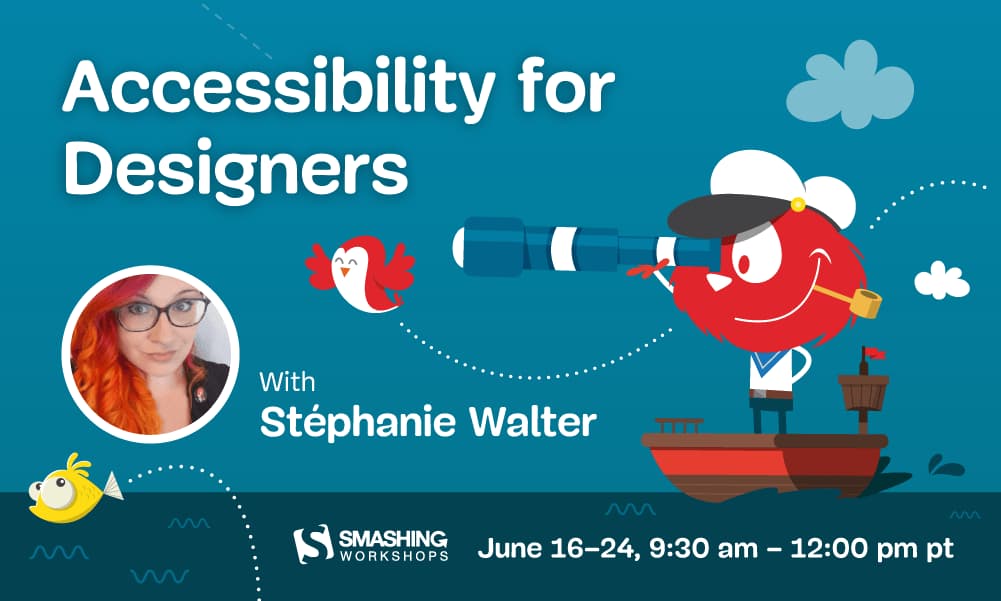
Design mockups that work for everyone, and meet the new European Accessibility Act. In this hands-on workshop, you’ll learn to spot and fix accessibility issues early in your design process. We’ll cover visual design, interactions, navigation, and content, with exercises and real examples.
Includes checklists, annotation kits, and practical tools you can use right away.
- When: June 16, 17, 23, 24 – 4 sessions (2h + Q&A)
- Time: 9:30–12:00 PT / 18:30–21:00 CET
- Price: $300, $255 with 15% off with my coupon link