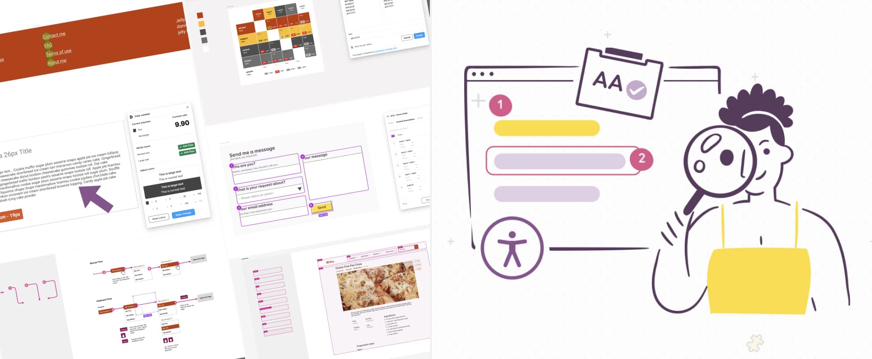
How to check and document design accessibility in your mockups
Using Figma plugins and annotation kits.
A lot of accessibility issues can be already foreseen and prevented in the design phase. Save time checking and documenting accessibility in Figma mockups with practical tips and a list of selected tools, plugins, and templates! In this article, I will cover color usage, contrast ratios, text resizing, font legibility, target sizes, form elements, focus order, complex components keyboard interactions, skip links, headings, landmarks, and alternative text for images. You can also jump to the list of tools and plugins directly.
The plugins in here are focused on Figma, but, the methods can be used with any other designer tool. This article is a text version of my slides for a Friends of Figma event.
Checking color usage in the mockups
You want to help all users distinguish the content. And for this, the first color rule, is to make sure color is not the only visual way to convey information.
How to check color only usage
This is a manual check to do in the mockups. Look for elements, where the information is only conveyed by color. (WCAG Criteria: Understanding Success Criterion 1.4.1: Use of Color)
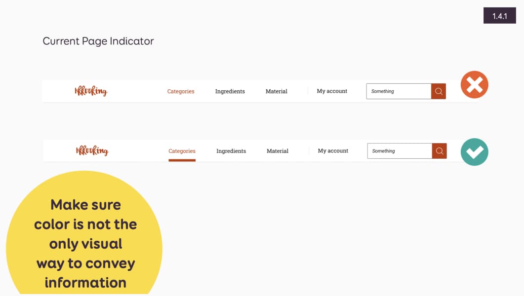
For example: I have a navigation and the active element is only conveyed by the color change to orange. This is not enough, I need to find a secondary way to provide the information. For example: a small border un it.
Checking color contrast issues
There are 2 areas you need to check: text, and non text elements. Let’s start with text.
The contrast ratios rules for text element
Here’s the 1.4.3 WCAG rules simplified. For text, you need:
- 4.5:1 between text and background for text (strictly) smaller than 24px, or 19px bold
- 3:1 between text and background for text larger than (or equal to) 24px, or 19px bold
I will not go into too many details here, instead, I will let you check Color accessibility: tools and resources to help you design inclusive products.
How to check text contrast
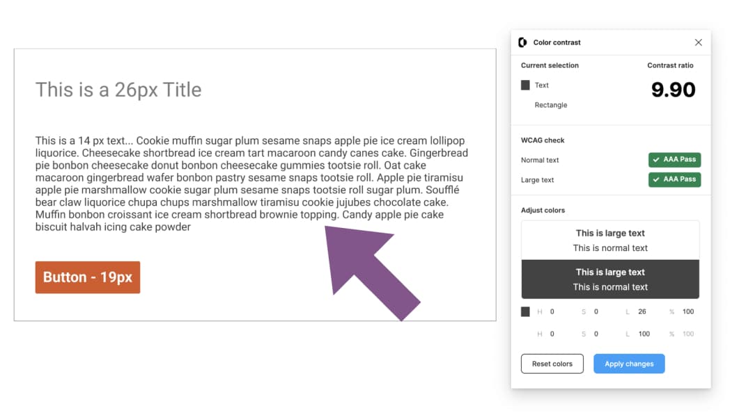
This can be a manual check in your mockups, most of the time with a color contrast tool. Pick the text color, the background color and check the result the tool gives you against the WCAG contrast result. Compare it to the criterion rules.
If it doesn’t pass, change either text or background.
If you need more information, check Tips to Create an Accessible and Contrasted Color Palette.
Color contrast tools
I’ve always been very happy with CCA, Color Contrast Analyser. You can install it on Windows, Mac. I like that it lets you check. If you use Figma, I’ve listed a couple of plugins that can help here:
- Color Contrast (offer suggestions and / or let me directly tweak the colors from the tool to find the perfect contrast)
- Figma Contrast (no suggestions but lets you check 3:1 rule for graphics)
- Stark (suggestions and a picker)
For the color tweaking (aka finding a color similar to the one you need with sufficient contrast) I like Color review. Note that CCA has also an option to play with colors using sliders.
There are automated checker, but, I’m going to be honest with you: most rely on layer position. So, even if they help, I would still do manual checks
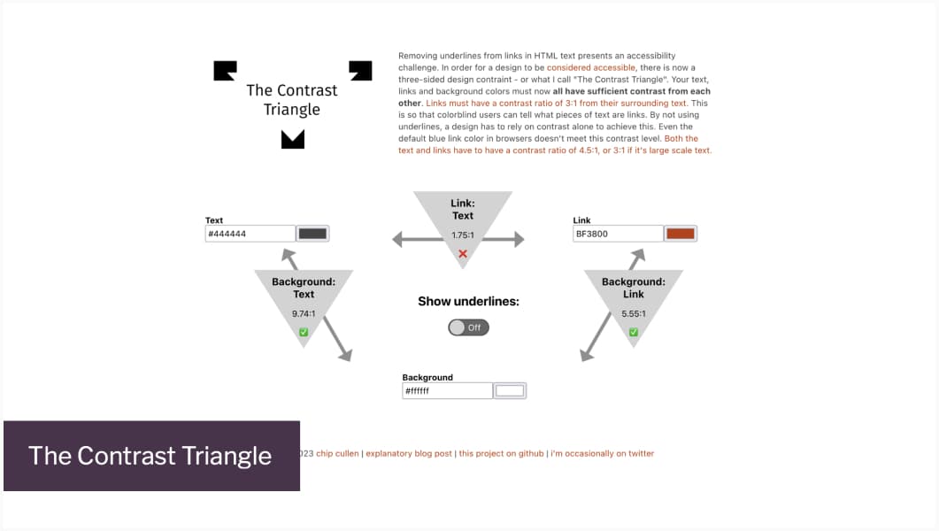
The double rule for links
So, for links, it’s a double rule to check.
- Check that color is not the only way to identify a link in a block of text from its surrounding.
- If the color is the only way to identify it (no underline), it must have a 3:1 contrast ratio with adjacent non link text (and provide additional visual cues on hover)
- Also don’t forget the link needs to have a contrast ratio of 4.5:1 with its background
To help you, you can use The Contrast Triangle.
The contrast ratios rules for non-text elements.
You also need to check non text elements. This is 1.4.11: Non-text Contrast criterion, and I think it’s one of the trickiest. I could do a whole article on this (I might). But for now, the short version: graphical objects and user interface components that need to be identified by the user must have a contrast ratio of at least 3:1 with adjacent colors.
This would apply (non exhaustively) to
- User interface components (except for inactive ones and default HTML ones)
- Focus indicator (except if you leave the default browser focus indicator)
- Part of graphic objects required for the user to understand the context, for example, icons that convey information.
The criteria also doesn’t require that controls have boundaries to indicate the hit area. Aka: background / button borders for instance don’t need a 3:1 if the button is easy to identify (by its content for example). Still, having clear boundaries with sufficient contrast is better for usability. So, I would try to get 3:1 when possible, even if it’s not a requirement from WCAG.
So, yeah, this is complex, if you want a bigger list, W3org has a nice table of user interface components where this applies And, to be honest, it can be prone to interpretation in some cases. There’s a whole discussion for example about cards design, and if the criteria applies or not. It really depends, if you can understand the component without the border or not. And if you want to have fun, check the Does it fail 1.4.11 non text contrast quiz.
How to check non text contrast
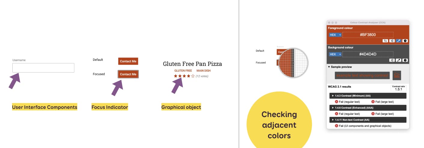
First, ask yourself: does this need to pass the criteria. There are a lot of exceptions. If it does, then, you need to check the “adjacent” colors. Often, adjacent refers to the component / graphic object and its background. But, if there’s a border ( in the case of a focus indicator), you need to actually check the pixels adjacent.
For example, if you check an input text, and it has a border, you need to check
- The border against the background of the container
- The border against the color inside the input.
This one is hard to automate with a plugin, so, you will need a color picker to manually check this.
I recommend
- CCA, Color Contrast Analyser on any platform.
- Stark if you are in Figma (the only color contrast tool that has a picker from what I’ve seen so far)
Documenting color contrast combinations
For color palettes, if you can, build an accessible color palette from the start.
Then, we can document colors combinations, to let other designers know which colors can be combined together with sufficient contrast ratio and which can’t.
For this, I’m using the contrast grid tool from eight shapes. They also have a Figma Contrast Grid plugin. It builds a matrice that has the same color on horizontal and vertical axis. At the intersection, you can check the contrast ratio of those 2 colors used together.
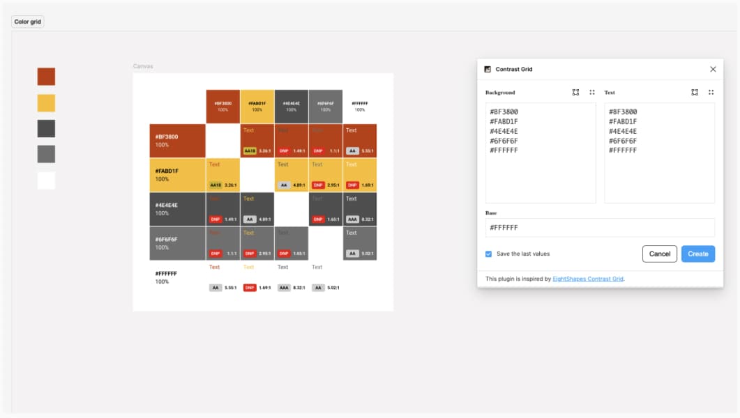
A color matrice that shows the contrast ratio at the intersection of horizontal and vertical axis
Checking for text resizing issues
To pass the 1.4.4 criterion the text content can be enlarged to 200% without hiding elements and missing functionality of the site. This is more of a technical criteria, to be implemented by development teams. But it can be interesting to check how your mockups would adapt at 200%, in order to foreseen possible issues and discuss with developers upfront.
How to check text resizing
Nevertheless, if you want to check what your mockups would look like, with the text enlarged at 200%, there’s 2 Figma plugins you can use
With the Text Reziser, you need to input your current base font. With the Include one, go into the Text Resize option. For both, you shall get a second version of your mockup, with fonts enlarged to 200%.
Usually if you have decent auto-layout, it should create a preview that is quite close to reality.
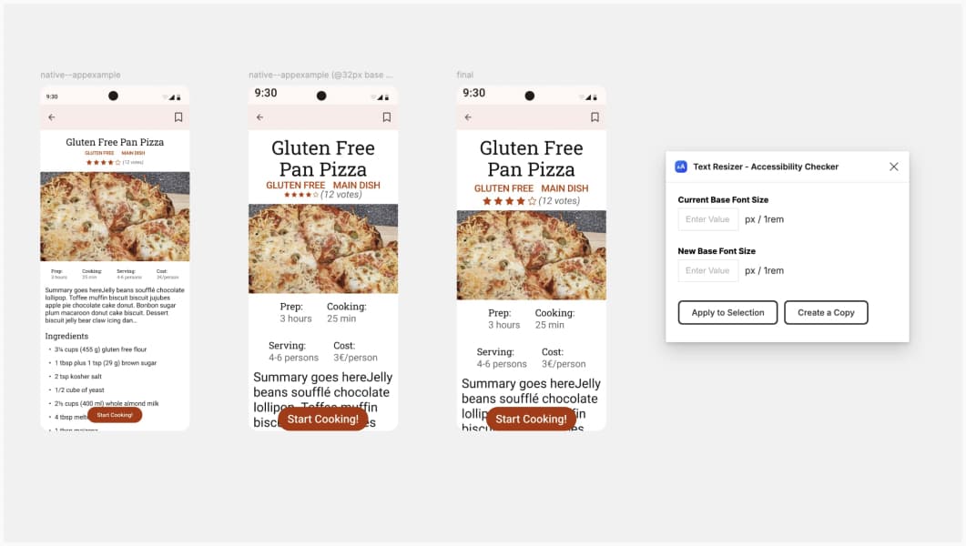 In my example here, I would ask the developer to also adapt the size of the rating stars. Because, this component brings information and needs to be enlarged too. With auto-layout the grid adapted automagically from 4 to 2 columns
Checking font legibility
This is not a WCAG criterion, but it can be interesting to check font legibility before choosing a font for your products. The goal is to identify, if your font has some ambiguous letterforms and glyphs. I usually write “iIlL10oO” and check if the letters look too close. To understand how typography affects accessibility, I also recommend you watch Designing Accessible Typefaces with Eleni Beveratou (youtube video)
How to check font legibility
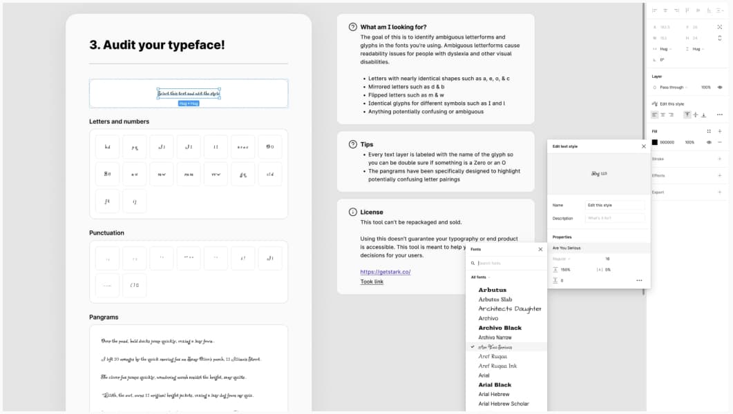
Stark and Tregg Frank created a very nice Letter Checker Template to help you with that. Go to the template, to the “audit your typeface” part. Get the Style, and edit if with the font you want to use. Then check the different glyphs combinations and look for ambiguity.
Documenting using my Figma accessibility documentation components
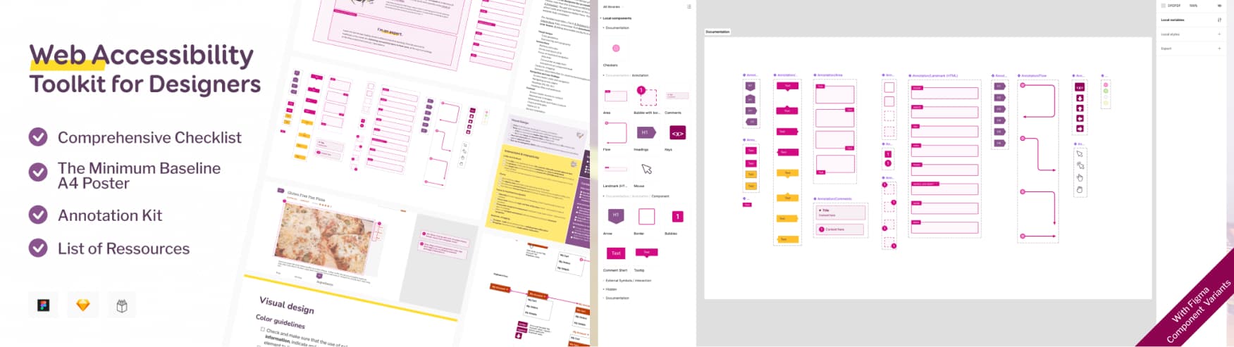
I’ve been testing a couple of Figma plugins to document, but often, find them either overkill (you end up with tones of noise), hard to use, or not complete. In the end, I mostly use my own components. They are part of my Web Accessibility Toolkit for Designer, that includes a big annotation kit for Figma, but also Sketch and Penpot. The kit also includes checklists and list of resources that should help with checking and documenting accessibility. Use the coupon “FOF24” for 15% on all the accessibility ressources until August 10, 2024.
Get the Checklist and Annotation kit
I’v also created Mobile Accessibility Toolkit for Designers
Checking for target size 24 px
WCAG 2.2 introduced a new 2.5.8 target size minimum criteria. The goal here: making sure people can easily hit a target, without hitting another one by mistake.
So, you want to check that the size of a clickable / tappable area is at least 24×24 CSS pixels. If it’s not 24px, you can use spacing to reach this “24px”. Please note that this doesn’t apply to links in blocks of text.
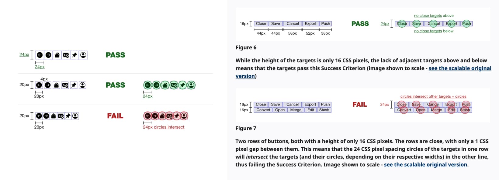
It’s easier to understand with the illustration from W3C. Basically: if your target (for a button for example) isn’t 24x24px minimum, but, let’s say 20px, and you have 4px spacing around, it works. The fun part: even if it might pass with 1 line of buttons, as soon as you have more lines (someone added a button, or screen gets smaller and buttons wrap on 2 lines), you might get into trouble.
How to check target size 24px
The official way to check this is “drawing a 24 CSS pixel diameter circle over the undersized target, centered on the target’s bounding box”. So, I’ve created a small “target checker” in my Accessibility annotation kit. It’s a 24x24px semi transparent circle (that comes in different colors).
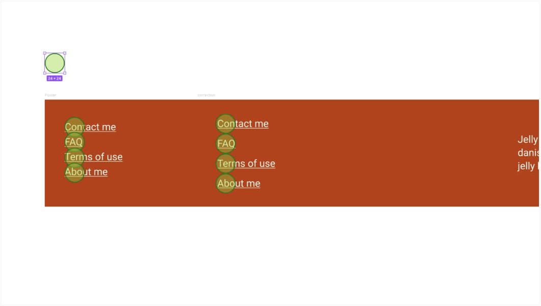
On the first example it overlaps so doesn’t pass. Adding spacing stops the overlap and the second version passes the criterion.
I’m putting the circle on the list of links, if it overlaps, it means I either
- I need to make the target bigger (the case of buttons for example)
- Or get more spacing between
Documenting form elements
There’s a lot of A and AA WCAG criterion around forms:
- 3.3.1 Error Identification
- 3.3.2 Labels or Instructions
- 3.3.3 Error Suggestion
- 3.3.4 Error Prevention (Legal, Financial, Data)
- 3.3.6 Error Prevention (All)
- 3.3.7 Redundant Entry
- 3.3.8 Accessible Authentication (Minimum)
We could summarize it like that:
- Each field has a label
- The label is clear and helps understand how to fill the field
- Help users prevent errors (expected format, instructions, mandatory fields, etc.)
- Help to recover from errors (errors are marked, clear messages, etc.)
- Avoid redundant entries: don’t make users input the same information twice
What to do?
Designers can help make forms better, by documenting beyond the happy path. Which means: documenting error cases, documenting error messages, documenting instructions, marking mandatory fields, etc.
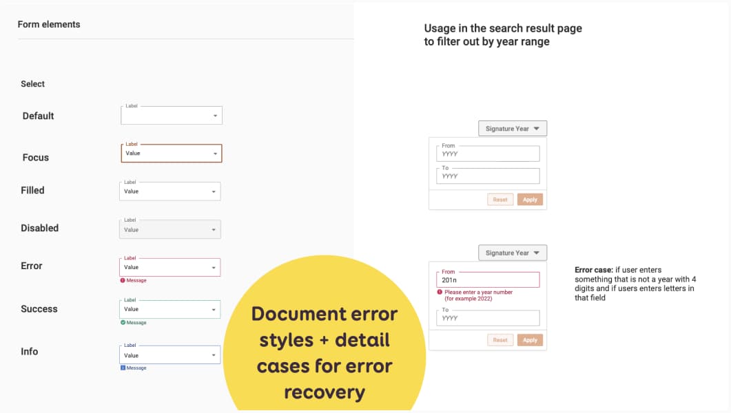
I usually have 2 levels of documentation:
- At design system level, I have “generic component” documentation, that would for example show all the statuses (including error, success, info) for my form elements
- When the element is used in a page, I usually document the real error message, etc.
Documenting skip links and focus order
Some users will navigate using keyboard. Users should have a way to skip repeating content. It’s often called “skip links”. Check 2.4.1: Bypass Blocks for more information. This would be a link, that sends the user the main content. It’s the first link in the page. It’s often hidden by default and gets shown on focus (or read by screen reader)
How to document skip links
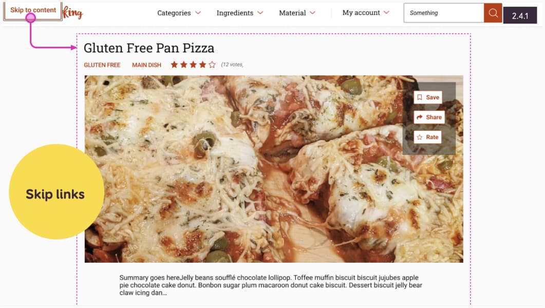
Designers can mostly design that link
- Where is the link (often top left corner)
- What does it look like when it’s focused
- Where does it send users
Documenting focus order
For someone navigating using a keyboard (or a screen reader), the focus order is very important. It should follow the logical order of the page. Users should not be trapped, and if an element is interactive, it should get a focus (this is more for developers). Focused elements should also have a clear focus indicator (but that’s something you checked in the color section). Check 2.4.3: Focus Order for more details.
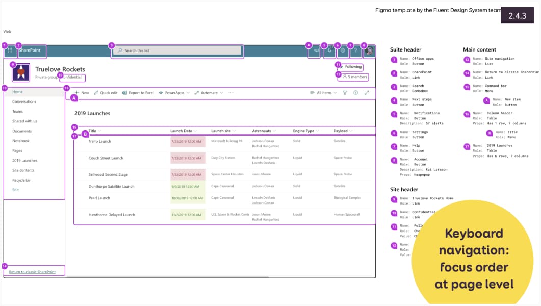
Here’s an example from the Microsoft Fluent that showed the focus order on a complex SharePoint page.
How to document focus order
The Microsoft Team created a very nice plugin to help you document focus order: A11y – Focus Order
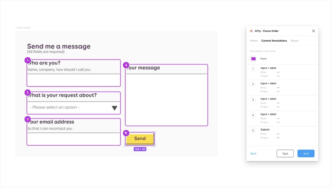
To use this plugin:
- You give a name to your annotation
- You select the first focused item, it gets the number 1
- Then you select the next, and the next, the numbering is automatic.
- If you made a mistake, you can re-order them in the plugin
If you don’t have Figma, you can use my annotation template. It has a component with the number, exactly for such cases.
Documenting complex component interactions & alternatives for complex movements
Users should be able to navigate and interact with all components using different pointing and interaction devices (mouse, keyboard, etc.).
This means a couple of things
- For any interaction that can be done with a mouse, you also need a way to do the same, with keyboard only (check 2.1.1 Keyboard)
- You need alternatives for multipoint or path based gestures (check 2.5.1 Pointer Gestures for details)
- You need single pointer movement alternative for drag and drop (check 2.5.7 Dragging Movements)
As a designer, here, your role is to make sure to provide those alternate keyboard paths, and gestures when needed.
How to document keyboard implementation
I use something I call “interaction flows” to document how a component should work. This is documented with mouse interactions. But also, with keyboard interactions.
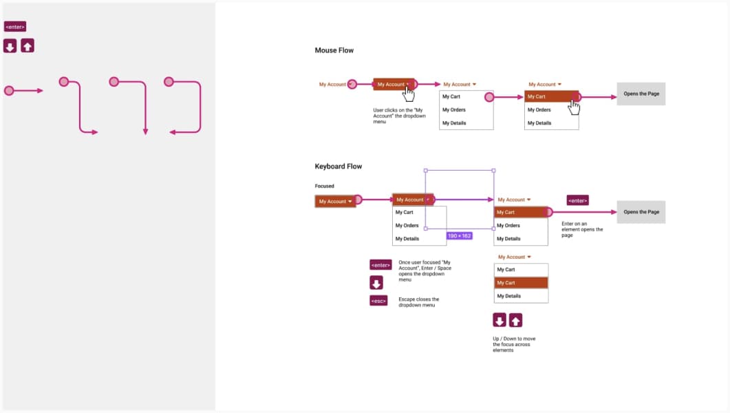
How do I build that? I start with mouse interaction:
- Start with the default component
- Add the end of the flow state
- Fill the in-betweens: what happens to go from the default to the final state
- Any specific states (hover, selected)?
Then, I document would someone navigate it with a keyboard?
- How do you activate / open the component?
- How do you close the component?
- How do you navigate across the elements (focuses state)?
- How do you activate / select specific elements?
- How do you validation / activate the input?
Again, for this, I’m using my annotation kit. But you can create your own components, of course.
Examples on how to document alternatives for gestures, drag and drop.
Here again, there’s not a big secret. If I want alternatives, you will need to design them. And document them.
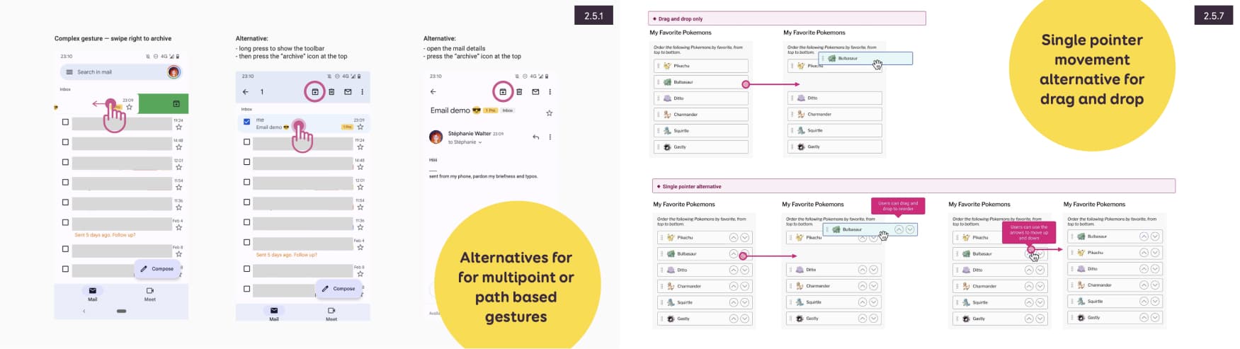
An example for an alternative for a path based gesture (swiping on an email). And for a drag and drop re-order alternative working with single pointer.
Documenting heading levels
Good information architecture follows accessibility best practices and makes content easily navigable. For headings, there are a couple of things you need to be careful about:
- The label of the heading is descriptive, clear and accurately describes the content that follows it.
- Don’t use paragraphs with bigger font, use Hns instead.
- Don’t use illogical order
How to document headings
You could document the heading levels directly on the mockups to help developers understand what is expected. For example:
- What is supposed to be a heading (and by comparison, what text is just big text without being a heading, for example, the big NEUROSPICY in the footer of neurospicy.agency which is not a heading, just pure visual big text for the visual aspect of it).
- If it’s a heading, what level is expected?
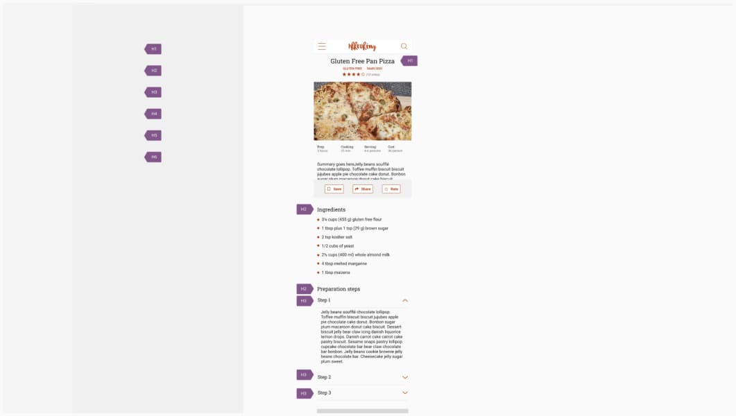
For this, you guessed it, I’m again using my annotation kit. I added special components for the headings.
Documenting landmark regions
You see the Eiffel Tower you know you are in Paris, right? On the web, a landmark does this job. It lets people orientate on the page, for example header, footer, main content. Those ensure screen reader users understand the structure of the page and orientate in it. (check 1.3.1: Info and Relationships for more information).
How to document main mockup area
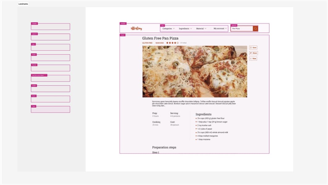
I’m not 100% sure it’s the role of the designer here to document precisely landmarks. But, as a designer, we know our design intent. We know what areas in the mockup
- In my annotation kit, I’ve created the main areas as symbols you can drag and drop. I’m using HTML tag names such as nav, header, search, main, footer, section, etc for this. Mostly because I think it’s easier for designer to understand those, than their ARIA equivalents. And also, because, ARIA rule number 1 is to not use ARIA when you can get an HTML element instead.
- In the Include—Accessibility Annotations plugin, you have a section dedicated to landmarks. It will document the technical name of the ARIA landmarks instead. Which means that, if you don’t know much about ARIA, it might be tricker to guess which is the footer one (hint: it’s the contentinfo)
Providing alternative text for images, when needed
If information is presented in non text format, such as an image, users need a text alternative (also known as alt text). I won’t go into the details of when you require an alternative text or not, but will try to summarize the main guidelines. For more information, please reference back to 1.1.1: Non-text Content and check Images Tutorial from the W3C.
When you need an alternative text (very high level summary)
- For informative images: images that represent concept, information, you should describe the intent
- Functional images, when you replaced a text label by an image (for example, you have an icon of a magnifying glasses instead of a search label), you should put the label that was replaced in the alternative
- If you have an image with text in it, you should put the text in the alternative
- Complex images such as graphs, charts should have an alternative text that conveys the information
Decorative images don’t need alternative text, but still need a alt=””
How to document alternative text
There’s 2 things I would document:
- If an image requires an alternative text, I would document what should be read by the screen reader.
- If an image doesn’t require it, I would document that fact that this one is decorative and screen reader should not read it.
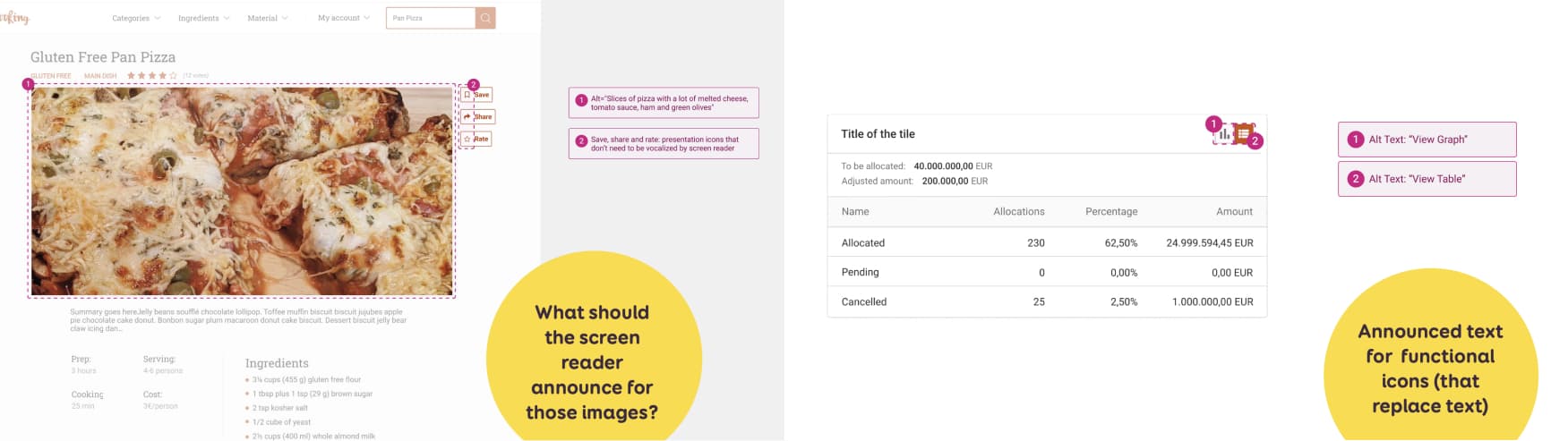
I’ll be honest: I’ve tested a couple of plugins that let you annotate alternative texts. I haven’t found one I like. Some of them are very cumbersome to use. Some document alt text, but tones of other things around. Which brings noise to the mockup. So, for now, I’m again doing this manually, using my annotation kit with 2 components: the bubbles to show where the image is, and the annotation comment in the margin on the right, for the details.
Providing alternative for media
Media, such as video and audio also need alternatives. For me, it’s the job of the designer to know about that, and push for it to happen. Of course, you are not the one who will write the transcript for a podcast. But, as a designer it’s your job to provide a way (button, link) and a place to access an alternative.
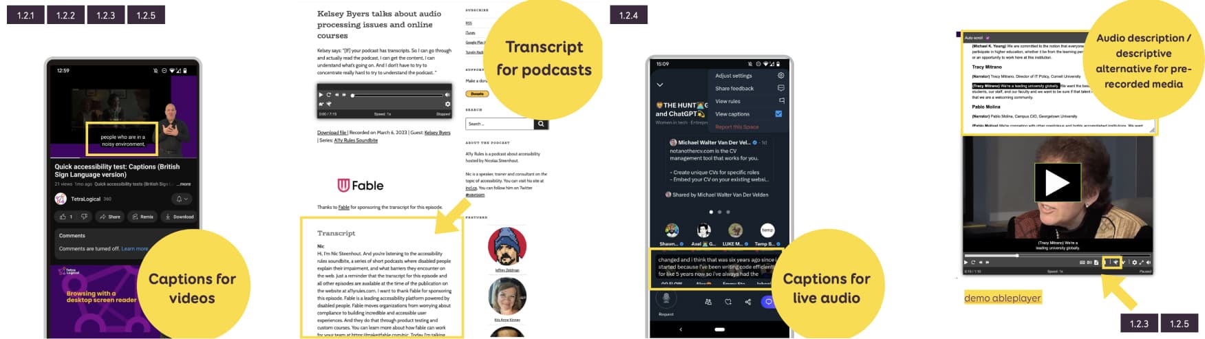
Examples include things like:
- A button for captions if you design a video player, and a place on the screen for those
- An area, under a podcast player, for the transcript. Or, a button, to access the transcript
Final note on annotation kits / design documentation and their limits
Eric Bailey wrote Accessibility annotation kits only annotate, an excellent article on how annotation kits can be a useful tool for communicating intent about how an interface should be operated. But, they might also cause more harm when misused, where they fall short and how to overcome the limits. So, please, if you are unsure about something, how something should work, check with some accessibility expert. You don’t want to document something that will bring more confusion in the process, and might make accessibility worse.
I totally agree that putting all the accessibility considerations on designers doesn’t seem fair. It should be a team work, and we need more ways to bridge the designer/dev gap.
Video version of the talk
You can check the video of the talk above, or direclty on YouTube
All the plugins and tools in this article
Color tools and plugins:
- CCA, Color Contrast Analyser (stand-alone mac, win)
- Color Contrast Figma (offer suggestions and / or let me directly tweak the colors from the tool to find the perfect contrast)
- Figma Contrast (no suggestions but lets you check 3:1 rule for graphics)
- Stark in Figma (suggestions and a picker)
- The Contrast Triangle
- Color review (website)
- Contrast grid tool (website) and Figma Contrast Grid plugin
Font
Focus order: A11y – Focus Order | Figma
Documentation kit: Web Accessibility Toolkit for Designers (checklist + A4 poster + Figma/Sketch/Penpot annotation kit)