Pixels of the Week – April 10 , 2023
Accessibility annotation plugin, mushroom computers and CSS masking
On Twitter, LinkedIn, and Mastodon, I share curated articles I read, resources and tools about UX Design, User Research, UI and mobile design, HTML, CSS, the web industry, some processes, some inspiration, etc. This is an archive of everything I shared this week. And some extra links that I decided to only share for the blog readers. Also, subscribe to the newsletter to get notified when those are published!
Now: what I’m currently up to
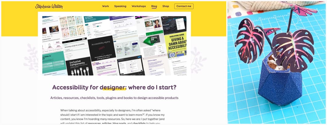
In case you missed it: I put together (and will update) this list of resources, articles, blog posts, and checklists to help you, designers, start building more accessible products: Accessibility for designer: where do I start?. I also updated my Accessibility & Interactions Documentation for Designers Checklist, reworked the structure which means, I will eventually need to update my talk (and article) to reflect those changes. I’m also preparing a “mobile native app” specific version. If you bought it before April 1st, you should have received an email with a link to download the new version! Check your mailbox.
I also finished some mini space monstera paper plants this weekend. It was fun but the glue it not optimal on the iridescent PVC for small pieces, I might need to find a better glue.
TL; DNR: the one you should not miss
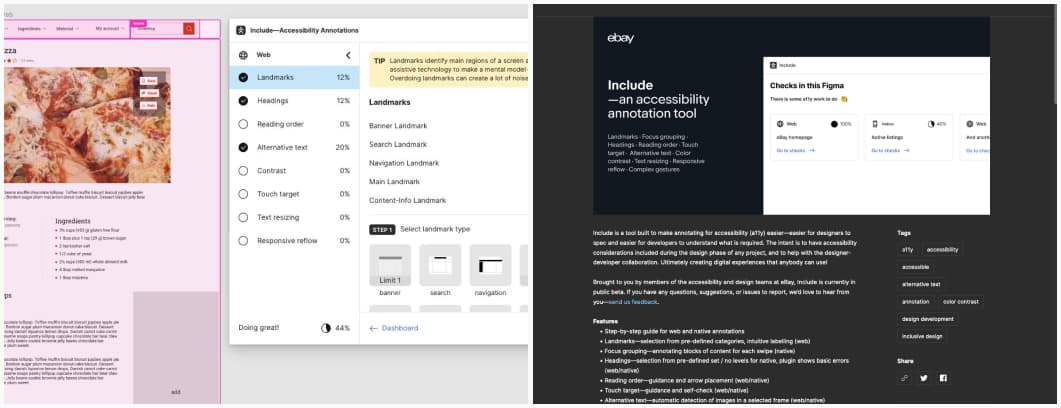
Include – Accessibility Annotations: a useful Figma plugin to help you annotate landmarks, focus groups (native), headings, reading order, alternative text (for images, it’s missing icons for now), check touch target, color contrast, create de 200% version of your page, document complex gestures (native) and more. It’s not perfect yet (and there is a feedback form) but it’s honestly the most advanced plugin I found so far. So, big kudos to the ebay team!
Interesting articles that caught my attention
User experience and product design
- Google, Amazon, and Meta are making their core products worse — on purpose: I can’t disagree with that, and it’s quite sad how this growth mindset is killing tech
- How to build a UX research role & practice from scratch: some interesting tips from Ori Dar to help you grow as a UX team of one, and a Miro template to help you with all the steps of your user research
- Bias is Unavoidable in UX Research: 12 techniques to help you mitigate biases during user research: learn about the different types of biases, identify your own biases, learn to spot bias in others, identify your assumptions, goals, and hypotheses in your research plan, ask other critical people to review your plan, use mixed methods, recruit a representative group of participants, avoid research fatigue, avoid leading questions, put your poker face on, invite other people to shadow the research and be careful when taking notes (not facts not opinions)
PS: if you are interested in cognitive biases, check my “UX Cognitive Bias Cards & Workshop“. It’s a fun way to raise awareness of biases when designing products & services
- User-Feedback Requests. 5 guidelines to survey users to give feedback during or after an interaction without interrupting their task: get the timing right, avoid eager emails, keep the survey short, offer a flexible feedback format, appreciate and incentivize
- Design as a craft will not die out because of new technologies: I like this positive approach that highlights why designers will always be needed, even in the age of AI and automation.
Some accessibility interesting reads
- Software accessibility for users with Dyslexia: a list of great tips to help make your products more inclusive for dyslexic people
- CSS-only Widgets Are Inaccessible: be careful with CSS-only widgets (like toggles), they are often not accessible
- Sabbath mode and assistive technology features: sabbath mode, just like accessibility features, is important for people who rely on it, you might have to be taught by someone, and it benefits other people too
- Accessible target sizes: the AAA WCAG2.1 guideline for minimum target size is 44 x44 pixels. Material design recommends 48×48 dp. If targets are close, spacing helps users not miss them. There’s a 24 CSS pixel AA criterion proposed to WCAG2.2, but it’s a work in progress.
- Accessibility vs emojis: some tips on how to use emojis without an annoying screen reader users: use them sparingly, use them in the end, don’t replace words by emojis, don’t use them as bullet lists, don’t rely on them to convey information and be careful about context
- Ten blunt things I wish I could tell clients: 10 hard truths people need to hear. I nodded especially at point 4: “Though it may offend them to hear, what your developers most need is training – not just in accessibility but in proper standards-based web development.”
On Machine learning and AI
- What will the Long-Lasting Impacts of Large Generative Models Be?: interesting review, the conclusion is the issue might be more the data used to build the model than the model itself. “For the sake of openness and to ensure the reduction of harm and possibilities for damage to be caused, we must prioritize dataset development, a strong belief in the good that the public commons can bring, and enable open access and participation in the development of further innovation.”
- How to Create a Survey With ChatGPT [Use Cases]: you will need to provide clear prompts, and tweak, it mostly works for generic prompts, in the end it’s a lot of time, and it might be a futile effort.
- GPT isn’t going to replace designers. But it’s coming for the users. Couldn’t agree more, and it’s a mess, because, at the end of the day, you can’t replace users in user research, yet, a lot of people seam super eager to try. Why? Do you hate your job as a UX researcher so much that you’d rather generate poor data than actually, talk to those users?
Life on the Internet:
- TW: child abuse Influencer Parents and The Kids Who Had Their Childhood Made Into Content: some states are trying to make laws to apply the same rules as the ones applied to child actors to the children who are used as child influencers by their parents on the internet.
Curiosity cabinet: non-design/tech rabbit holes I enjoyed
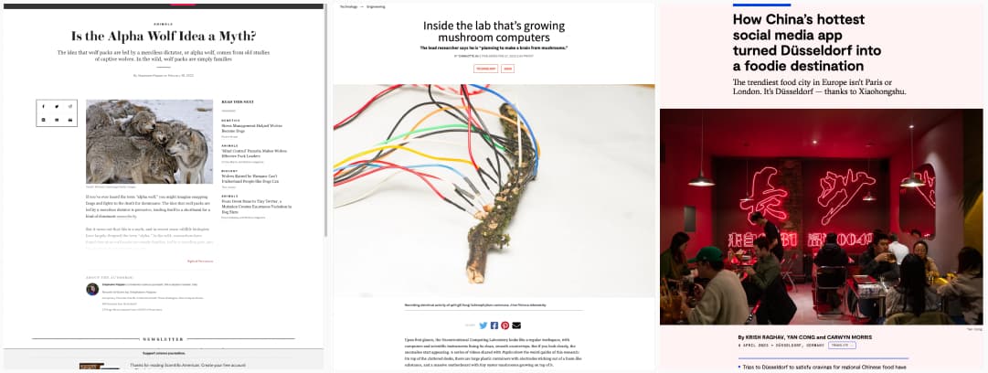
- Is the Alpha Wolf Idea a Myth? Some alpha males are going to be sooo sad to read that, the alpha wolf behavior is due to observing them in captivity
- A look inside the lab building mushroom computers: this is many levels of sci-fi cool, and one step towards bio computers, or more accurately mycelium computers!
- Düsseldorf has become a destination thanks to Xiaohongshu: I knew Düsseldorf had an awesome Japanese cooking scene already, but Chinese cuisine, ho yeah, I need come back for another visit
Inspiration: fun experiments, beautiful art, and great ideas
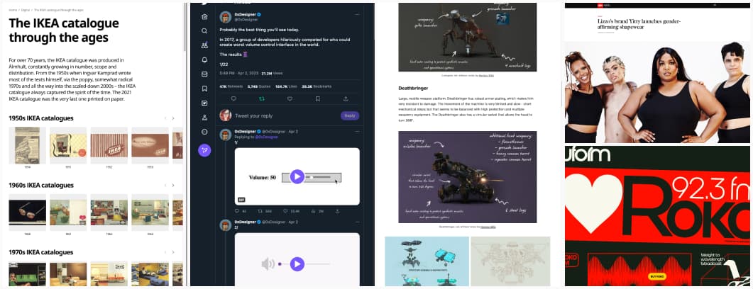
- Time travelling with IKEA catalogues 1951-2021: some retro eye candy for print fans and home decorator enthusiasts
- Lizzo’s brand Yitty launches gender-affirming shapewear: I don’t often share content around fashion and clothes design, but this is making my week, such an awesome initiative!
- Rokolo don’t need another font, I don’t need another font, I,.. need that one? Send help
- A twitter thread with the worst volume control UI ever: In 2017, a group of developers hilariously competed for who could create the worst volume control interface in the world.
Useful tools & resources that will save you time
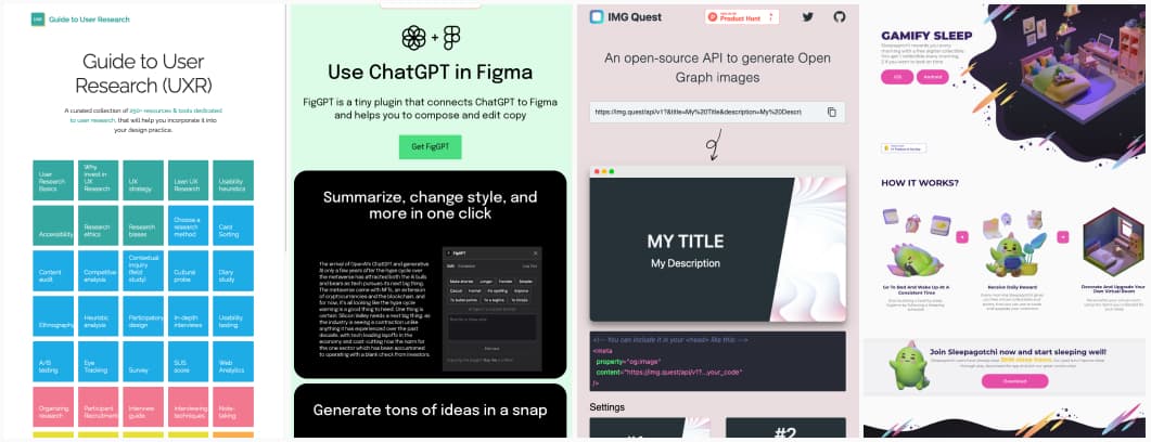
- Guide to UXR: Paulina Barlik curated more than 250 resources, articles, and tools dedicated to UX research on many different topics, from why invest in UX research to specific methods like card sorting, usability testing, how to report on your data, etc.
- FigGPT Figma Plugin: interesting usage of chatGPT to help generate content for your Figma mockups
- IMG Quest: a very cool open-source API to generate Open Graph images for your blog posts and other needs
- Sleepagotchi: an application that aims to help you achieve a consistent sleep schedule with a cute little gamification mechanism. I love the idea of building a room!
Videos
- These Stupid Trucks are Literally Killing Us: “Your freedom to swing your arm ends where my face begins” is a sadly good metaphor for the issue of having more and more light trucks and SUVs in cities. This video is about America, but I see the same issues in Luxembourg
- #119- It’s Not Research, It’s You! A podcast where Holly Hester-Reilly dives into bad research practices, decision-driven research, finding the right research method, and more.
- Avoid centered text: a small video and article by Oliver Schöndorfer where he shows how he improved a card with a few typographic changes
Tutorials
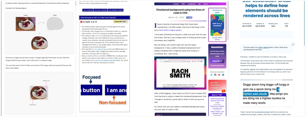
- CSS Masking: an awesome tutorial on the many awesome things you can do with CSS masks, especially if you mix them with gradients
- Does it fail the 1.4.11 WCAG non text-contrast criterion? 20 quiz questions (and answers) to help you better understand the “3:1 contrast ratio between the UI element and adjacent colors” criterion
- Checkered background using two lines of code in CSS some really cute little tutorial
- New on the web: How to detect disabled JavaScript in CSS; that one could be super useful
- box-decoration-break helps to define how elements should be rendered across lines: a simple trick (not supported in Firefox mobile) to get your text-decoration to play nicely on 2 or more lines
Latest news in the industry
What’s New in Figma: some cool features were launched this year in figma, the multi-select search saves me so much time

