Pixels of the Week – April 5, 2026
Web accessibility is getting worse, a free product design course & designing for anxiety
Pixels of the Week is my weekly-ish curated newsletter for designers, UX folks, devs, and anyone building accessible, inclusive, usable (and let’s be honest, awesome) digital products. This edition covers web accessibility getting worse, some Figma mockups design pattern implementation pitfalls, and native HTML not guaranteeing good UX. Also cute pastel kawaii art, a product design course, and a pocket second brain.
Subscribe to my newsletter to get this directly in your mailbox!
Now: what I’m currently up to
This week I recorded a podcast on Enterprise UX, that should be out in April. I’ve also almost finished my little (hum okay not that little) crochet tot-bag: you can check pictures of the tot-bag on Bluesky and on mastodon
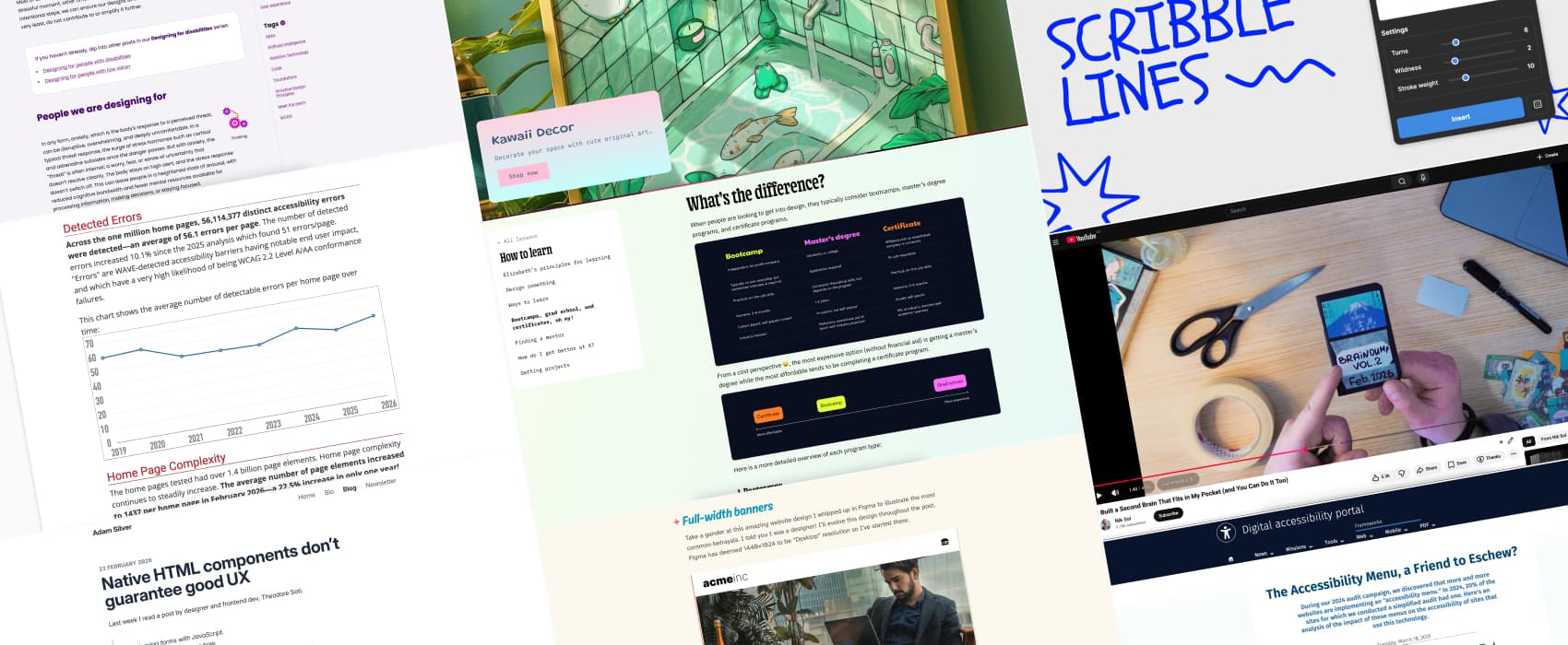
Is web accessibility getting worse in 2026?
The 2026 WebAIM Accessibility Million Report is out, and the results are disappointing. After years of progress, web accessibility is declining. Errors have increased, with users likely to hit one on every 26 homepage elements. Empty buttons, missing labels, low contrast issues, and poor ARIA use are rising. Why is this happening?
There are a few possible reasons. More teams rely on 3rd‑party frameworks, libraries, and AI‑assisted code. If the code you start with isn’t accessible, AI will just build on those same issues. Also, growing page complexity and heavy ARIA use make accessibility harder to manage and maintain.
I also don’t know if it’s only in Luxembourg, but lately, I see more and more websites adding “accessibility menus” since the European Accessibility Act came into effect. An accessibility menu allows users to customize certain site presentation settings related to accessibility, such as changing text size, enabling enhanced contrast, managing text spacing, etc. Some of those are packaged under commercial solutions called “accessibility overlays”.
It often feels like a short-term fix to say, “we did something,” instead of addressing the real accessibility issues in design, code, and content. Maybe it’s a temporary measure while teams work on long-term improvements?
Digital Accessibility Luxembourg published a study in 2024 showing something quite interesting: the presence of such accessibility menus, actually correlated with lower accessibility scores. So without a real accessibility strategy, these tools might not only fail to help, but could even make things worse.
Interesting articles that caught my attention
Top ten Figma betrayals (9min) some design patterns and decisions that look okay in pixel perfect Figma mockups, but become a giant mess to implement, and bring a lot of questions to developers. Fun things like full-width banners that don’t scale with viewport, specific focal points, or arbitrary line breaks in text. By David Bushell.
Designing for people with anxiety (10min) Designing for anxiety is about reducing cognitive load for the users. Give people time to fill forms, with 2FAs, etc. Offer the option to hide countdown to avoid stress. Limit urgency when possible, yeah looking at you shading “only 8 left” deceptive patterns. Keep interactions predictable to avoid making anxiety worse. Provide clear progress updates, be transparent as to why some data is required, give options to review the data, and multiple options for wayfinding (like breadcrumbs, navigation and search). by Demelza Feltham for Tetralogical. And for more resources on the topic of designing for neurodiversity, check out my selection of resources: Neurodiversity and UX: Essential Resources for Cognitive Accessibility
Native HTML components don’t guarantee good UX (5min) I admit I also have almost never seen a real use case for type=reset, from a user perspective. The only one I got is complex search, where each filter might have many options. We have a reset button on each filter to reset it. But even there, it’s kind of overkill, since users can remove the filter via another way. I admit I have the same issue with HTML5 placeholders, from all the accessibility and usability issues they bring. So, yeah I agree with Adam: Just because it’s native doesn’t mean it guarantees good UX.
How to Make Sense of AI (15min) to get out of the AI noise, ignore hot takes, predictions, and focus on real world usage. Once you found reports, about real world usage ask yourself: what are the suggested outcomes, what actions may I take in response, what would be the value of those outcomes to me (my work, my company) and finally, what would be the relationship to my domain. That’s it.
I’m OK being left behind, thanks! (3min) On why it’s okay to wait and see if something is actually useful, and not, jumping on the hope bandwagon
Curiosity cabinet: non-design/tech rabbit holes I enjoyed
Being cold doesn’t make you sick, so why are illnesses more common in winter? (8min) low temperature is not making you sick in the winter, viruses are. But, winter helps them spreads! Cold, dry air preserves viruses, weakens nasal defences, indoor crowding and low vitamin D further raise infection risk.
Inspiration: fun experiments, beautiful art, and great ideas
Kitty and Meg is the home and shop of an Irish illustrator, specialized in absolutely cute kawaii chill pastel art and decor.
Useful tools & resources
Scribble Lines Generator another “not sure when you would need that, but it’s a fun idea”, so here we go, a Figma tool that generates random scribbles!
Elizabeth’s Declassified Guide to Product Design if you want to become a product designer, Elizabeth Lin answers a lot of questions in this free online course, including, what product design is and what product design is not (equally important!) and what type of education can bring you to this job. I really like that she doesn’t endorse any schools, but instead brings you questions you need to ask, to investigate if this course, school or any other curriculum is right for you.
Cool and interesting videos
I Built a Second Brain That Fits in My Pocket (and You Can Do It Too) In a fully digital world where we offload more and more to AI and our phones,I like the idea of a small pocket sized paper place to keep track of things. I’ll admit though, I’m bad at journaling, but I having something very tiny might help.