Pixels of the Week – April 11, 2021
Every day, I share on Twitter and LinkedIn a list of curated articles I read, resources and tools about UX Design, User Research, UI and mobile design, HTML, CSS, the web industry, some process, some inspiration, etc. This is an archive of everything I shared this week.
#Now – what I’m up to
Next Thursday (the 15th) I’ll be talking in French at NantesJS about designing beyond pixel perfect components for real life (real browsers, real users). It’s online and you can follow it in twitch and youtube.
TL;DNR the one you should not miss
#Design #Disability
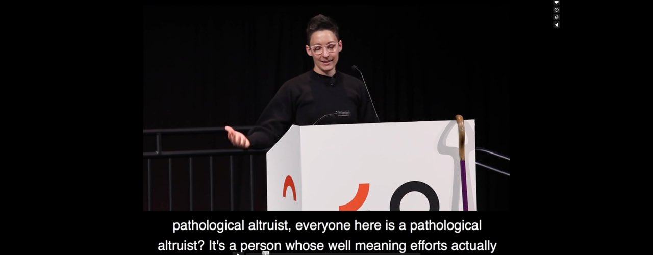
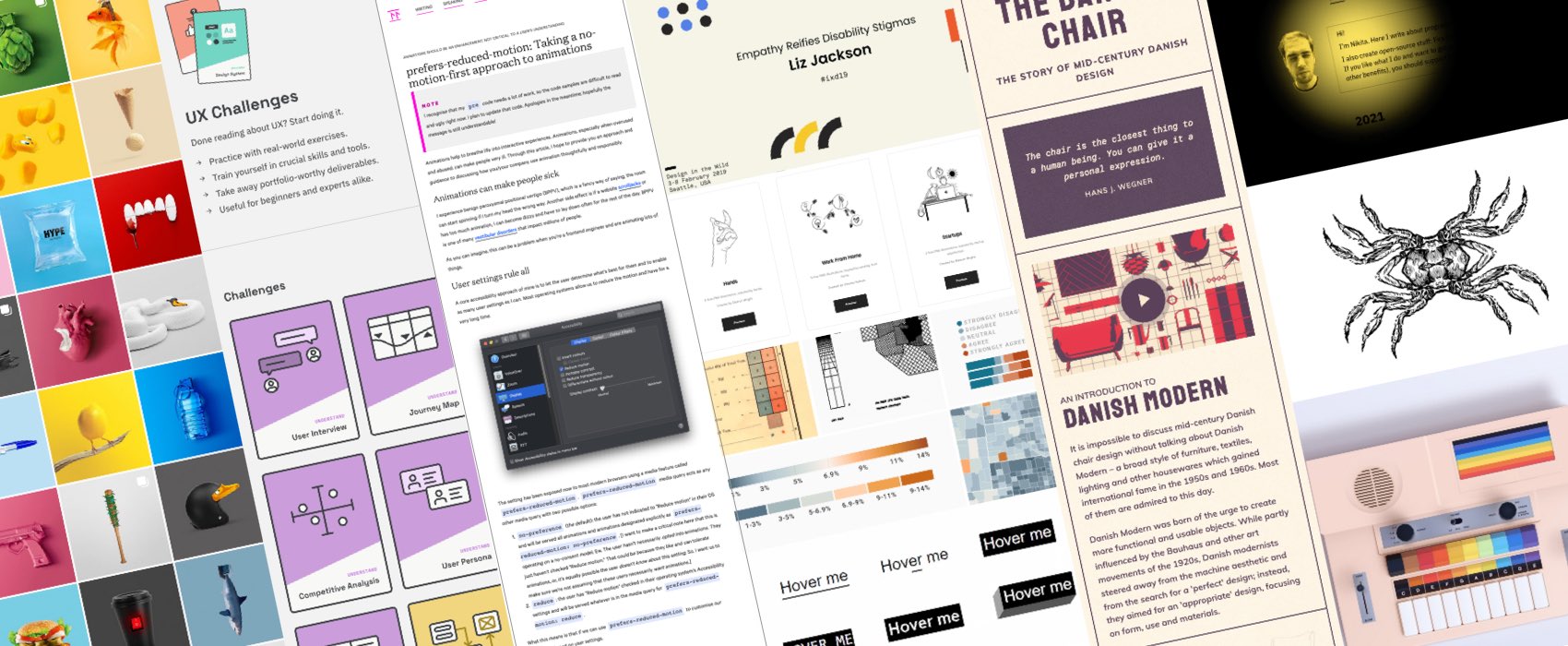
“Empathy Reifies Disability Stigmas” a great talk by Liz Jackson. So many things to unpack about empathy and how much damage it can actually do, how we turn people with disabilities into “design problems we can fix”. We need to stop.
Interesting article
#Accessibility #HTML
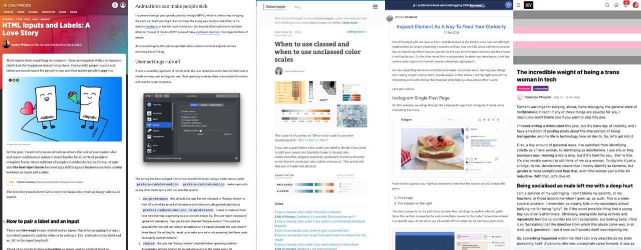
“HTML Inputs and Labels: A Love Story” by Amber Wilson (@ambrwlsn90), an awesome article on how to build accessible form text (and date) fields. Also, love the cute illustrations!
#Animation #Accessibility
“prefers-reduced-motion: Taking a no-motion-first approach to animations” by Tatiana Mac (@TatianaTMac). As someone prone to motion sickness on some sites (parallax I hate you) I would love if more sites could implement this 🙂
#Dataviz
“When to use classed and when to use unclassed color scales” by Lisa Charlotte Rost, another great article to help you choosing colors for dataviz (also read the other articles in this series they are awesome too)
#Header #Design
“Sticky Headers: 5 Ways to Make Them Better” some interesting tips
#Inspect
“One of the best gifts we have as FE developers is the ability to see how something is implemented by simply inspecting a website and see how the CSS works behind the scenes”, yes yes, I love that about the web, a nice article about Inspect Elements as a way to find curiosity
#Inclusion
“The incredible weight of being a trans woman in tech ” by @penelope_zone, having to chose between being effective or being true to yourself is a lot of mental weight.
#Language
“Designers: mind your language” true, but funnily, I have the same impression of the dev community, since most dev articles those day suffer from the same ego buzzword elitist attitude “why X is dead and you have to use Y instead” titles ^^ I still agree with the part about “user don’t know what they want” is poor phrasing and quite inaccurate as well. The issue with such statements is that is becomes (false) rules, like the 3 clicks rules which is a myth.
#Management
“The benefit of having a highly competent boss is easily the largest positive influence on a typical worker’s level of job satisfaction. Even we were surprised by the size of the measured effect”
Inspiration, fun experiments and great ideas
#CSS
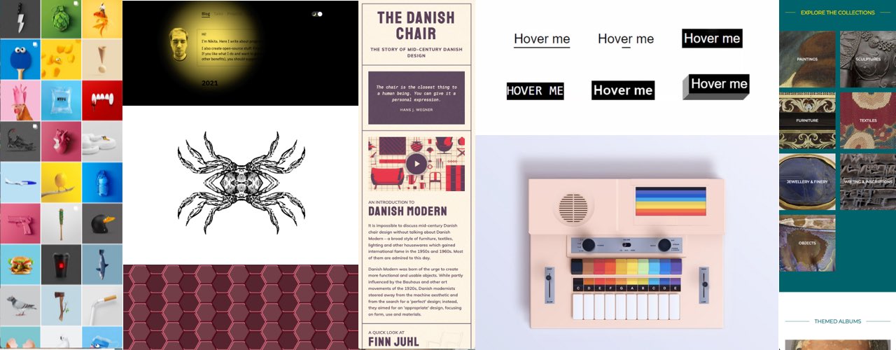
This is a fun collection: 100 underline/overlay hover animations, would not use them all on project, but I like the exploration around different techniques. Did I tell you that CSS is awesome already? (by Temani Afif)
#CSS #Art
More CSS awesome art, here’s Sara Fossheim’s HTML and CSS synthesizer drawing
#Kaleidoscope
To continue with fun Friday experiments, @heydonworks built this infinite crab kaleidoscope, open it in Chrome (might trigger motion sickness)
#SVG #Pattern
OOOOhhh, this SVG Neon Hexagons Pattern is awesome (by @AmeliasBrain)
#Art #Collections
If you too you miss museums, Le Louvre put a database of 480,000 works online
#Inspiration #Art
Jose Navarro creates some interesting colorful art mixing different concepts
#Inspiration
Did I just giggle when I switched to dark mode on Niki’s (@nikitonsky) blog? Maybe…
#Design
The story of mid-century danish design beautifully illustrated in short videos and a really nice website (via @lunatictac)
Tutorials
#Icons
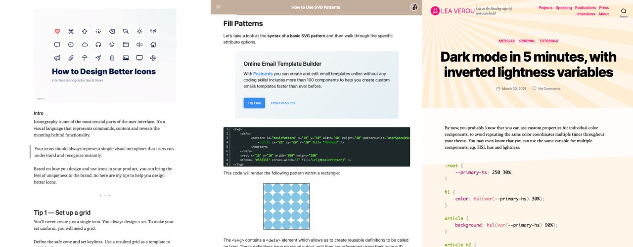
“How to Design Better Icons” by @buninux set up a grid, make it consistent, make it clear, use equal spacing, don’t forget about optical correction, fill the space in that square and don’t hesitate to combine styles
#SVG #Pattern
More on how to build SVG patterns here Via @cassiecodes’s awesome newsletter on SVG
#CSS #Colors
“Dark mode in 5 minutes, with inverted lightness variables” a really nice trick. I’m also looking forward to more LCH colors support in the browser
Useful tools and resources that will make your life easy
#CardSorting #UXMethod
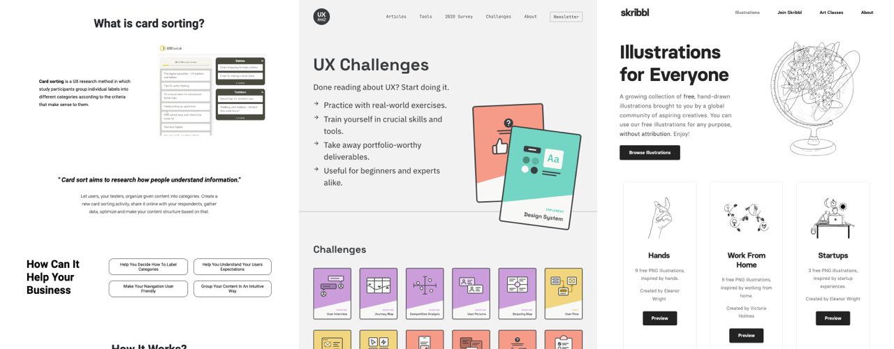
This is nice: a website entirely dedicated to card sorting with how to, advice and a collection of free and paid tools
#Challenge
This is a cool idea if you learning UX design methods are looking for some fake project to practice on one specific UX method at a time. (by @uxtoolsco)
#Illustrations
That’s my type of illustrations: @weareskribbl, a collection of free hand-drawn illustrations
