Pixels of the Week – August 11, 2024
Cats in pirate ships, alt text from D&D and some B2B UI principles
My curated weekly-ish online newsletter, where I share interesting articles, tools, and resources I found during the week. You can expect content about UX, design, user research, accessibility & tech, but also some processes, some inspiration, sometimes books, and a couple of videos and podcasts. Also, don’t forget to, subscribe to the newsletter to get notified, you will get the weekly links directly in your mailbox, and be notified when I publish other articles.
Now: what I’m currently up to

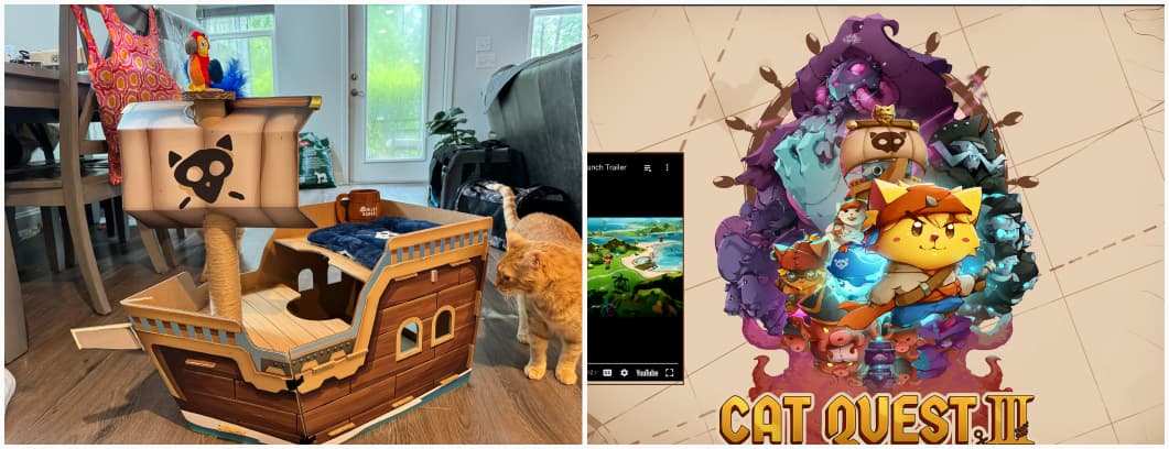
Cat Quest III is out, and I’m having so much fun with this little game! We also need to talk about their awesome PR strategy: you could win a paper pirate ship for your cat. And, it’s just the best. People shared the picture on TwitterX of their cat inside the little ship, of the cat eating the ship, obviously, of the cat with the bandana, etc. Love it.
Interesting frameworks and concepts
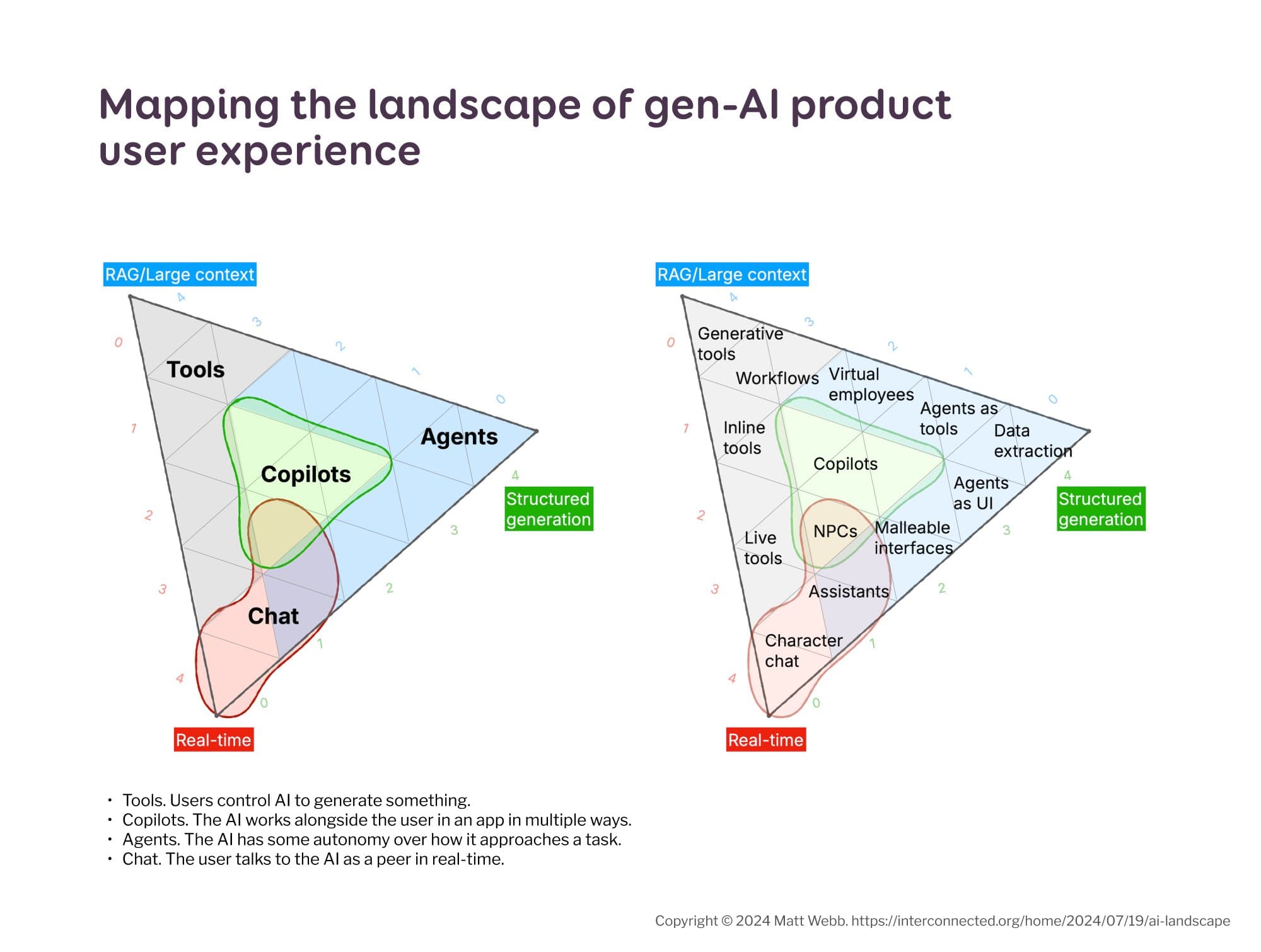
Mapping the landscape of gen-AI product user experience Matt Webb build a very interesting map of the different AI products we might interact with. This can help define what kind of product we want to build, see what other products exist in the same area. It can also help brainstorm different approaches or the same concept what if it was a tool, and agent, a copilot, etc.?
Most popular content this week
SENDUNE, HTML email design tool that lets you design your newsletter in a nice drag and drop interface, then export your HTML. Also, it’s open source and you can check the code in github. (I don’t know why this is the most popular this week to be honest, but, it kind of exploded on TwitterX)
Interesting articles that caught my attention
UX research and Design
- Other UI principles for B2B web apps (5min) yep, adding yet another button is tempting, but might not be the solution in complex B2B applications. I’m fighting against this one sooo much, we can’t solve process and communication issues with “yet another button”. Some problems need to be solved at higher level. Also, highly agreeing on “design user flows, not individual pages”. Which might be complicated again in enterprise, because sometimes the flow goes through another app you don’t have any control over. But still, understanding a whole user flow is very important. By Roman Lihhavtsuk.
- How to survive the tricky design situation of the product vision change (7min) when the company shifts product vision, make sure you document design intents to avoid miscommunications. When you redesign pages, features to help with the change use lower fidelity designs to explore multiple solutions. Don’t commit too fast to polished design in times of uncertainty.
- Scenius: why creatives are stronger together (8min)The solitary creative hermit is a myth. Collaboration, mutual support, and the exchange of ideas within a community lead to cultural breakthroughs. As creative people, we should seek supporting networks, offline or online if we want to thrive. by Sheryl Garratt
- Why more and more companies are killing their classical Homepage (12min) a current interesting trend in product design: companies are replacing traditional homepages with ungated freemiums and demos. It makes sense: you let the user start engaging with your product, without paywall or anything, which can lead to higher conversion rates (according to Leah Tharin)
- The Paradox of Builders & Users (6min) Builders constantly seek to improve the product while users prefer consistency. “Remember, the goal isn’t to build the most features. It’s to build the right features, at the right time, for the right reasons. The most critical muscle in building good software, is restraint.”. Yep, 100%! By Hardik Pandya
- What we can learn from UX Research job descriptions Thomas Stokes, Lawton Pybus, Brian Utesch analyzed 1,400 UX job descriptions in the US market and identified the following trends: there’s a predominance of mid-level roes, titles for UX researchers is a mess, most positions are full-time, but there’s an interesting proportion of contract-based roles in mid- and senior-level. And, half of the job openings are remote. I’m curious about the European market, I get a feeling most jobs here are not remote.
Artificial Intelligence
Dangerous metaphors in AI (8min) language shapes the way we think, so, we need to be careful about how we talk about AIs, to avoid it becoming a self-fulfilling prophecy. For example “Data is the new gold” and “AI is the new Wild West” might lead to dangerous behaviors. By Luis Berumen Castro
Accessibility and Diversity
- Dungeons & Dragons taught me how to write alt text (11min) I love the examples here: Eric Bailey explains how you want to emphasize the important things, and prioritize most critical information first when writing alt texts, then go for contextual details to help the understanding. Good alt text should convey the essential details of an image in a clear and engaging way.
- Embedding Equality, Diversity, and Inclusion in Usability Testing: a great summary by Dr Maria Panagiotidi of a lot of techniques you can use to make your research more inclusive. She emphasizes the importance of valuing diverse participant contributions, establishing trust, and empowering user autonomy.
- Overlays Misunderstand Accessibility (5min) overlays misunderstand how assistive technologies work, they label features by disability types instead of addressing individual needs. by Joe Dolson
- Why not all voices should be equal in the design process (21min) If we want true inclusion, social change and equity, the voices and decisions of those deeply impacted by the systems we build should be prioritized in the design process. Marielle Sam-Wall give tips and tools to help: deep understanding of power dynamics, focusing on trust and relationship with the communities we design for, being transparent about tensions, limitations, harms and expectations.
- How Small and Medium Business Can Leverage Neurodivergent Talent (8min) neurodivergent people often bring unique strengths, different perspectives and productivity to small businesses. Many accommodations are, in reality, low cost, despite what people often imagine.
- AT Is More Than Screen Readers (5min) a screen reader (SR) is a type of assistive technology (AT), and there are other types of assistive technologies that are not screen readers.
Inspiration: fun experiments, beautiful art, and great ideas
- Tokyo’s oldest train line – in pictures: A reportage of stations along the circular JR Yamanote line in Tokyo, capturing the hustle and bustle at the heart of the world’s biggest urban area
- Linamp: nostalgic friends, here’s a project to build a physical music player inspired by Winamp 2.91 and retro hi-fi gear
- Astronomy Photographer of the Year 2024 shortlist those are amazing pictures of the stars. But my favorite is the arctic dragon aurora panorama
- Desigeist another curated list of daily design inspiration by Pablo Stanley
Useful tools & resources
- Avaaatars a library of free to use avatars for your projects, even for commercial purpose (as long as you don’t resell those)
- Site of Sites a nice curated list of web design inspiration, you can filter by industry, type, style and platform
- File Thumbnail Kit for Figma: a list of thumbnails with the name ot the page / section and the status for your Figma files
- buttplug.io an open-source, cross-platform libraries and applications for intimate hardware control, including sex toys, health devices, and more.
- BSoD maker Need a 30min break during a hard day (or maybe you just want to prank people)? You can fake a Blue Screen of Death with this website
Tutorials
- Create an accessible combobox using ARIA a tutorial to help you create keyboard and screen reader accessible comboboxes (those complex dropdowns with different options)
- What if you used Container Units for… everything? (6min) container queries are nice and fun, but might bring issues. Sometimes it’s easier to achieve what you want with clamps for example. So, yeah use container queries where it makes sense, but don’t force them.
Latest news in the industry
Why Mattel’s Blind Barbie design really matters Mattel worked closely with the American Foundation for the Blind to bring a accurate representation. The doll also has a cane, functional glasses, articulated elbows, an altered eye gaze, positioned slightly up and out and comes with tactile clothing.
