Pixels of the Week – August 2, 2020
Every week I share a list of curated articles, resources and tools about UX, UI and mobile design, HTML, CSS, the web industry, process inspiration and more…
This week’s selection: designing flexible components beyond breakpoints, 9000+ cool illustrations and icons, a complete guide to usability testing, meaning of 100% in CSS, Figma design systems, a mandala maker, designing for iPad, an online CSS animations builder tool, an amazing talk on systemic systems, user research tips, a figma contrast checker plugin, a podcast on design principles, an online place to shout your frustration, form design, etc.
#Now – what I’m up to
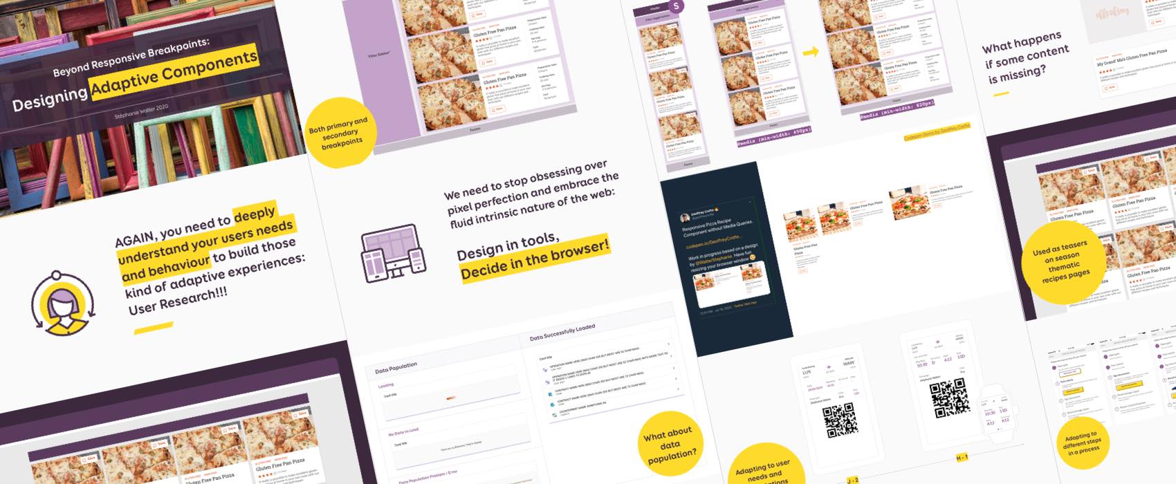
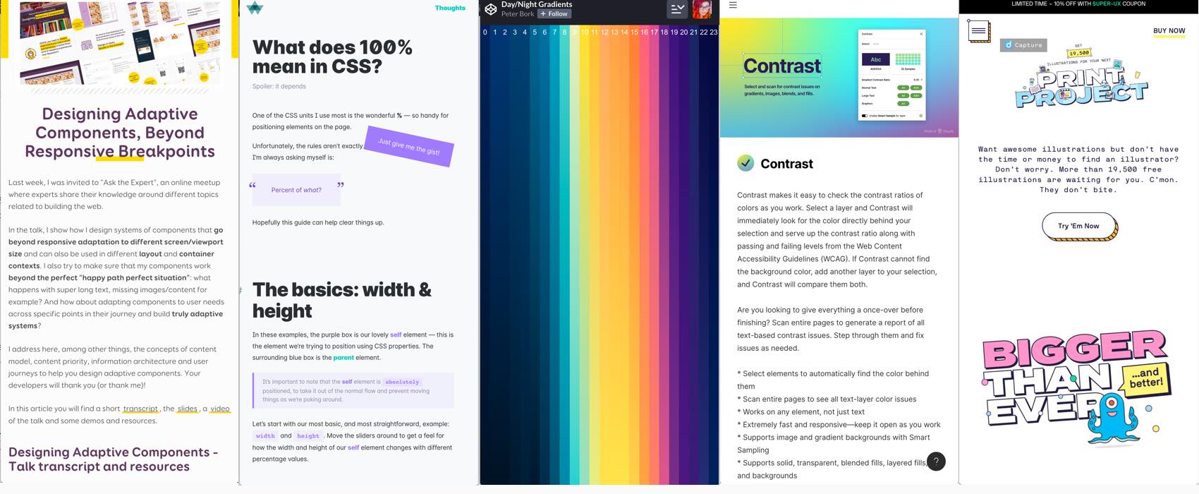
I published the transcript, slides and video of my talk on “how to design systems of reusable components that adapt to responsive layouts, containers, work with different content states & adapt to user needs, behaviour and context?“.
May I brag about the fact that Ethan Marcotte, author of Responsive Web Design found this talk “wonderful” ? 😀
Also I’ll be talking about how to enhance user experience with CSS animations this week at shiftconf remote. Expect slides, video and transcript soon.
TL;DNR the one you should not miss
#CSS #Tools
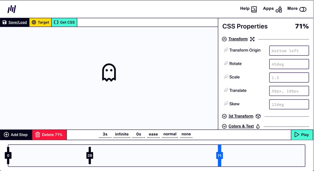
An online tool to help you build CSS animations, you can add, remove stops, change different properties like transform, color. I would avoid animating size, spacing and position, those trigger layout when changed, aka performance issues.
Interesting article
#Form
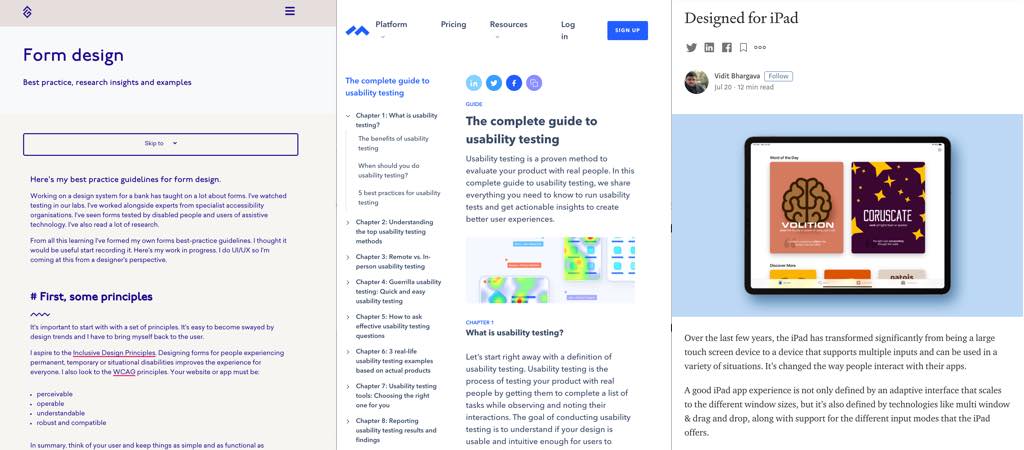
Form design – Best practice, research insights and examples
#UsabilityTesting
“The complete guide to usability testing” from remote, in person, moderated, unmoderated, guerilla, to how to ask question, how to chose the right tool and how to report on the results, this is a long but quite useful guide.
#Design #Tablet
“Designed for iPad” some interesting advice to help you design interfaces that work with the iPad new constraints: adaptive layout, multiple input mode (including pointer) and multi-window / picture in picture
#Design #Pitch
The “Only-ness Statement“, A small framework by Dan Mall to help frame brand statements: This is the only …
that… for… in… who want to… during a time of …
#Design #Code
“The State Of Pixel Perfection” haa this article on flexibility but respecting look and feel is a perfect addition to the talk transcript I published on my blog yesterday, why didn’t I read this article before haha?
#UX #Research
3 Things You Need to Know as a Fresh UX Researcher:
- There’s no pattern to being a UX Researcher, all of us can contribute in our own ways
- Ethics are Not Optional
- A good researcher’s awareness is the key to the company & their potential
#Accessibility #Process
“Translating Design Wireframes Into Accessible HTML/CSS” I like the idea of documenting accessibility in the mockups but not a lot of designers, me included, are fluent in aria roles so this might be quite complex :/
#Portfolio #Developer
“What I learned after reviewing over 40 developer portfolios – 9 tips for a better portfolio” some tips to make your developer portfolio better. Big YES to tip 6, stop with the percentage / skill-bars nonsense!!!
Inspiration, fun experiments and great ideas
#Inspiration #Colors
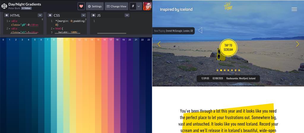
Some days, all you need is just a beautiful day/night gradient
#Demo
This is really cool: a mandala maker in the browser
#Frustration #Marketing
This is an amazing idea to promote Iceland: just let it out, record your current frustration scream, send it to them and they release it in a small video with Iceland’s beautiful, wide-open spaces. (the website plays sounds)
Talks & Podcasts
#Systemic Design
One of the best talks I saw this year: Tatiana Mac: “System of Systems” — Clarity 2019
#Podcast #Design
This time @lauraklein and @katerutter talk about Design Principles and I love how Laura is honest about those “Dieter Rams’ 10 Principles of Good Design”, THANK YOU this feels so refreshing to hear.
Tutorials
#CSS
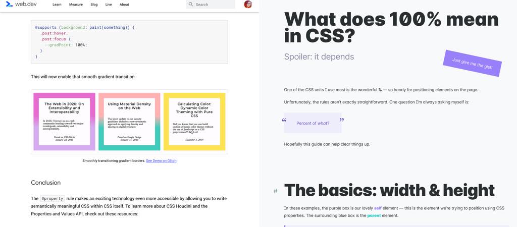
- A great article by Ameria Wattenberger illustrated with a lot of demos to help you understand what “100%” means in CSS depending on different contexts
- This looks exciting: “@property : giving superpowers to CSS variables The Houdini Properties and Values API is coming to your CSS file in Chromium 85“
Useful tools and resources that will make your life easy
#Icons
Tired of boring icons? Discover Streamline UX 2.0, with now more than 9000 illustrations in different styles, colors and more for your project by @webalys ‘s team
#Figma
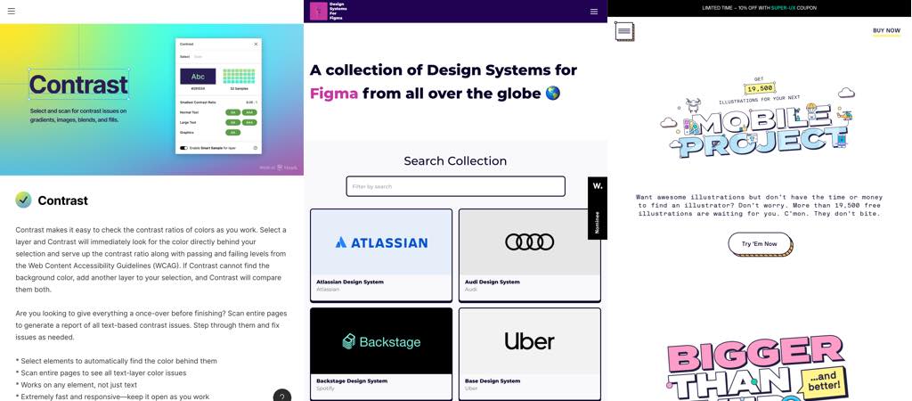
A collection of Design Systems for Figma from all over the globe
#Accessibility #Figma
A Figma plugin that lets you check for contrast issues in fills, gradients, images and blends to make sure the colors you are using in your design are passing the Web Content Accessibility Guidelines (WCAG).
#Mailto
A small script that turns your mailto: and tel: links into something more user friendly and actionable with a few options for the user to chose from
#Tabs #Chrome
I see you all joking around the 320 tabs you have open in your browser. If that browser is Chrome, maybe this plugin could help: it lets you find the tabs and has a “nap” option to free up memory.
