Pixels of the Week – August 23, 2026
Design system governance, inclusive stock photos and a creative recipes diagram.
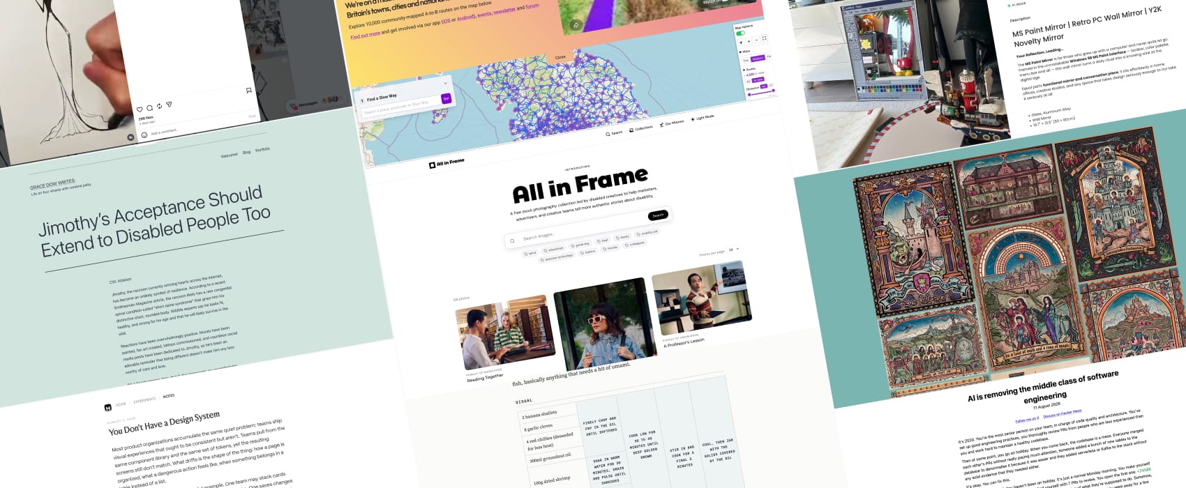
Pixels of the Week is my weekly-ish curated newsletter for designers, UX folks, devs, and anyone building accessible, inclusive, usable (and let’s be honest, awesome) digital products. This week we explore design systems beyond pattern libraries, AI’s impact on software work, and disability acceptance. Also don’t miss inclusive stock photos, amazing medieval illustrations, and a creative recipe flow diagram.
Subscribe to my newsletter to get this directly in your mailbox!
Accessibility workshop in September!
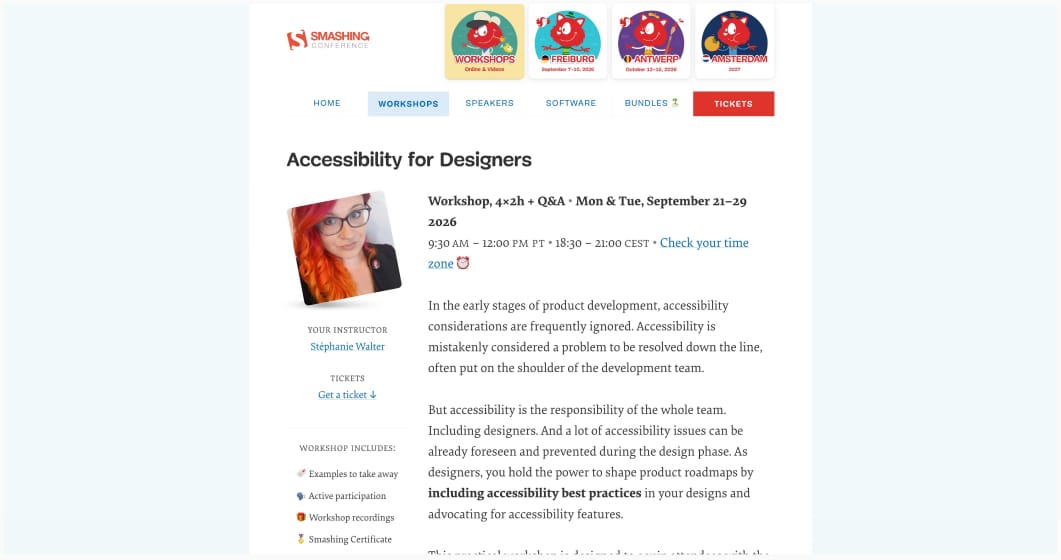
I’m running my Accessibility for Designers in September. It’s a 4 × 2h live workshop to help you design more inclusive products, with many practical exercises.
It’s from Sept 21 to 29, Mondays & Tuesdays, 18:30 – 21:00 CET / 9:30 AM – 12:00 PM PT.
Included: video recordings, slides, Figma exercise & annotation template, accessibility checklists and a LinkedIn certificate.
Most popular content this week
You Don’t Have a Design System (14min) Matt Rothenberg gave AI agents the same component library and ended up with 3 different setting pages. Because component libraries often don’t document the kind of product patterns that you need in order to bring consistency across all the pages. Honestly, you don’t even need to bring AI to the mix: give the same pattern libraries to 3 designers, if you don’t have strong documentation on the expected hierarchy, navigation guidelines, etc, you will end up with each designer building their own thing. His solution is to write those strong rules down. But here, again, I wonder: it’s kind of easy to force AIs to follow the rules, but how do you ensure the designers do it as well? (yeah, I know, governance hehe)
This resonated a lot, because I’m currently building a new design system, in a place where we want not only to standardize the components, but also the UX patterns. If you want to participate in the discussion, you can reply the my post on Bluesky or reply to the post on Mastodon.
Articles
AI is removing the middle class of software engineering (15min) “AI will make the best people much more productive and the bad ones almost impossible to hire. Before, there was a good chance someone would catch their bad decisions before they went too far. Now they can make changes faster than anyone around them can realistically review or understand them.”. A very interesting point of view, from Florian Herrengt. I wonder if this will become true for designers as well?
Claude Code 101, for Designers (10min) an introduction to understand what Claude code is, with lots of definitions of its basic concepts. Whether you use AI or not, I think it’s still quite nice to understand what it’s about, and the main concepts around it. By Yaron Schoen
Jimothy’s Acceptance Should Extend to Disabled People Too (5min) we have to acknowledge the uncomfortable irony that a disabled animal is more accepted in society than a disabled person. We need to apply this acceptance towards disabled people: accept that a life with disability is a full and valuable life, and worthy of respect as it is.
Curiosity cabinet
Slow Ways very niche, but if you are in the UK and love slow walking, this is nice map!
Inspiration
There’s something very relaxing, watching BX♡Ink draw dark fantasy illustrations. Because art is also about the process, not just the end result.
Eethok is an illustrator based in the UK who specializes in medieval illustrations style, mixed with modern pop-culture references. Needless to say I absolutely adooooore this Dungeon Crawler Carl inspired illustration.
MS Paint Retro Mirror, for my nostalgic people. I don’t think I would pay that much for a mirror, but, I kind of love the idea.
Interesting websites
in Frame, a free stock photo collection to help bring better disability representation in marketing, advertisement, design and beyond. It’s led by disabled creative people and contains more than 250 images. The collection captures the full range of everyday life: at work, at home, and everywhere in between. Real people. Real moments. No clinical tropes.
Frameworks and concepts
XO-ish Sauce I love cooking, but this is the first time I’ve seen a recipe presented as, kind of an “ingredient to process” flow diagram. This is actually an amazing way to present a recipe! (also that sauce looks delicious). Recipes and website by Josh Nesbitt.
Tutorials
prefers-reduced-motion, explained (and how to test it) (9min) a tutorial by Kevin Fröba to help you understand and implement prefers-reduced-motion so that people like me don’t get nauseous when you have too many things moving around on your website. Thank you!
