Pixels of the Week – August 28, 2022
Every day, I share on Twitter and LinkedIn a list of curated articles I read, resources and tools about UX Design, User Research, UI and mobile design, HTML, CSS, the web industry, some process, some inspiration, etc. This is an archive of everything I shared this week.
#Now – what I’m up to
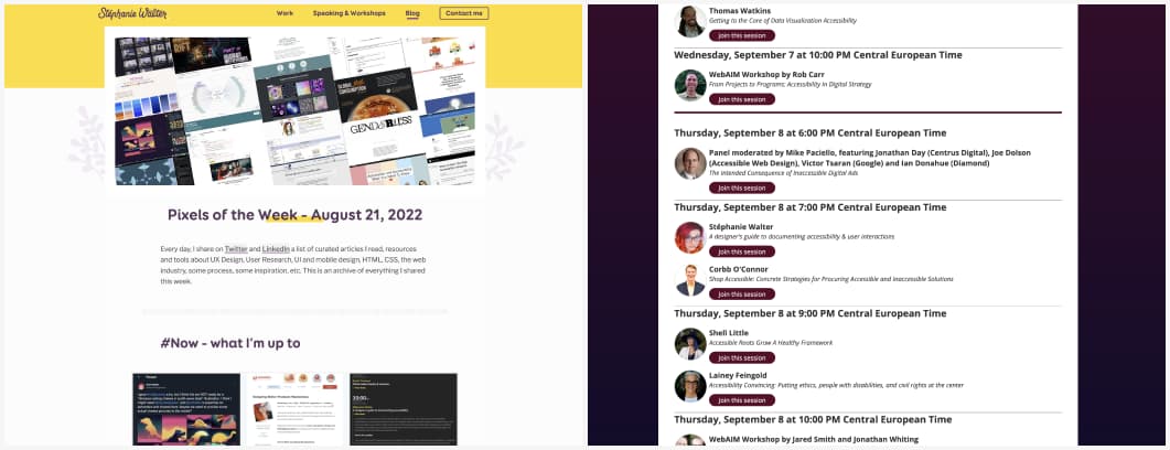
Hi people, a lot of things happened this week. First, I’m thrilled to be talking at the Web Accessibility in Mind Conference, a remote conference on September 7–8, 2022 from 12pm–5pm US Eastern Time, with a list of other amazing speakers!!! Get your free ticket!
I also finally changed my body font. The new one is Libre Franklin, variable font version. I’m already having fun with 5 different whgts (not a typo). I posted a video on twitter if you are curious about the variations. I will also start using it for other places (slides, etc). I keep Booster for titles. Also cute plants on articles, yeahy!
I also had yet another copycat. That one was strange, I learned later that this was allegedly a student exercise where the teacher presented my site and a few other one, and students were supposed to get inspiration from it and mix/redo. It doesn’t really make it okay, since copying most of the CSS and visual identity is not a remix and redo. So, yeah, bottom line: if your teacher asks you to remix and redo my site (or anyone’s site), please don’t blindly just copy it. Don’t put it online where it gets indexed by Google. And if you use it in interviews, be honest about it, mention it was an exercise.
Finally, my design advice of the week for junior designers: do not center copy text. Especially on bullet points. No cape, no centered text!
TL;DNR the one you should not miss
#Bootcamps
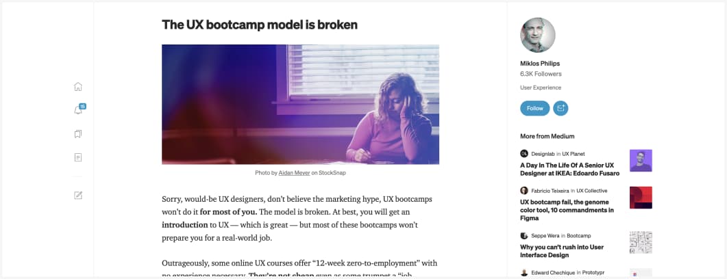
Interesting take on the many issues with UX bootcamps. The alternative offered is is interesting: ditch the expensive bootcamp if favor of a cheap UX certificate + get a mentor and/or find an apprenticeship. That part might be tricky though. I’m convinced most senior/lead UXers dream of getting apprentices and teaching the craft. But many companies lack the maturity (and budget) to do so. We are still in the “UX team of one unicorn who needs to do 3 jobs for the salary of 1” area in many places. It’s not about UX leaders not stepping up, it’s often about budget, priority and the lack of design maturity. The fact that people in the industry keep telling and teaching companies that “everyone can be a designer” and “everyone can do research”, because design is a bottle neck and not agile doesn’t really help raise the maturity. If we want junior jobs, apprenticeships, we need to stop giving those task to just “anyone in the company who read 2 articles about research so they know how to talk to users”.
Interesting article
#Design Systems
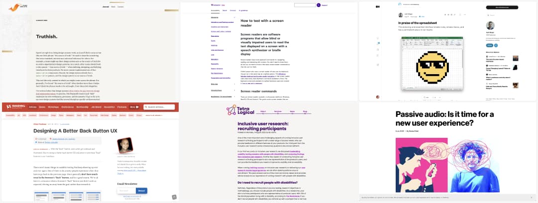
Truthish: “Design systems work is fundamentally lossy, in my experience. The more our mental models, our processes, and, yes, our sources of truth acknowledge that fact, the stronger our design systems will be.” by Ethan Marcotte
#UXPattern
Designing A Better Back Button UX by Vitaly Friedman : a lot of things to consider, from placement in different situations to how it looks like so that user understand its function
#Accessibility Testing
- How to test with a screen reader, a nice list of commands for NVDA, JAWS, VoiceOver to help you test your site
- Inclusive user research: recruiting participants. When, how, how to recruit participants with disabilities for your usability tests.
#Excel UX
In praise of the spreadsheet, the enduring and essential interface breaks rules, wreaks havoc, and has a permanent place in our hearts. Ah, so true, especially in enterprise UX people love excel because there is so much to do with it.
#UX Resume
Interesting advice to make your resumes more effective, mostly for North America. I get a feeling you can have more than 1 page in Europe for example? EUROPASS CVs for examples are super long
#Agile
Long and very interesting read on the history of agile and the issues today with that methodology.
#Windows XP
This is awesome and strange at the same time: Janet Jackson had the power to crash laptop computers. Not a musical judgement, just some frequency issues.
#Remote
Remote Startups Will Win the War for Top Talent. How your office is your competitor’s opportunity (aka top talents want remote work) and the “we do our best work around the water cooler” myth debunked, how offices are good for certain demographics, not all of them.
#Noise
Passive audio: Is it time for a new user experience? Interesting article on the nuisance of people sharing their audio without headphones in public spaces. My current way to deal with that is to almost never go into public spaces without noise cancelling headphones, but it’s complicated in a group.
#FinTech
For all the hype around Bitcoin, Salvadorans just want digital banking. N1co is Central America’s first neobank, and it’s thriving because El Salvador is still in need of basic financial inclusion.
Inspiration, fun experiments and great ideas
#Inspiration
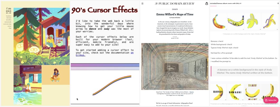
Let’s start the week with the amazing work of Lyne Hehlen. She creates beautiful and colorful illustrations, 2D and 3D animations
#Fox
The cutest fox ever, Que Fofo.
#Inspiration
Beautiful old school illustration inspiration: Emma Willard’s Maps of Time
#Cursors
90’s cursor effects, I have a mixed feeling that goes from “ha ha it’s fun we can technically do that” to “please never implement this on a side it makes me and a lot of people nauseous”.
#Fun #AI
This is a fun experiment: “I recreated famous album covers with DALL-E”
Useful tools and resources that will make your life easy
#Color
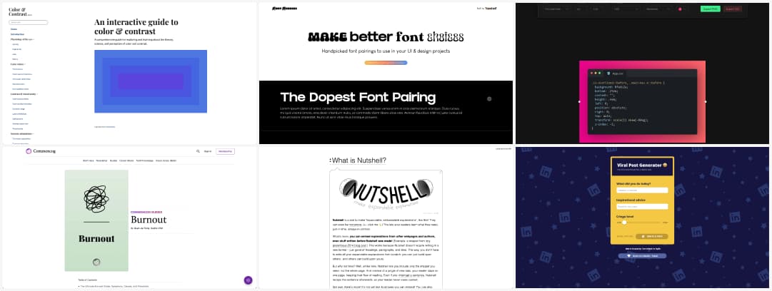
Interactive guide to color and contrast: a comprehensive guide for exploring and learning about the theory, science, and perception of color and contrast.
#Map
A map to make your drive fun by showing you interesting things to see and visit on the road
#Font Pairing
A nice place with examples of fonts you can pair together for your projects
#FAQ
Nutshell is a tool to make “expandable explanations”, I could totally see this used in some FAQ pages as well
#PrettyCode
A cool tool to create beautiful images and videos of your code for articles, conf, presentations, etc.
#LinkedInNoise
Okay, now I get where all those noisy useless viral post come from, they use this tool. The secret of every great influence is finally revealed
#BurnOut
The Ultimate Burnout Guide: Symptoms, Causes, and Prevention, a guide that could help a lot of people
Tutorials
#Accessibility #CSS
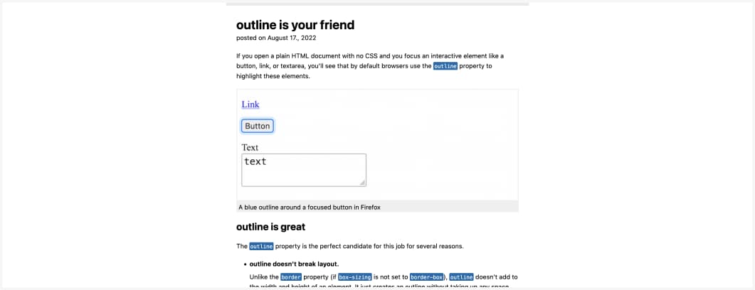
Outline if your friend: be careful when customizing focus styles, don’t forget to test in forced color modes, and always remember that outline is your friend by @mmatuzo
Videos and conferences
#Typography
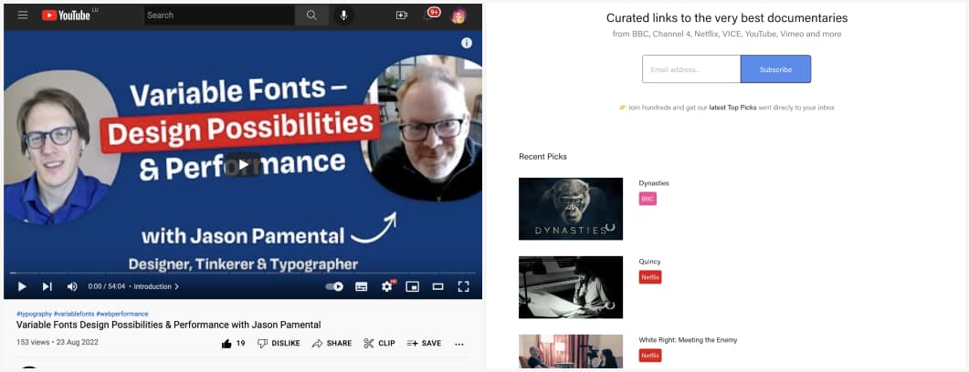
Two of my favorite font lovers, Oliver Schöndorfer and Jason Pamental talk about variable fonts, the possibilities for designers and creative people and performance
#Documentaries
Tired of watching the same things? Here are curated links to the very best documentaries from BBC, Channel 4, Netflix, VICE, YouTube, Vimeo and more
#Accessibility
Introduction To Screen Readers (Desktop Edition) by Bruce Lawson. An interesting thing to understand: a screen reader doesn’t just read a page, but gives valuable information about the structure to help people understand and navigate it.
