Pixels of the Week – August 29, 2021
Every day, I share on Twitter and LinkedIn a list of curated articles I read, resources and tools about UX Design, User Research, UI and mobile design, HTML, CSS, the web industry, some process, some inspiration, etc. This is an archive of everything I shared this week.
#Now – what I’m up to
I’ve got 2 podcasts scheduled with 2 people I really admire, so you can bet I’m super happy and excited to record those. September is close, a new “school” year, so it’s again “time to revamp my mobile design teaching class”. I’m splitting it into 3 modules this time, each can be done on its own. Stay tunes for more info on that.
TL;DNR the ones you should not miss
#Accessibility
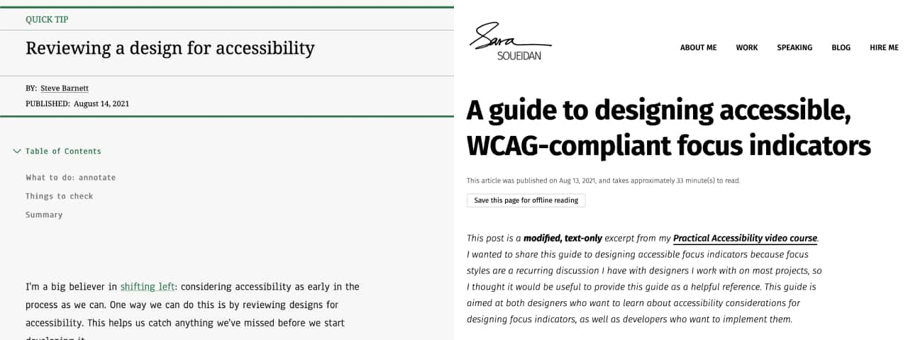
- Reviewing a design for accessibility by Steve Barnett, a list of small checks you can do before starting developing to make sure you got the accessibility bases covered
I would add to double check the contrast ratio one last time as well ^^ - A guide to designing accessible, WCAG-compliant focus indicators by Sara Soueidan
Interesting article
#UXCertification
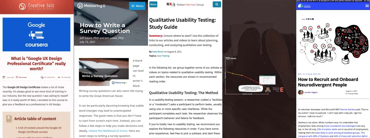
If you are wondering what is “Google UX Design Professional Certificate” really worth, Geoffrey Crofte wrote an honest review article on all the issues with the Coursera platform, the course content, its name, etc.
#UserResearch
- “How to Write a Survey Question” a in depth guide to help you write the right survey questions the right way
- NNgroup has an interesting collection of resources and videos to help you plan and conduct usability testing sessions, from planning to recruitment, building tasks, facilitation, etc.
#Tables
I love how all those “UI tips” articles on “large data tables” have 8 columns maximum on 1980px mockups. You call that a challenge? Try “21 columns, millions figures (no rounding) with users on a 1280px screens” tables ^^ So to help you, here’a few resources:
- How to Fit Big Tables on Small Screens, a short video to help you build complex tables, TLDNR: try to understand what people want to do with that table and designs ways to accomplish that (hiding columns, scroll, re-order, etc).
- How To Display Too Much Data from 2010 but still relevant
- How should large table columns be handled on a responsive design?
#BadCX
Ready for some really bad customer experience? @GrowthDotDesign presents you the Off-boarding of Adobe products.
#Accessibility
The Internet Is For Accessible Porn: like any other industry that operates on the Internet, porn companies and websites must provide accessibility for their disabled customers.
#WellBeing
“Semi-online” by @coryetzkorn, some interesting toughs on how everything is now “online” with this little dot communicating our “presence” on tools and how internet used to be a space you choose to enter but it’s not the case anymore
#Neurodiversity
We need more diversity in the workplace, and this also means, giving a chance to neurodivergent people: How to Recruit and Onboard Neurodivergent People by Jennifer Riggins
Inspiration, fun experiments and great ideas
#Illustrations
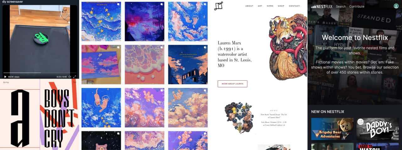
Meet YANNI (@cryyanni) an illustrator & painter who paints cute little cats in the sky. Check their instagram and their website for more links
#WaterColor
Lauren Marx is a watercolor artist based in St. Louis, MO. She paints birds, beasts, fish, plants, and more blossom radiantly on the page in their cycle of birth and destruction. You can also check her insta.
#Typography
The Bumpy Typeface project challenges us to rethink our assumptions about gender through type design
#WTF #KDA
Can we talk about this K/DA Popstar remix with dogos?
#MakingOff
DIY screensaver, all you need is a vaccum robot, green paint and a camera
#Movies
I love this kind of totally meta things: Nestflix is platform that lists the fictional films and shows within the shows.
News in the industry
#Transition
“Smooth and simple page transitions with the shared element transition API” part of me loves that idea, the other part wants to remind you to be careful with animations, they might trigger nausea for more and more people (check prefers-reduced-motion)
#CSS
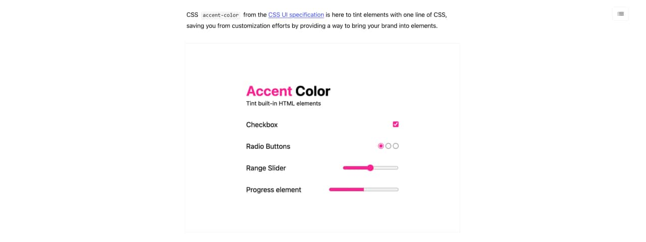
CSS accent-color, we can now style the color of checkboxes, radio buttons, range sliders, progress elements in the browser (Chrome under a flag). This should make a few designers happy ^^
#Robots
“What we’re trying to do here at Tesla is make useful AI that people love and is … unequivocally good.” ** Nervous laugh ** Oh gosh…
Videos and Podcasts
#VideoGameHistory
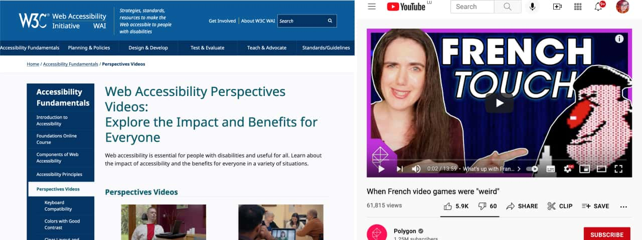
When French video games were “weird”. In the 1980s, French game developers were going wild, making games that would fit right in on itch today. And yes, games used to be (some still are) political and there’s nothing wrong about that.
#Accessibility
Web Accessibility Perspectives Videos – Web accessibility is essential for people with disabilities and useful for all. Learn about the impact of accessibility and the benefits for everyone in a variety of situations.
Tutorials
#Tutorials #Illustrator
illustratorhow is a nice place if you are looking for some Illustrator tutorials to help you become a better designer
#SVG
SVG is awesome and here’s how to build a star rating system, using masks for half starts, with it by @shadeed9
Useful tools and resources that will make your life easy
#UI
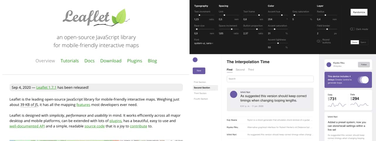
Shaper, a project that lets you style an interface live with different options. I just like to hit the random button and see what different options would look like.
#Mobile #Maps
Leaflet is an open-source JavaScript library for mobile-friendly interactive maps (powered by OpenStreetMap)
