Pixels of the Week – August 6, 2023
UX statement earrings, Accessibility workshops, UX research insights and CSS patterns
On Twitter, LinkedIn, and Mastodon, I share curated articles I read, resources and tools about UX Design, User Research, UI and mobile design, HTML, CSS, the web industry, some processes, some inspiration, etc. This is an archive of everything I shared this week. And some extra links that I decided to only share for the blog readers. Also, subscribe to the newsletter to get notified when those are published!
My accessibility workshop(s)
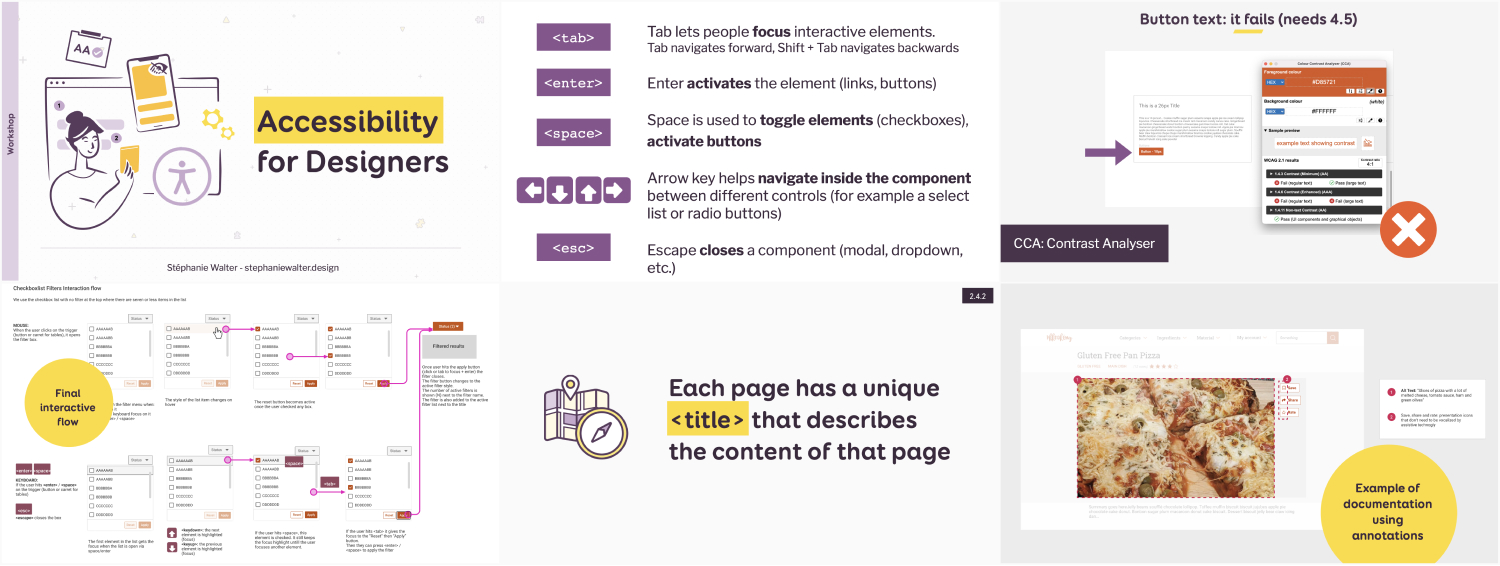
Great news, you now have two options if you are interested in my Accessibility Workshop. You’ll learn how to include accessibility in the design phase, what to be careful about, what you can document and annotation, etc.
- Full-day workshop, Thursday, October 12, 2023 in Antwerp. Check the details and grab a ticket (also if you are a newsletter subscriber, check your emails there is a coupon for you).
- Remote version , 4×2 hours, Mondays and Wednesdays, from 6 to 15 November 2023. Check the remote version early birds tickets.
What I’m up to – Craft Edition
I’ve been testing a lot of new fun things the last couple of weeks.
Shrink plastic

All the fun shrink plastic pieces
First, I gave shrink plastic another try. I bought a heat gun, and it’s a lot of fun. Check the shrinking video of a couple of pieces on my Instagram. I tried some printed ones. To print and get a nice color, you need to make it lighter and desaturate, since it gets darker when you shrink it. I turned them into pins and keychains and some very cool “Talk to your Users” UX statement earrings. The whole series is on Instagram. My main issue with shrink plastic: if sometimes changes shape, so you end up with skewed pieces, and there is little you can do about this. So, you don’t get your perfect print.
Cardboard and PVC

Cardboard and PVC pieces
While looking for a solution for this, I discovered Kandor, who makes keychains with cardstock. I decided to give it a try and created some Luna inspired pins, and a couple of moths . Again, you can check the video of the making of on Instagram for the Luna cat and the Moth earrings. I sealed both with UV resin, and added some some mica powder and glitter.
Last but not least, I experimented with 3D mod podge and created some other moth earrings made with iridescent 0.7mm PVC and some vinyl. I sealed them using 3D modpodge. I’ve sealed PVC with UV resin on another piece (check the crystals in my feed) but I didn’t like how it shrinks and got distorted. The 3D mod podge doesn’t do that, so I prefer it that way.
TL; DNR: the one you should not miss
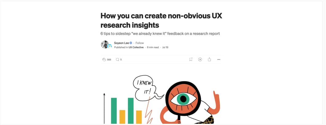
How you can create non-obvious UX research insights (7min) 6 tips to avoid the “yes we already knew that” when presenting UX research reports: start with stakeholder interviews to clarify what they already (think they) know, combine methods, include extreme users when recruiting, build aha moments, present the findings in a narrative, and remember that it’s normal they feel that way too due to the hindsight bias (by Soyeon Lee)
Interesting articles that caught my attention
I’m introducing a time to read after the article link. It’s based on Firefox’s reader mode, but it should give you an idea of how long / short articles are. Let me know what you think of it (by email or social media).
UX Research and design
- Unmoderated User Tests: Optimize and Scale Your Research (15 min) when to use unmoderated user testing, some advice to optimize them, but also, very important, when you want to avoid this method by Nikki Anderson-Stanier
- How to Conduct Contextual Inquiry in Usability Testing (7min) a short introduction to this method that involved interacting with users in their usual context (aka you go to them where they are using your product / service), why use them, when, when not to, pros and cons
- Are data dashboards vanity projects? (12min) not everyone is good at understanding complex data, no matter how visually appealing you present them. Before investing in building data visualizations or dashboards solely because they seem necessary to remain competitive or because that’s what other B2B and B2C products are doing, it’s crucial to consider your users and their actual needs.
- Product List Usability: Avoid ‘Quick View’ Overlays (12min): I was wondering about the efficiency and usability of those. Turns out, they don’t work well for spec driven sites, focus instead in improving the product list and product page.
- Gaming UX Research: 5 Lessons to Level-up User Experiences Across Industries: from becoming an “expert” in the subject matter, to observing users going through a complete flow without interrupting, I never noticed that game UX research is actually quite close to doing research for financial services or healthcare. Maybe I could work in game UXR once I’m tired of finance, haha.
- How do incentives impact bias in UX research? (20min) a long read to help you understand different types of incentives and how they impact user research, and how to mitigate this
Accessibility
- Web Accessibility in High-Risk Segments (10min): not being accessible is a risk and the best way to mitigate it is to start making meaningful progress on accessibility now. Doing so is the least expensive, least stressful, and most-sustainable approach.
- 8 common heading questions: let’s debunk a couple of myths and bring best practices around accessibility of headings (h1, h2, etc.)
Other interesting articles
- Death of Ownership: Companies Use Software, Subscriptions to Grab Money From Customers (10min) How companies are taking away our ability to “own” stuff, but also repair what we bought with various unfair restrictions on good
- The Psychology of ChatGPT (13min) the 12 biases of ChatGPT that product researchers (but really anyone looking to get better results out of it) need to be aware of
Curiosity cabinet: non-design/tech rabbit holes I enjoyed
- Riding the WORLD’S LONGEST Model Train Track, 37 miles / 60km of model roads, and I’m just fascinated.
- Chinese Zoo Denies Their Bear Is a Dude in a Bear Costume: conspiracies are amazing, but kind of sad too, so, nope, those are bears, just very small ones that can stand on 2 feet
Inspiration: fun experiments, beautiful art, and great ideas
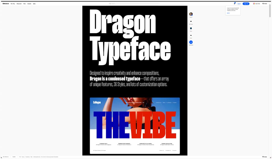
Dragon Typeface: looking for a hot variable font? Meet Dragon, a condensed variable font, with 36 and a lot of different options by Rajesh Rajput
Useful tools & resources
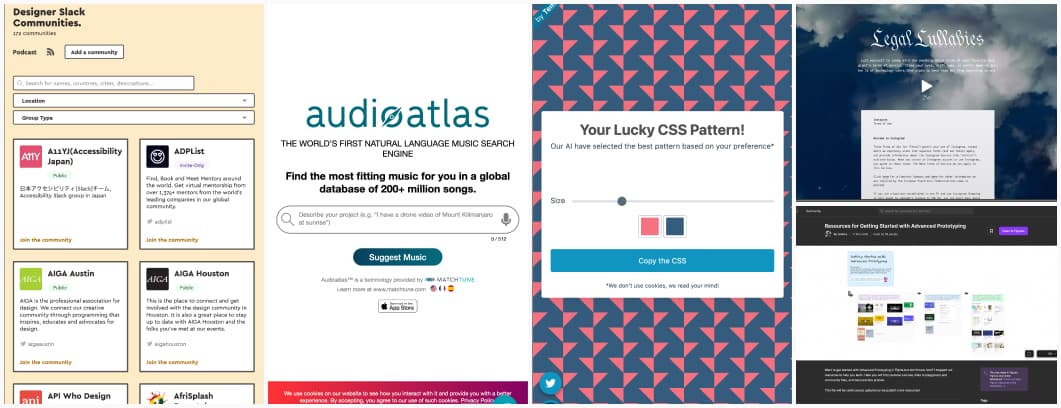
- Legal Lullabies: can’t sleep? Why don’t you try listening to some soothing voice reading you the Instagram terms of service? Or the TikTok version. I think this is pure chaos genius and I’m here for it!
- Designer Slack Communities: a place to find designer communities based on interest and location and grow your network
- Resources for Getting Started with Advanced Prototyping: a FigJam board with YouTube videos, demo, tutorials and articles to help you start playing with the advanced new prototyping features of Figma. Curated by Mallory Mallory Dean
- Audioatlas: a tool to find music based on a prompt you enter. Honestly, not bad so far.
- Fun random CSS patterns: refresh to get a new one!
Tutorials
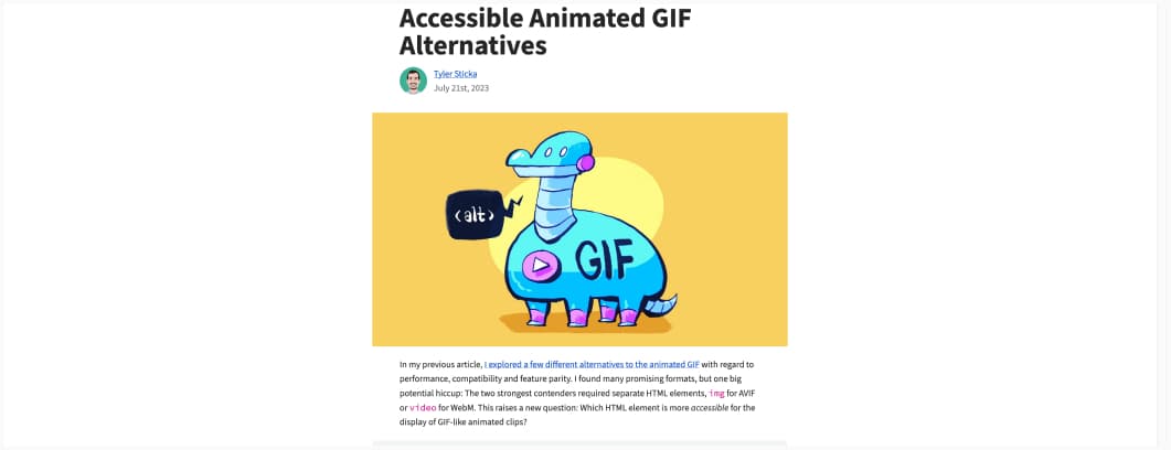
Accessible Animated GIF Alternatives: using the video element to put looping “GIFs” that visitors can control, don’t autoplay when user as reduced motion on, and have a text alternative.
Latest news in the industry
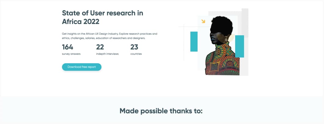
An interesting state of the UX report that focuses on Africa (2022) (shared by Harry ben Bossuki)
