Pixels of the Week – December 19, 2021
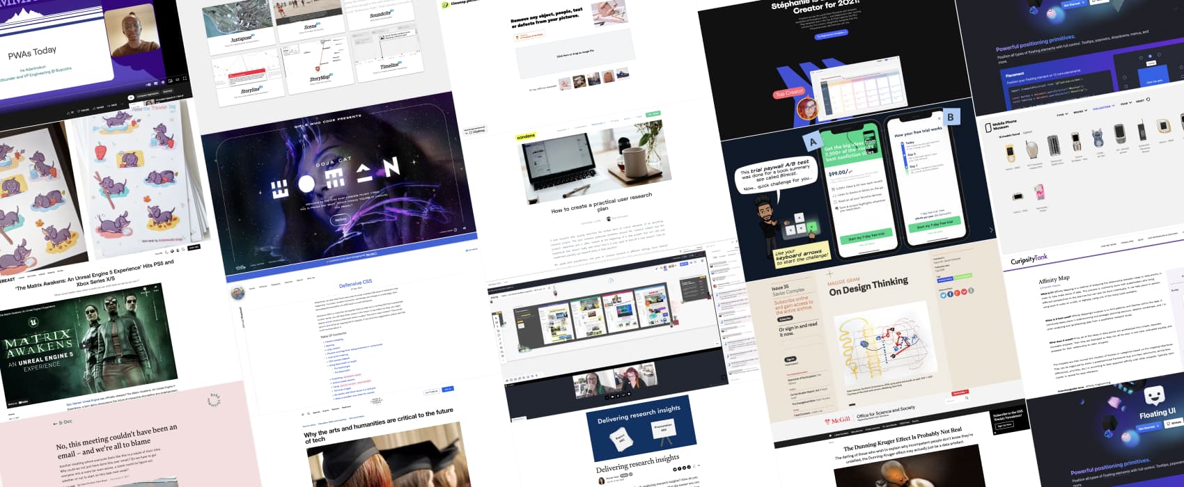
Every day, I share on Twitter and LinkedIn a list of curated articles I read, resources and tools about UX Design, User Research, UI and mobile design, HTML, CSS, the web industry, some process, some inspiration, etc. This is an archive of everything I shared this week.
#Now – what I’m up to
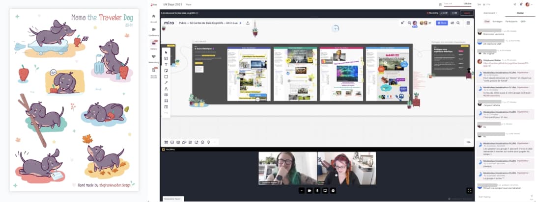
This week I published “How to Facilitate a Remote Workshop on Cognitive Biases“. We created a workshop with physical cards, this year we brought it online.
I had a lot of fun with my kawaii illustration course. So here’s my final project: Momo the traveler dog. The sticker sheet is based on the life of Myriam Jessier’s dog. And yes the little dachshund visited Google Zurich and even got a badge ^^
I’ll also be on holidays for the next 2 weeks, so this is the last edition of pixels of the week for this year. Wishing you all the best for the end of the year festivities. And stay safe!
TL;DNR the one you should not miss
#CSS
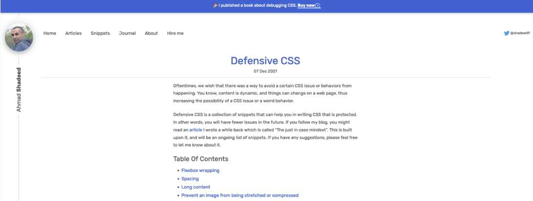
This is amazingly useful: a list of CSS techniques to make sure your content is protected from overlapping and other small issues when it grows or expands. Because content is often dynamic, you need some defensive CSS (by @shadeed9)
Interesting article
#UserResearch
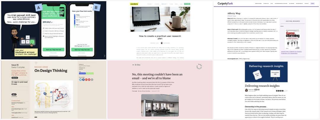
- This week’s definition on UX Lex is Affinity Map: a method of analyzing the relationship between ideas or data points, in order to help make sense of data.
(via Michele Ronsen’s newsletter) - Conducting the research is just a small part of the job. At some point you have to deliver user research insights to the team, stakeholders, etc. Here’s some interesting tips by @beehoyle on how to do that
- “How to create a practical user research plan“, a nice introduction to what a research plan, why you need one, how to create it and a few templates by Sina Schreiber
#Design Case Study
Interesting case study trying to improve and explain the psychology behind a free trial onboarding A/B test experiment. I’m not sure how I feel about using the fear of forgetting to cancel to push (haha) users to accept push notifications tough
#Figma Tokens
This is really nice technique for consistency: How to manage space in Figma using tokens
#Design Thinking
On Design Thinking: Long interesting read on the origins of design thinking and how a big corporation (IDEO) branded it and how the DT solutions applied to Gainesville’s design experiment actually did irreparable damages to the city.
#Psychology
“The Dunning-Kruger effect was never about dumb people not knowing they are dumb or about ignorant people being very arrogant and confident in their lack of knowledge” interesting read on why D-K effect may actually just be a data artefact
#Food
27 courses, very little edible: Review of Michelin-starred restaurant goes viral I don’t know what’s best in this news, the horrible mouth eye container for food, or the horrible condescending reply of the chef that includes a drawing of a horse. But this is internet at its best.
#Technology
“Why the arts and humanities are key to the future of tech” in a technological complex landscape with AIs, privacy concerns, inclusion issues, we more than ever need people able to think critically, an not just people who can code.
#Meeting
“No, this meeting couldn’t have been an email – and we’re all to blame” interesting read on why we end up with so many meetings and what we could do about it to make this better
Inspiration, fun experiments and great ideas
#LearnToCode
This is awesome: @girlswhocode partnered with @dojacat to turn her music video onto a small tutorial to learn to code. You can use different languages to interact with some parts of the video.
#Game Engine
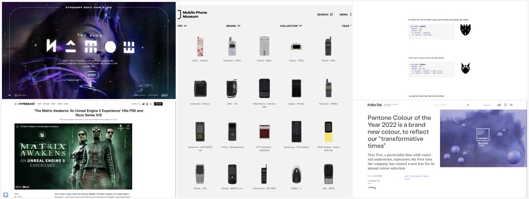
Wow, this is impressive: a demo using Unreal Engine 5 for the Matrix Awakens. “What would reality mean when a world we can build feels as real as our own?” Also, “agents are bad, but whatever you do, stay the hell away from marketing”
#Phone Design
Feeling nostalgic? Here is the Mobile Phone Museum. The collection “ugliest” is quite fun. What was your first phone? Mine was the iconic Nokia 3310, with the snake game ^^
#CSS
This is fun: some CSS shapes generates with polygons and clip-path (by @yuanchuan23)
#Color
I’m happy to see a violet as pantone colour of the year 2022. And yes, I’m biased (just check my yellow and violet website haha). Looking forward to see some interior design items in that color. I want some violet pillow to go with my yellow ones ^^
Useful tools and resources that will make your life easy
#UserJourney Template
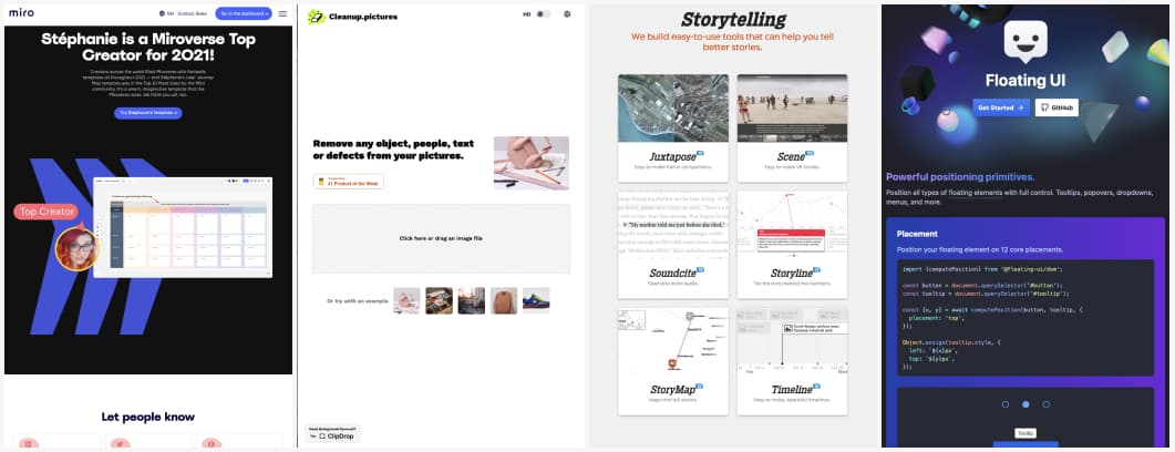
Apparently my User Journey Map template was in the Top 10 Most Used by the Miro community. Whooo, super happy it if helps people!
#Tool
A tool to quickly remove some objects, people or text from a picture
#Dataviz #Storytelling
This is a really handy list of tools that help make information meaningful and promote quality journalism, storytelling and content on the internet by @knightlab
#UITool
This is nice: Floating UI is a low-level library for positioning “floating” elements like tooltips, popovers, dropdowns, menus and more.
Videos and podcasts
#PWAs
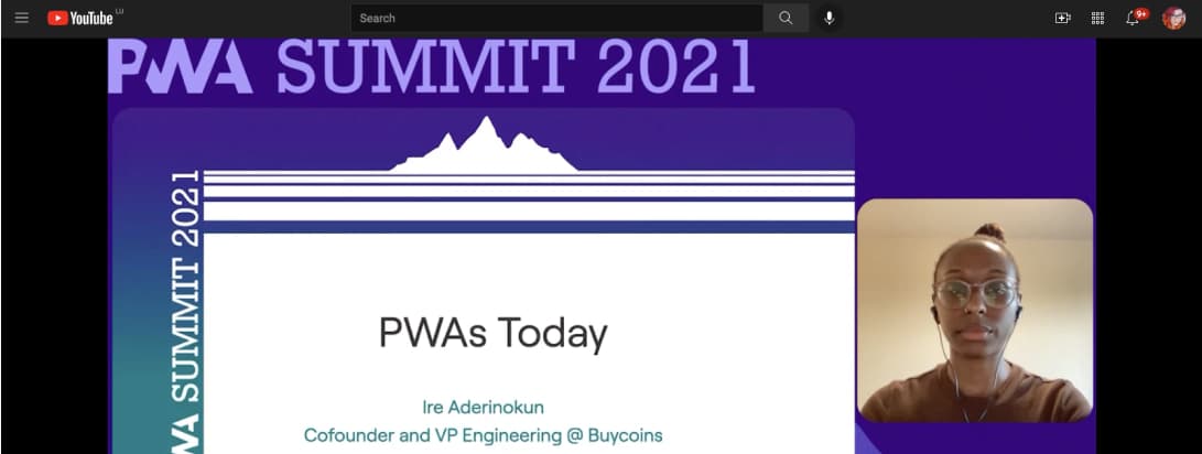
PWAs were introduced in 2015, where are we today, what can you do with those? @ireaderinokun answers all of those questions and so much more on her great talk “PWAs Todays”
Tutorials
#Performance
If you have to deal with displaying big tables in a browser (hi you work in finance too? ^^), here’s and article that should help: How to lazy render large data tables to up performance
