Pixels of the Week – February 1, 2026
Manipulative buttons, a free accessibility book & art exploring adult issues
Pixels of the Week is my weekly-ish curated newsletter for designers, UX folks, devs, and anyone building accessible, inclusive, usable (and let’s be honest, awesome) digital products. This week includes sad accessibility predictions, a free accessibility book and some manipulative buttons. Also: some art exploring adult issues, a font tools and an SVG stroke animator.
Subscribe to my newsletter to get this directly in your mailbox!
Now: accessibility barriers cards and carrier pigeons
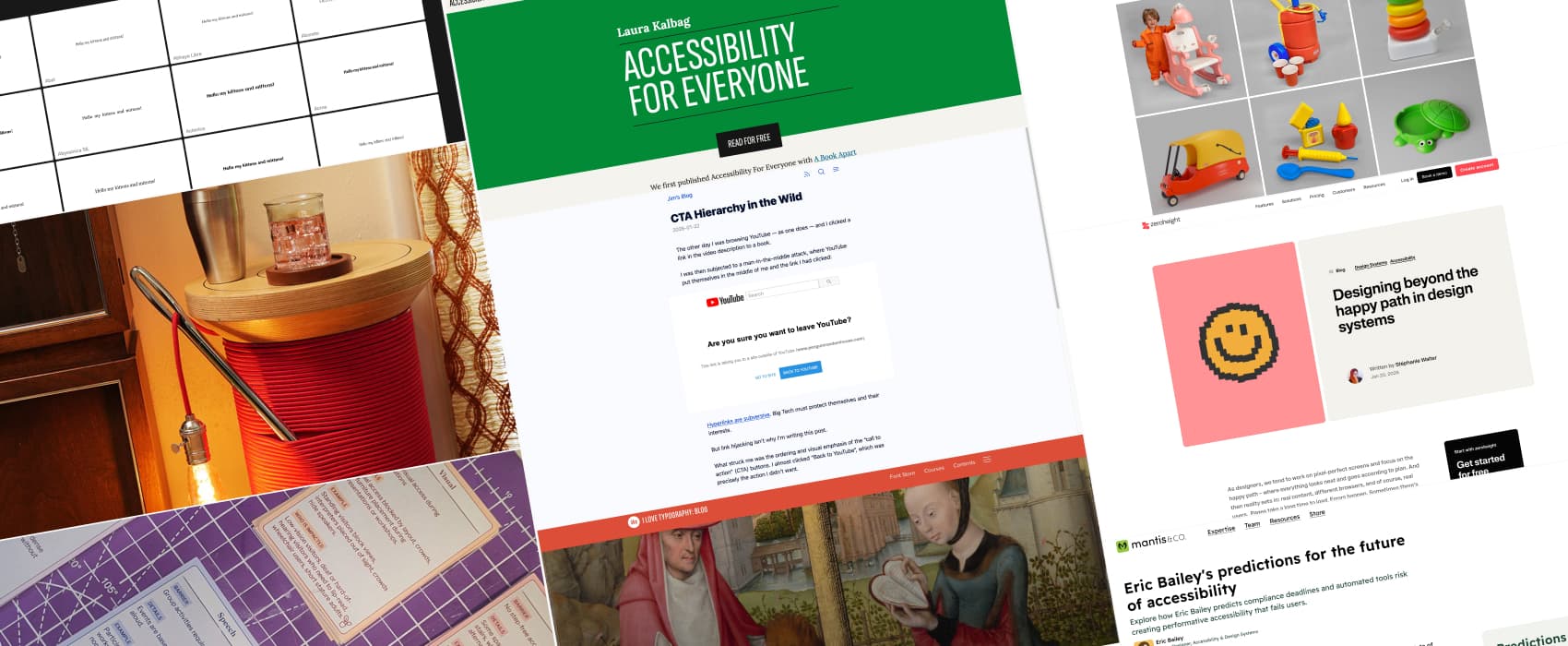
Shorter selection this week, because, it’s been a wild week, and I had very little energy to read anything. My client’s work is super busy at the moment, so, I’m a little tired. And on top of that, I went to Bruxelles on Friday to run a brand-new workshop: mapping accessibility barriers for public spaces. This space was a museum. I shared a preview of the cards on Bluesky, Mastodon and LinkedIn. The workshop went great, people were super invested. I had amazing feedback. I will write about this, once I get some spoons back.
The trip though, wow. It’s supposed to be a 3.5 hours trip by train from Luxembourg to Bruxelles. But, there was a strike, the train got cancelled, so I arrived 2h30 late. The strange part: I was okay. I’m the kind of person who stresses a lot about travel, before the travel, imagining all the worse situations. So, I thought it would trigger anxiety. But in the end, my brain is strange, and works very well in crisis. I waited for the only train available. I accepted that I will be 2h30 late and there is nothing I can do about it anyway, and we adapted the workshop schedule. And, then on the trip back, I ended up with 5 pigeons in my compartment. Not kidding. We herded them to nicely get them out, so that we could continue the journey. Needless to say, my Saturday was, zero spoon, potato couching.
Most popular content this week
CTA Hierarchy in the Wild (3min) Another “I don’t like what he says, but I sadly agree” article this week: CTAs hierarchy. It changed from “what’s best for the user” primary action, alternative as secondary, to “what’s best for the company” (primary) /what’s acceptable for users (secondary). Yup, yup, raging yup. By Jim Nielsen
Interesting articles that caught my attention
Designing beyond the happy path in design systems (10min) The designer’s happy path is only a fraction of the real experience. On zeroheight’s blog, I share a practical checklist to design components that survive loading, error, empty and offline states, real content, and diverse users. Less Figma fantasy. More reality!
Eric Bailey’s predictions for the future of accessibility (7min) I don’t like his predictions. But I can’t disagree. I’m already seeing the grifters circling, selling fake fixes and performative compliance. Just like with cookies. Accessibility deserves better than checkbox contracts and automated snake oil. And on a personal note: accessibility also deserves better than an army of lawyers, who put efforts into finding loopholes so that your products don’t have to comply with EAA (European Accessibility Act). Let’s stop this nonsense, and, put budget into training developers, designers, project managers, even stakeholders. I’m convinced that the fear (and lawyering up) comes from people who mostly don’t even know what is expected to make sites accessible and are just scared. We need stakeholders to understand that it’s not impossible, it will bring business, and, it’s also the right thing to do.
Curiosity cabinet: non-design/tech rabbit holes I enjoyed
Heart-shaped Books the different symbols of the heart in history, and how the heart symbol became linked to love, with the appearance of heart shaped books.
Inspiration: fun experiments, beautiful art, and great ideas
SPOOL TABLE – Yetch Studio yup, that’s is, a giant spool table, it’s a statement for sure, but I still love it. I think it would go well with the giant BIC lamp from last week.
Kids Toys, Adult Issues (trigger warning suicide, self abortion, drugs)) Andrew Sahlstrom uses nostalgic toy-like sculptures to explore difficult adult themes like grief, addiction, anxiety, and mortality. The aesthetics is plastic, colorful, playful yet, which makes this honestly unsettling.
Books
Accessibility for Everyone I’m often asked for accessibility resources for beginners. Laura’s book has been my go to. It’s clear, practical, and works for designers, developers, and anyone involved in building products. The best part: it’s now free and available online. Bookmark it. Read it. Share it!
Useful tools & resources
Font Mojo a simple online tool to compare the same text in multiple fonts. Very useful when searching for a heading font, or designing logos
Stroke – Animate SVGs an online tool to animate SVGs you can hand-draw.