Pixels of the Week – February 15, 2026
Accessibility innovations, components accessibility checks and a fun 404 page
Pixels of the Week is my weekly-ish curated newsletter for designers, UX folks, devs, and anyone building accessible, inclusive, usable (and let’s be honest, awesome) digital products. This edition explores how accessibility innovations became mainstream, 5 quick component checks to build better UI and invisible work in projects. Also: open source design tools, UI inspiration and new CSS features in 2026.
Subscribe to my newsletter to get this directly in your mailbox!
Now: what I’m currently up to
I’ve finished my slides for my talk How to Convince People to Care and Invest in Accessibility at axe-con and sent them for remediation. Reminder: it’s a free online conference with many other great talks! I, of course, did what I usually do: plan to re-use a talk with minimal edits, and then, end up spending 10 hours rewriting the talk, adding content, removing other parts, changing the whole hierarchy and structure to better fit that specific audience.
Most popular content this week
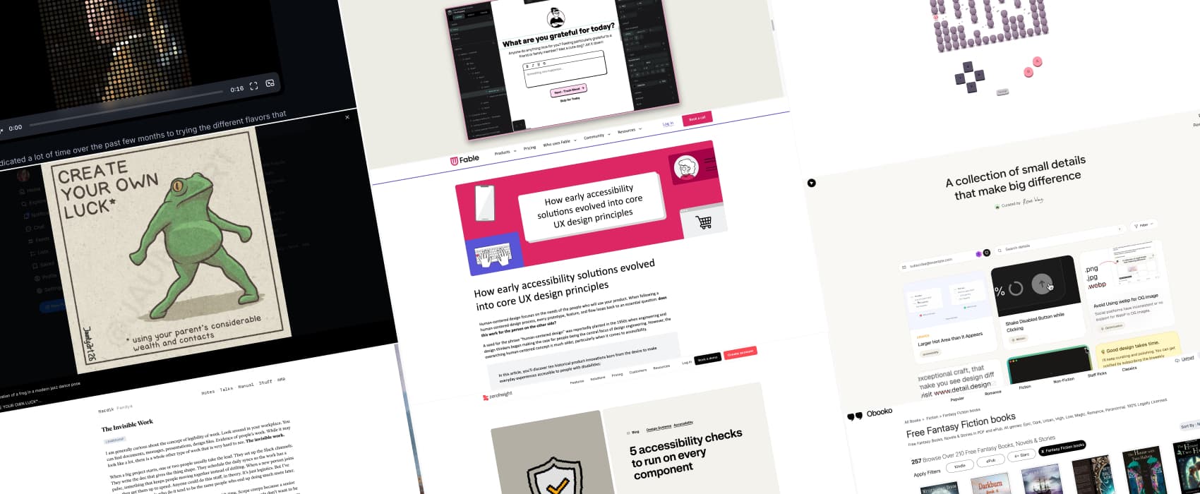
Accessibility is the origin of human-centered design (5min) 10 examples of how accessibility innovations like the typewriter, audiobooks, the typewriter, text-to-speech, online shopping, and touchscreens began as solutions for disabled people and evolved into mainstream products that benefit everyone. This usually makes a strong argument against the pushback “accessibility kills creativity / innovation”. In fact, it’s quite the opposite!
Interesting articles that caught my attention
The Invisible Work (8min) We all know that person, who does the invisible work, who quietly coordinates and holds projects together. They sadly rarely get credit for it though. It’s hard to measure, and often overlooked. We need to find leaders who can see and reward this invisible work. by Hardik Pandya
5 accessibility checks to run on every component (6min) Testing accessibility at component level is such a good first step toward an accessible product. Hidde De Vries shares 5 quick checks: keyboard, tokens, clear control names, zoom/user preferences, and screen reader behavior. Small habits, big impact.
Inspiration: fun experiments, beautiful art, and great ideas
Detail a curated list of nice little design details that make a big difference: nice UI, motion and interactions that simply work.
Caveat Frogs You should always read the small prints. Always… Caveat Frogs is a fun illustration project, with frogs, and, well, fun small prints, by Jaunty Art (Also on Instagram)
Elle Sho 404 page a fun 404 page with a cute little game. The rest of the website is equally fun.
Books
Does the existence of a “Fantasy Fiction” filter category mean, there is also a “Fantasy Non-Fiction” somewhere. If so: where is my dragon?!?
Useful tools & resources
The open source design stack if you are tired of every design tool ridding the AI slope, or just need open source alternatives, a goldmine of open source alternatives for research, prototyping and collaboration, with Penpot and HTML/CSS at the heart of a saner design stack
A small collection of text-only websites very niche but very interesting: websites that offer a plaintext version when you add .txt, .md or other nuggets to the URL. by Terence Eden
Tutorials
CSS in 2026: The new features reshaping frontend development (12min) in case you blinked and missed a couple of new CSS features, from select customization to cool things like sibling-index(). By Jemima Abu
Shades of Halftone (28min) some fun with halftone shaders in GLSL, by Maxime Heckel