Pixels of the Week – February 16, 2020
Every week I share a list of curated articles, resources and tools about UX, UI and mobile design, HTML, CSS, the web industry, process inspiration and more…
This week’s selection: working with UI frameworks, large phone UX, accessibility and neumorphism, progressive enhancement, focusing on user needs instead of competition, design systems, notifications refusal rate, responsive typography, accessibility dev tips, CSS transition, CSS in React components, etc.
#Now – what I’m up to
This week I was invited on the Smashing Podcast from @smashingmag. We’re taking a look at UI Frameworks and how can the custom needs of a highly usable application be met with a set of off-the-shelf tools: Smashing Podcast Episode 9 With Stéphanie Walter: How Can I Work With UI Frameworks?
I updated my list of selected books on design, User eXperience, mobile, accessibility & more with a new section dedicated to Information Architecture & Content Strategy. The first book in this list is Lisa Maria Marquis’s Everyday information architecture!
On my blog this week I replied to someone who asked me an interesting question by email: “What minimum font-size for a high-density data web app do you suggest?”
TL;DNR the one you should not miss
#UserResearch
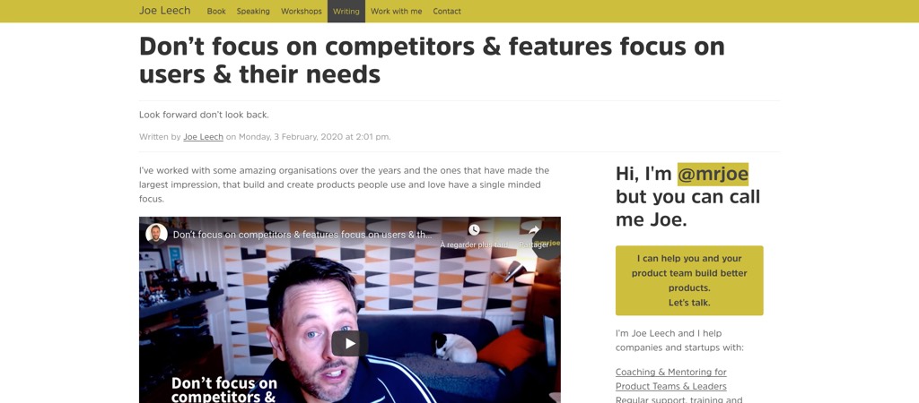
“Don’t focus on competitors & features focus on users & their needs” – Joe Leech.The real way to innovate is to out there, understand your users, their needs, find new niches and solve their problems
Interesting article
#Mobile
“Large screen phones: a challenge for UX design” by Maria Grilo. Totally agree, it’s becoming quite complex. As a user, it was more convenient for me when Chrome had almost everything on a bottom tabbar. I re-activated it using a flag ^^
#Accessibility #Trend
An attempt to make Neumorphism more accessible. What do you think? Personally I’m not super convinced here by the result but I’m happy that people try to make something accessible
#UX
“UX: What happens when the user wants out?” A great article about making onboarding easy but making it super hard for users to leave the service. Sometimes you wonder if it’s not hard on purpose
#Design
Black History Month spotlight: advice from 10 accomplished black designers
#Notification
“YEStifications: Exploring how users engage with notification prompts in the Chrome UX Report” TLDNR: 16% of global users accept them, maybe it’s time we start finding ways to build better notification?
#Design System
The design systems we swim in: “Does the system you work with allow you to control the process of your work, to make situational decisions? Or is it simply a set of rules you have to follow?” Great article on the freedom and constrains that come with a design system
#Content Writing
Haaaa, I almost forgot how amazing the “Want to Pick My Brain?” page on
Myriam ‘s site is. Everyone who does freelance work, consulting and shares some knowledge needs one of those
#FrontEnd
Hydration: Jeremy Keith explains the current situation of JS server side rendering and progressive progressive enhancement that leads to quite a poor experience for users who have to wait to interact content even if it’s on the screen.
#Typography
“Responsive Type and Zoom” a few examples to demonstrate different behaviors based on the way you build your site
#SEO
“You and Your FAQ Page: A Guide to Better SEO & Vocal Search” Myriam tells you all you need to know to optimize your FAQ!
Inspiration, fun experiments and great ideas
#Illustrations
Jesse Lonergan is a really talented illustrator and you should totally check this portfolio out.
Tutorials
#Accessibility
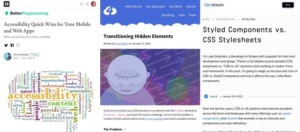
“Accessibility Quick Wins for Your Mobile and Web Apps” I really like the idea of adding some accessibility rules to the linter!!
#JS #CSS
Transitioning Hidden Elements, building a side drawer menu that transitions on the screen when users click on a button is not as simple as it seamed
#CSS #React
Styled Components vs. CSS Stylesheets: great wrap up of pros and cons of both techniques
Useful tools and plugins that will make your life easy
#Figma
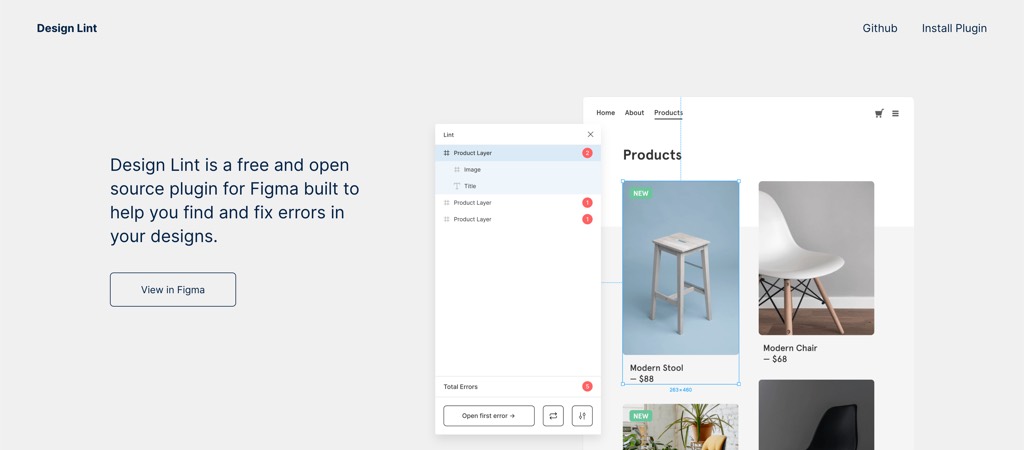
“Design Lint checks for missing text, fill, stroke, and effects styles. It also catches incorrect border radius values.” meeeh I want to use Figma this plugin looks awesome (via Smashing Magazine)
#Browser
“Building the Web We Want” by Stephanie Stimac, building the web we want by giving browser vendors what we want fixed


