Ask me Anything: What minimum font-size for a high-density data web app do you suggest?
I get quite a few emails with very specific questions about UX and UI design. Most of the time, the question is so specific that it’s hard to reply in just a few lines without understanding the context and users of the project. I can nevertheless give some generic advice in some cases. I decided to share the replies to those questions (with authorization of their authors) so that it will help more people. So here we go, I’ve no idea if this is going to become a “thing” on this blog and needs a specific section. For now, let’s try to keep it short and simple.
This first article is about font size and the minimum font-size for high-density data web app.
The “minimum font-size” question
Here is the question I was asked in an email:
“Hi Stéphanie,
I’m a developer in a company that produces high-density data software. I’m building a web app for a client in 1024 x 768 screen resolution and I use font-size:14px;
Some colleagues use font-size:10px; or font-size:12px; We are not a big company with a UX designer to decide 🙁
What is your personal point of view in what should be the minimum visible font-size (for a high-density data screen with data grids)?”
Some “quick” advice for minimum font-size.
First, it’s really hard to give advice without actually “seeing” the software and understanding who the users are their goals and how they use it. So keep in mind that those are quite generic advice that can be applied to many web app software design. But you should always test it on YOUR users.
It depends…
In my humble opinion 10px and even 12px is usually really small in many cases. BUT this depends on a few things.
It depends on the font itself. Some fonts display smaller letters, other bigger ones, different fonts have different kerning, some fonts are easier to read on screens, some are not. It means that some fonts will look okay at 10px for your data tables and some will be almost impossible to read and you will need to make them bigger (or change the font itself if it comes to that).
It also depends on the browser and the operating system. Different browsers and operating systems have different antialiasing. Chrome is known for crappy antialiasing on Windows for example. Try Fira or Lato Thin on Chrome Windows and you might not even be able to read the text. That’s why I would advise you to NEVER use thin fonts on a website.
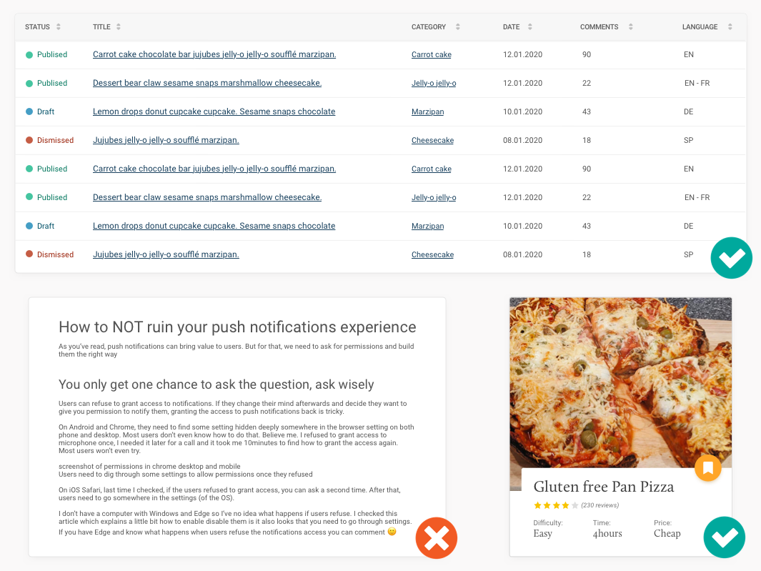
A 12px font-size here used as table header, repeating tags (it works) and body copy (it’s hard to read because of the amount of text)
In this example I tested Lato Thin and Roboto Regular on a few browsers in different operating systems. The way it is displayed is not the same at all.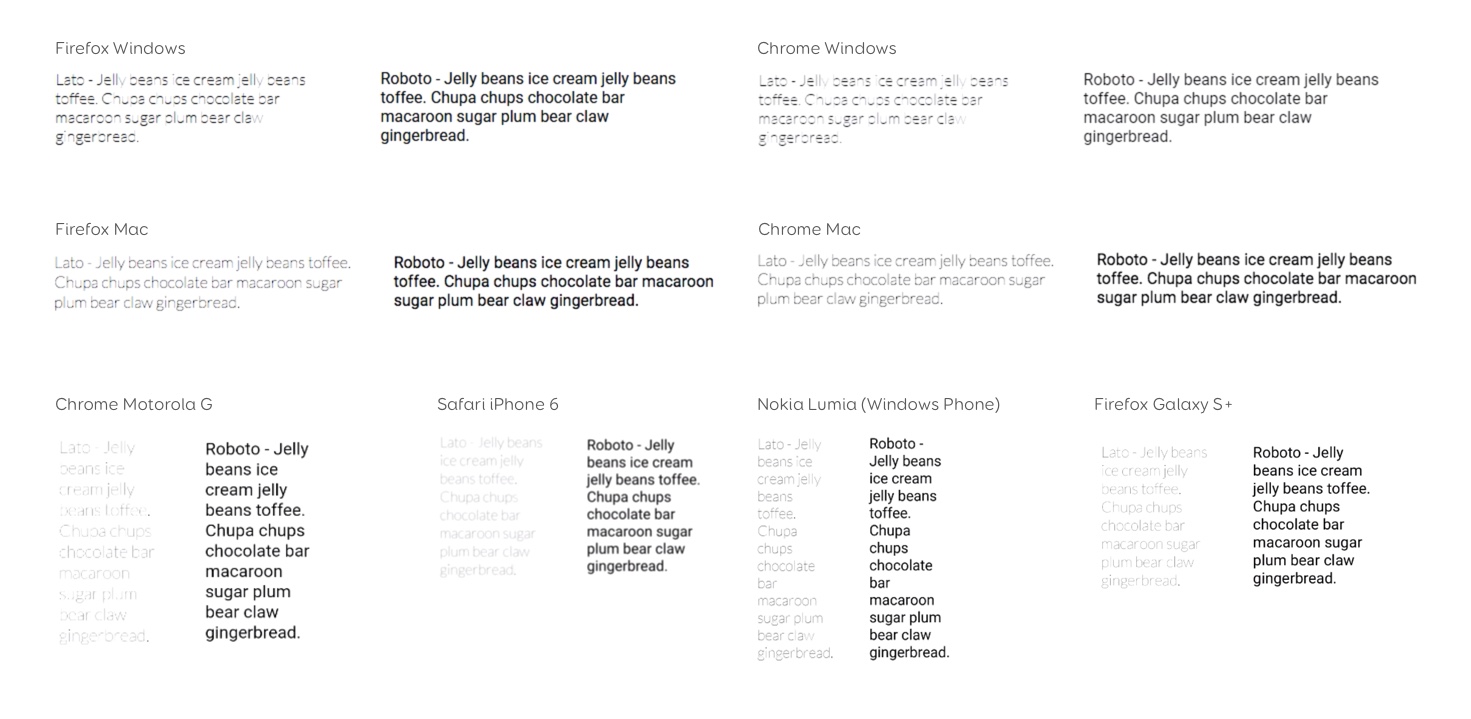 It also depends on the context and what the font is used for. 10px for headings in tables or a tag in a card could do the job because users only need to “see” those quickly as illustrated in the image here. On the other hand, with the same font (in this example Roboto Regular), reading a 10 lines paragraph text with a 10 pixels font size can be exhausting really quickly. So, the minimum font-size will also depend on the elements on the page and what they are used for.
Browser defaults is 16px
By default, most browsers set the font-size to 16px when you install them. This seems to be a convention. I don’t know if it’s based on some research (I kind of hope it is? I’m not the only one wondering) but you could assume that 16px should be a good “base” for font-size for the body text (copy that is going to be read and split in paragraphs).
Gather feedback from your users!
In doubt (like here) try to gather feedback from the users and see if some people complain about the font size. Maybe the software has a support team who gather this kind of information (even old school IT support)?
There might also be a way to programmatically catch if most users zoom on your site and make the font bigger in that case. Log this and then see how many of the users, if it’s a lot, maybe you need to make the font bigger. Here’s a good article on that topic: Pixels vs. Ems: Users DO Change Font Size
Don’t forget about accessibility
If it’s a web app, make sure that the users have the ability to increase the size by 200%. To do so, use relative units (em, rem) rather than pixels (more in the resources above). This way, even if the font is too small for some of them, they can have the interface adapt. Test your site with different levels of text zoom and make sure content is still readable and doesn’t overlap.
Also don’t disable the zoom on mobile (with viewport declaration for instance). Never. Ever. Even if you optimise your website for responsive, you have no idea what kind of situation your users are in. So, don’t take control of their browser, let them zoom if they want to.
Maybe you need to work on your information architecture
Last but not least: based on my experience with B2B and high-density data interfaces, reducing the font-size is usually an “easy” way to display a LOT of data and content on the screen. Many B2B users are quite happy to have a lot of data on the page since it provides them an overview. I’m pretty sure that many would be super happy with an excel sheet in the browser. Data density is a complex thing for B2B software. To solve this tricky dilemma, we usually need to work on the information architecture of those pages. There’s a concept called “progressive disclosure”. The idea is to not show all the data right away, but to progressively display is when users need it.
To build interfaces with progressive disclosure in mind, you will really need to work with the users to understand what kind of information they need, when and what they do with that information.
You can also use font weight and colors to build a well-structured set of data. But that’s another big topic, I guess.
Reading further
In case you were wondering, the header image was taken at the Buchstabenmuseum in Berlin and I totally recommend this museum.
- What’s the best font size for the web? Well, it depends…
- Font Resizing Guidance
- REM vs EM – The Great Debate
- Google advices at least 12px.
- On Web Typography: a great book to help you get started with typography with a lot of advice to choose the right font and font-size
- My list of articles on table design, if you need help with complex high data density content