Pixels of the Week – February 17, 2019
Every week I share a list of curated articles, resources and tools about UX, UI and mobile design, Front-End development, HTML, CSS and more…
This week’s selection: form design, pixel fox, design for data density, running research sessions, leveraging mental models, ineffectiveness of lonely icons, conversations about diversity, meetings about product design, design systems for mobile apps and desktop, CSS4 selectors, design tips, mobile design advice, learning HTML and CSS, etc.
You can follow me on twitter to get a dose of links every days.
TL;DNR the one you should not miss
#data #UX #complexdashboard
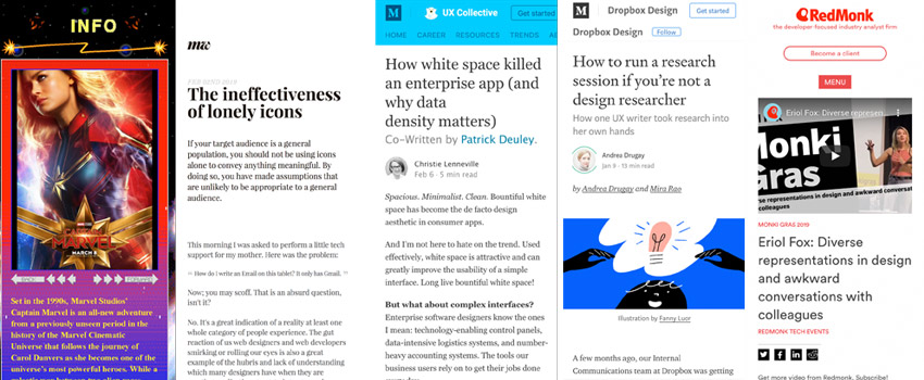
Sometimes adding more whitespace and having a minimalist design won’t work for your users. A great read and tips on “How white space killed an enterprise app and why data density matters”
Interesting article
#UX #Research
- How to run a research session if you’re not a design researcher: real world Wednesdays, a speed dating like quick research format that is both fun and informative. This gives me a few ideas for our next weekly user session
- Leveraging Mental Models in Product Design, I really like all the mental model related UX tool, it’s super useful to understand what people expect and how they expect it
#Product Design
Principles For Designing Better Products – different type of meeting formats to nourish and develop ideas for your product
#UX #Forms
Don’t Get Clever with Login Forms a few annoying login form patterns and how to do it better. TL;DR; create login forms that are simple, linkable, predictable, and play nicely with password managers.
#Design system
- Creating a web design system from an app design system: translating mobile design into desktop one is never easy. Here are a few interesting tips to help.
- Don’t be afraid to “think outside the database” — your UI doesn’t need to map one-to-one with your data’s fields and values. Here are a few ideas you can use to present “field: value” data in a more interesting way.
#Mobile Design
“Tips for making interactive elements accessible on mobile devices” great tips, I’m adding this as a ressource to read for my mobile usability students <3
#Icons
The ineffectiveness of lonely icons… Icons are pictograms. They’re modern day hieroglyphics. They’re poor at conveying meaning and are easy to misunderstand, or are simply unrecognisable. Archeologs needed years to interpret those because context was lost.
#CSS
- CSS selectors level 4 – there’s a lot coming and already supported to help you select almost anything in CSS
- Great read —> BEM for everyone else – Using emoji to explain the principles of BEM
#Browser
Paint the Picture, Not the Frame: How Browsers Provide Everything Users Need > interesting, I’d add a point about not taking control over the click behaviour.
Regarding contrasted theme, it’s sometimes the only solution for predefined visual identity.
Talks
#Diversity
Eriol Fox: Diverse representations in design and awkward conversations with colleagues
Inspiration, fun demos and Great ideas
#Game #Pixel
#CSS
CSS puns illustrated and you can even have them on a T-shirt
#Webdesign #Fun
Captain Marvel brings 2000 back and it’s awesome
Tutorials
#CSS #HTML
Where Do You Learn HTML & CSS in 2019? A list of sites and books for beginners.
Also if you speak French, here is my HTML/CSS free course. It’s 2 years old now, no flexbox, but it’s still useful to learn the basics of HTML, CSS selectors, cascade, etc.