Pixels of the Week – February 2, 2020
Every week I share a list of curated articles, resources and tools about UX, UI and mobile design, HTML, CSS, the web industry, process inspiration and more…
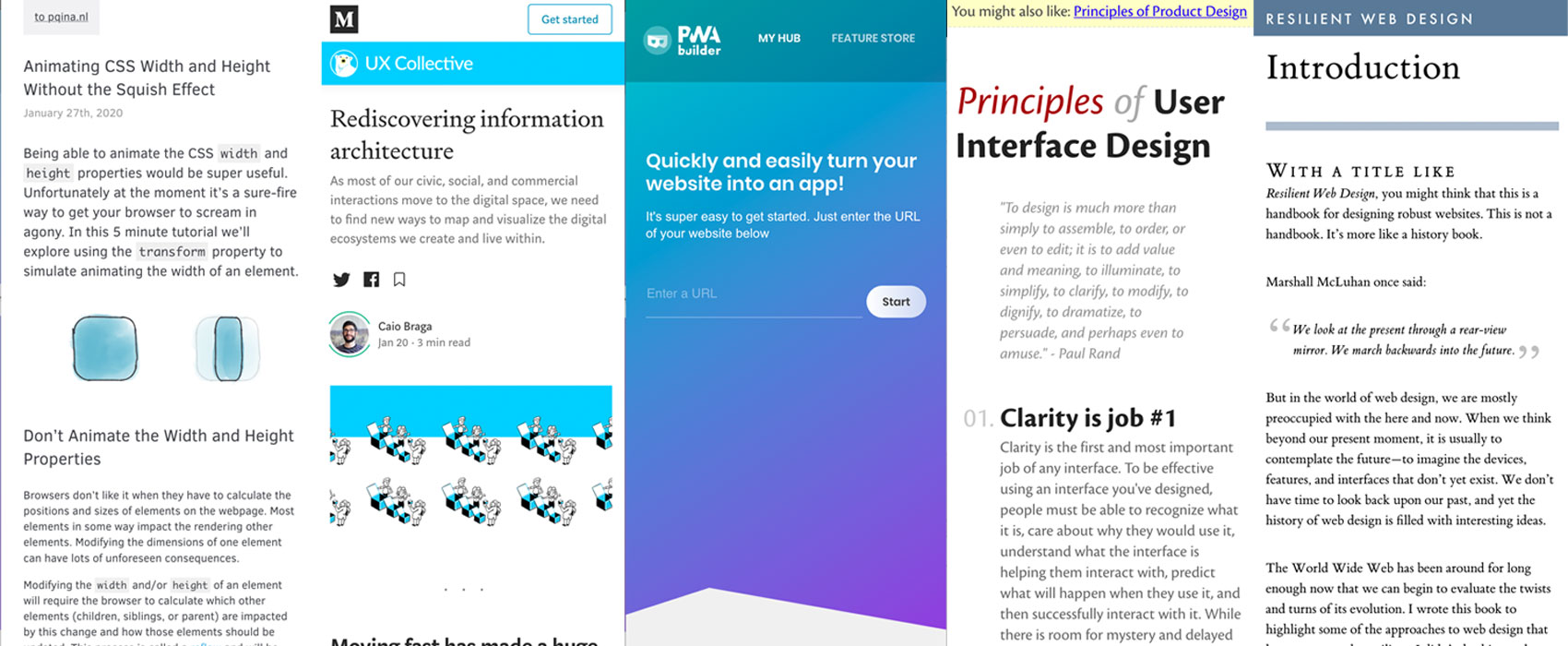
This week’s selection: resilient web design ebook, UX of textareas, SVG animations, FontsNinja tool, PWA builder tool, 7 design psychology fundamentals every designer should know, rediscovering information architecture, CSS width animation, 19 principles of User Interface Design, 9 tips to improve your UI, UX Strategies for Multiple Devices and Platforms, a list of 300 CSS properties, a lot of dataviz resources, design systems, CSS Online drop-shadows generator, etc.
#Now – what I’m up to
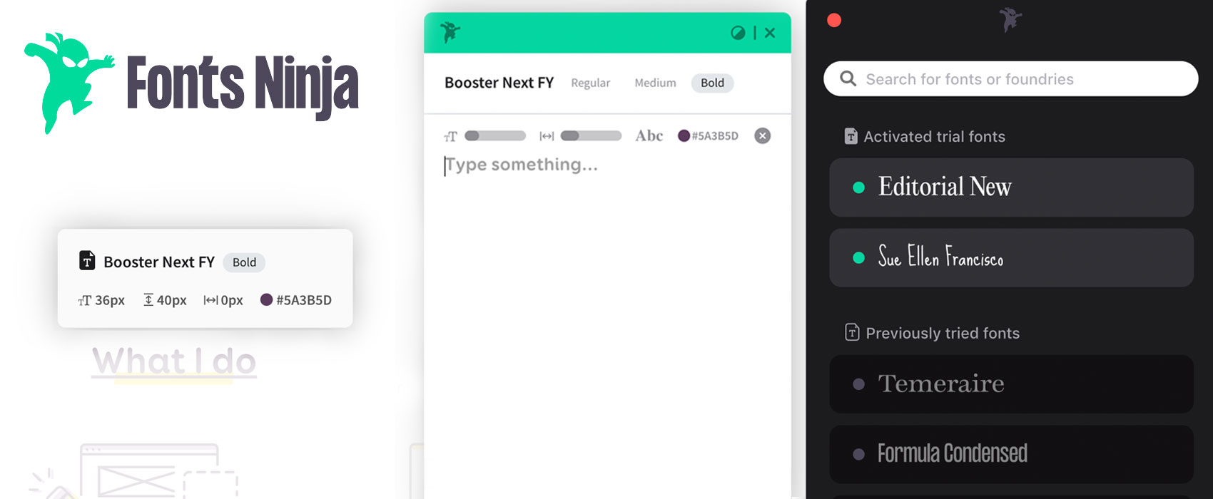
This week there’s a contest on the blog to discover FontsNinja, a really nice tool to discover and test fonts. Get a chance to win 1 free licence!
I also created some “zero fox given” holographic stickers, yeahy.
TL;DNR the one you should not miss
Reminder: the amazing “Resilient Web Design” book by Jeremy Keith is available online, and offline. Also it’s a PWA so you can add it to your homescreen and read it wherever and whenever you want. Offline for the web is amazing
Interesting article
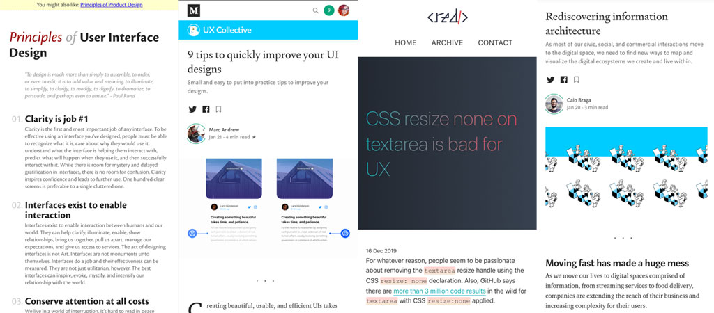
- Principles of User Interface Design, 19 principles to help you design better more usable interfaces
- ⭐ Nice 9 quick tips for any beginners in the field of UI design and anyone who wants to improve their interface. I like that they include tips on bringing more contrast to make text easier to read
#User Research
- “What is a research framework and why do we need one?” Really interesting article on the different types of users research you can do in a company and why it’s important to formalize this kind of things
- MeasuringU: Comparing Fully vs. Partially Labeled Five- and Seven-Point Scales
#Information Architecture
“Rediscovering information architecture” I’ve seen this happen a lot, the urge to move fast so that devs can start coding as soon as possible, designers becoming pixel pushers with almost no time to understand and structure the content and info. “Read the user story and design me a mockup for this part of the page” user story beeing a wish list of content that does makes zero sense without understanding business and user needs. So designers try to reverse engineer it to try to build an information that makes sense (ish) “As a user I want to see a 404 with a text that tells me that the page doesn’t exist so that I know the page doesn’t exist”, “As a user I want to have a list of X and a button to delete X so that I can open the X or delete them”. “Information architecture is the way that we arrange the parts of something to make it understandable.” But this is how you end up designing parts of content with almost no global pictures so it the end they might not make sense together.
Bottom line: information architecture ♥️
#Psychology
Ever heard of cognitive biasis? Here are 7 design psychology fundamentals every designer should know. Because design is not just about UI and beautiful interactions
#MobileUX
“UX Strategies for Multiple Devices and Platforms” interesting summary of different experts advice on building responsive experience with user needs and behavior in mind
#Design
- “The death of design files” welcome to the prototyping and collaboration area. Well at least if you don’t work for a company that blocks any tools in the cloud. Otherwise it’s back to PDF export sent by mail and comments to collaborate 😁I’m joking around but this is a real problem. Devs get “Cloud” tools that can be installed on company servers like Jira and Gitlab. I wish we got the same for design collaborative tools, a version you can self host for such companies. Meanwhile you get creative and use the tools of the company. You learn to design user flows in PowerPoint. Wireframes in an Eclipse plugin. You use PowerPoint comments to give feedback on mockups, links within documents to create interactive prototypes you export in PDFs. Welcome to the pragmatic design world
- “Dear Clients: Read this. Love, Designers.” I understand most of the frustrations here, I worked in web agencies but I also think that it’s our task as designers to educate clients about all of that and help them help us create the best work we can!
- “Invisible design systems“, design systems reflect your company culture, before revisiting which color to use for calls-to-action, we first need to revisit the values our company holds.
- “Our Design System is a Meeting” I get the feeling that that it’s like in many places especially when you have different design teams and technologies. In the end, it’s all about findings ways to better communicate with the rest of the teams
#UX #CSS
“CSS resize none on textarea is bad for UX” yup, let the users resize if they want to, it’s better to have your nice design break a little than to frustrate users who can’t fill the form properly
#CSS
“Some Imaginary CSS” yes, yes, yes for container queries, those would have saved me so much time when I used to still code for a living ❤️ (those days I just code for fun on the blog and to build quick animations prototypes for my FrontEnds ^^)
#Ads
“Why Google’s new search results design is a deceptive pattern” great analysis of the new design of the search results
Inspiration, fun experiments and great ideas
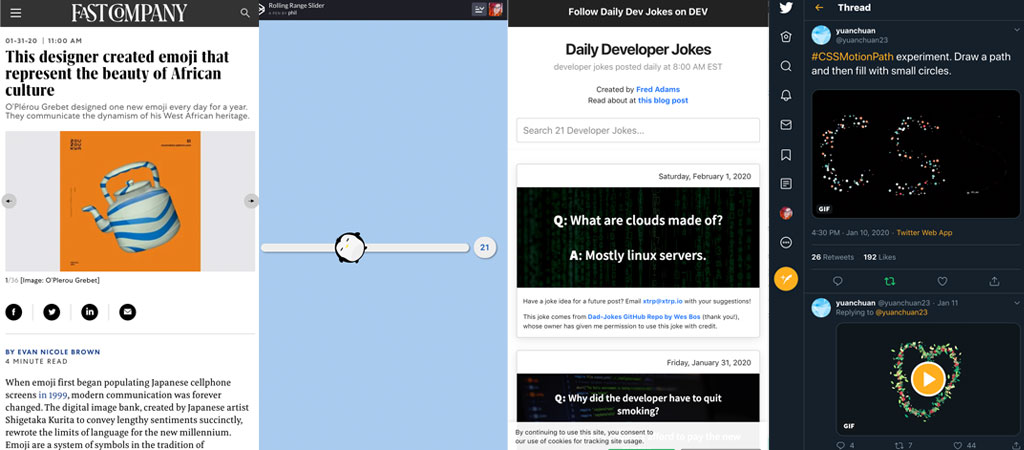
This designer created emoji that represent the beauty of African culture
#CSS
CSSMotionPath experiment. Draw a path and then fill with small circles.
#Inspiration
If you are tired of circling around the same designs on dribbble this article has a nice list to help you get inspired from other creative fields: My Secret Weapon for Design Inspiration
#Fun
#Slider
I was stuck in the bus. This “Rolling Penguin Range Slider” is making my day.
Tutorials
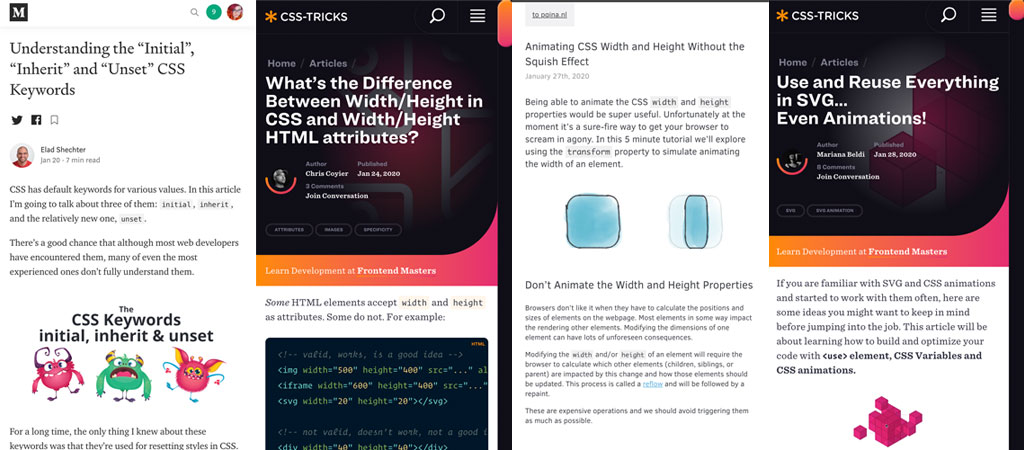
♥️ SVG is amazing: Use and Reuse Everything in SVG… Even Animations!
#CSS
- Hehe back to 9-slices techniques, this reminds me ole android apps where we used that to stretch rounded backgrounds nicely across different device screens: Animating CSS Width and Height Without the Squish Effect
- “What’s the Difference Between Width/Height in CSS and Width/Height HTML attributes?” One of those small little thing you need to know about CSS to make your life easier
- “Understanding the “Initial”, “Inherit” and “Unset” CSS Keywords” plus as a bonus the revert property that is coming soon.
Useful tools and plugins that will make your life easy
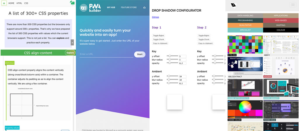
A nice tool to help you turn your responsive Web app and web site into a Progressive Web App: PWABuilder
#CSS
#Dataviz
Here is a huuuuge list of resources to help you build dataviz, from color palette tools, graphs JS librairies to maps and other cool tools: Visualising Data
