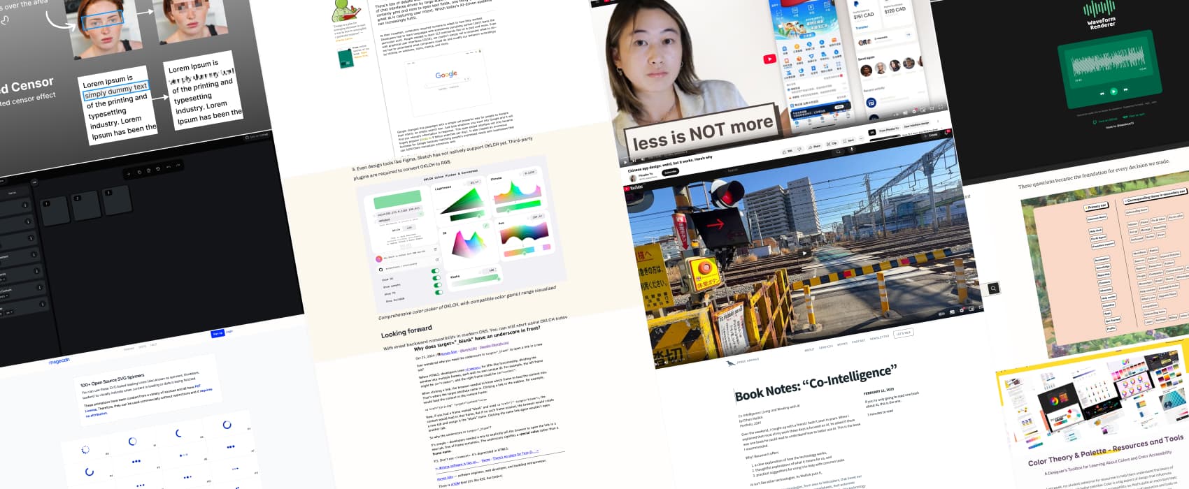
Pixels of the Week – February 23, 2025
OKLCH for designers, Chinese app design and color palette resources.
My curated weekly-ish online newsletter, where I share interesting articles, tools, and resources I found during the week. You can expect content about UX, design, user research, accessibility & tech, but also some processes, some inspiration, sometimes books, and a couple of videos and podcasts. Also, don’t forget to, subscribe to the newsletter to get notified, you will get the weekly links directly in your mailbox, and be notified when I publish other articles.
Now: what I’m currently up to
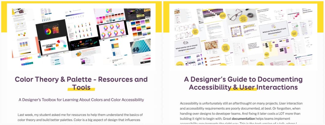
My students asked me for resources to help them build a color palette, so I decided to share this list here as well, because every beginner—whether they’re my student or not—deserves guidance: Color Theory & Palette – Resources and Tools
I’ve also talked about design and accessibility at the Smashing Meet this week. If you attended the meetup (or didn’t), here’s the content of my talk with all the links mentioned in the slides: A Designer’s Guide to Documenting Accessibility & User Interactions And, if you want the longer version of that content, with exercises, tips, checklists, I’m running a new session of my Accessibility for Designers workshop, online, in June. Grab you early bird ticket at $255
Most popular content this week
OKLCH, explained for designers (6min) I’m really looking forward to more support in design tools, because I like the possibilities of building palettes, with less tokens, while keeping contrast ratios for accessibility. Great introduction by Samuel Wong (also check the OKLCH playground to understand the options)
Interesting articles that caught my attention
- Chat Interfaces & Declaring Intent (5min) AI-powered chat interfaces are changing how we use computers. Instead of clicking buttons or learning commands, we just type what we want, and the AI understands. We’ve moved from humans learning how to speak the machine’s language, to machines learning to understand human’s intent, and won’t go back. by Luke Wroblewski
- The paradox of UX personalization (6min) AI-driven platforms enhance user convenience by curating familiar content. But at the same time, this limits the user’s exposure to new content, experience, that might be outside their usual comfort zone. I like Michael F. Buckley’s idea: we should balance personalization with intentional opportunities for discovery, and maybe introduce elements of randomness once in a while. To be honest, I sometimes get a feeling Spotify does that, since I sometimes have strange suggestions. Some are, actually, good surprises.
- Designing for clarity: How we restructured Intercom’s information architecture (12min) I usually don’t read case studies, but, I’ve a soft spot for information architecture, especially when is emphasis how much effort it takes, to create something that look simple, and feel effortless. The takeaway? Simplicity isn’t the starting point – it’s the result of relentless focus and persistence. Yes.
- The European Accessibility Act for websites and apps (10min) Martijn Hols wrote a great summary, what accessibility is and who it is for, who is targeted by the new EAA and who is exempt (microenterprises). What to do? EN 301549 (the directive) aligns closely to WCAG 2.1 (for now, expect and update to WCAG 2.2 late 2025), with a couple of more criteria in EN 301549. So, you can use WCAG 2.1 as a base framework to improve your website and should publish an accessibility statement. The 2 deadlines to remembers: June 28, 2025: all new developments must comply (yes, even if it’s as small as changing a button). And June 28, 2027: existing services must comply (so you have 2 more years to make your whole current site/app compliant).
- Why does target=”_blank” have an underscore in front? (3min) the answer to a question, you might never has asked, but, still, I like random HTML knowledge. So here we are. It has to do with framesets, and the need of a free of frame semantics. by Kyrylo Silin
Curiosity cabinet: non-design/tech rabbit holes I enjoyed
The Longest Railroad Crossing in Japan (For Now) because, I like fun train facts, and Japan
Inspiration: fun experiments, beautiful art, and great ideas
This Designer Transforms Rough Sketches Into Actual Furniture… Quite Literally! this is absolutely my kind of art!
Useful tools & resources
- Pixelated Censor a Figma plugin to help censor part of a screen. Useful if you want to put photos of UX workshops in your case study and want to anonymize the people for example.
- Select Random Layers – Figma Plugin I’m trying to think about a usecase where I would need to select random layers in Figma (maybe for abstract backgrounds), but, in case you need to, there’s a plugin for that!
- Flexbox Labs a visual tool that helps you create layouts using CSS Flexbox. I like such sandbox tools where you can play around without writing code. I think it’s important for designers to at least understand what flexbox can do. Also, it’s quite close to the Figma auto-layout we got used to and the Penpot Flex Layout. Created by Praise Ogunleye
- Waveform Renderer a library to render audio waveforms (in HTML canvas), in case, you work on a music, or sound player, and need such a tool.
- Open Source SVG Loading Icons (Warning: motion) 100+ SVG loaders you can re-use for your own project
Cool and Interesting Videos
Chinese app design: weird, but it works. Here’s why an explanation of the power of the super apps (WeChat and all of those other apps that cluster everything you need in 1 giant super app), with some roots into collectivist culture, a community that prioritizes the needs of a group over the individual. Also, according to Phoebe Yu, Chinese people want their user experience to be like a MacDonald’s happy meal: everything centralized into one, like a giant combo box. In this case, clutter means more trust, and more features. Architecture also plays a big role: in China, according to Phoebe, everything is cluttered, giant neon stands, lots of information, this is the norm. Last but not least, computers are more expensive, so China’s digital expansion bypassed the usage of traditional laptop computer, in favor of cheaper mobile phones. Sometimes less, is not more, you need to understand the cultural context of what you design for (it’s called localization by the way).
Books
Book Notes: “Co-Intelligence” hum, finally a book about AI I’m actually interested in reading. Adding it to my (way too long) to read list. By Jorge Arango