Pixels of the Week – February 25, 2024
Figma components checklist, UX writing guidelines and the looming cheese crisis
My curated weekly-ish online newsletter, where I share interesting articles, tools, and resources I found during the week. You can expect content about UX, design, user research, accessibility & tech, but also some processes, some inspiration, sometimes books, and a couple of videos and podcasts. Also, don’t forget to, subscribe to the newsletter to get notified, you will get the weekly links directly in your mailbox, and be notified when I publish other articles.
Now: what I’m currently up to
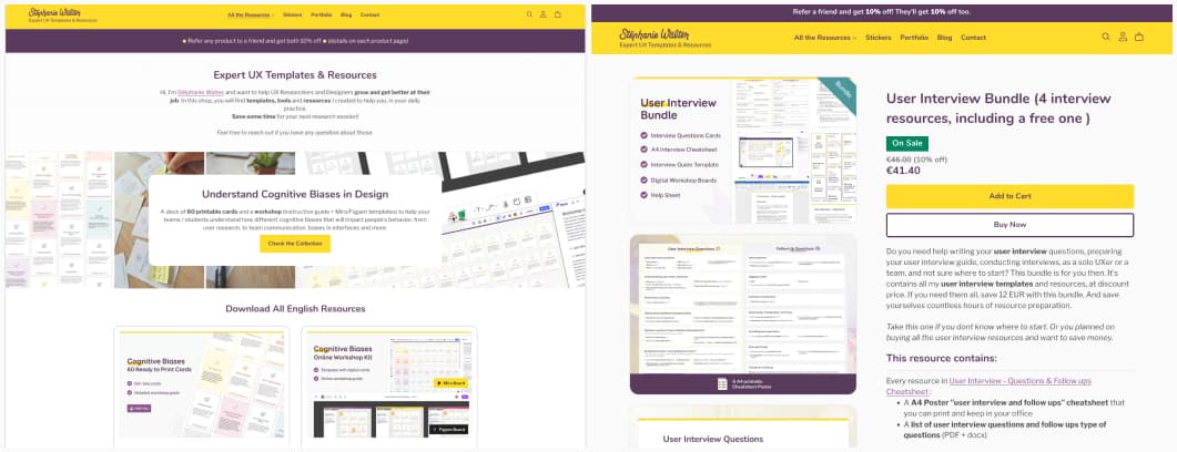
I’ve reworked my UX template shop a little. I’ve created new thumbnails for products to make it look more consistent. I’ve also removed the annoying hover effect, and changed the layout of the product page to show images without needed to use the slider. What do you think? I’m also planning to add new resources this year, including some user testing templates to make your lives easier. Anything missing? Any templates you would need help with? Let me know!
I’ve also been featured in Christopher Nguyen’s “16 things to do before opening Figma” series. You can check the PDF on LinkedIn where I’m explaining that sometimes, inspiration doesn’t come from direct competitors, so, don’t hesitate to find out how other solved the same problem, not just your own competitors.
Interesting frameworks and concepts
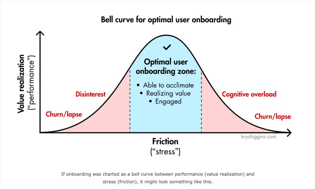
The optimal user onboarding zone Krystal Higgins presents an interesting framework to help you strike the right balance for your user onboard.
Most popular content this week
Figma component checklist: from layers to layout, properties and style, a checklist to standardize your Figma file and improve component quality before sending those to collaborators (by Javier Cuello)
Interesting articles that caught my attention
Design and UX
- Design Dilemma: Balancing Aesthetics and Functionality (10min) Aesthetics attract users and create emotional connection, functionality ensures users can easily accomplish tasks. Ideally, aesthetics and functionality would merge seamlessly in digital design, but that isn’t always the case. Merehan Elamrosy discusses when to prioritize one or the other for the optimal user experience. I honestly still believe you could have both, even for highly functional types of interfaces. Also, accessibility should be by default too.
- Enhancing Employee Experience through UX (8min) you can apply the same UX methods (research, interactive design, usability testing, journey mapping, etc.) to improve employee experience (EX). The goal is then not only to work on interfaces and tools, but also, to improve satisfaction and engagement in the whole workplace. I’m working in such a setup, and I would add: observation and task analysis are also methods often used, to understand how employees work on a daily basis, in order to improve this. (by Dr Maria Panagiotidi)
- What is Throwaway Prototyping? (10min) Throwaway prototypes are a quick and cheap way to get useful user feedback, when you want to align your team on the requirements for the product you are creating. It helps to find team agreement, explore possibilities, and find an innovative solution while saving costs and time.
- What is design accountable for in a product company? (13min) Thomas Sutton introduces a framework to define (and measure) design quality, that connects it to business goals. I’m happy to see accessibility being in the core components. He also offers different ways and tools to measure each part of the framework. It’s a work in progress. Level 1 is directly measuring design quality with usability, accessibility, usefulness, enjoyment, context fit and net-simplicity. Level 2 is about measuring if people use it and are happy with it.
- Why AI Can Never Replace Designers (5min) “AI will rapidly expand the capabilities of the best designers, and help established brands create far more visual content, much faster. But AI will never replace the brilliant spark of ingenuity that a designer brings to the table. That spark rests only with us humans.” great summary indeed by Randal Cumming
- Designing for Privacy in an Increasingly Public World (9min) great reminder that privacy isn’t about secrecy, it’s about maintaining control over your own information. How can you help the users achieve that? Avoid deceptive patterns, maintain transparency, use language with care and avoid legal jargon, provide (aka design) the tools to help users protect their data in your systems, ensure that your privacy features are discoverable, reminder users about them once in a while and never change privacy settings without letting users know.
Accessibility & browsers
- I worry our Copilot is leaving some passengers behind (20min) a long essay on how copilot (the github one) pushed people to write inaccessible code, and all the ethical issues around this. By Josh Collinsworth
- Browsers Are Weird Right Now (3min) Interesting short read by Tyler Sticka on the state of the different browsers currently available
Curiosity cabinet: non-design/tech rabbit holes I enjoyed
Beware: A cheese crisis looms apparently the genetic diversity of some of those microbes that let us have Camembert and Brie caved. And today, some of the most famous French cheeses rely on just a single fragile strain of fungi that is at risk of dying out. Biodiversity matters, and there’s hope. But still, damn, I’m not a big fan of those, but would be sad to see them go.
Useful tools & resources
- Curated Design: a catalog of websites inspiration, from across the world, organized by type of site: productivity, tech, assets, design tools, portfolios, etc.
- Nearest Color Finder your design system exploded, people picked a couple of colors they were not supposed to, and now you need to find the closest color in your design system, to bring harmony again? This plugin lets you do exactly that: pick a color, let it find the closest match in your library
- Vector Arrow Scribbles yup, sometimes all you need are some cool and fun vectorized arrows.
- Navigating career: Designers’ milestones a collection of short stories, from different designers in the industry, around different milestones in the life of a designer, including working with challenging clients, maintaining work-life balance, taking pro bono work, dealing with burn out, etc.
- noTunes a macOS application that will prevent iTunes or Apple Music from launching (because yup it’s annoying you can’t bind other apps as default for music)
- UX Language Need some help with UX writing? This is a set of useful and semi-universal UX copywriting and style guidelines and examples to reference while designing and building products and interfaces, by Quinn Keast
Tutorials
Advanced Figma components tips & tricks Christine Vallaure shares some life saving advanced Figma tricks to speed up your workflow and process
Latest news in the industry
- Midjourney Style Reference Parameter: I’m quite impressed by the capability of getting images based on a reference now
- Big Tech jobs have lost their glamour (6min) with all the rounds of layoff, people start going back to more traditional sectors like bank and insurance