Pixels of the Week – January 10, 2021
Every day, I share on twitter and LinkedIn a list of curated articles I read, resources and tools about UX Design, User Research, UI and mobile design, HTML, CSS, the web industry, some process, some inspiration, etc. This is an archive of everything I shared this week.
#Now – what I’m up to
What a week people, I never thought I would see the day were big social media would finally do something about the orange guy. It’s 5 years and too many hate messages to late, too late, but still. Wow. Also, I’m back to work, well, I’m still working remotely for now but still, back from a nice week of holidays. 2021 started with a foot injury while playing JustDance. Who knew that when they said “video games are dangerous” it meant “playing just dance might get you hurt”, so this was a stressful week.
On the bright, I’m currently working on talks and articles for 2021, mostly about design process, designing beyond edge cases and pixel perfect mockups and more. On January 28th I will be talking at “We Love Speed” online event about designing errors, loading, empty screens and more of all of that is part of a designer’s job (the talk is in French but slides will be in English and I’ll publish a transcript in English). On February 5, I’ll talk about “designing beyond the pixel-perfect idealistic case” at WebStories.
TL;DNR the one you should not miss
#Web #ProgressiveEnhancement
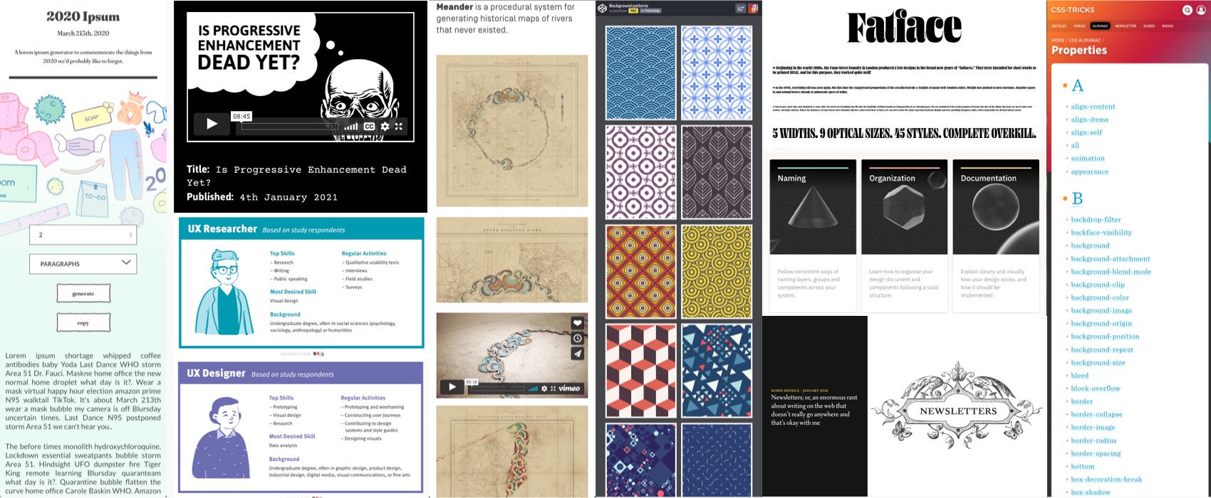
“Is Progressive Enhancement Dead Yet?“, Heydon Pickering (@heydonworks) uses shark in a fez, Tony Hawk, and zombies to explain progressive enhancement in a fun educational black and white video. Also, JengaScript
Interesting article
#Design
An interesting article on “designer biases” and how to mitigate those. I think the “consistency bias” is part of the reason why a lot of designers redesign browser dropdowns, while users don’t care if dropdowns look different in each browser
If you need help with raising awareness around biases when designing products and services, check my UX Cognitive Bias Cards & Workshop
#UX #Career
“What a UX Career Looks Like Today” by @NNgroup. I like the split between UX Designer and UX Researcher, also don’t forget to check the full report for more details on skills, how to switch career, why a mentor is important and more.
#UX #UIPattern
Infinite scroll: what is it good for? Not much to be honest, it sounds like it’s more annoying than anything, here are some alternatives and advice if you really want to implement this
#Motion #Accessibility
Reminder: in 2017 Apple, published this article that not only details the support of prefers-reduced-motion, but also shows and lists some potential triggering animations for which you might want to consider reduced variants
#Consistency #CSS #Components
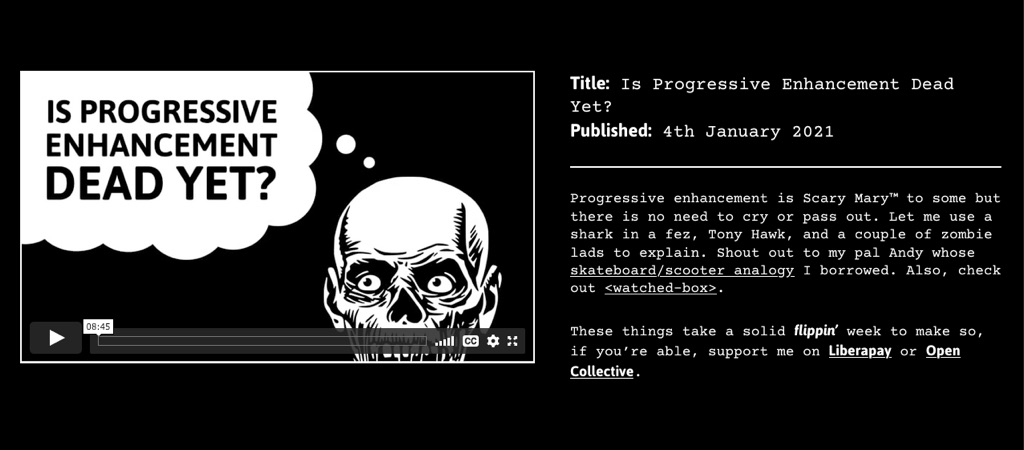
“The Art of Building Real-life Components” by Ahmad Shadeed, how a component that “looks” simple can actually have a lot of different variants that leads to some work when building it
#HTML #CSS
“My stack will outlive yours” A HTML/CSS only stack for blogs, for performance and simplicity, I think it makes sense at some point (by @steren)
#Newsletters
A beautiful essay by Robin Rendle on newsletters, writing for the web, the failure of RSS, how hard it is to pay writers and making the web easy, fast, accessible and beautiful again
#Myers-Briggs
Interesting tweet thread: Friendly reminder: Myers-Briggs was developed by two white supremacist eugenicists, with the goal of “scientifically proving” the superiority of the white race. When it failed to do that, they remarketed it as a “personality indicator” for the corporate business circuit.
Inspiration, fun experiments and great ideas
#Termandconditions
“I agree“, an interesting project from 2018 by Dima Yarovinsky were he printed “terms of service” of the leading online services that we use on a daily basis on A4 to show how small and helpless we are against those.
#Computer #cover
A 240-page hardcover coffee table book about computer advertising from 1950-1999
#Coffee
A fun codepen that visually explains you what each type of coffee is made of.
#GenerativeArt
There’s something relaxing with playing with those Generative Voronoi Splodges (PIXI) (by George Francis @georgedoescode) I really want to look into generative art this year but I guess you need some advanced programming skills for that?
#Dataviz
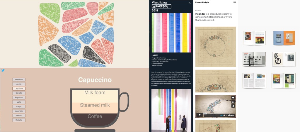
This is beautiful: “Meander is a procedural system for generating historical maps of rivers that never existed” created by Robert Hodgin (@flight404)
#PWAs #RSS #Trolling
This made ma laugh: far right people not trusting Progressive Web Apps, because it’s “Progressive”. This lead to me, making fun or RSS feeds (because URSS/ USSR) and Heydon being inspired by my silly ideas to create a “putting the U in RSS” illustration.
#Animations #Accessibility
You can complain all you want about the design of the new CIA logo, at least the website uses prefers-reduded-motion to remove the “fade in select” animations that are super annoying for some of us.
Useful tools and resources that will make your life easy
#Typeface
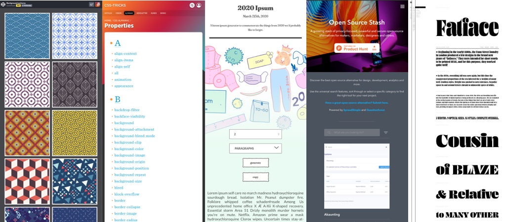
Hoo, hello gorgeous! Fatface is an amazing font available in 5 widths, 9 optical sizes and 45 styles (plus a variable font ^^) made by @ohnotypeco
#CSS
Maybe now is a good time to remind you that @css (CSS tricks) has a CSS almanac that details most CSS properties you can find.
#Patterns
I love those background patterns created by @yuanchuan23
#OpenSource #Tools
Open Source Stash – A growing stash of privacy-focused, powerful and secure open-source alternatives for makers, marketers, designers and others.
#Generator
In case you already miss 2020, here is a “2020-ipsum” generator for your projects
#NoCMS #Notion
There’s a tool that lets you create a website or a blog from Notion. That’s cool.
#Organisation #DesignFiles
An interesting project if you are looking for tips on how to name and organize your design files. I usually tend to treat those kind of resources as “inspiration”, then adapt this to my own process and tools.