Pixels of the Week – January 15, 2023
On Twitter and LinkedIn and Mastodon, I share curated articles I read, resources and tools about UX Design, User Research, UI and mobile design, HTML, CSS, the web industry, some process, some inspiration, etc. This is an archive of everything I shared this week. And some extra links that I decided to only share for the blog readers.
#Now – what I’m up to
I finally took the time to split my pages, my workshops, teachings and classes now have a dedicated page, if you are curious you can check all my workshops here.
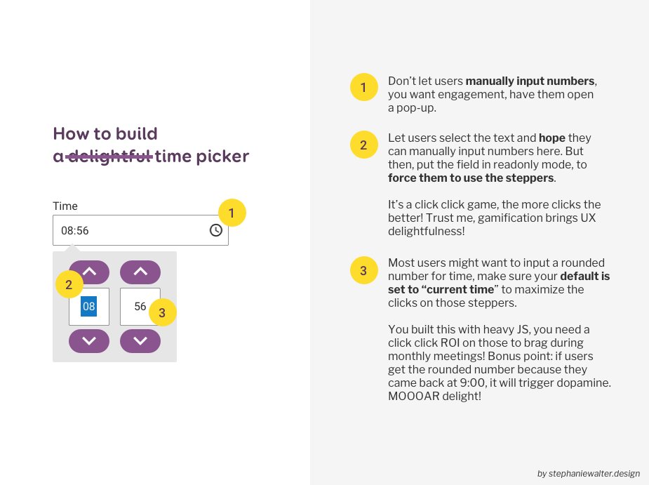 I also created a very sarcastic “How to build a (not) delightful time picker” (this may or may not be inspired by real life events)
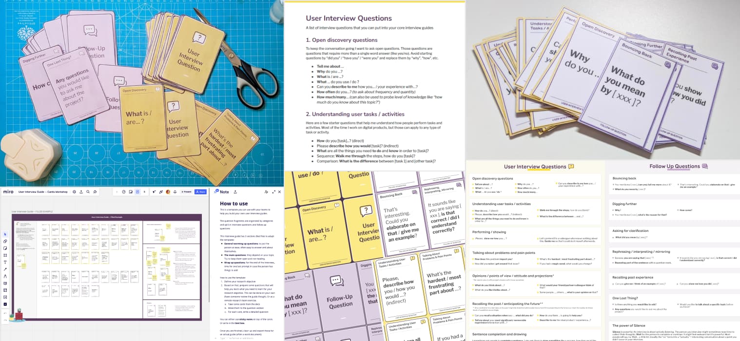
User Interview Cards and Resources
I finished testing prototypes for my User Interview Cards. Those are finally ready. I added them to the shop yesterday. You can now find them in the User Interview Resources collection, along with other templates and tools to help with your user interview guides.
TL;DNR the one you should not miss
#UX
A list of user frustrations and user deligthers, to build less frustrating experiences in 2023
Interesting article
#MobileUX
Interesting “State of Mobile UX” article. TLDNR: lines between Android and iOS, native and web get blurrier and more and more capabilities (like biometric authentication) come to both supports, too many overlays and in app browsing.
#Crisis
Designing out of difficult times. Design matters, and not just in good times. Design can help overcome issues during volatile bad times, yet, usually design teams are the first ones to get fired when things are economically bad. The article gives a few nice examples of how good design helped shift and solve problems in time of crisis. So, next time you think “yeah, we don’t need those designers”, maybe, think again. McKinsey research has shown that companies that embrace the business value of design are better able to respond to shifting landscapes and generate improved performance
#Design
Why do users prefer certain design? Insights from the landscape theory? Interesting idea: applying the theory of landscape (coherence, complexity, legibility and mystery) to try to understand and predict why users might prefer and interview over another
#Psychology #Biases
- Haa, all the biases and psychology tricks applied to restaurant menu design. Will you pay attention next time to eat at a restaurant now?
- Unconscious Biases That Get In The Way Of Inclusive Design: confirmation, optimistic, omission, false consensus, perception and status quo bias.
#Icons
A very detailed guide to help you draw the perfect icons. With a few bonus tips on how to name them and make them easily findable in your Figma files:
#AI
Interesting article how designers can use AI can help streamline repetitive tasks, aka, use AI as a tool to help, instead of seeing it as a threat to your job:
- Navigating the AI revolution: how designers can stay competitive
- How designers can start using AI at work today | by Steve Dennis | Dec, 2022 | UX Collective
- Designers can find their place in an AI future, interesting essay on how we all seek inspiration from the same place anyway
- AI-generated answers temporarily banned on coding Q&A site Stack Overflow, due to “a high rate of being incorrect”
#DataViz
Wow, this is an amazingly detailed article to help you chose which type of dataviz will work best for you audience and data set. I really like that Sara makes the distinction between a beginner audience and an audience used to charts and graphs
#Inclusion #Name
What the fnu? This is what happens when systems, tools and administrations don’t want to take into account the diversity of the world we live in, you end up with people getting Fnu (for “First Name Unknown”) as first name on official papers.
#Game
- Introducing Project Leonardo (video), a more accessible very customizable PlayStation 5 controller for gamers with disabilities. Check the full article for details.
- Did you know that Microsoft has some very detailed guidelines to help you with game accessibility?
- How a game developer reworked his flash game to make it available to steam users in 2022. I really love those kind of rabbit holes that show how technology evolves and how people adapted. Also the game looks fun.
#Product Strategy
Sometimes you build something people need without knowing it, sometimes, you hope for the best and it fails. I love the “glorified clock radio” analogy. So, is there some place in the ecosystem for voice assistants in 2023? Amazon thought Alexa would be the next iPhone. Turns out it’s a ‘glorified clock radio.’
#chatGPT
An interesting read on how an early adopter of ChatGPT is using it to help her write her novels
#Ecommerce
Overcategorization of the Product Catalog Can Lead to Abandonment (Yet 75% Get It Wrong), another great article by Baymard to help you optimise your ecommerce user experience
Inspiration, fun experiments and great ideas
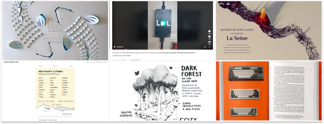
If you like paper craft, you should check out the work of Lisa Rodden, an Australian Paper Engineer, artists and creator
#Alphabet
In case you are curious about the whole NATO phonetic alphabet, here you go
#LOL
LOL Verifier: a device that only lets you type lol if you’ve truly laughed out loud. I love funny projects like that.
#AI
An essay on the gloomy forest of growing AI generated content, and the needs and means to prove you are human, and stay human, in the global mess of generative content
#Dataviz #Inspiration
If you like beautiful data visualizations, take a look at Spencer Schien’s work with population density and relief maps
#Inspiration #Book
This is very cool: Shift Happens, a book about the story of keyboards (well technically 2 big books with many photographs):
Useful tools and resources that will make your life easy`
#AI Art
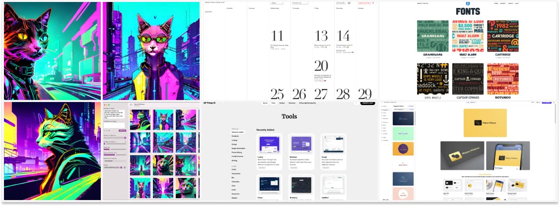
I had some fun with Mochi Diffusion, a GUI to run stable diffusion on mac. I found a Inkpunk Diffusion model that I really like. (Warning: if you look for models, prompts example for the hassanblend are totally NSFW)
#Design
A calendar with design events all over the world (if you have an event you can submit it)
#AI Tools
All Things AI, a place to find different AI tools that you could need, ordered by categories
#Typography
Looking for your next font? Meet simpletype, a tiny type foundry with very cute specimens for a very small price
#AITool #BrandIdentity
I had some fun with Looka, an AI that generates brand identities for you. Not sure about the “Intelligence” in AI here, since it’s mostly mixing multiple styles and user still has to pick and chose, but it was fun.
#GPT
Tired of manually writing your replies to people on Twitter, hopping to gain some algorithm juice? Why don’t you give tweetGPT a try (honestly, can’t be worse than some actual replies). I am sarcastic here, I think this will just bring even more noise, yeahy.
Tutorials
#Accessibility
How to use Indesign to build a more accessible PDF resume: a lot of interesting Indesign tips, those can apply to any of your documents, not just resumes
#ResponsiveDesign
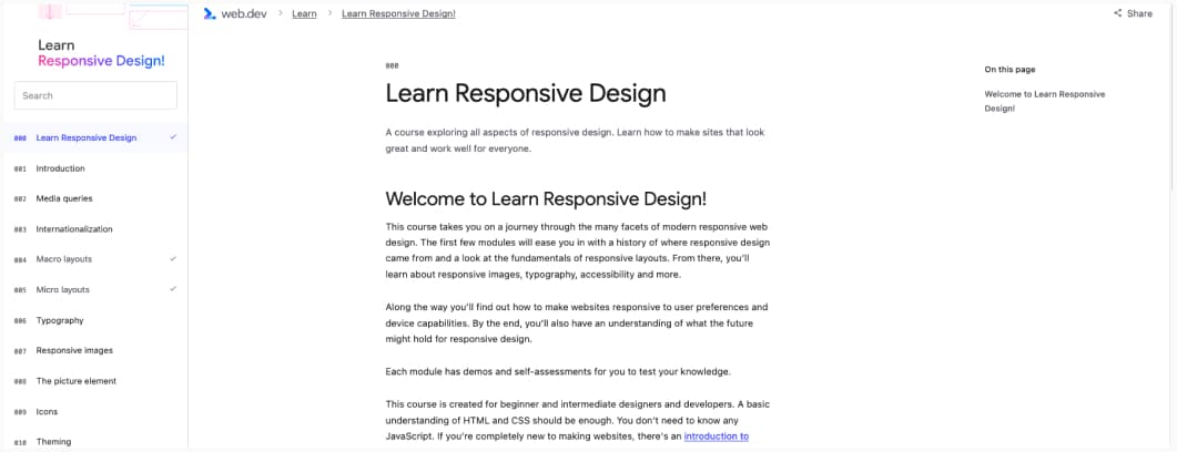
Oh, Jeremy Keith wrote a free online “Learn Responsive Design!” course. I really like his distinction between macro and micro layouts. I called them “primary” and “secondary” breakpoints, I might borrow his terminology for my students.
