Pixels of the Week – January 25, 2026
MacOS icon inconsistencies, giant BIC lamp & LinkedIn job titles fun
Pixels of the Week is my weekly-ish curated newsletter for designers, UX folks, devs, and anyone building accessible, inclusive, usable (and let’s be honest, awesome) digital products. This week we explore the new confusing macOS icons, why humanity over automation is a competition advantage, and red flags for soul-crushing jobs. Plus, death to scroll fade animations, a giant BIC lamp, a fun LinkedIn job title maxximizer, etc.
Subscribe to my newsletter to get this directly in your mailbox!
Now: what I’m currently up to
I’m currently trying to reach out a shop’s support, because the papasan I bought has, wood worms. It’s the second one I got from them. I thought I was unlucky on the first one, so, I ordered a second thinking “yeah, statistically speaking, it can’t happen twice, right?” Right… have you met me? So, after 3 months, second one also have now wood worm holes. I tried to reach out to support, and, when you submit, their form triggers a “humans make mistake but this time it’s a technical one, please search again” error. I tried 3 times. Also, what search, this was a support request ?! This happens a lot, with forms online, and I have to admit, it makes me cringe, because, often people go “we don’t need UX anymore, it’s just common sense”. Yet, many forms are still quite broken. So, yes, we still need UX designers in 2026, but also, testers!
And, shameless plug, because I proofread and wrote the preface, muhaha: Geoffrey Crofte wrote a whole book on the topic: Web Forms: Costly Mistakes you want to Avoid. Use the coupon STEPHANIEWALTER at checkout, to get -20% on the whole site (in case you want other books)!
Most popular content this week
It’s hard to justify Tahoe icons (18min) Nikita Prokopov points out all the inconsistencies, in the icons of Tahoe, the new Mac operating system. The “fifty shades of new” made my day. If you can’t find a good metaphor, using no icon is better than using a bad, confusing, or nonsensical icon. They are also very small, hard to differentiate and confusing. When everything has an icon, nothing stands out. You can join in the conversation on LinkedIn, Bluesky, or Mastodon if you want to comment!
Interesting articles that caught my attention
The Hidden History of Women Game Designers (10min) Women shut out of formal education still shaped early game design, especially in music, turning lessons into rich playful systems that taught theory through detail, interaction, and everyday objects. By Sara Ivry Via cassido’s rendez-vous newsletter
Traveling with a Service Dog: The Hidden Hurdles: Part2 (6min) New travel rules for service dogs were meant to stop abuse, but they mostly punish disabled travelers. Imagine having to fill a form on a website that often doesn’t work with your screenreader, with fields that get repeated, to then have another untrained dog bark at yours. Bureaucracy at its worse, making the whole experience of travel very complex and stressfull. By lucy greco
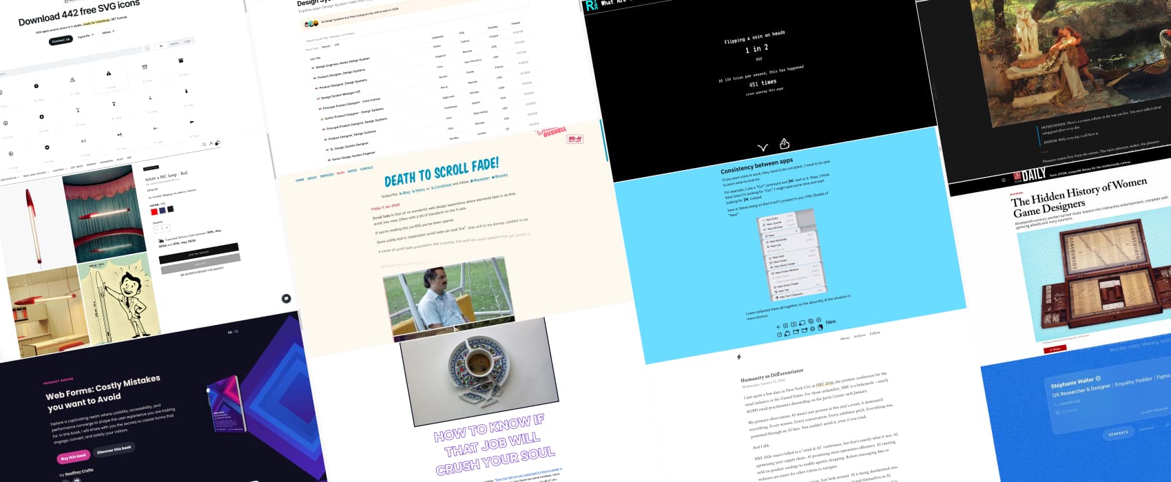
Death to Scroll Fade! (5min) I hate scroll fading, I’m not the only one, sometimes it’s hard to convince people. David Bushell brought you the perfect “a picture is worth a thousand words”, enjoy the horrible experience of trying to read this article.
Humanity as Differentiator “The irony of everyone chasing the same AI strategy is that it eliminates competitive advantage. When everyone optimizes for the same thing, nobody stands out. But a company that deliberately chooses humanity over automation? Right now that’s an admirable decision and a signal customers can’t ignore.” This is about retail industry, but I think it applies to design and tech industry as well. In order to innovate, you need new ideas, to be allowed to explore, and even to fail and bounce back. When everything is AI driven, this gets lost, and, we end up with the same products, solutions, based on what exists already and fed the model.By Jeffrey Inscho
How to know if that job will crush your soul (9min) Seven questions to sanity check jobs: do they actually improve the world, who really pays them, and are their assumptions about success realistic. Talk to workers you trust, look for leaders who do the right thing, and ask how the company admits it was wrong. Then get very concrete about pay from day one and whether the role has real resources and a credible path forward, not just vague promises. by Anil Dash
Curiosity cabinet: non-design/tech rabbit holes I enjoyed
Viscerality (9min) for once, the curiosity cabinet is a nice essay this week. About pleasure. Simon Sarris argues that modern comfort and sterility dull our senses. That real pleasure comes from visceral details, seasonal rhythms, and everyday “luxury” in objects and rituals. This resonates with me a lot: each year I grow tomatoes and salads on the balcony. Not to be self sufficient, I don’t get that many. But for the quiet joy of watching them grow and then making a fresh salad from something I have tended myself.
Inspiration: fun experiments, beautiful art, and great ideas
What Are The Odds? a website dedicated to random fun odds, for example, you have 2% of chances to be allergic to peanut butter.
Seletti x BIC lamp – Red: same silhouette. Different job, I love it. An industrial design becomes iconic when form outlives function and enters collective memory.
Useful tools & resources
Design Systems Jobs Directory a job board dedicated to design roles!
Glow Icons 442 free open source SVG icons for you project, available as a Figma file as well.
LinkedIn Job Title Maxxing: optimize your LinkedIn profile headline for recruiters, with this must have growth hacking secret tool all the influencers are keeping from you. But today, I say No to the gate keeping!! I’m now a “UX Researcher & Designer, Empathy Peddler, Figma Prisoner, Button Mover”. The “Figma Prisoner” makes me finally feel seen! (sorry, it was too tempting to make a total satyr here, no worries, I wasn’t hacked, I’m just having fun).
Tutorials
Building the Brain of Your Accessibility AI (10min) Ted Drake shows how to build a trusted AI brain for accessibility: an AI driven knowledge base, to help your organization implement accessibility. Use internal docs first: approved policies, checklists, design rationale, training materials, failure logs. Pick only current, definitive ones. Add WCAG, ARIA, solid design systems like USWDS or Carbon. Careful though, it should become an extension to help your accessibility program, not a replacement for experts.
Latest news in the industry
Web Almanac Oh the 2025 web almanac is out with interesting statts from HTTP archive!