Pixels of the Week – January 8, 2023
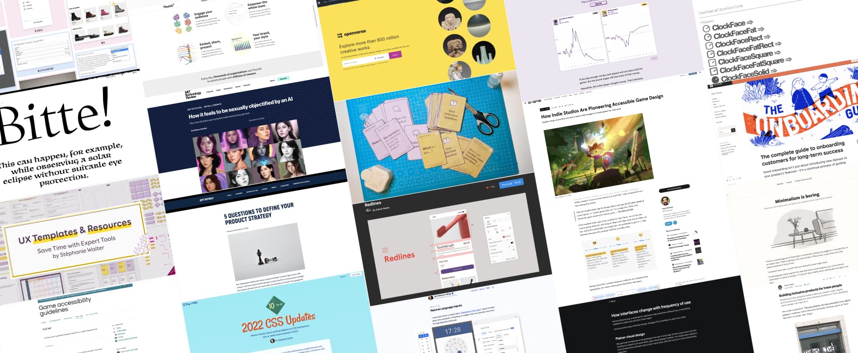
On Twitter and LinkedIn and Mastodon, I share curated articles I read, resources and tools about UX Design, User Research, UI and mobile design, HTML, CSS, the web industry, some process, some inspiration, etc. This is an archive of everything I shared this week. And some extra links that I decided to only share for the blog readers.
#Now – what I’m up to
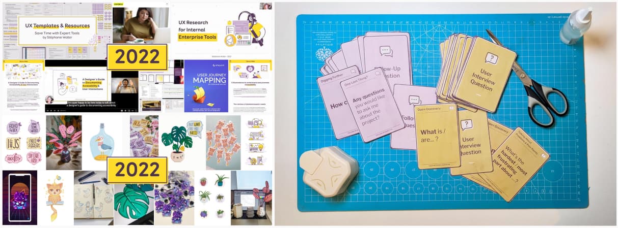
Hello and happy new year! I started 2023 with 2 articles on my “year in review”. One is about what I did professionally last year (work, conferences, workshops, articles, teaching classes, etc.) The second one is about the creative part of last year (illustrations, stickers, paper crafts, etc.). This Friday, I tested some more “print at home your own cards” prototype. I’m quite close to the final version, yeahy!
You might have noticed that I changed the introduction. I decided to stop publishing all the links I curate on social media. I’m honestly tired of the social media game, especially Twitter and LinkedIn, that rewards views and reach over quality. I suspect those platforms will start shadow banning people like me, who mostly post “content to other sites”, because, it makes the users leave their site. So, I’ve decided to slowly share less on social media, and more on my blog. Which means: the Pixel of the Week articles, now have extra links, that were not shared on social media.
My Expert UX Templates and Resources Shop
Also, small announced: I launched an online shop where you can find my UX tools, templates and resources. I am adding resources slowly. Coming soon: some printable cards for your user interview and follow-up questions, some resources for usability testing, user research plans, etc.
TL;DNR the one you should not miss
#Product Strategy
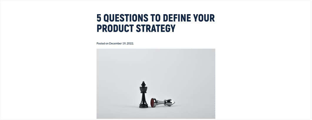
Back to basics: a list of features is NOT a product strategy. Repeat it 10 times if you need to. And here are 5 questions to help you come up with and actual product strategy.
Interesting article
#Interface #Information Architecture
Interesting short read on how an interface might change if it’s a product that is often used or not
#Typography #Responsive
Sizing typography in design systems, when the tshirt sizing (S, M, L, etc.) doesn’t work, try defining your heading based on columns size . Also, the rule of LIDS for deciding on the constant minimum width is genius!
#Onboarding
The complete guide to onboarding customers for long-term success. Great introduction to how to do (and keep doing) onboarding right for your users. It’s not a “one time” thing, it’s an ongoing process. So true.
#Design
- Minimalism is boring: an interesting read on the lack of personality of minimalism, why simple copying such styles might not work for your brand (or your home decoration) and the idea of inside-out design thinking, aka, starting with understanding you, your brand, and honoring your creative taste.
- How and why make your products and services more inclusive to trans people. Every form field, every default setting, every push notification, affects people. Every detail can add to the culture we want
- The interesting concept of natural language inputs. It honestly can’t be worse than being forced to use the Android wheel date picker on desktop because Material UI offers this as a component and it’s a usability nightmare with a mouse.
#CSS
- 2022 CSS Updates: what new cool things come to the browser at the end of 2022: cascade layers, :has() and viewport units, yeahy
- A list of things that Chris Coyier would like to see come to CSS. I would be delighted to get the regions too, also, yes for animate to auto!!!
#Accessibility
- Hello PDF, goodbye accessibility, an interesting article on the issues and challenges of providing a content in PDF format when it comes to accessibility
- How Indie Studios Are Pioneering Accessible Game Design – Amazing to see things are moving forward in different industries regarding accessibility, and not just for big gaming studios.
#AI
- How it feels to be sexually objectified by an AI: “It’s not just the training data that is to blame. Companies developing these make active choices about how they use the data (…) someone has to choose training data, decide to build the model, decide to take steps to mitigate those biases or not” Yup.
- Is Popular A.I. Photo App Lensa Stealing From Artists? “Everyone is profiting except the artist.” is a good summary on what is going on with Lensa, who was clearly trained on stolen artwork, since the AI has a “you need a signature in the corner” in her model now
#Languages
I’ve a background in languages and tech and I love to read about news in neurolinguistics (I also haven’t heard the name Chomsky in a while haha): Finding Language in the Brain, Psycholinguist Giosuè Baggio sheds light on the thrilling, evolving field of neurolinguistics, where neuroscience and linguistics meet.
#Car Control UX
Sometimes, I just want to scream “no shit Sherlock” when I read such news: “Study Finds That Buttons in Cars Are Safer and Quicker to Use Than Touchscreens”
#Science #Fun
Sometimes scientists have fun and write, unusual geeky fun articles that are still scientifically accurate: “She-Hulk And Winnie The Pooh: When Funny Science Takes The Spotlight”
Inspiration, fun experiments and great ideas
#Dataviz #Economics
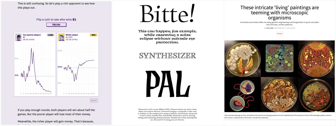
The Yard-sale model, a simple statistical model to explain “why rich people get richer” (even if it doesn’t capture the complexity of the economy).
#Typography
Let’s start the year with a tribute to the work of the typographer Oldřich Menhart (you can test and buy the fonts)
#Science
Aww this is cute: Microbes are “like pandas: beautiful and fluffy”, when art meet science, you get amazing colors and natural paintings
Useful tools and resources that will make your life easy
#Designer Annotation
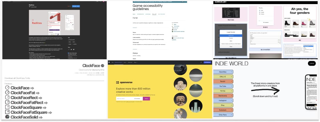
Redlines is a Figma plugin to add design measure specs for spacings and sizes to your mockups. And, yes, devs can inspect, but honestly, having some measures directly on the mockups is sometimes faster
#Dataviz
Flourish, a tool to create beautiful and easy data visualizations (for storytelling, teaching, journalism, etc) with a very generous free plan.
#Game #Accessibility
Game accessibility guidelines, a list of different areas where game accessibility can be improved and what you can do about it.
#Free Content
Openverse is a place to find free images, but also audio under creative commons licenses for your project
#Inclusive Design
Genders.wtf Some very bad examples of forms asking for people’s gender. Seriously, just, don’t ask? Also, what happens on a project to come up with “Sea Captain”, “Venezuela”, “Hot bread” as gender options, seriously?
#Curation
Indie world is a platforms to help you follow all your small creators in one single place. You can add their URL to the tool and you are all set
#Icon #Time
If you need to display time with little icons (5min intervals), here you do: ClockFace. I just like that this exists, even though I’m not sure what I would use if for
Tutorials
#CSS
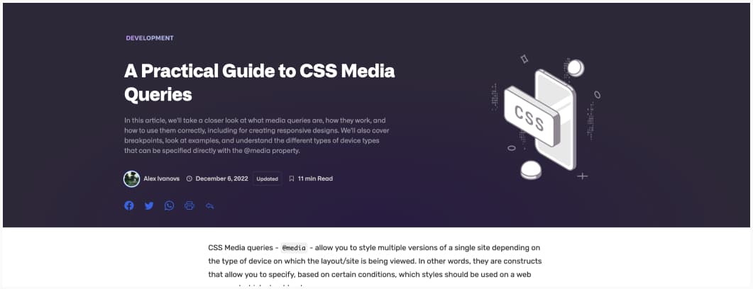
Need some help with media queries? Here is a A Practical Guide to CSS Media Queries
News in the industry
#VideoGames #DeceptiveDesign
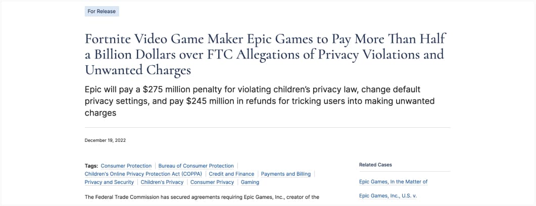
Why deceptive design (previously known as dark patterns) are not a good strategy on the long term: Fortnite video game will pay $245 million in refunds for tricking users into making unwanted charges.
