Pixels of the Week – July 14, 2024
Checking accessibility in mockups, resources for UX desk research & a checkbox game
My curated weekly-ish online newsletter, where I share interesting articles, tools, and resources I found during the week. You can expect content about UX, design, user research, accessibility & tech, but also some processes, some inspiration, sometimes books, and a couple of videos and podcasts. Also, don’t forget to, subscribe to the newsletter to get notified, you will get the weekly links directly in your mailbox, and be notified when I publish other articles.
Now: what I’m currently up to
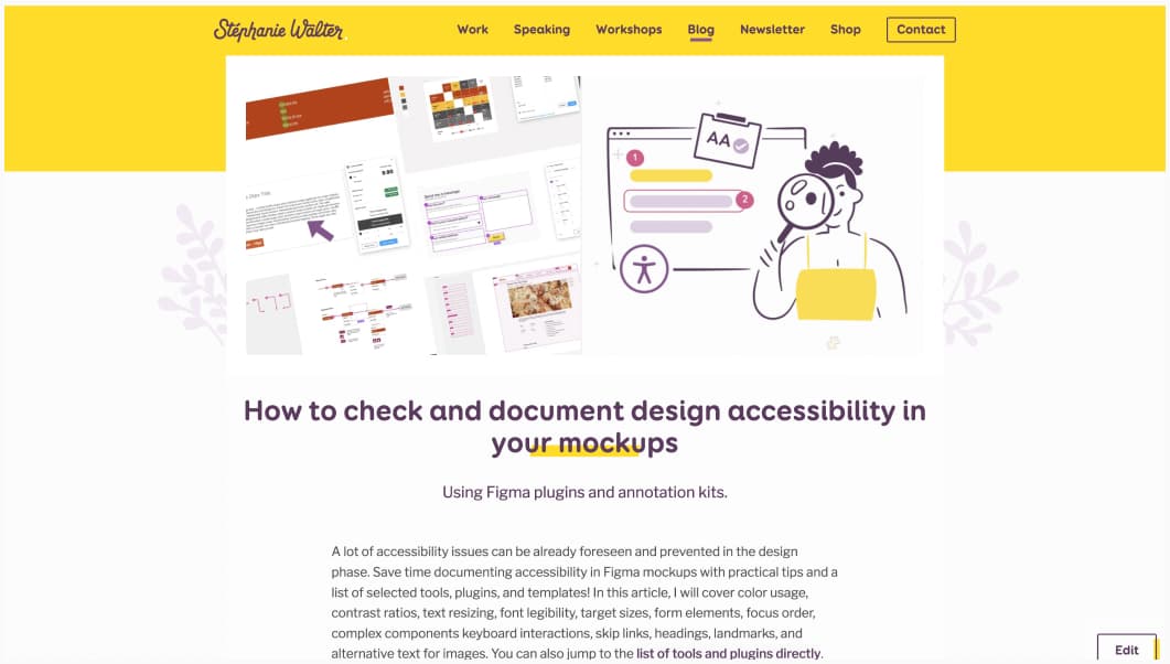
This week, I was invited to a Friends of Figma event to talk about accessibility. I’ve prepared nice demos, and showed participants how they can check and document different aspects of accessibility in Figma. I think we had 140 people live at some point, and 500 registered (many for the replay, because, timezones). I’ve prepared an article version of this content: How to check and document design accessibility in your mockups. It has all the links to all the plugins and tools I used, and more detailed explanations for some WCAG criteria.
Most popular content this week
Top resources for UX desk research (20min) a very detailed list of places, tools and how to do secondary research, including internal research, web search, google trend, online reviews, forums and social media, white papers and reports, UX case studies and academic articles.
Interesting articles that caught my attention
UX, research and design
- Design a better MVP with mixed methods user research (12min) yes yes yes, just because you are building a MVP, doesn’t mean you can skip user research. Quite the opposite: you want to make sure you put things that users actually need in the MVP. Jack Holmes presents how to use card sorting and tree testing to help align the product with user expectations. You can also conduct prototype testing to evaluate your solutions and reduce the risk of building a product that doesn’t meet user needs.
- AI anxiety and how to design for it (16min) understanding what type of anxiety AI might trigger for the users (privacy violation anxiety,bias behavior anxiety, fears of artificial consciousness, opacity in AI decision-making, job replacement, and ethical dilemmas) can help find design solutions to mitigate them. It’s mostly about transparency, involving users in the design process, and maintaining ethical standards.
- Want to Design a Great Product? Go on a Field Trip (7min) bringing design teams and clients to observe and learn from unrelated industries, help them understand different environments, and come up with more creative solutions to their own challenges. So get our teams outside, once in a while!
- Why toggle switches suck (and what to do instead) (5min) the main problem with toggle switch is that users may not understand their state, how to use them, or if the changes are saved, which can be annoying. They also cause accessibility issues when color is poorly used. Adam recommend you use checkboxes and radio buttons with clear labels instead.
- Checkboxes: Design Guidelines, speaking of checkboxes a guide to help you design them on NN/G
Accessibility and code
- Why is it so difficult to give best in class accessibility examples of websites? (8min) Accessibility is evolving and highly subjective? Even if a site follows the WCAG guidelines, products get updated. So such a ranking would be outdated fast. An idea would be to scope down on good examples of components, patterns, not whole pages/ apps.
- Free idea: design token ugly mode (7min) Eric Bailey proposes something quite fun: creating an “ugly mode”, that would make a web design visually unappealing to highlight inconsistencies on outdated elements. This is totally my type of chaos! And I think it could work: having stakeholders actually see where the inconsistencies are, could help prioritize fixing it.
- The time for designers to learn to code is now (8min) I don’t 100% agree that designers should learn how to code, but knowing about basic HTML/CSS is always a good think. Andy shares a lot of places to help you get started, if you want to learn to code as a designer.
- Zoom, zoom, and zoom (11min) Miriam Suzanne explains the 3 types of browser (and CSS!) magnifications and what it means for your site
Last but not least
Why are Japanese developers not undergoing mass layoffs? (12min) Japanese game developers have largely avoided the mass layoffs seen globally because the employee protections in Japan are stronger (than in US and Europe), the language barrier, and a stable mobile gaming market.
Curiosity cabinet: non-design/tech rabbit holes I enjoyed
Anger Can Help You Meet Your Goals? (10min) Sometimes, but it must be managed carefully to avoid negative consequences that don’t align with what you were actually trying to accomplish
Inspiration: fun experiments, beautiful art, and great ideas
- One Million Checkboxes some fun procrastination, where you check, checkboxes, while other people try to check and uncheck them too. And if you want information about how this was made: One Million Checkboxes
- Life Anti-Checklist: missed the bus, burned a meal, lost my wallet, finally a checklist of things I might actually be able to check. Not sure if it’s a good sign though.
Useful tools & resources
- Alt Text Selfies an interesting collection of alternative text examples for selfies, that explores the way people describe themselves and other, beyond visual description. Some go can blend smell, taste, touch, sound, and more.
- Layoffs.fyi a site to track tech layoffs since COVID19. You can check by company, location, industry, etc.
- 100% Free Patterns: high-quality seamless designs a collection of free geometric patterns you can download and re-use. You can also create an account and create your own patterns
Tutorials
Data Table Design Patterns (8min) a collection of does and don’t for table design and some interesting design patterns for complex enterprise tables. It’s base of best practices, just remember that nothing is absolute and sometimes, it’s also okay to break the rules once you master them. For example: “use monospace typography” is a good idea if you can, but having a font change just for the numbers might be annoying to some users, especially if the table has also non-numeric data too. So, take the rules, and see if they apply to your case. And for even more table content, don’t forget my Enterprise UX: essential resources to design complex data tables article.
Stop Figma from training AI models using your content
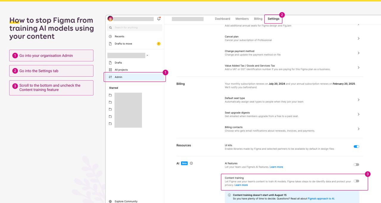
So, Figma has launched new AI features, expect, it might train on your mockups. If you have sensitive client data in your Figma mockups, you might want to stop Figma from training AI models using your content. Here’s how:
- Go into your organization Admin
- Go into the Settings tab
- Scroll to the bottom and uncheck the Content training feature
To be fair, I would uncheck this even without sensitive data. I’m not a big fan of my work getting used to train things, without my explicit consent. Because, yes, this is checked by default.
Learning
Debbie Levitt launched her brand new “Planning Qualitative CX and UX Research Studies – Generative or Evaluative” course. If you are looking for a great place to start, to learn how to plan for qual research, strategize, create good protocols, scripts, guides and recruit, this course is for you! The format is a cohort, with videos recording, live sessions, real project exercises and peer reviews, plus personal instructor feedback. Debbie was kind enough to offer a 30% discount to my readers, so use this link, and the coupon will be applied.
If you are interested in more courses from Debbie, please check those (30% coupon also included in the links):
- Live version: Strategizing Products and Customer Experiences – SPACE – Live Remote Workshop: achieve business goals, happy users, success, growth, innovation
- Video version: Strategizing Products and Customer Experiences – SPACE – Videos & Feedback
- Macro & Micro Product-Market Fit PMF: Adoption Satisfaction Retention Growth: The same old methods produce the same old cycles of guesses and high failure rates. Try something smarter and more strategic.
- Improve Your Presentation Writing – Public Speaking – Work Presentations: Increase your confidence. Improve your writing and speaking. Any topic, any industry, any job.

