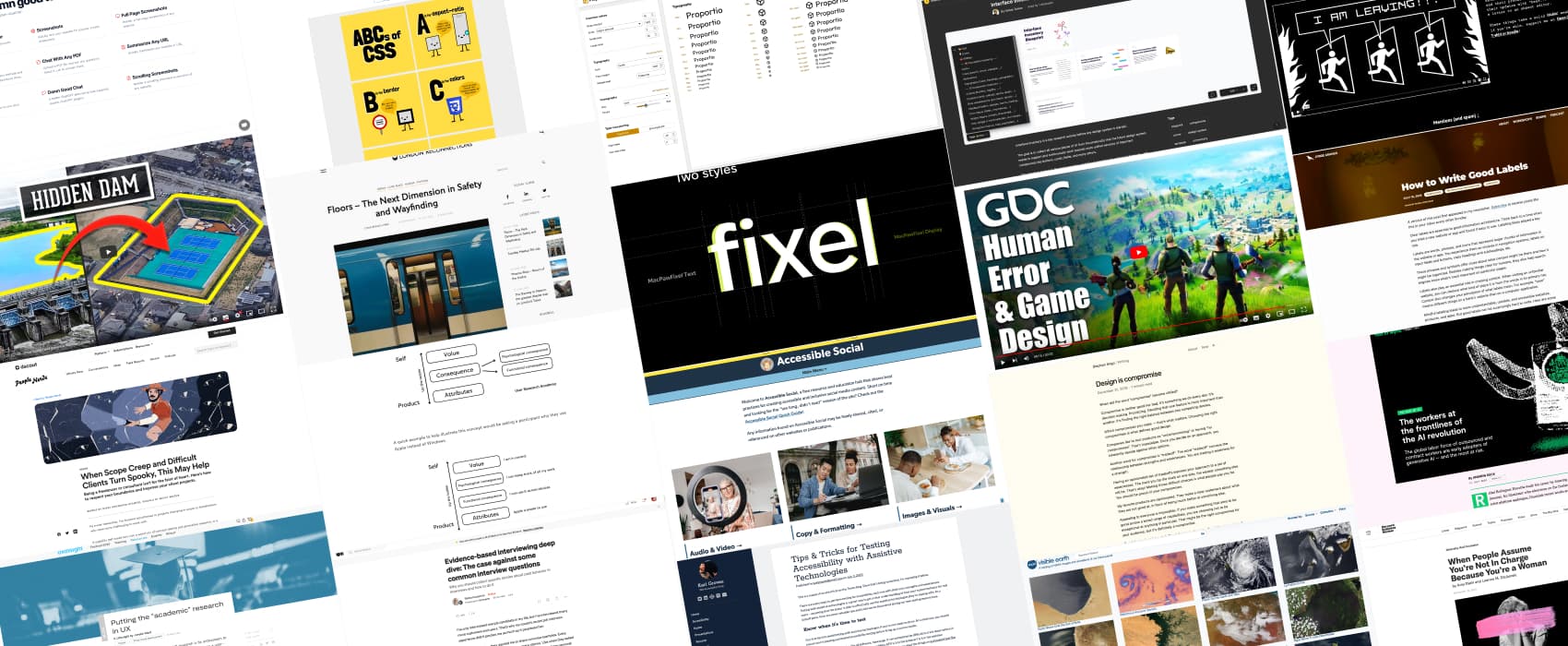
Pixels of the Week – July 23 , 2023
Social media accessibility, interface inventory Figma template and the ABCs of CSS
On Twitter, LinkedIn, and Mastodon, I share curated articles I read, resources and tools about UX Design, User Research, UI and mobile design, HTML, CSS, the web industry, some processes, some inspiration, etc. This is an archive of everything I shared this week. And some extra links that I decided to only share for the blog readers. Also, subscribe to the newsletter to get notified when those are published!
Now: what I’m currently up to
Ha, for once, I’m actually doing a lot of things in French again
- I was interviewed by Digital Accessibility Luxembourg to talk about the importance of building accessible products from the start, the need for more training, and the snake oil I start to see more and more around that topic on social media.: « Les bonnes pratiques des développeurs rejaillissent sur l’accessibilité ».
- I’ll also co-animate a workshop with Myriam Jessier at ParisWeb, we will teach you how to schedule, prepare and facilitate user interviews, using my deck of user interview cards (that will be translated to French for the occasion): Entretiens utilisateurs : identifiez les améliorations clés pour votre site ou service
I’m also working a lot, behind the scene, on a couple of things that are not ready yet, but, teaser: expect from me in the next couple of months a full revamp of our Cognitive Biases UX cards (and a version with a license that will let you use them for commercial purposes), an UX online training and an accessibility online training.
Interesting frameworks and concepts
 ACV Laddering: a framework that will help you dig deeper to understand user’s core values. During the interview, you start with the Attribute, then climb up, asking follow-up questions (often why do you / why does it) to dig further into Consequences for the user, to end up bringing Core Values behind a behavior, user choice or actions. Article by Nikki Anderson-Stanier
TL;DNR the one you should not miss
Interesting articles that caught my attention
UX Research, design methods
- Design is compromise “Good design is opinionated. Good design is choosing the right compromise for your audience.” I tend to agree. We need to be able to make choices. Choices based on our audience needs, but also on the product strategy, roadmap, business value and vision. I’m curious to hear what you think about Design being compromise.
- Putting the “academic” research in UX: what academic research and UX research have in common and could learn from each other
- When Scope Creep and Difficult Clients Turn Spooky, This May Help: some project management advice when you work as a freelancer or as an agency to help you deal with clients. I really like the idea of packages and add-ons in proposals, it helps be more flexible while protecting your time as a consultant. Also, the template Nikki Anderson-Stanier provides is very helpful
- 5 tips for landing your first UX job: how do you get your first UX research job? Identify relevant experience in your background that translate into UX skills, get real world experience (side projects, incorporate UX in your current job), immerse yourself and learn, apply even if you are not the perfect fit, get into companies that have already a UX practice that will be able to support your growth (I agree with that one a lot, try to avoid being the first UXers in a company with very low maturity, you are going to struggle). by Anna Efimenko
- Evidence-based interviewing deep dive: the psychology and behavior science behind “Why you should collect specific stories about past behavior in interviews and how to do it”. By Riikka Iivanainen
Accessibility
- Tips & Tricks for Testing Accessibility with Assistive Technologies: if you want to test with assistive technologies, check those tips first
- When People Assume You’re Not In Charge Because You’re a Woman: some interesting tips on steps organizational leaders, workplace allies, and women themselves can take to prevent and correct it., including setting organizational norms, being an ally, owning your mistakes, and, if you’re a woman, proactively identifying your role.
Information architecture
How to Write Good Labels: labels are important for information architecture, but also for accessibility, localization, etc. Jorge walks you through the basics on good labels.
AI, AI, again, and again
The workers at the frontlines of the AI revolution: the global labor force of outsourced and contract workers are early adopters of generative AI — and the most at risk. Rest of the world also commissioned different people to create content (text, photos, etc.) with and without AI to show the difference.
Curiosity cabinet: non-design/tech rabbit holes I enjoyed
Don’t ask me why, this week’s rabbit holes is water:
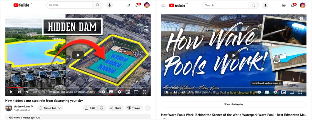
- You’re surrounded by tiny dams, here’s why: a fascinating video explaining all the different infrastructures put in place in many big cities to try to tame the water and avoid flooding when it rains too much.
- How Wave Pools Work! Behind the Scenes of the World Waterpark Wave Pool: in case you wondered about this. The simplicity behind this is magical.
Inspiration: fun experiments, beautiful art, and great ideas
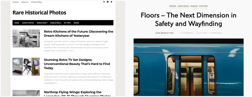
- Rare Historical Photos: a blog exclusively dedicated to historical and rare photographs. Each historical photograph has a story to tell, each of them documents a major event in human history, each photo is a way to grasp the full meaning of the past.
- The Next Dimension in Safety and Wayfinding: it’s always interesting to see how people design public spaces and include different signs to guide fellow humans, this one is dedicated to signs in different public transportations. The “walk, run text” one might sound like a fun joke, but it could actually be quite efficient for the fluidity of stairs traffic.
- NASA Visible Earth an inspiring catalog of NASA images and animations of our home planet
Useful tools & resources
- Accessible Social: with all the new social media platforms popping, trust me, you will need this curated resources on the accessibility of social media platforms, guides, and articles on how to make your content accessibility on those, by Alexa (Alex) Heinrich
- Fixel Font: a cool new grotesque variable font
- Interface Inventory Blueprint: a template to start your design system interface inventory (by Honza Toman)
- ABCs of CSS: for each letter, you get an illustration of CSS property, value or concept. A fun way to (re)learn about CSS!
- A checklist for choosing type: if you need help choosing a font for a project, follow those guidelines: the typeface suits the purpose of the project, the typeface’s design is comprehensive (muti-language support, legible details, etc.), the font files are reliable, the fonts are usable in the situation required (licenses my friends!!)
- CrowdView: a search engine that search through different forums to find your answer, really useful when looking for advice from other people
- DamnGood.Tools: a couple of useful, free, open source tools in the browser, including a privacy policy generator, a tool to take screenshots (area, full page, while scrolling), one to detect fonts, and a couple that use chatGPT (up to you to trust them or not).
- DuckDuckGo gives you a privacy-first gateway to ALL the search engines – with a bang: I wasn’t aware this existed, it’s quite nice, you can use duckduckgo as a search engine and add some exclamation shortcuts (called bangs) to get the search redirected via other engines (google, wikipedia, reddit, etc.)
Cool and Interesting Videos
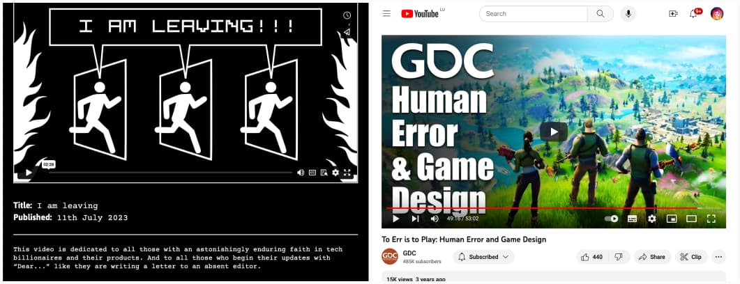
- I am leaving (Webbed Briefs) another fun video from Heydon, dedicated to all those who begin their updates with “Dear…” like they are writing a letter to an absent editor.
- To Err is to Play: Human Error and Game Design: most of the time, with interface, you want to prevent users from making errors. But, in video games, you actually want the players to make mistakes. That’s part of the challenge! Ben explains how cognition works, how to prevent or use potential errors as part. By Ben Lewis-Evans
- Anti-Social Behavior in Games: How Can Game Design Help? a very insightful talk on toxicity in video games, the concept of the 3 Es: Education, Enforcement, Engineering and what can be done on those 3 levels to help.
Tutorials
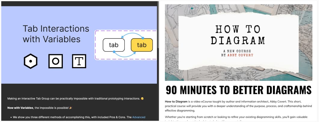
- Tab Interactions with Variables: 3 different ways to prototype tabs in Figma with the new variables
- How to Diagram: a 90 minutes online courses to help you build better diagrams, by Abby Covert
Latest news in the industry
Wix’s new tool can create entire websites from prompts: haha, this sound fun, it’s kind of any client’s dream, I hope it can deal well with client requests like “make the logo bigger” or “merge v1’s header with the font of v2 and the colors of V2490-final-b”

