Pixels of the Week – July 28, 2024
Iceberg drawing challenge, minimum WCAG target size & some design system inspiration
My curated weekly-ish online newsletter, where I share interesting articles, tools, and resources I found during the week. You can expect content about UX, design, user research, accessibility & tech, but also some processes, some inspiration, sometimes books, and a couple of videos and podcasts. Also, don’t forget to, subscribe to the newsletter to get notified, you will get the weekly links directly in your mailbox, and be notified when I publish other articles.
Now: what I’m currently up to
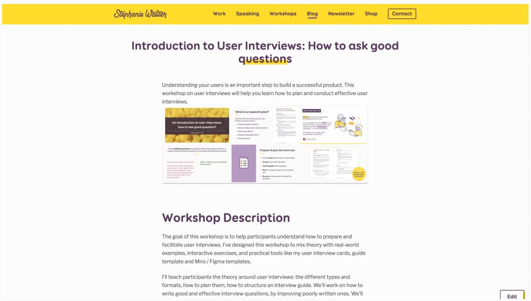
This Friday, I run a private session of my Introduction to User Interviews: How to ask good questions. It was a really nice French audience and I had a lot of fun. Also, I’m slowly formalizing my workshop offer on my site. Take a look at the workshops available. And don’t hesitate to reach out by email if you are interested in either, a private training session for your company, or want to invite me to run a workshop at your event. At the moment, I’ll admit I’m more open to remote workshops. But, we can always check the agenda for in person.
Most popular content this week
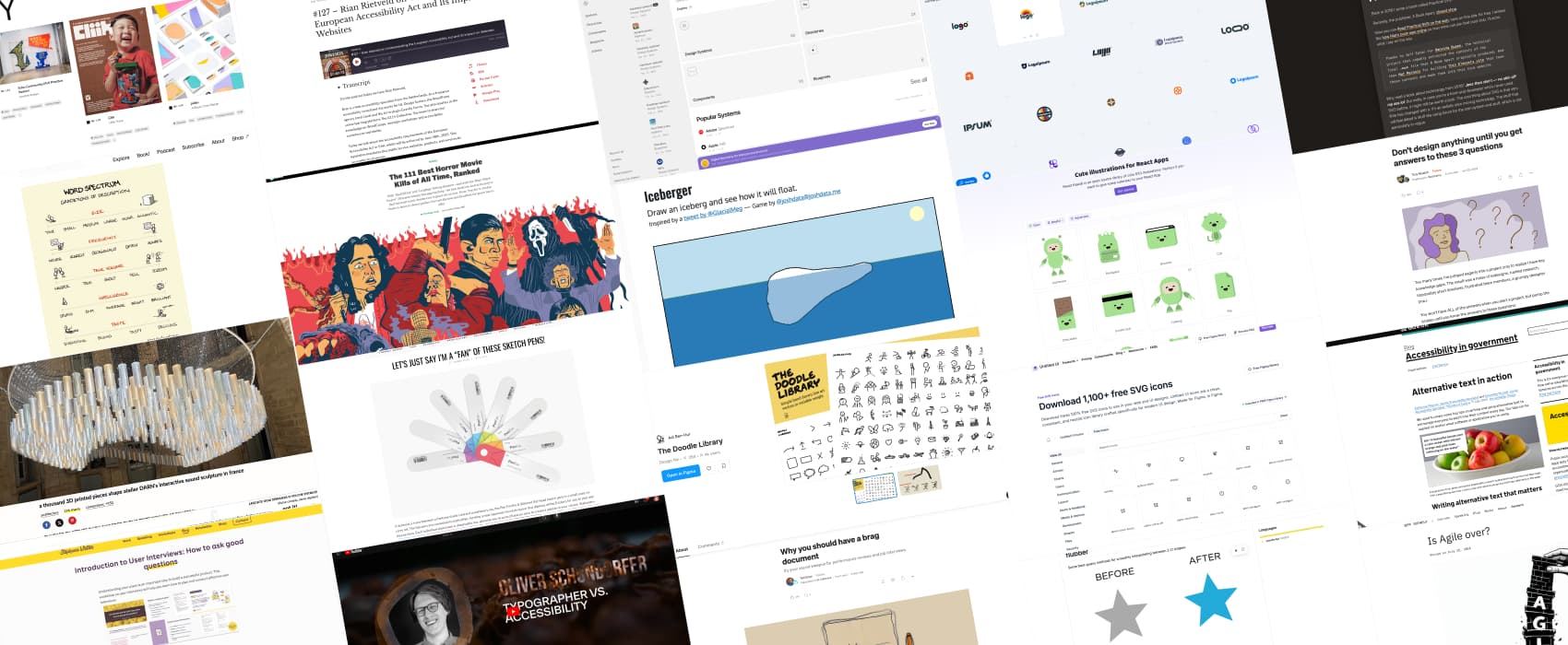
Draw an iceberg and see how it will float. We often draw icebergs vertically, with a little tip above the water, and a giant part under the water. This doesn’t work, it wouldn’t float, because of mass distribution. If you want to have fun, draw your best iceberg, and see how it would actually float! If you want to have fun, check what people on mastodon drew in the replies. The Titanic one made my day.
Interesting articles that caught my attention
- Don’t design anything until you get answers to these 3 questions (4min) What problem are we trying to solve? How will we know we’ve solved this problem? What is the timeline for this project? by Tina Musich
- Towards a Strategic Information Architecture (8min) by Jorge Arango. Information architecture traditionally focused on improving the structure of the information people find on a website or and app. But the tools and methods can also be applied to structure information that supports organizational strategy, enhancing decision-making, cohesion, and efficiency. Working in enterprise UX, I spend a lot of my time organizing processes in high level organization taxonomies, so I can only agree here.
- Why you should have a brag document | by Ted Goas (6min) having a document where you note your career accomplishments, skills, and milestones makes it easier to remember them, and present them during performance reviews, job interviews, and career discussions. I also have a “love” folder, in the email and drive, where I keep nice comments from people on the things I do / the content I put in the world. It helps balance the negativity of social media some days.
- Getting To The Bottom Of Minimum WCAG-Conformant Interactive Element Size (15min) great summary by Eric Bailey. For 2.5.5 (AA): target must be 24px, you can use padding (extend the size) or margin (add spacing) to achieve it. This doesn’t apply to link in blocks of text. Same for 2.5.8 (AAA) except you need to achieve 44px. Also, devices have different types of inputs, so you can’t really “detect” mobile. Accessibility is a baseline, ultimately, you need to understand what users are trying to achieve with those interactive elements, design them accordingly (so, user research, usability testing, etc.)
- Is Agile over? (4min) the implementation of Agile in most companies is superficial, which leads to very little benefits, resistance, or worse, people thinking the method doesn’t work. Jeff Gothelf offers to push for “agility” instead, an prioritize understanding team needs and team success over strict, rigid dogma: “Rather than telling people how to do their jobs, work with them to set the goals for a process that would make them and the company more successful”. I kind of want to say “obviously”, but, unfortunately, I’ve seen too many companies try to do “agile by the book” and force a process in an environment where it can’t work. So, yes, I understand where this is coming from.
Curiosity cabinet: non-design/tech rabbit holes I enjoyed
The 111 Best Horror Movie Kills of All Time, Ranked nice ranking, if you love gore and horror movies
Inspiration: fun experiments, beautiful art, and great ideas
- Design Everywhere an ever-growing collection of carefully curated works from around the world, for your inspiration
- a thousand 3D printed pieces shape atelier DARN’s interactive sound sculpture in France beautiful and fun, I love art you can interact with
- Let’s just say I’m a “fan” of these sketch pens! it’s just a concept, but I love it, and wish this was a real product. It’s the perfect tool when you travel a lot as a designer and don’t want to bring all the sharpies and stabilos with you all the time
Useful tools & resources
- Logoipsum you can choose one of those 100 free placeholder logos in case you need a fake logo for a project.
- The Doodle Library Hand drawn line art vectors in 3 weights and accent color for your designs in Figma
- 1,100+ free SVG icons some free SVG icons to use for your designs, organized in different categories.
- Word spectrum I really like the visual representation of a word spectrum, we often use them when doing surveys to measure things on a scale. But it’s not always easy to come up with the right words for the spectrum.
- Flubber a script to get better automatic interpolations on 2D SVG shapes
- React Kawaii: an open source library of cute SVG illustrations, perfect if you want to give some cuteness to your React App. Can we talk about the human dinosaur, I love it.
- Design System .surf a directory of different design systems that you can explore by components or categories, like accessibility. The blueprint section also offers component anatomy, states, usage, behavior, and best practices. Made by Ilya Greben.
Cool and Interesting Videos
Typographer vs. Accessibility in this very nice 40 min talk, Oliver Schöndorfer confronts himself with his own misconceptions as a designer and type nerd. Is 16 px the required minimum font size? Is high contrast necessary? Should you really avoid serif typefaces? And is Comic Sans best for dyslexic readers (while being the worst for everyone else)?
Podcast
#127 – Rian Rietveld on Understanding the European Accessibility Act and Its Impact on Websites an interesting podcast on the impact of this new legislation that shall be in place by June 28, 2025 for all public service websites, products, and services in EU member states. They also discuss sanctions but it’s honestly still quite unclear on this whole is going to work, since it’s a directive that will become a law in each country. Which means: each can have different sanctions and ways of controls. It’s still quite blurry on that part.
Books
Practical SVG is Now Free to Read Online: you can now read Chris Coyier’s book for free online.
Tutorials
- Alternative text in action (7min) great tips to help you write better alternative texts by the gov.uk
- How not to use box shadows: David Gerrells is messing around with box shadows to make ray tracer, because, why not? I love such level of geekery.
Latest news in the industry
- Twitter Thread on Figma AI terms explained by a lawyer interesting things, like, if you put someone else’s work in a Figma file to create a moodboard (don’t pretend, we all do that, basic inspiration), you don’t own the copyright, but it’s being used to train their AI (if you didn’t change the option). If someone sues Figma for using that work, you can be held accountable. Bottom line: switch of the AI training option!
- NASA Transmits Hip-Hop Song to Deep Space for First Time, ha, love such news
