Pixels of the Week – July 30, 2023
Accessibility in the design phase, users express solutions not problems and the new font-face syntax
On Twitter, LinkedIn, and Mastodon, I share curated articles I read, resources and tools about UX Design, User Research, UI and mobile design, HTML, CSS, the web industry, some processes, some inspiration, etc. This is an archive of everything I shared this week. And some extra links that I decided to only share for the blog readers. Also, subscribe to the newsletter to get notified when those are published!
Now: what I’m currently up to
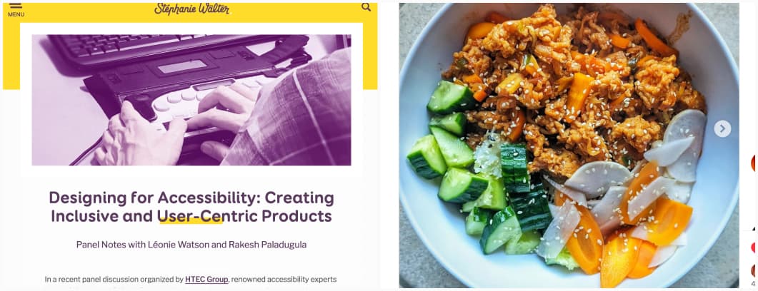
I’ve published My notes from the panel “Designing for Accessibility: Creating Inclusive and User-Centric Products Léonie Watson and Rakesh Paladugula discuss the importance of designing for accessibility and the need for inclusive, user-centric products. Newsletter subscribers should have gotten a notification. If you didn’t feel free to contact me.
If you speak French, I was interviewed for the podcast The Product Design Insights and talk about my career and accessibility. It’s split in 4 episodes: 1/4, 2/4, 3/4, 4/4
On a personal note, I tried gojuchan chicken rice bowl and it’s awesome (you can check the pictures on Instagram). I’m also up to some shrink plastic and UV resin fun, but I’m still working on the pictures and videos so I’ll share later.
TL; DNR: the one you should not miss
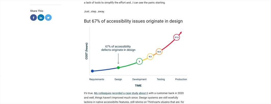
Is Closing the Web Accessibility Design/Development Gap a Bridge Too Far? according to Deque, 67% of accessibility defects originate in the design. So, what can designers do? Bridge the gap with developers by adding accessibility annotations to mockups!
Also, shameless plugs: if you want to learn more about documenting accessibility for designers, using annotations among other things, I have a whole conference that I gave at axe-con in 2022 (turned into an article) on the topic: A Designer’s Guide to Documenting Accessibility & User Interactions
Interesting articles that caught my attention
UX research and design
- Passwordless Accounts: One-Time Passwords (OTPs) and Passkeys: two very interesting technologies to make registration and login easier. It boils down to “give the user choices”.
- Tears of the Kingdom: how Nintendo improved (and ignored) UI issues: it’s indeed very sad to learn there are accessibility features missing that are standard in other games (like button remapping) in a 2023 blockbuster game. Nintendo, we expect better!
- Why UX Researchers should be dungeon masters a fun parallel between D&D and user research (makes a lot of sense, haha, I love table-top role playing)
- The Design Thinking Movement is Absurd: a long read on the shortcomings of design thinking, via an analysis of its origin story by Lee Vinsel. I thought the Burnett part was satiric, but, nope, apparently he wants you to design think your life.
- The Trap in UX Research: what do you do when user express solutions and not problems? You interpret those as “problem statements”, go beyond the surface level and try to find the root cause.
- The UX Recruitment Struggle Is Real: great tips if you are in a situation where finding participants for your user research studies.
- The Differences Between Design Frameworks Debbie Levitt explains how most design processes you can see are derivatives of User Centered Design
Accessibility
Designing Age-Inclusive Products. A couple of best practices to help you make your interface more friendly for 60 years old + users: have large target size, avoid relying on precision gestures, reduce the number of actions to arrive to a goal, let people progress at their own rate, add feedback to reassure them, etc. Note that many of those are also accessibility best practice that can benefit users with cognitive issues and motor impairment, everything is connected.
IA: Information Architecture
How to Create a Content Model: a great step by step guide to help you build content models for your systems
AI, which is not IA, this is confusing
Prompt-Driven Design I’m skeptical about this, while I see how it can be efficient in certain areas (like the “negotiate price for me but keep the same plan”), I still think there are plenty of places where “prompt only” is frustrating for users. Like image generation: how are you supposed to know you can use some settings with a prompt only interface that won’t tell you so? So, yeah, curious about what the future holds, but let’s be critical about how usable prompt only interface is too.
Inspiration: fun experiments, beautiful art, and great ideas
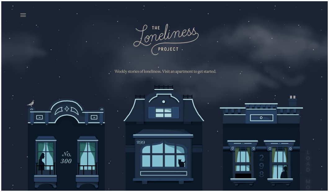
The Loneliness Projects: anonymous people share stories of the last time they felt lonely, what loneliness means to them, the first time they realized they were lonely and the time they felt the most lonely.
Useful tools & resources
- Kanboard a free and open source Kanban project management software.
- Songfacts is a searchable database of song information where you can find out the stories behind the songs, get the lyrics, and watch the videos.
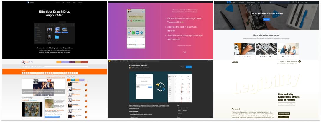
- No Audio Please! a Telegram bot that creates an automatically (AI) generated text transcript from voice messages.Could this be an accessibility helper? Still, it’s sad that Telegram doesn’t provide transcripts by default (Slack does for example), maybe in the future?
- Export/Import Variables: Export variables from one file and import them to another. It’s great for migrating libraries, or when you downloaded library from the community and you’d like to import variables to your existing design system.
- iFixit: an online repair community, that helps people fix their broken stuff, instead of throwing those away. They have nice guides for different tech devices, but also vehicles
- Dropover: a utility macOS tool to make drag and drop better, by adding the ability to gather and move content without having to open different windows at the same time
- Legibility: a free online ebook on how to design for “easy to read”, including explanation of how one reads, the movement of our eyes when we read, how we recognize words, basic principles of typography, wrong ideas and practices that are common in the profession, and advanced concepts of reading on the screen supported by scientific research.
Cool and Interesting Videos

He Watched 50 Hours of MrBeast So You Don’t Have To: yes, totally clickbait title, but, still an interesting analysis in the psychological hacks Jimmy uses to hook viewers: input bias (show how much effort you put into something), costly signaling (spend money to make money), the contrast effect and concept of juxtaposition, loss aversion, curiosity gap, etc.
If you are interested in biases, don’t forget to check my UX Cognitive Bias Cards & Workshop
Latest news in the industry
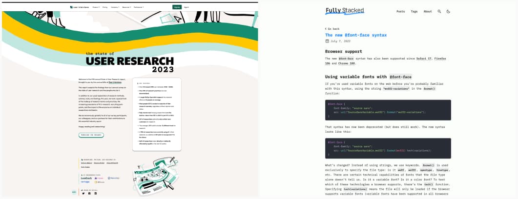
- The new @font-face syntax: the tech() function was added so that you use for example color fonts, open type features and more.
- State of User Research 2023 Report: we all love data and graphs, so here we go, company size, industries, how people became researchers, remote vs in the office, ReOps, Centraliazed vs hybrid vs distributed models, research methods, recruiting (participants), salaries and so much more.