Pixels of the Week – July 6, 2025
Designing for motion-sensitive users, no yes/no questions and a fun password generator
My curated weekly-ish online newsletter, where I share interesting articles, tools, and resources I found during the week. You can expect content about UX, design, user research, accessibility & tech, but also some processes, some inspiration, sometimes books, and a couple of videos and podcasts. Also, don’t forget to, subscribe to my newsletter to get notified, you will get the weekly links directly in your mailbox, and be notified when I publish other articles.
Now: what I’m currently up to

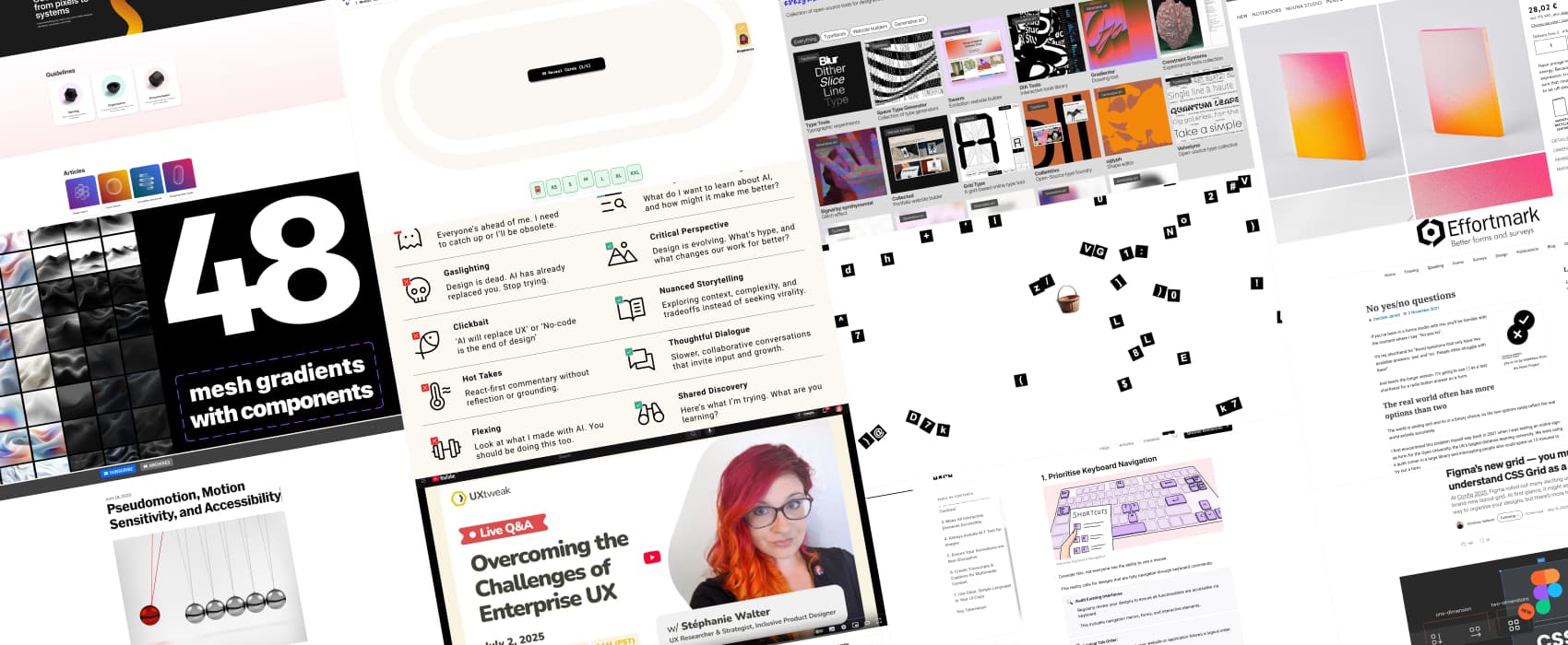
I had a great time last Wednesday, talking about challenges of Enterprise UX with UXtweak! The replay is now available on YouTube, in case you didn’t attend and have FOMO.
Most popular content this week
Speaking of enterprise UX, I had some fun, and I’m thinking about creating some enterprise UX stickers. I asked on LinkedIn, Mastodon and Bluesky what should go in there, and the answers are a lot of fun!
Interesting articles that caught my attention
Pseudomotion, Motion Sensitivity, and Accessibility (9min) I was once told I was being dramatic, when I explained that an animation was making me nauseous. Expect: I’m not the only one. Motion and pseudomotion in digital interfaces can trigger nausea, vertigo, migraines, and even seizures for users with vestibular disorders, migraines, epilepsy, and other neurological conditions. So, how can we make the web more inclusive for motion sensitive users? As often, for accessibility, it’s about choice and options: respect system-level “reduced motion” settings, offer motion toggles and customizable animation settings to your users.
The broken rhetoric of AI. (12min) a needed critique of the current AI discourse, that is toxic, performative and fear-driven. Mike Schindler urging creatives to move beyond clickbait, gaslighting, and elitism. He proposes a couple of interesting alternatives, grounded in dialog, curiosity, community and storytelling. I really like this, I’m too growing tired of the gaslight and clickbait, doom predictions around this topic.
No yes/no questions (8min) We were told to avoid yes/no questions in forms because they often cause confusion. Real-life situations rarely fit neatly into binary answers. How to improve them? Try to spell out the meaning of the yes/no, test them and add an extra answer to keep those open. By Caroline Jarrett
Design for Accessibility: 7 Essential Principles for Inclusive UX Designs (7min) When making your products more inclusive, you can start with keyboard navigation, color contrast, accessibility of interactive elements, alt text for images, non disruptive animations, transcripts and captions for video and clear simple language. (by Christopher Nguyen)
Inspiration: fun experiments, beautiful art, and great ideas
Notebook Colour Clash L Light Burn I’m trying to convince myself I don’t need yet another notebook, but, the color, everything… damn it.
Useful tools & resources
Design good practices a place to find designer best practices guidelines, from standards, naming conventions, organisation, documentation and more.
Password Basket a simple little browser tool to help you generate strong passwords, with a fun interaction that I’ll let you discover, no spoilers!
everywhere.tools (warning: motion sickness triggering gifs on the page) a collection of open-source tools (typeface, website builders, generative art) for designers and creative people.
48 AI mesh gradients that’s it, just, nice mesh gradients you can re-use
scrumplanning.com a free poker planning tool, that is also super cute!
Tutorials
Figma’s new grid — you must understand CSS Grid as a designer another great tutorial by Christine Vallaure, to help you understand the new grid feature in Figma. Why should you care? Well, If you want your Figma layouts to actually work in the browser, you need to understand CSS Grid. Your devs will thank you later.