Pixels of the Week – June 11 , 2023
The Pentagram User Centric Design Process, AI & user research and some CSS awesomness
On Twitter, LinkedIn, and Mastodon, I share curated articles I read, resources and tools about UX Design, User Research, UI and mobile design, HTML, CSS, the web industry, some processes, some inspiration, etc. This is an archive of everything I shared this week. And some extra links that I decided to only share for the blog readers. Also, subscribe to the newsletter to get notified when those are published!
The Pentagram User Centric Design Process
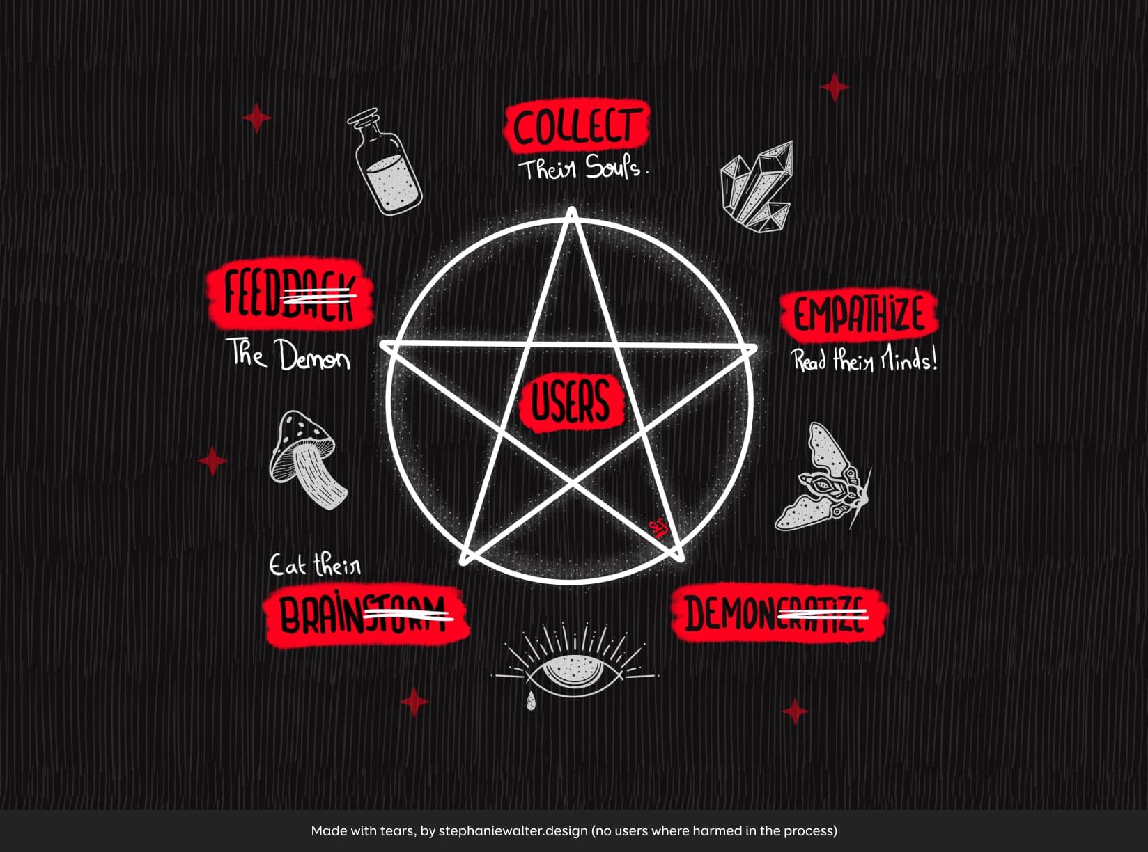 I’m back from holidays, and, friends, you are in for a treat. I was having fun this week with Procreate and, let’s face it, kind of making fun of all the design processes diagrams that make very little sense that I’ve see around the last couple of months. So, here we are, discover my “Pentagram User Centric Design Process”.
And, since some folks wanted shirts, I put it on a redubble shop, where you can get shirts, stickers and more…
What I’m up to
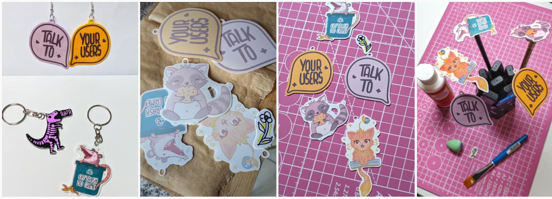
Well, when I’m not drawing ways to conjure demons, I’m also currently experimenting with shrink plastic. From printable one (you need to tweak the colors, hence the muted colors) to transparent one with vinyl. Those earrings are way too big, I messed up shrinking factor, but, that’s how you learn. I’m also thinking about turning those into pins. I think I might create a whole collection of UX statement jewelry, keychains, and some pins to wear for meetings. Current ideas: “Talk to + Your Users”, maybe “Test it” and the obvious “It depends”. If you want to brainstorm some catchy sentences that would work well, I’m all ears!
Interesting frameworks and concepts
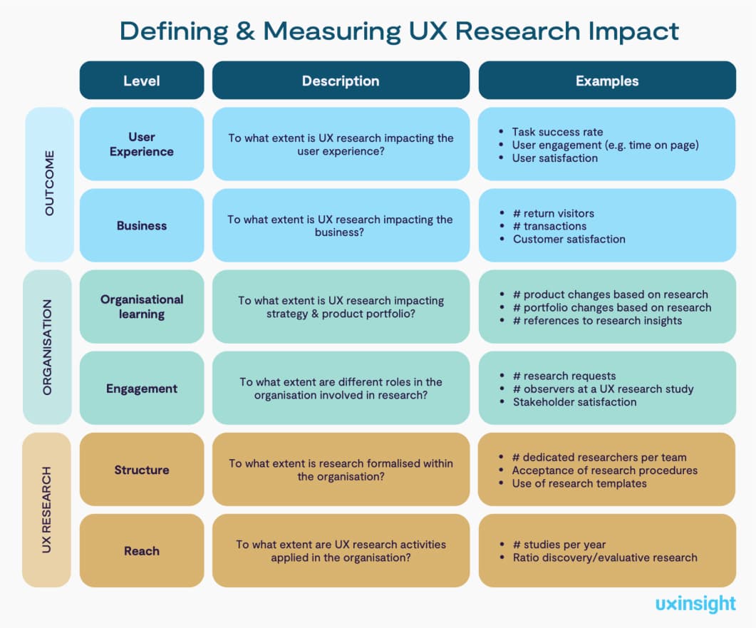
How to measure UX research impact: an interesting framework to tie UX researcher to different outcomes in the company, with 3 levels:
- Impact on the customer and business outcome
- Impact on the organization
- Impact on the user research practice
TL; DNR: the one you should not miss
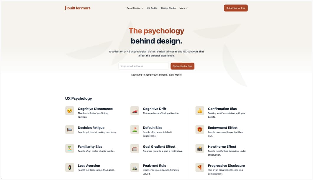
The psychology behind design: a collection of 42 psychological biases, design principles and UX concepts that affect the product experience.
Interesting articles that caught my attention
Information architecture
- Do digital products have information architecture? Why and how Information Architecture is much more than navigation!
- Early Childhood Information Architecture: awesome read on the different levels of information architecture children develop, subjective vs objective classification and how it can mess up your color search by Abby Covert
UX Research, UX writing and psychology
- Bad copy will ruin your designs. Great tips for better copy: design with words in mind, write for users, clear and simple, true and accurate, keep a consistent voice. Also test the text and don’t try to sell the interface to users.
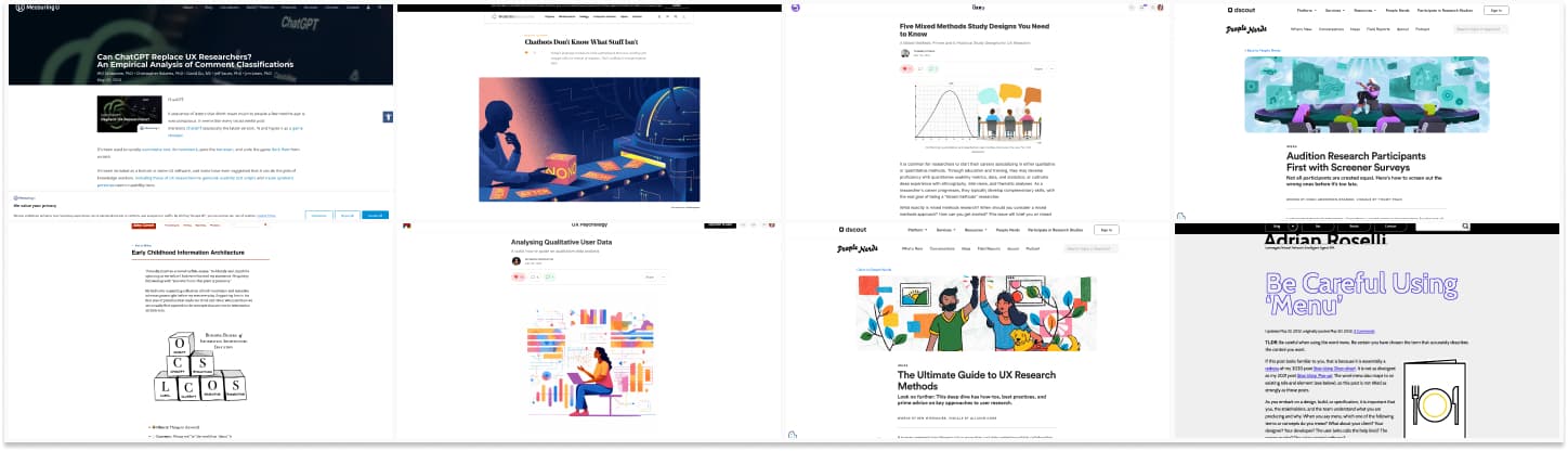
- Synthesising Qualitative User Data: a great introduction to what we UX researchers call “qualitative coding”, how to code data, the different types of coding methods.
- Five Mixed Methods Study Designs You Need to Know: 1 convergent parallel, 2 explanatory sequential, 3 exploratory sequential, 4 embedded, and 5 multiphase design. I mostly use 2 and 4 but I’m curious about the other ones.
- The Ultimate Guide to UX Research Methods: a nice list of articles, templates, Q&A, if you need help with a specific UX method, or just finding the right one.
- These FAQs from Product Managers May Surprise You: I really like the idea of a What can you expect from me” document that shared with colleagues, so they know the full scope of our skills and role. In the end it’s all about communication.
- Audition Research Participants First with Screener Surveys: 7 steps to help you write screener surveys. Those are important in order to recruit the right users for your sessions!
Accessibility
- False Consensus Effect: Why it’s so hard to understand customers: interesting examples of how people, thinking that their own beliefs and behaviors are the same as the general population, caused projects to fail. by Jen Clinehens
- Be Careful Using ‘Menu’: help better communicate accessibility with your developers by properly naming your components. I wasn’t aware the navigation with multiple levels at the top of a page is called “fly out” navigation, so, yeah, now I do!
AI, yes, again, it’s a hot topic
- Chatbots Don’t Know What Stuff Isn’t: so, you might have issues if you use it to analyze user data with a lot of sentences with negations. I’ve seen the same issue with text to image AI: the word “without” is hardly understood. Like “rats without tails” still get, tails.
- ‘They’re afraid their AIs will come for them’: Doug Rushkoff on why tech billionaires are in escape mode
- Do product professionals have a role to play as we explore AI and ethics? As AI is integrated into mainstream digital experiences, we can do what we do best to help ensure safety and ethics. How?
- Plan user research with ethics in mind
- Ask further questions about user pain points. For example: are user pain points just UX issues? Or is it possible that the AI technology fueling features and flows is not respectful of the user—perhaps discriminatory or suggestive of another ethical issue?
- Help the organization understand the impact of AI on your users
- Can ChatGPT Replace UX Researchers? MeasuringU tried to have chatGPT code qual data and compared it to human coding. It worked pretty well with the 3 following caveat: chatGPT rarely creates themes for individual statements, it takes time to get a good prompt (garbage in, garbage out) and you need to run it multiple times.
Curiosity cabinet: non-design/tech rabbit holes I enjoyed

Why does rice sink ships? Information you didn’t really need but it’s still awesome to know, presented in a nice animated video
Inspiration: fun experiments, beautiful art, and great ideas
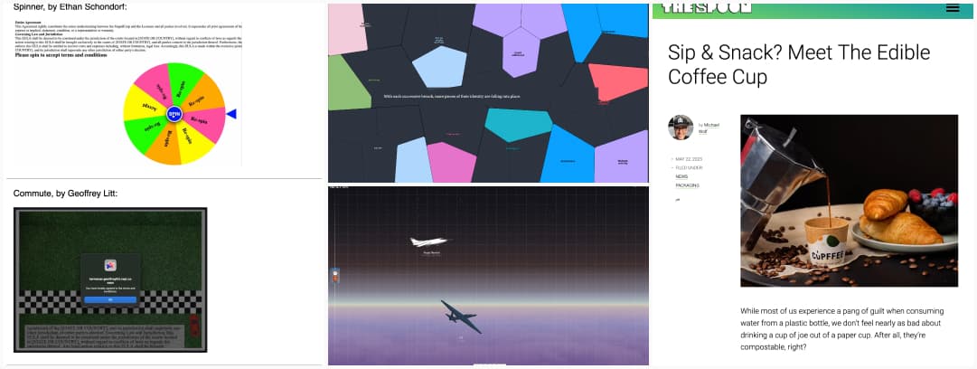
- Terrible Terms and Conditions: sometimes it’s fun to do evil on purpose, why not make terms and condition confirmation even worse? I really like the spinner.
- Space Elevator: scroll up to discover the different layers of our atmosphere and get interesting information about each, including what type of fly there
- Edible Coffee Cups? YES PLEASE. (expect I usually forget my coffee so I hope it won’t leak haha)
- See your identity pieced together from stolen data: interactive infographics where you enter your email, and they generate a personalized report (based on Have I been Pwned data). Even with only 6 breaches over 15 years with one email the result it pretty bad, 11 distinct pieces of my identity have been potentially exposed. Main issues from CafePress and ClearVoiceSurveys (I’ve never heard of that one…)
- (obvious trigger warning: motion sickness triggering animations) Motion: a great example of a website that was able to put all the animations that trigger motion sickness for me in one single place Too bad to talk about UX and motion while respecting user’s prefers-reduced-motion settings, right? I’m also pretty sure it’s a nightmare for anymore with ADHD and other cognitive issues.
Useful tools & resources
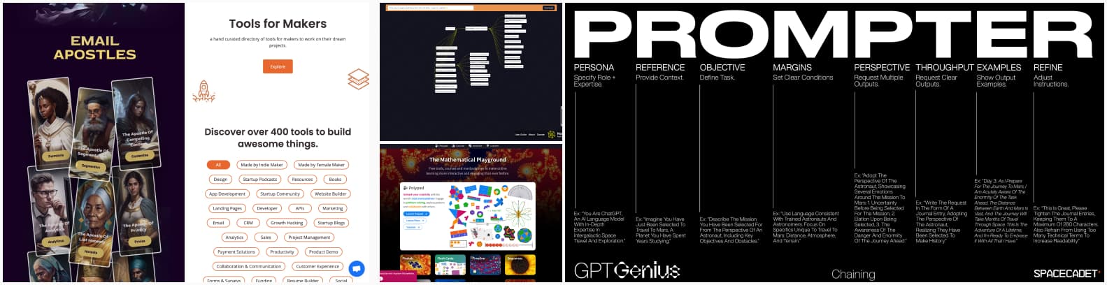
- Emailism: If emails were a religion, with their commandments and apostle. A fun way to present email marketing best practises, DOes and DONTs
- Zoo Replicate: a fun tool that lets you prompt different AI image generator to compare the results for your prompts
- NodePad a fun visual notepad that lets us use AI to brainstorm more ideas. I tried it with “accessibility for designers”, I’m a little worried it never mentions WCAG though, so I’m wondering about the dataset
- Tools for Makers: a hand curated directory of tools for makers to work on their dream projects.
- PROMPTER: an interesting acronym to help you build better prompts.
- Mathigon: a place with free tools and courses to learn math in a more engaging way
Tutorials
- 11 HTML best practices for login & sign-up forms: a couple of HTML and JS tips to improve the UX of your sign in forms. My main issue with them is when people disable password auto-complete. As mentioned in the article, please don’t!
- CSS is awesome: Chris Coyier presents some nice modern CSS features you might have missed, and what you can do with those: logical properties and layout, container queries and units, cascade layers, new colors and view transitions
Cool and Interesting Videos
- Office hours: Figma like the pros (2023) a lot of super useful little Figma tips
- Meet Michelle Carney, a Machine Learning User Experience Researcher at Google. She talk about music, neuroscience, teaching, and machine learning have informed her ability to understand how people use Machine Learning tools, and provide better feedback to help make these tools more useful, helpful, kind, and inclusive of all types of user experiences.
Latest news in the industry
- DragGAN: A New Method for Manipulating Generated Images: The technique enables one to “drag” any points of the image to precisely reach target points in a user-interactive manner. Okay, this is very impressive
- Beta W3C: the W3C has a new beta website, you can leave feedback if you want.
- Video games are making ‘safe’ modes if you’re afraid of spiders or deep water. Activate them, and they disappear. I really like such ideas to make video games more inclusive
- The Dangers of Google’s .zip TLD. TLDNR: could be used for phishing, scam and downloading malware
- Why an Octopus-like Creature Has Come to Symbolize the State of A.I. You encounter the chatGPT Shoggoth, please roll your sanity check and prepare for initiative! Little roll player and cultist me loves that news a lot.